Great paintjob ... I just wonder if there should be a 2 tone schematic applied on the facemask ... what do you think Studio 49?
Chaim
Well this is an interesting topic that I been talked to the guys over at the SLD forum about for a while before painting. I forgot to post those things here so I shall do a summary of my thinking
")
:thumbsup
So there were 2 possible options that could be considered if I were to do a 2 tone scheme, first is the grey and black like seen in the movies and second is pearl like blue and black like seen in some of the art and drawings.
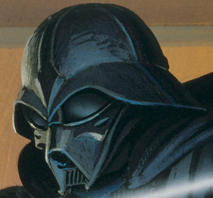
To begin with I disregarded the grey option as there is nothing to suggest that in the art or on any of the offical statues that have been released to date. Looking at the picture it may seem that the helmet does have a 2 tone grey and black scheme, but if you look closer, none of those lighter tones are uniform which suggests to me that it's just lighting that's been rendering my RMQ.
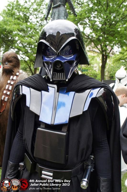
Then the second option was the 2 tone scheme with the pearl like blue with black. This one is a little less clear to determine but I believe the blue was never invented to represent a colour that was physically applied to the helmet. Now for this one I needed to look at the state that have been produced over the years.
Now this is what some people may be thinking of in terms of colour but I just feel that the blue is not an accurate representation of the art. (although I'm not being negative about the costume, because it is absolutely awesome)
So in terms of offical sources there are a few sources to look at.
First is the Gentle Giant which goes with the straight gloss black
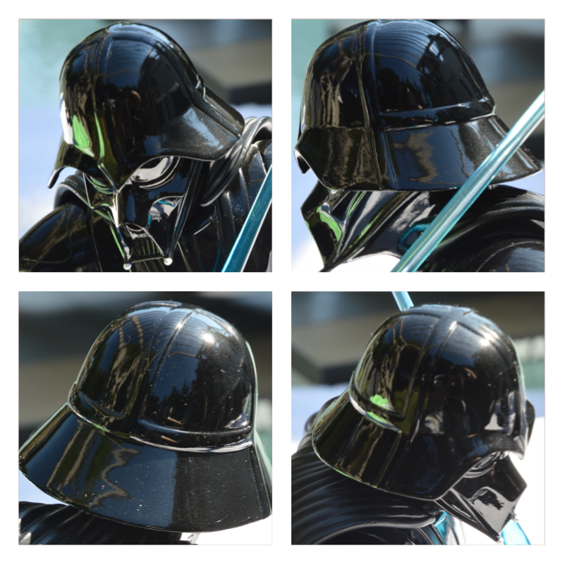
Then second is the Kotobukiya. Now this one is the most stylised one thats been released.
And these blue highlights are reflected all over the figure, the helmet, leathers, boots shins, etc
I believe that all these blue highlights are not a physical feature but instead an aesthetic choice by the Koto design team to show what they intemperate the reflect of the saber blade to be.
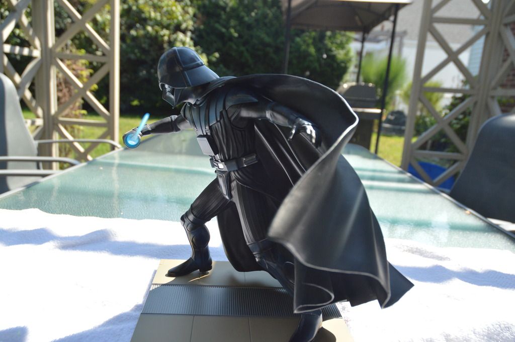
Then finally there is the RMQ Vader Figure that Sideshow is making, and you can clearly see that they are going for the plain black for the entire figure.
So long story short, by comparing all my sources and process of elimination I believe that the helmet should be a one tone gloss black paint scheme an that is the most accurate reflect of the art RMQ drew all those years ago and and that any of the blue type paints used in figures are simply to represent the reflection of the Lightsaber blade.
Hope that helps answer the question mate