Sorry for bumping this thread.
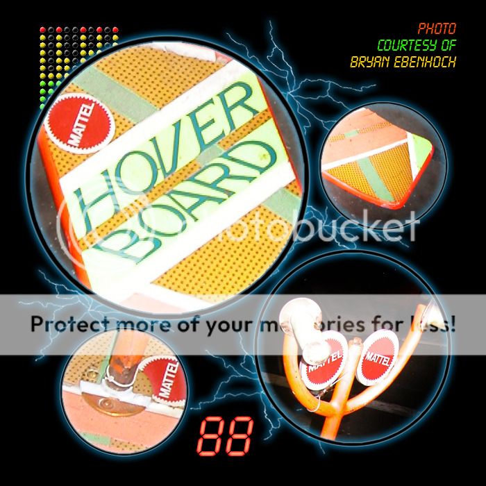
But I have a theory that you guys may very well be over complicating some of the replication with the orange board.
What I mean is the color matching. On first glance it looked to me like the board was just a hue shifted pink board, as the colors looked very off putting to be a design choice.
It was almost like that vibe you get when you see a picture that has had it's colors inverted. Where you can just tell it wasn't purposeful/natural.
So off I went to photoshop. If you take Rolands brilliant pink board files and hue shift it, when you reach a correct color, the rest of the colors match in relative to the one you shifted to. This happens on pretty much everything apart from the "hoverboard" logo and "Mattel" logos.
Given red is part of Mattel's logo, it looks like they simply corrected that.
As for the "Hover board" text. It looks to me like they just chose the hue adjusted green from the stripes on the bottom.
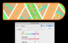
Here's how it looks in my quick test with nothing done beyond the hue change:
Given that all the colors pretty much match in relation to one another with a simple hue change, I think it's a safe bet that this is what they started with.
")


Q~~60_57.JPG)