Yes, his hero diary is fantastic! (Though his current run is his "tool" diary which uses his invented pages as well). If I didn't have one of my own diaries (took me 20 years to finally make one for myself!), I'd want one of Holt's as my first pick.
You are using an out of date browser. It may not display this or other websites correctly.
You should upgrade or use an alternative browser.
You should upgrade or use an alternative browser.
Your Indiana Jones Displays - Lets see 'em
- Thread starter Dave Ward
- Start date
kalkamel
Master Member
Holt's Hero diary is GORGEOUS. It's what inspired me to have a go at the Hero myself.
Here's his post in the RPF a few years ago on his Hero. It's just filled with diary eye candy.

 www.therpf.com
Here's his post in the RPF a few years ago on his Hero. It's just filled with diary eye candy.
The 1:1 replica of the Grail Diary Hero prop
Hello guys. Been alittle while since I have been on again. However, my MIA has produced something you might want to take a look at. I introduce the 1:1 replica of the hero Grail Diary. Little info about me, Im a guy who has studied this Grail diary prop for two decades. and lets just leave it...
www.therpf.com
Onkelpsycho
Sr Member
Ah yeah, Holt, that's him...
I'm a member at COW, but I'm not often there, so I miss a lot of what's going on there.
One day I will find my perfect diary. After all, I'm not a big Fan of computer fonts for the writing.
I'm a member at COW, but I'm not often there, so I miss a lot of what's going on there.
One day I will find my perfect diary. After all, I'm not a big Fan of computer fonts for the writing.
OasisSupernova
Sr Member


MAKE BELIEVE
Master Member
Love that "wall"
Lightning
Master Member
New addition, the Chachapoyan map, shape based on the new info about the actual shape of the original. I generated the background map in Dall-E, after a couple dozen attempts. I added some references to the landmarks and traps translated into Quechua. I could have put a little more time into this, it's still pretty quick and dirty.

Cool use of this new AI tech!
What size is the vile please.Vile From Amazon. Gold tape and gems from Walmart. Gold paint for cap. Filled w listerine. Lol
OasisSupernova
Sr Member
These are what I ordered.What size is the vile please.
Attachments

A friend of mine and I have been working on the vial for a couple months. Deceivingly tough prop to get accurate due to the lid. We have tried to match it exactly on CAD and he is 3d printing it. I’m very encouraged by the result so far. Will post pics once it’s finished.These are what I ordered.
Heck even getting the color and shape of the rhinestones right has been a challenge. Lol
Lightning
Master Member
Heck even getting the color and shape of the rhinestones right has been a challenge. Lol
I've yet to be able to find ones small enough locally. And I don't want to buy 1000 on ebay.
OasisSupernova
Sr Member
I'm pretty happy with the way mine turned out. Considering I spent maybe $10 on all of them. LolI've yet to be able to find ones small enough locally. And I don't want to buy 1000 on ebay.
Attachments
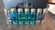
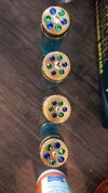
And of course the color is almost impossible to match exactly since the stone colors look different in almost every shot. We’re actually doing multiple fully painted prototypes just to test the different colors


And here are some of the other color variations we’re trying.

And here are some of the other color variations we’re trying.
Here’s where I got mine from in case you’re interested. 7mm size (aka 34ss). They’re pretty inexpensive. The key for me (besides the color) was finding ones that were the right shape. Many of the ones out there have kind of a pyramidal pointy shape that didn’t look right to me. These are a bit flatter on top. Hope this helps.
 www.the-crafts-outlet.com
Rhinestones | Beads | Pom Poms | Jewelry | The Crafts Outlet
Huge selection of arts & crafts supplies, largest selection of colors & shapes. Free Shipping
www.the-crafts-outlet.com
Awesome. Love the rocky background. Is that a Sarednab cross and an RM Belloq idol?Added some more fun
FYI, the lantern is from Hobby LobbyView attachment 1658245View attachment 1658246View attachment 1658249View attachment 1658250
Yes, also Sarenab false GrailAwesome. Love the rocky background. Is that a Sarednab cross and an RM Belloq idol?
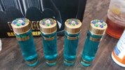
As I mentioned above, chubsANDdoggers and I (mostly chubsANDdoggers really), have been working on the vial prop. Still making tweaks to it (a new set is being printed in resin to try to achieve a bit more sharpness in the grooves —these are printed in MJF), but here are some pics I figured I’d share. The first few pics have an early set of rhinestones that we ultimately found a bit too dark and pointy, but they offer a good comparison against the screen prop.


And these are with the rhinestones that we ended up selecting (sent above). The middle one below is the one we originally tried (shown in the pics above). The ones on either side are the ones we ultimately went with (the one on the left is my favorite but a buddy of mine prefers the lighter colors on the right one —oh well).


And these are with the rhinestones that we ended up selecting (sent above). The middle one below is the one we originally tried (shown in the pics above). The ones on either side are the ones we ultimately went with (the one on the left is my favorite but a buddy of mine prefers the lighter colors on the right one —oh well).
OasisSupernova
Sr Member
Looks goodAs I mentioned above, chubsANDdoggers and I (mostly chubsANDdoggers really), have been working on the vial prop. Still making tweaks to it (a new set is being printed in resin to try to achieve a bit more sharpness in the grooves —these are printed in MJF), but here are some pics I figured I’d share. The first few pics have an early set of rhinestones that we ultimately found a bit too dark and pointy, but they offer a good comparison against the screen prop.
View attachment 1658548
View attachment 1658549
View attachment 1658550
View attachment 1658551
View attachment 1658552
And these are with the rhinestones that we ended up selecting (sent above). The middle one below is the one we originally tried (shown in the pics above). The ones on either side are the ones we ultimately went with (the one on the left is my favorite but a buddy of mine prefers the lighter colors on the right one —oh well).
View attachment 1658553
View attachment 1658554
Similar threads
- Replies
- 2
- Views
- 467
- Replies
- 42
- Views
- 4,326
- Replies
- 12
- Views
- 2,876