Well I'm a little confused as to what you are getting at with a few things, so I'd like to clarify.
<div class='quotetop'>(SithLord @ Jul 29 2006, 09:51 PM) [snapback]1290521[/snapback]</div>
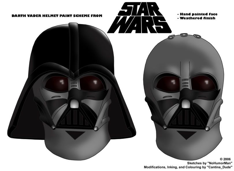
Wow....I think they look terrific. The lenses are great. I think the single ANH helmet is fine as it is....unless you'd like to add a black right tusk (Vader's right)
")
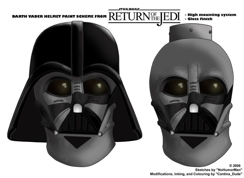
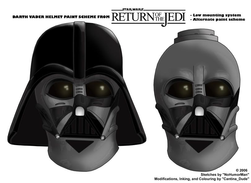
. I think the two ROTJ versions are an important reference....one for tour and one for screen. Keep in mind that they had the two-step ring mount system as well for ROTJ...perhaps left over ESB helmets? Very likely....[/b]
I do currently have the right tusk darker on the ANH template than the left tusk. I didn't want to have it out-right black, as I think it never really looked full on black on screen, it was always a bit worn. If people would prefer it as totally black, I can change it. As for the two ROTJ versions, I wasn't really thinking of them as one for the film and one for tour, as I know that the used both mounting systems for the film. I wasn't really trying to say that all low mount helmets had one paint scheme while all high mount helmets had the other, I just wanted to show both mounting systems and both paint schemes, so I just pick some combinations and went with them. Again, if people have some other suggestions for this, I can make it happen.
<div class='quotetop'>(SithLord @ Jul 29 2006, 09:51 PM) [snapback]1290521[/snapback]</div>
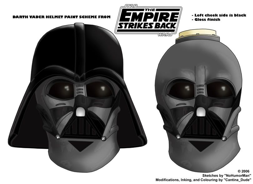
One thing that is different between ANH and ESB/ROTJ....the black over the nose where it meets the silver on Vader's right side...over the U-shaped part of the nose....that black/silver boundary overlaps further onto the cheek than for ESB and I think even less for ROTJ. You've shown that boundary to be identical. I realize this is simply a painting scheme and I think it's great as that but thought I'd throw that little difference in[/b]
OK, well the black/silver boundary that you speak of isn't actually identical in my images. The ANH is farther on to the cheek than the ESB and ROTJ. Do you think the ANH should be even farther on to the cheek? And do you want it moved farther on to the nose for ROTJ? Let me know.
<div class='quotetop'>(SithLord @ Jul 29 2006, 10:10 PM) [snapback]1290530[/snapback]</div>
Ok for ROTJ the silver should be more gunmetal....it seems in screencaps that the silver is darker on the neck and cheeks than in ANH/ESB....whereas it's a lighter silver on the nosebridge/head.
So the nose on the ROTJ is a very light silver compared to the rest of the face and head....lighter definitely than the top of the head.[/b]
It would be helpful if you could illustrate more clearly what exactly you mean by all this. It's a bit confusing with all the various "silvers" you speak of. From what I think you are saying, you're implying that there were several different shades of gunmetal used on the ROTJ helmet. I kind of doubt that they actually used different paints; I'd be more inclined to think it a trick of lighting rather than different mixes of colour. Let me know if that's what you are getting at.
<div class='quotetop'>(SithLord @ Jul 29 2006, 10:10 PM) [snapback]1290530[/snapback]</div>
Check also the areas in red below for ESB...here there's clearly the gunmetal...[/b]
Is there an alternate suggestion in there, or are you just confirming that what I've done for the ESB is correct? Let me know.
Regards,
MJC.