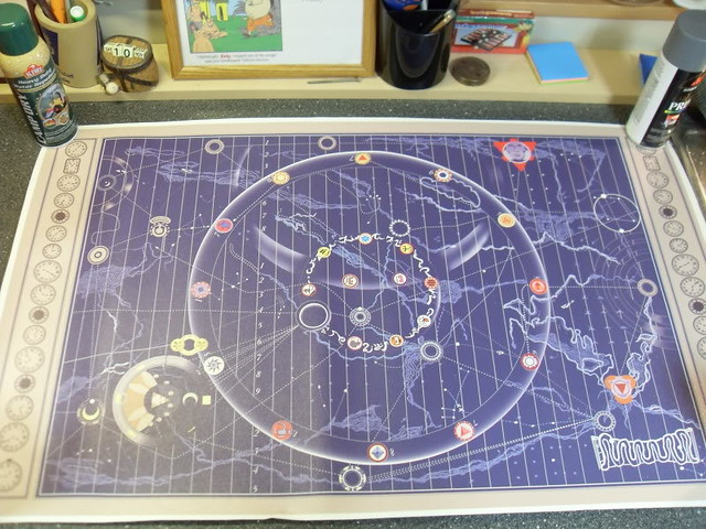
Great stuff, breakfstmachine! This brings me back to the early days of Grail Diary research. Keep it up!!
Last edited by a moderator:
From the looks of it, they used several of Fludd's images. Some of the spherical images match the ones on the map:
http://bildgeist.com/robert-fludd-utriusque-cosmi-rosicrucianism/
It's perfectly logical that they would have used existing like this, since Fludd's images are public domain and also taking into account that the original map would have been silk-screened with plates made from originals that were cut'n'pasted, then photographed onto celluloid. They would have had at least one plate for the blue, then either made separate ones for the other colors or did those by hand. (Certain elements also bear evidence of possible airbrushing, such as the fading around the large rings.)
Question for you, @JOATRASH FX, or for anyone, what makes you think it was silk-screening? Rather than some other pre-computer transfer method?
(I'm almost done with all the blue squiggles... hours of digital tracing, printing, then re-tracing with pen and ink! But I think it's going to look very nice.)
I never really wanted one of these until reading this thread. Great work everybody.
I agree, its always been a film I loved, but for some reason when I think about props i want, it never pops up.... until now!

Do you know if the actual map was made of canvas or linen?Great find on the source of some of those graphics. Looking forward to seeing your progress. My map journey really began in 2001 following RPF member Kapow's recreation. Adam Savage contributed some design work to that one if I recall. When it was complete, I couldn't afford one. Six years later, and with more reference material gathered, I began my own. I think it took 3-4 months in Photoshop. I did hand draw everything in separate layers on top of my reference images. Massive file back then. Today, not so much. Adam contacted me and gave some advice on varying the background to add depth and suggested more variety in the clock designs. He has purchased a number of these for himself and as gifts. Very enthusiastic and generous guy. But, you all know that.
The original props were created by Bernard Allum. I tracked him down years ago and we corresponded a bit. More recently, I was contacted by the author of this article http://www.madnesshub.com/2017/08/the-100-greatest-props-in-movie-history.html
He was looking for info on the origins of the map. I shared what I had and he also located Bernard. You can read the info at the link. Yes to silk screening, and yes to hand painting. He also mentions other reference books if you can track those down? Bernard remembers the sizing as 120cm x 70cm. That would be 47.24" x 27.56". But, he also says he cut holes in the maps for the dwarves to jump through, so take his recollection with a grain of salt? To me, Bernard only mentioned the original was A1 size, which is 33.1" x 23.4". Height would be very close to what most have replicated, but too narrow. Unless he's talking the main map minus the clock panels??
I do not have the TB blu-ray yet. Would be curious to see the foldout since it's sounds like it's the Harrison map, the one used for the credits. I replicated the filming map since, at the time, that had the best reference material. But I have never been tempted to rework mine. I made several rounds of tweaks in the first year or so, but it's been locked since about 2008.
I have made comparisons between mine and others in the past. It's interesting to see the different interpretations of the reference material. Kapow's was similar in detail to mine, but differed wildly in color. Joatrash's map does have a more hand-painted look. Chris_s' map looks very nice.
One suggestion I would make is to avoid using the airbrush tool or smooth gradients. Personally, I just think airbrushing looks out of place on an ancient map. I laid down a solid color first, then slowly ate away at it with a custom brush on the eraser tool until I achieved the gradient look I liked. Took forever, but I think it really helps sell the look. Your mileage may vary.
Good luck. You are off to a wonderful start and you have some references that we never knew existed. It should blow us away when done!
Allum says canvas, so that's all I can go on. That said, it was probably nothing like the inkjet coated canvas we are printing on today. Likely uncoated and thinner. I remember artists' canvas back in college. Probably something like that?
.....Joatrash's map does have a more hand-painted look. ....
It would be fun to spread out every version of the map on a big table to compare and contrast. Unfortunately, I cannot afford to buy them all.
I have seen all of them to date. None of them are anywhere close to 100% screen accurate.I have got to pick up one of yours and a “Marvel” banner soon! :thumbsup
