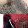
The Amazing Spider-man 2 - 3D Print Files/Pattern - FREE

An interesting approach to the blue bricks, since there is no muscle shading on the TASM2 suit, might be to overlay the highlights of the muscle pattern onto JUST the blue bricks, making them look like they have a sheen where the muscles should be raised and having them be darker where there should be recesses...

Just a thought as a way to compromise between the look of screen printing and the limitations of dye sublimation.

-Nick

I have actually tried this and it doesn't look bad. It just looks weird where the bricks value is in between the white and black... it kind of disappears into the blue. Here I added highlighted bricks where shine would be in addition to the muscle highlights.

EXAMPLE:
ASM2Test.jpg
 
Last edited:
I have actually tried this and it doesn't look bad. It just looks weird where the bricks value is in between the white and black... it kind of disappears into the blue. Here I added highlighted bricks where shine would be in addition to the muscle highlights.

EXAMPLE:
View attachment 344596

To me it looks beautiful, no so aggressive as the base muscle one, i prefer this way, just my thought.
 
I have actually tried this and it doesn't look bad. It just looks weird where the bricks value is in between the white and black... it kind of disappears into the blue. Here I added highlighted bricks where shine would be in addition to the muscle highlights.

EXAMPLE:
View attachment 344596
WOW! That looks even better than I imagined it would. This is one of the many reasons I love this project of yours, Ken...open collaboration!

-Nick
 
I can certainly add these layers to the .psd... another option.

That will be great!

Anyway i just received my test print here you can see:
IMG_0829.JPG

What i can say from looking at it live is, bricks on the red almost vanished if you look at the original one we miss it
1613881_10152156307523137_2034092893747068869_n.jpg
And if you look at i think Oradhar one:
1048498_10152131212768137_5371536544299829911_o.jpg
 
On YOUR print I'm liking the FILE:v02 Red & Blue both... hard to tell if I'm seeing a bit of purple in that blue though.

(Just got a phone call from home and it looks like my FOD print has arrived. Will update later today.)

Loool. I really like the red i picke :D so bright and red. But the blue of v5 is great


Sent from my iPhone using Tapatalk

I think the red of v2 and the blue of v1 would look good

I will post one on sunlight, it's a difficult choice!
 
That's actually not Oradhar's but looks amazing! Does anyone have the name of the creator?

A quick google search shows him on Facebook. His Facebook page says he was just banned this morning from the RPF. Just search up New Element Studios. He doesn't state who made the file. But that's the guys picture
 
Last edited:
Here it is! First photo was taken indoors, drapes open....
indoors.JPG

------------------------------------------------------

Here is one taken outside, late afternoon.
outdoors.jpg
------------------------------------------------------

... and here is what I sent to them.
FOD_testPrint_v02-RGB.jpg
----------------------------------------------------

spideyjpg.jpg

So while looking at these pics and having the FOD swatch in hand I think that version 3 is the way to go. (top right)
Red looks great, blue looks good too... could be a bit more saturated, but it's darn close.


Pics were taken with an iPhone, but I will get better pics with the SLR later.
 
Last edited:
Here it is! First photo was taken indoors, drapes open....
View attachment 344811

------------------------------------------------------

Here is one taken outside, late afternoon.
View attachment 344812
------------------------------------------------------

... and here is what I sent to them.
View attachment 344813
----------------------------------------------------

View attachment 344824

So while looking at these pics and having the FOD swatch in hand I think that version 3 is the way to go. (top right)
Red looks great, blue looks good too... could be a bit more saturated, but it's darn close.


Pics were taken with an iPhone, but I will get better pics with the SLR later.

It might just be the pictures but v3 looks a little orange. The blue is good but I think vchaotic might be a bit better for red.
 
POSTING AGAIN! holy toledo!! ok so my buddy is going to make a SpOck and I'm going with him as TASM2 spidey and he sent me this link for an ultimate spiderman how to. i really how how he did the shoes, much cheaper than boxing shoes but i think it has a great look!!

How to build an Ultimate Spider-Man Suit - Imgur
82o6PZC.jpg

but he also has his webbing tutorial with micron pens, and he also has some tips with lenses and the face shell
 
Here it is! First photo was taken indoors, drapes open.
So while looking at these pics and having the FOD swatch in hand I think that version 3 is the way to go. (top right)
Red looks great, blue looks good too... could be a bit more saturated, but it's darn close.


Pics were taken with an iPhone, but I will get better pics with the SLR later.

I like the lower middle one.. v5 if im not wrong..
nice work on this one Ken! can wait to make another print now!!
Will u update ur jpg file as well with new color.. without muscle shade?
 
Back
Top