SSgt Burton
Sr Member
I'm one of those weirdos that thinks the Ambassador class is beautiful. :lol
I liked the Enterprise C. :confused
Kevin
I'm one of those weirdos that thinks the Ambassador class is beautiful. :lol
")
ive never liked the moving parts on the voyager ship, i once asked someone 'who knows these things' why they move and i was told its to create a different shape warp bubble around the ship so it was able to reach the speeds of larger ships......
or so i was told
.
Matt Jeffries and Roddenberry were both pilots and military men.
They knew instinctively what real vessels of service look.
The people that designed the JJ-Prise were clearly not cut of such cloth and
it's painfully obvious.
Ive been using that as my sig line on here for years now.
!!! I didnt see that until now though. I was emailed this in response to a christmas email describing what was going on in my life over the last year... I'm not necessarily disagreeing with your analysis of the JJ-prise, but Jeffries and Roddenberry designed the Enterprise before NASA designed the first Space Shuttle - hence the JJ-prise looks more Space Shuttle than Aircraft Carrier.


I agree.
I can appreciate the sentiment that the original Enterprise had a real-world ship style, but then again that was based on the real-world concept of space crafts during the mid to late 60's.
Any new technology's first incarnation is going to be more practicality than style....As technology improves, more design aspects will be added.
Look at what jets looked like when they were first invented, and look at what they look like now.
Is one more real-world than the other?


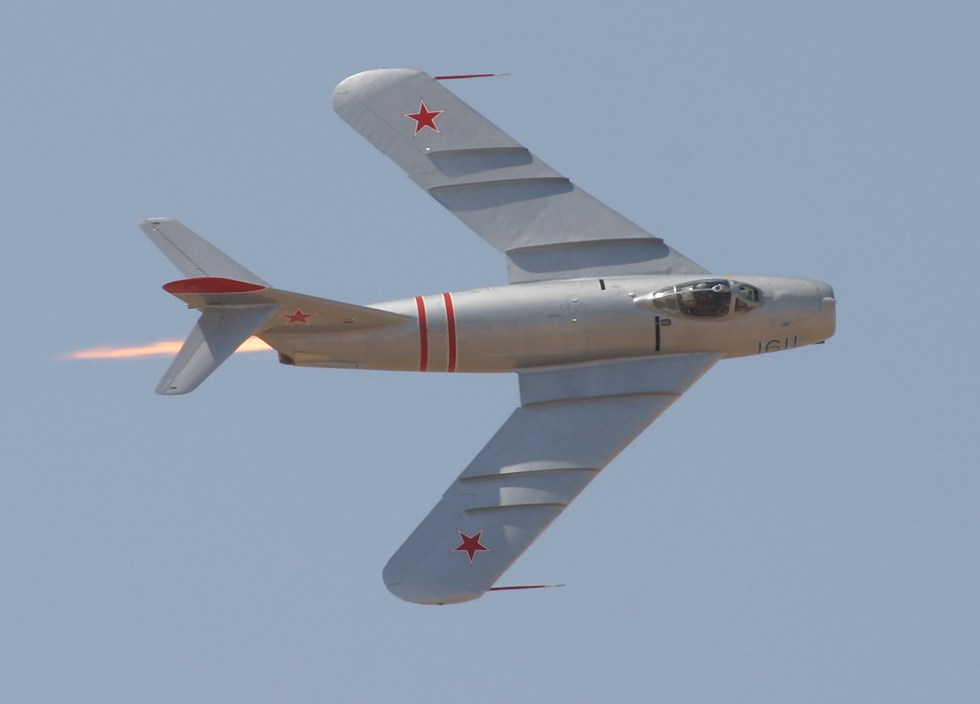
More like this...
And yes that is an actual flying aicraft.
I think it flys by repelling the earth through pure ugly.


I think the new Enterprise is perfectly acceptable... it's much more a "hot rod" then we're accustomed to - but they could've just gone in a completely different direction that paid no attention to the previous Enterprise designs.
Frankly, compared to the Enterprise D and esepcially Enterprise E, it's an improvement. The E is the worst looking Starship we've seen from Starfleet.
Frankly, compared to the Enterprise D and esepcially Enterprise E, it's an improvement. The E is the worst looking Starship we've seen from Starfleet.

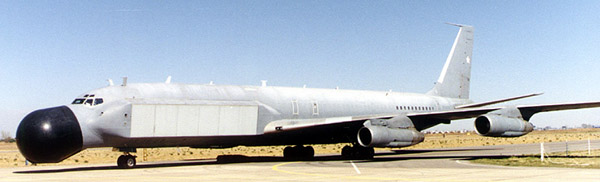
What about this?

Even THAT'S better than Abrams' Apple Enterprise .