Star Trek Comm Badges; what paints?

Sumatra

Sr Member
I've got resin castings of the TNG and Voyager comm badges. What are the most accurate, currently available paints for these? Also, any suggestions for finishing them? The TNG needs a black outline corrrect? For some reason I'm thinking that was Sharpie. Is that right?

Thanks for any help.
 
My notes indicate

Krylon Chrome Aluminum
Dupli-Color Instant Gold
Testors Gloss Black paint pen

First Season, "Last Outpost"

tngcombadgeyr1lojk2.jpg


Fourth Season, "Redemption"

tngcommbadgeyr4rdmptmy4.jpg


"Starship Mine"

tngsmcommbadgejr6.jpg
 
Last edited:
Thanks for the help. I've been sitting on these things for a few years. Finally decided I better finish them. :lol
 
I've been watching Voyager lately, so I did pick up on that. I think that's one of the reasons I prefer that style comm. It looks a bit classier to me.
 
Never cared for the Voyager style badge because the arrowhead is so distorted. The TNG badge's arrowhead has the same outlines as the original TOS badges.

Or maybe I just don't like the Voyager badges because they remind me of Voyager. :lol

- k
 
Worth noting that the early TNG badges as seen for example in "Last Outpost" (left in this photo below) have a dimensional "lip" around the edge, which is painted black (as well as the sides of the arrowhead).

Later TNG badges have a flat top to the arrowhead, and sometimes these appear to be painted black only on the sides.

tngcommrj6.jpg


Castings of commbadges are often one-piece (such as the TNG badge I got in my Rodd.com badge collection). Authentic badges were two pieces tho I think (which are much easier to paint).

Worth noting that the so called "Voyager" commbadges (which were actually designed by John Eaves for the TNG "Generations" movie and then used in DS9 before appearing on Voyager), ALSO have a dimensional lip around the arrowhead, and that plus the sides are painted gold.

voyagercommsex3.jpg


Personally I'm partial to the "alternate reality" badges that were first used on TNG. These show rank depending on which bars are painted gold

parralelsalternateweslehq0.jpg
 
Last edited:
^ first in a holographic reality created by aliens to fool Riker, then in at least one other alternate reality (one of the alternate universes in that Worf episode, IIRC). I guess those aliens had a bead on alternate reality Starfleet badge designs! :lol
 
Well I was just saying I liked the design of the badge, not what they DID with it. :lol

But yeah that was laziness or no-budget at work there... it's kind of unlikely that the Riker episode and the Worf episode should have featured the same commbadges.

It's the same situation with the reuse of "All Good Things" alternate-future badges. The scenario in AGT is a possible future, resulting from events set up by Q. So there's no need for it to "actually happen".

And yet for the rest of DS9 and Voyager, whenever somebody goes into the near future of "our characters' lifetimes", the Starfleet badge always looks like this. :lol

agtfromorigmoldsxe1.jpg


Then later in Voyager, whenever you go "hundreds of years" into the future, the badge always looks like this. :unsure

japanscreenused29combadgh3.jpg


I call this the theory of Future Badge Inevitablity. :sleep

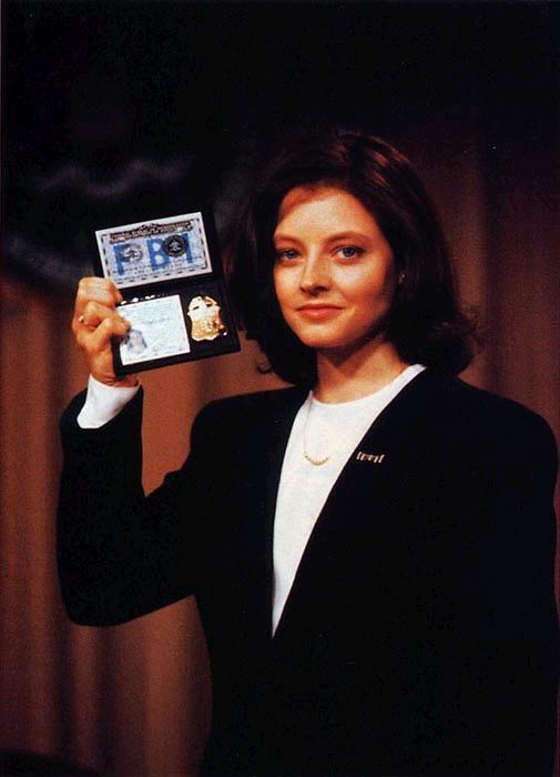
Abbreviated by the acronym "F.B.I." and represented by THIS badge.

!clarice_starling-jodie_foster-fbi_badge.jpg


- k
 
Last edited:
Wow, I think I just learn way more than I thought there was to learn about comm badges. :lol

The TNG badge I've got doesn't have the ridge, so I'll just paint the sides black. Is it just the lighting, or is the arrow on the badge on the left in the first picture in post 8 painted a different color?

Thanks again for the wealth of info.
 
Hold up, the 'Voyager' style comm badge first appeared in Generations

Yep! Very good. The badge was designed by John Eaves for "Generations", not "First Contact" as I had originally posted.

Amusing story: when producers asked Eaves to "design a new communicator" for the upcoming film, Eaves (who had only ever seen TOS and never TNG) drew up a flip-grid handheld communicator, not a comm badge! :lol

Ah, Hollywood. :rolleyes

Anyway, yeah it does appear that these two badges use different paints. The left one has a shiner, richer gold too.

tngcommrj6.jpg


IMHO the correct approach is shown on that left badge, a very deep rich gold. Primer with gloss black for best metallic results! :)

- k
 
I remember hearing years ago, that the "gold" was actually Krylon "Brass". The brass was yellower and photographed better than gold under the bright lights.

-Sarge
 
Ron Nomura painted some of the voyager style if im not mistaken, and he's a member on the board if he wants to speak up.
 
The originals were one piece and the outline was often done with a black sharpie marker.

Not mentioned here yet was the "Cadet" version which was silver on silver, worn by Wesley Crusher.
 
Back
Top