SS Botany Bay Color

Proper

Well-Known Member
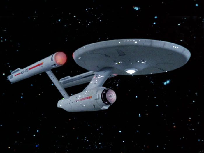
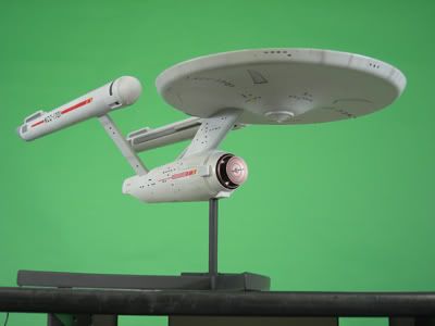
Does anybody have any info on the greyish colors of the Botany Bay studio model as it looked “on screen?” I'm familiar with the brownish-red-rust color of the model as we've seen in pics here in the RPF. But what gave it that extreme grey look on screen with very little red/brown indicated? Was it a camera filter? I just don't understand how the model was painted rust but made to look so grey on screen. Even the weathering looks different than the studio model pics uploaded by Scott.

It looks quite grey against the blue screen. See photos below:
 
Last edited:
A lot of the behind-the-scenes FX shots that have hit the web in recent years have been "restored" from faded source material, and who knows if he balanced them accurately.

But the multi-generational nature of the FX composites for the show had the side effect of desaturating the warmer colors and just overall shift the whole thing blueish.

This is why when I shifted this composite I made to be more blue:
composite6.jpg


it looked more "screen" accurate than the original photo of my MR Enterprise:
beautypass.jpg
 
But what about the very blu-grey looking (un-remastered) Botany Bay that we see on the TV screen? How can that be the very rusty-looking, red-tan filming model?
 
I wonder if they used a red filter. Maybe its not a blue shift but rather a lack of red that we see on the screen. Time to rewatch Space Seed.....
 
The difference in appearance is simply due to how composites get desaturated in the printing process and the image degradation that is inherent to video transfer. Trust me, no one at Paramount cared about color fidelity! As for the grayish color of the model in the behind-the-scenes photos, I can't say. But one should note that the purple appearance of the blue-screen is way off from what a blue-screen really looks like. Maybe that's why the model looks so gray.

Scott

That makes sense about the composites. But as far the behind-the-scenes photos, it seems to me that if the blue-screen looks too purple it means the photo is tinted toward red so the Botany Bay would look more red as well... which it doesn't really, it looks blue-grey; much like the color of the Enterprise. :confused
 
Last edited:
After looking at it closer on blueray i can see some red hues and tint so i am thinking it's just the bright lights washing it out.
 
I have always wondered if they used some sort of powder on it to lighten it up. You can see red hues in it but there is a white finish on the outside along with the color we know it to really be. If you look at the bluescreen photo in the first post you can see the base color (redish) with a white coating on it. Almost like reverse weathering.
 
Just for the heck of it, I just took the photo and shifted it more towards blue in photoshop. It's a little confusing trying to figure out what color the ship is since it also shifted towards blue and has so much weathering on it. It took some of the brown color out of the weathering. Not sure if it helps, but I figured it might help you in some way...
 
I have always wondered if they used some sort of powder on it to lighten it up. You can see red hues in it but there is a white finish on the outside along with the color we know it to really be. If you look at the bluescreen photo in the first post you can see the base color (redish) with a white coating on it. Almost like reverse weathering.

It's really perplexing. I can understand if they brought the studio model in after its original paint job of rusty tan and set it next to the Enterprise and maybe thinking there was too much of a color contrast--so, being pressed for time as they always were they made an adjustment to the color right then and there (with blue powder?!?) since repainting it would be too time-costly? Who knows!!

Unless, the original paint of the Botany Bay was what we see on the blue-screen and the model was repainted AFTERWARD to the tan color that we see on it today. But why would they do that after filming?

Just for the heck of it, I just took the photo and shifted it more towards blue in photoshop. It's a little confusing trying to figure out what color the ship is since it also shifted towards blue and has so much weathering on it. It took some of the brown color out of the weathering. Not sure if it helps, but I figured it might help you in some way...

That photo sure makes it seem like there's no way the BB could be that reddish tan that we all know, doesn't it?

I thought maybe someone could cast light on the subject, but apparently there's a fog of mystery over this.
 
Last edited:
We don't know if all the lights were on for that blue screen photos though. They may have turned some off just for that photo. It could also be that they overexposed when they filmed it to hide model imperfections.
 
We don't know if all the lights were on for that blue screen photos though. They may have turned some off just for that photo. It could also be that they overexposed when they filmed it to hide model imperfections.


It doesn't look underexposed, though, which tells me that that wouldn't make that much difference if any, especially regarding the hue. I doubt that's the reason.
 
I thought maybe someone could cast light on the subject, but apparently there's a fog of mystery over this.
?
Two of us have pointed out that that sort of thing tended to happen after all of the photographic elements were copied and recopied during the compositing process. No fog, no mystery...that is the reason!
 
?
Two of us have pointed out that that sort of thing tended to happen after all of the photographic elements were copied and recopied during the compositing process. No fog, no mystery...that is the reason!

Perhaps. But the reds and coppers on the Enterprise don't appear to be that desaturated at all, so I'm not convinced that's the main reason for the Botany Bay looking so radically different on screen.
 
Last edited:
I have always wondered if they used some sort of powder on it to lighten it up. You can see red hues in it but there is a white finish on the outside along with the color we know it to really be. If you look at the bluescreen photo in the first post you can see the base color (redish) with a white coating on it. Almost like reverse weathering.

You might have something there. Compare these two photos. There's no way that I can believe that they are the same paint finish, filters or no filters. Maybe baby powder did have a role...
 
After looking at it closer on blueray i can see some red hues and tint so i am thinking it's just the bright lights washing it out.

I watched it on Blu-ray, too, and the exposure is very bright and the colors washed out. It looks very much like the first picture in the first post. I can barely--and I mean barely--see some very faint suggestion of red (more like very light pink) on the Botany Bay just here and there. I still believe there was something done to the studio model to remove a whole lot--in fact most--of the rust color. And I don't mean filters. Perhaps a temporary coating of something like white chalk or talcum powder...but I definitely don't believe it was the studio model as we know it to be painted and just overexposed and filtered. It just doesn't look like that. It looks to be very similar in tonal value as the Enterprise next to it: very light blue-grey, very much like in the first picture posted.
 
Last edited:
So are you intending to duplicate the on screen look or the photos of the actual model? IMO both "versions" have merit, one to be instantly recognizable as Khan's ship and the other to accurately reflect what the artist/craftsman intended. I personally lean to onscreen, but that's just my personal preference.
 
So are you intending to duplicate the on screen look or the photos of the actual model? IMO both "versions" have merit, one to be instantly recognizable as Khan's ship and the other to accurately reflect what the artist/craftsman intended. I personally lean to onscreen, but that's just my personal preference.


Good question! I'm torn! I think I would want to replicate the studio model as it looked next to the Enterprise in the studio... to "recreate" that scene with my Master Replicas Enterprise. The problem is, it's hard to know exactly what that looked like because the photos are all either horrible copies and or remastered color distortions.

I know this sounds nit-picky crazy...
 
A lot of the behind-the-scenes FX shots that have hit the web in recent years have been "restored" from faded source material, and who knows if he balanced them accurately.

But the multi-generational nature of the FX composites for the show had the side effect of desaturating the warmer colors and just overall shift the whole thing blueish.

This is why when I shifted this composite I made to be more blue:
composite6.jpg


it looked more "screen" accurate than the original photo of my MR Enterprise:
beautypass.jpg

It looks like you also put a bit of smeg on the lower hull and primary hull to look like optical printing dirt. I admire your thoroughness!
 
Thanks! :) I did have a version with a scratch through the whole frame, but it was generally decided that was too much. :)
 
Back
Top