If you see this comparison and honestly think there is not an obvious choice as to what looks more Screen accurate...
It's actually kind of sad... Worse than I thought.
AA's Vader looks surprised... Maybe even scared...
Too many things to even really start pointing out!!! Look at the dome ridge, where the ridge comes to the nose has no shape other than a soft square, no sign of the leftover ANH "Y crease"... dome flare, eye shape, cheek shape neck shape, lens material....
It is the only UGLY Vader helmet in this thread! LOL!!!
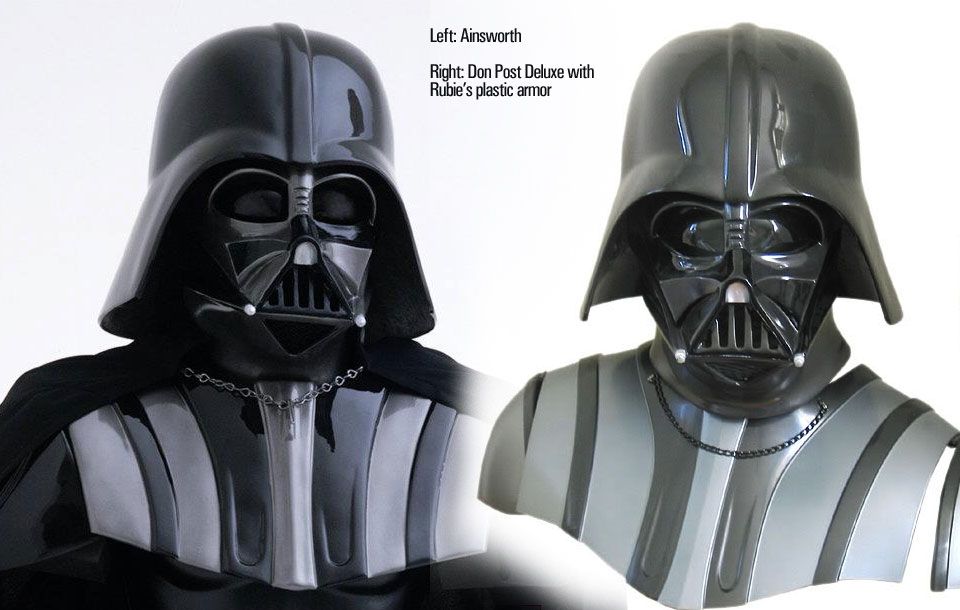
Is that not a Rubies??? :X
Mac, you are too talented to be soo humble.
A++ in my book. As an artisan and human being in general.
")
ROTJ? Is there a chance?
If you made a reveal my collection would be "complete". If I didn't have the eFX legend and 20thC ESB I would have all of your stuff! It just captures the feel. I can't say it enough!!!
I just can't justify multiples of the same ep Vader at this time.
And while neither of my helmets are BEST of the best... They are up there...
But for the 3rd time... Please try your hands at ROTJ. Hero or reveal...
I really want to see what you could do with it.
Hell, I thought your whole idea of acccurizing such a crap casting was futile.... And well... I was really REALLY wrong!
ROTJ ROTJ ROTJ!!!!! (Everybody now!)
The difference is obvious. Bookface's & MAC's Vader setups, are the way to go, IMO. Thanks for the comparison.