Oh, also there's no indication as to how full our inbox is...has the limit increased by chance? I am usually near max so knowing how full was always very handy.
This indicator is now at the bottom of your PM page.
Oh, also there's no indication as to how full our inbox is...has the limit increased by chance? I am usually near max so knowing how full was always very handy.
Not sure if this is for everyone or not but Pm's just site they don't actually send, at least I don't think they do.
Also the ads can be minimized but every time you open a new page etc they are back.
Hi Art, not sure if this has been addressed before or not.
1. From the Title/thread starter page, we can't go directly to the last page of a thread, so we click the thread to open the first page, then click last. It's a bit annoying
2. Why only Judge Dredd group? Will there be another group? Iron man will be enormous, now that it will have 42 suits.
3. Can't upload multiple picture (or maybe I didn't found the way). I clicked insert image, it only got one slot. The color of the tab "From computer" and "From URL" sems to be inverted. Selected on is grey, unselected is white. Normally selected on should be brighter
thank you
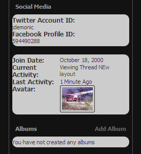
The Profile page still needs some attention as far as padding/margins go. Nothing major, was discussed in the beta.
View attachment 173778
Not seeing the Chat link in the navbar - nor a link to the Premium board.Corrected.
Can you not see the chat link in the navbar?
3. Can't upload multiple picture (or maybe I didn't found the way). I clicked insert image, it only got one slot. The color of the tab "From computer" and "From URL" sems to be inverted. Selected on is grey, unselected is white. Normally selected on should be brighter
")
Make links stand out more from regular text would help a lot.
Can anything be done about the giant scroller with the ad beside it at the top of the page? It takes up about half the screen real estate meaning you have to scroll a lot before you can even see the list of threads. The sidebar with ads is less annoying, but with both, it gets a little unpleasant.
For the menu at the top, how about opening it on hover rather than on a click? Expandable in terms of number items in the future, but no additional clicks required to access content.
Making the icon for threads posted in more visible would certainly help.
Creating a little more visual division between the topics in the list of threads would make those pages a bit easier to scan through as well. Reads a lot like a big block of grey with no easily visible links.
Also, I hope I don't sound know-it-all-ish, but these changes should help fix some of the overlaps:
- Share your Fandom button at the bottom should be fixed by removing the position: absolute on .below_threadlist .newcontent_textcontrol
- bottom pagination overlap should be fixed by removing margin-top: -30px on .below_postlist .pagination_bottom .pagination
Just tested the uploader within the "Add to the Conversation" box. No problem uploading multiple images.
Junkyard changes?? :confused
Just right now couldnt find where to push reply lolWe have 6 pages of issues with the upgrade. Don't make me reach through the monitor and strangle you...
