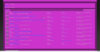
Although a change is welcome, I dont think this new template is working for me. The menus on top and the quick navigation on bottom are difficult to read, the text is too small and the grey doesnt has enought contrast with the background darker gray.
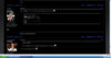
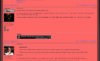
Im a professional graphic and web designer, and first thing I think of when facing a work is funcionality, clearity, readabilty and such, and give the user as easy access to the wanted information as I can, and according to that, I would never use a template like that. The general color is too plain and there is no color or typographic variations to guide the user eyes to the main sections. For example, in the main menu the area for the threads is small, and even in a big monitor has i have you have to scroll halfway down to get to it. Then, the small text and the too gray color for all text does not let you read the thread titles as easily as you should. Then, once in the threads, more or less the same. All text is gray, there is no color or size or weight variations to break the sameness of the page, and the name of the authors of the post gets kind of lost.
Please understand that I say these things without harshness and maybe I come across as smug or such, but Im not, I do it because I love this place and I want to see it become better than it already is.
Cheers!
")