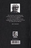
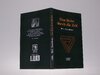
Update on the Tannhaus book: I reached out to the Redditor who posted pictures of his "journalist promo copy" of Eine Reise durch die Zeit to ask if he'd be willing/able to provide scans of the cover, and I was delighted when he replied in the affirmative! In case anyone is interested, I've attached the raw scans here. But I should mention that I'm currently in the process of font-matching every bit of text, with the ultimate intention of creating a printable jacket file. (I've also attached a sample GIF showing a comparison between the scan and what I've recreated so far for the front cover. To be clear, this is "real" vectored text in Photoshop, not just a cleaned-up version of the scanned text, so it should print nice and high-res.) I work in publishing, so luckily I have the knowhow and software to put that all together...ideally, once the jacket is complete, I'd like to print up some copies with blank or notebook-style interiors.

You are using an out of date browser. It may not display this or other websites correctly.
You should upgrade or use an alternative browser.
You should upgrade or use an alternative browser.
Netflix - Dark props
- Thread starter eethan
- Start date
Sandman0077
Sr Member
Fantastic!Update on the Tannhaus book: I reached out to the Redditor who posted pictures of his "journalist promo copy" of Eine Reise durch die Zeit to ask if he'd be willing/able to provide scans of the cover, and I was delighted when he replied in the affirmative! In case anyone is interested, I've attached the raw scans here. But I should mention that I'm currently in the process of font-matching every bit of text, with the ultimate intention of creating a printable jacket file. (I've also attached a sample GIF showing a comparison between the scan and what I've recreated so far for the front cover. To be clear, this is "real" vectored text in Photoshop, not just a cleaned-up version of the scanned text, so it should print nice and high-res.) I work in publishing, so luckily I have the knowhow and software to put that all together...ideally, once the jacket is complete, I'd like to print up some copies with blank or notebook-style interiors.
View attachment 1324709
Update on the Tannhaus book: I reached out to the Redditor who posted pictures of his "journalist promo copy" of Eine Reise durch die Zeit to ask if he'd be willing/able to provide scans of the cover, and I was delighted when he replied in the affirmative! In case anyone is interested, I've attached the raw scans here. But I should mention that I'm currently in the process of font-matching every bit of text, with the ultimate intention of creating a printable jacket file. (I've also attached a sample GIF showing a comparison between the scan and what I've recreated so far for the front cover. To be clear, this is "real" vectored text in Photoshop, not just a cleaned-up version of the scanned text, so it should print nice and high-res.) I work in publishing, so luckily I have the knowhow and software to put that all together...ideally, once the jacket is complete, I'd like to print up some copies with blank or notebook-style interiors.
Ok, first of all, this is beyond awesome! Secondly: I don't know if it's possible, but since you've made contact with this redditor, could you ask if they could post a high res, in focus shot of pages 14 and 15(the machine blueprints)? I doubt a scan is possible but the ones they took are not in focus and the numbers are mostly illegible, unfortunately. It could be a huge help to those who are hoping to recreate the machine.
Cmdr.Kerner
Master Member
Hi guys,
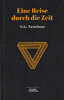
here is my take on the book. I used these fonts:
Eine Reise durch die Zeit = Bauer Bodoni Std Black
Mino Taurus = Britannic Bold
Wir vertrauen .... = Times New Roman
ISBN = Arial Narrow
here is my take on the book. I used these fonts:
Eine Reise durch die Zeit = Bauer Bodoni Std Black
Mino Taurus = Britannic Bold
Wir vertrauen .... = Times New Roman
ISBN = Arial Narrow
Attachments
Last edited:
Aditrap
Active Member
Finished up the door! I feel like the best application for this might be engraving it or cnc onto a board to create the door as a prop. It's not 100% perfect but pretty happy with the turnout as it was my first project straight out of finishing an illustrator course. Here's a few png's and an svg, feel free to use for any purposes and tag Islander_Replicas on instagram if you can, would love to see any applications for it.


Edit: Nevermind SVG didn't work lol, pm me if anyone wants it.
Edit: Nevermind SVG didn't work lol, pm me if anyone wants it.
Shaolan023
New Member
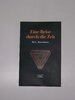
on my side I was able to reconstruct the entire cover of the book. it is non-vector, but a work of reconstructions with quality photos.
I then printed my work on cardboard paper (160g) to paste it on a book with pages yellowed over time, of a good thickness with a size corresponding to the book by HG Tannhaus. I then lightly sanded the borders and points of folds.
I then printed my work on cardboard paper (160g) to paste it on a book with pages yellowed over time, of a good thickness with a size corresponding to the book by HG Tannhaus. I then lightly sanded the borders and points of folds.
Attachments
ThreshKeller
Active Member
Update on the Tannhaus book: I reached out to the Redditor who posted pictures of his "journalist promo copy" of Eine Reise durch die Zeit to ask if he'd be willing/able to provide scans of the cover, and I was delighted when he replied in the affirmative! In case anyone is interested, I've attached the raw scans here. But I should mention that I'm currently in the process of font-matching every bit of text, with the ultimate intention of creating a printable jacket file. (I've also attached a sample GIF showing a comparison between the scan and what I've recreated so far for the front cover. To be clear, this is "real" vectored text in Photoshop, not just a cleaned-up version of the scanned text, so it should print nice and high-res.) I work in publishing, so luckily I have the knowhow and software to put that all together...ideally, once the jacket is complete, I'd like to print up some copies with blank or notebook-style interiors.
View attachment 1324709
If you need any assistance I am a graphic designer employed as creative director for over half my life and am at your disposal.
I am in the process of recreating the cover of Martha’s copy of the Ariadne play from scratch. While I have not given up totally on trying to find a copy of an “actual book”, I have come to the conclusion that it was most likely made for show by the prop department after some fairly extensive searching.
I am rewatching the series now and taking hi res screen caps on which I will base the recreated cover. I do not have high hopes for the back. Martha’s hand is obscuring the text in the only shot I can find which shows the back. So I will do my best. I will make the files available for free to anyone that’s interested. I could use help on the scale. I’ll get my screenshots together over the weekend and maybe get a consensus on the approximate size the book.
In other news, I am awaiting delivery of 3 different “bird pendants”, one of which seems at least to my eye to be very similar to the one Franzisca wears. I am hoping it is the same exact mold... will report back when it’s received. Of the +320,000 I‘ve looked at I bought the closes looking 3.
I have also been working with someone from Etsy to have a replica of Elizabeth's Fox hat made. It’s taking some additional time because the yarn she suggested that is correct according to the pattern is from overseas and is out of production. She has sourced enough to make me a hat and I should have it soon.
Finally, through the process of working to have the hat made an item was suggested to me that claims to be roof tiles taken off of the Kahnwald house. I bit the bullet and placed an order for one and will post images when I receive it in 1-2 weeks. The listing is rather elaborate to be fake and for the price I decided to roll the dice. If it’s real, great! If it’s fake. Jokes on me and I’ll let PayPal handle it.
Interested in opinions If anyone wants to look up the listing. I don’t know the policy on linking to items for sale so I’ll let you guys look it up. Of course, I have zero affiliation with the seller. Seems like a very cool piece if it’s legit.
Sorry for any typos or formatting issues. I’m on mobile and admittedly rather tired.
Good night friends.
Last edited:
ThreshKeller
Active Member
Here are some photos of a bird pendant that I obtained which appears to be very close to the one Franziska wears.
I've tried to photograph it at similar angles to a few screen caps that I took of it on Magnus's table and one in his hand from when he finds it by the mattress under the bridge near the train tracks.
So far this is the closest thing I've found. It's hard to tell if this is correct honestly as the charm looks different from every angle when photographed. The charm also is very soft and bends easily. The one I have needs some cleaning as well. Its close for sure. Interested in any comments. Thanks guys!
Last edited:
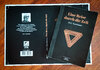
Update on the Tannhaus book: approaching completion! I have uploaded two GIFs below overlaying my recreated PSDs on top of the scans, one for the front and one for the back. Once I do a bit more tweaking, I'll put together a high-res PDF or something and share it here! But I also plan to try some print-on-demand services, and I'll let y'all know if it works out well.
After comparing small details with a font-obsessed friend of mine, I'm quite confident that I've matched the primary fonts exactly to the scans. (The only ones that I couldn't match were the ISBN and barcode fonts, but I think I've gotten those "close enough" for such minor details.) Once I identified the fonts themselves, I fiddled with character width, word spacing, and kerning until everything lined up as closely as I could manage. I also recreated vector versions of the penrose triangle, the barcode, and the minotaur logo. I ran the Tannhaus portrait through an upscaler, so hopefully it'll print a bit more smoothly than if I'd tried to simply re-print the scan itself--and I replaced the box around the portrait with vector shapes as well.


After comparing small details with a font-obsessed friend of mine, I'm quite confident that I've matched the primary fonts exactly to the scans. (The only ones that I couldn't match were the ISBN and barcode fonts, but I think I've gotten those "close enough" for such minor details.) Once I identified the fonts themselves, I fiddled with character width, word spacing, and kerning until everything lined up as closely as I could manage. I also recreated vector versions of the penrose triangle, the barcode, and the minotaur logo. I ran the Tannhaus portrait through an upscaler, so hopefully it'll print a bit more smoothly than if I'd tried to simply re-print the scan itself--and I replaced the box around the portrait with vector shapes as well.
If you need any assistance I am a graphic designer employed as creative director for over half my life and am at your disposal.
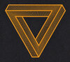
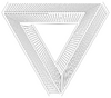
As a matter of fact, if you're offering, there is one element that I was never able to reproduce to a level I was happy with: the triangle itself! I kept attempting to auto-trace the triangle from the scan (after doing varying levels of contrast/brightness adjustment) and I kept encountering a couple of problems:
- The angles where the interior hatch lines meet the bolder outlines kept smoothing out too much. In theory, there should be a strait-edged four-sided shape between every pair of hatch lines (even if some of those sides are extremely short, or the angles extremely obtuse). But the auto-trace function kept rounding the corners, or sometimes even combining two close-together corners to make a long, skinny triangle.
- In some cases, the auto-trace function mistakenly interpreted sloping pixels in a straight line as "waviness". I believe this was due to the relatively low resolution of the scan combined with the angle of certain lines lines. The hatch lines at the bottom point of the triangle were particularly bad about this; in the screenshot below, you can see the "stepped" pixels in the scan and the wavy lines that resulted.
Attachments
Sandman0077
Sr Member
You're gonna have to manually trace it for it to be clean and crisp. Too much noise for Illustrator to do a clean trace.As a matter of fact, if you're offering, there is one element that I was never able to reproduce to a level I was happy with: the triangle itself! I kept attempting to auto-trace the triangle from the scan (after doing varying levels of contrast/brightness adjustment) and I kept encountering a couple of problems:
I know just enough about Adobe Illustrator to be dangerous, but not enough to make it do exactly what I want--especially when I'm trying for 100% accuracy on tiny details in projects like this. Even using the Simplify Path tool wasn't enough to fix the issues mentioned above. I honestly don't know if there's a better/easier way than what I was attempting, or if it would require manually drawing the whole thing...but if you're willing to give it a try, I'd love to have a high-res or vector version of the triangle that's geometrically "perfect"--entirely composed of straight lines, with nice sharp angles where they meet. I've attached the scanned triangle as well, if that helps!
- The angles where the interior hatch lines meet the bolder outlines kept smoothing out too much. In theory, there should be a strait-edged four-sided shape between every pair of hatch lines (even if some of those sides are extremely short, or the angles extremely obtuse). But the auto-trace function kept rounding the corners, or sometimes even combining two close-together corners to make a long, skinny triangle.
- In some cases, the auto-trace function mistakenly interpreted sloping pixels in a straight line as "waviness". I believe this was due to the relatively low resolution of the scan combined with the angle of certain lines lines. The hatch lines at the bottom point of the triangle were particularly bad about this; in the screenshot below, you can see the "stepped" pixels in the scan and the wavy lines that resulted.
Luckily, it's just 3 identical parts combined, so you can just trace 1 part and then copy/paste. I can do it for you in a minute if you want.
You're gonna have to manually trace it for it to be clean and crisp. Too much noise for Illustrator to do a clean trace.
Luckily, it's just 3 identical parts combined, so you can just trace 1 part and then copy/paste. I can do it for you in a minute if you want.
Ah, that's a shame! I was hoping there might be some kind of assisted trace, or straight-line-only trace, or some other tool I was unaware of.
Either way, if you're offering, I'd love to have a nice crisp vector version!
Sandman0077
Sr Member
Ah, that's a shame! I was hoping there might be some kind of assisted trace, or straight-line-only trace, or some other tool I was unaware of.
Either way, if you're offering, I'd love to have a nice crisp vector version!
Here you go!
Attachments

ThreshKeller
Active Member
As a matter of fact, if you're offering, there is one element that I was never able to reproduce to a level I was happy with: the triangle itself! I kept attempting to auto-trace the triangle from the scan (after doing varying levels of contrast/brightness adjustment) and I kept encountering a couple of problems:
I know just enough about Adobe Illustrator to be dangerous, but not enough to make it do exactly what I want--especially when I'm trying for 100% accuracy on tiny details in projects like this. Even using the Simplify Path tool wasn't enough to fix the issues mentioned above. I honestly don't know if there's a better/easier way than what I was attempting, or if it would require manually drawing the whole thing...but if you're willing to give it a try, I'd love to have a high-res or vector version of the triangle that's geometrically "perfect"--entirely composed of straight lines, with nice sharp angles where they meet. I've attached the scanned triangle as well, if that helps!
- The angles where the interior hatch lines meet the bolder outlines kept smoothing out too much. In theory, there should be a strait-edged four-sided shape between every pair of hatch lines (even if some of those sides are extremely short, or the angles extremely obtuse). But the auto-trace function kept rounding the corners, or sometimes even combining two close-together corners to make a long, skinny triangle.
- In some cases, the auto-trace function mistakenly interpreted sloping pixels in a straight line as "waviness". I believe this was due to the relatively low resolution of the scan combined with the angle of certain lines lines. The hatch lines at the bottom point of the triangle were particularly bad about this; in the screenshot below, you can see the "stepped" pixels in the scan and the wavy lines that resulted.
I can take a look at this tomorrow. Would be happy to help. I can probably redraw it accurately. I’ll download the scans and see what I can do. Really nice work so far! Well done!
EDIT: Looks like sandman already nailed it! Nice!
ThreshKeller
Active Member
Here you go!
Looks like you’ve nailed it! Well done!!! Fantastic!
Aditrap
Active Member
Here's my shot at it using all the elements provided by sandman, patattack, and cmdr.kerner. Going to be sacrificing a duplicate copy of Ready Player One so it was made to match its size. Proportions aren't 100% but looked good as far as I can tell. Sending it off to print now since I can't do it myself. Thanks to those I mentioned for providing info!

Edit: Also, not entirely sure how to bind it to the book, would love to hear if anyone has any tips or resources I can look at before attempting it.
Edit: Also, not entirely sure how to bind it to the book, would love to hear if anyone has any tips or resources I can look at before attempting it.
For anyone assembling their own cover rather than waiting for mine, here are the font choices that I'm 99.9% confident in:
- Title/author on front and spine is Abril Fatface
- Publisher name is Magnesium MVB
- Blurb on back is Baskerville URW Bold
- Author byline under blurb on back is Baskerville SemiBold Italic
Aditrap
Active Member
Just finished my copy! Removed the old cover, wrapped it with the new one, and rebound the book with contact cement. Pictures are pre-weathering, and I've since added some scuffs to add some realism. Might have to give it another go in the future with patattack's new font findings. This will do for now ")


Thank you Sandman0077 for putting that triangle together! However, as it happens, the "geometrically perfect" version with one segment copied and rotated 3x doesn't actually line up with the original quite right. I don't mean to sound unappreciative, because you created exactly what I was asking for, and it looked great on its own!! But it turns out the original must have been hand-drawn all the way around, since there was a bit of inconsistency to the spacing/angling of the hatch lines in the three segments.
To that end, I've had an external conversation going with ThreshKeller, who has very graciously hand-drawn the entire triangle graphic--and who has encouraged me to share their images here, in case it's useful for anyone assembling their own covers. It definitely lines up with the graphic on the original scan, and I must admit there's a subtle organic je ne sais quoi to the hand-drawn asymmetry that appeals to me.
 www.dropbox.com
If anyone happens to have a lead on a higher-quality version of the author portrait from the back cover, please share here! Currently that's the lowest-quality part of my cover and ThreshKeller is helping me to improve it...but a higher-res photo than the original scan would really do the trick.
To that end, I've had an external conversation going with ThreshKeller, who has very graciously hand-drawn the entire triangle graphic--and who has encouraged me to share their images here, in case it's useful for anyone assembling their own covers. It definitely lines up with the graphic on the original scan, and I must admit there's a subtle organic je ne sais quoi to the hand-drawn asymmetry that appeals to me.
Dropbox
www.dropbox.com
If anyone happens to have a lead on a higher-quality version of the author portrait from the back cover, please share here! Currently that's the lowest-quality part of my cover and ThreshKeller is helping me to improve it...but a higher-res photo than the original scan would really do the trick.
Similar threads
- Replies
- 1
- Views
- 2,167
- Replies
- 12
- Views
- 2,805