--His suit should look "other-worldly". Hello, he's from another planet. The texture and bulkiness on the suit makes it look more like...a suit of armor.
Seeing how the character has survived without an "other-worldly" suit since 1938, doing this now is nothing more than distracting.
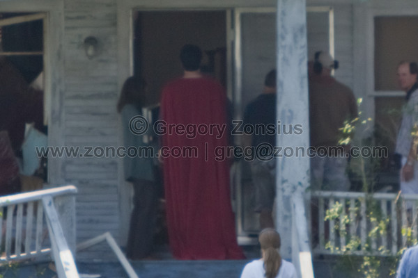
--The red undies are finally gone...THANK YOU!!! If you wore brightly colored undies on the outside of your super-suit paints, do you think anyone would take you seriously?
So your "other-worldly" design acceptance only applies when it coms to disco ball blue and shimmering red. Gotcha
--The pleated look of the cape is awesome! Very regal and majestic. It gives that broad shoulder look.
Two words - Lois and Clark.
--Brass belt looks very cool so far from what I can see.
Yippeee! We agree.
--Hair curl gone. Was never important to me and it made him look like a wuzzy anyway.
Are you ever going to do the Kryptonian shirts - i sure hope so. You mock ups were awesome!
--Colors are finally done right. None of this brightly colored comic-book stuff.
I felt the same way when they colorized some of those stupid old black and white movies. Shirley Temple looks so much better singing Animal Crackers with teal bleeding from her ears.
He finally looks like someone who comes from a place called Krypton. I'm even more jazzed about this reboot than before.
One of the producers of "Kick-Ass" said, "Different types of media require different methods of storytelling." In otherwords you can't do a direct interpretation from comic to screen and expect people to take it seriously. Change is not only inevitable, IT IS DEMANDED! Without recognizing that, you will be left in the dust.
Change is a good thing - i especially like when people CHANGE things back to the way they were - which will happen. If it ain't broke, don't fix it and so far the only thing that's truly been broke when it comes to Superman is the story they come up with to turn into a 200mil dolar movie.
Bravo on this bold new look.
Olive Oil: Phoooey!