You are using an out of date browser. It may not display this or other websites correctly.
You should upgrade or use an alternative browser.
You should upgrade or use an alternative browser.
Jurassic Park
- Thread starter Onkelpsycho
- Start date
-
- Tags
- jurassic park


I haven't seen Lost World in SO long. Was that W-4 form in one of the shots?
I surely can't remember.
I surely can't remember.
CT1138
Sr Member
They were among folders of papers shuffled around by Ludlow in the deleted Board Room scene, and Hammond during his scene with Ian Malcolm in his bedroom office. I always assumed they were blank papers because we never see them shown up close on screen, but it seems the prop department went the extra mile. That's something I love about the Jurassic Park movies. The devil is always in the details.I haven't seen Lost World in SO long. Was that W-4 form in one of the shots?
I surely can't remember.
The paper props weren't the only thing done that way. Todd Marks, who did the computer animations for The Lost World, released the full animation he did for the Marksmann GPS. It includes a lot of material never seen on screen. He also privately released the full animation he did for Hammond's laptop in the aforementioned Hammond office scene, but I've yet to see him give anybody permission to release it publicly. There's been a ton of archival material unearthed in the past year or so, and I have little doubt that the announcement of the "Ultimate Visual History" book being released this October isn't connected.
Last edited:
They were among folders of papers shuffled around by Ludlow in the deleted Board Room scene, and Hammond during his scene with Ian Malcolm in his bedroom office. I always assumed they were blank papers because we never see them shown up close on screen, but it seems the prop department went the extra mile. That's something I love about the Jurassic Park movies. The devil is always in the details.
The paper props weren't the only thing done that way. Todd Marks, who did the computer animations for The Lost World, released the full animation he did for the Marksmann GPS. It includes a lot of material never seen on screen. He also privately released the full animation he did for Hammond's laptop in the aforementioned Hammond office scene, but I've yet to see him give anybody permission to release it publicly. There's been a ton of archival material unearthed in the past year or so, and I have little doubt that the announcement of the "Ultimate Visual History" book being released this October isn't connected.
Thats really awesome. Its those little details that make it all the more awesome.
That GPS video reminds me a little bit of the Jurassic Park game for the Sega CD, which I never actually played, but I remember screen shots and its got that vibe a bit....only better of course.

CT1138
Sr Member
A couple theoretical props here. Some post-cards, and a full-page style ad using an image from a 1993 Kauai Film Commission ad.


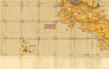
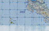
Also, included in attachments here due to their size, I tried recreating the Las Cinco Muertes map by combining 4 different maps. It's not as good as I think it could be, but I don't think I have the skills to do better. It's not the prettiest, or the largest image of this map available, but I can assure it's the cleanest and the clearest. Also included is a film accurate sepia toned version.
Also, included in attachments here due to their size, I tried recreating the Las Cinco Muertes map by combining 4 different maps. It's not as good as I think it could be, but I don't think I have the skills to do better. It's not the prettiest, or the largest image of this map available, but I can assure it's the cleanest and the clearest. Also included is a film accurate sepia toned version.
Attachments
Goobeetsa
New Member
Haha--fun!this is a JW Dino Protection agency - adopt a dino form made by me
Portugaraptor
New Member
Hello everybody.
I'm trying to make my own replica of Roland Tembo's InGen Specimen packets as accurate as possible. Can you tell me what the size of the sheets would be?
Thank you!
I'm trying to make my own replica of Roland Tembo's InGen Specimen packets as accurate as possible. Can you tell me what the size of the sheets would be?
Thank you!
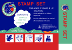
Hey guys! Wanted to share this with you, but after looking for 8 years, I finally have found the stamps!!


Building off of the Kodak Gold Plus image on the back of the brochure, I've created a box that matches the ad. It fits a film canister.
Note: Most real-world examples have the film details for number of photos (exposures), ISO and speed settings, etc. But I've left them off to match the ad.
I printed mine on 200gsm premium gloss paper on a laser printer, but the paper is too thin. It needed extra layering to add structure. I used the full page, for mine. Only cutting away the corners and edges to fit together. But depending on your needs, you can just follow the instructions. I've uploaded both a clean version and one with instructions/guides on where to fold and cut.
Attachments
I also found a clear photo of the back of the Stamp Set. So I created a front and back (someone posted a version earlier, but the colours and details didn't quite match. So I redid it closer to the originals). I couldn't find images of the sides of the box. So they are a bit rough. And I'm not sure on the size. Not sure if Emma can provide more info as they have found one. But this might help others.
Attachments


MAKE BELIEVE
Master Member
Thanks for sharing
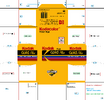
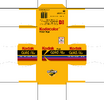
I did a deep-dive on cigarettes and packets, so I figured I would post this here too.
I needed to create a Marlboro packet for my Jurassic Park Control Room Desk display. But I had to create the image to match the on-screen version. But by combing through the movie scenes, I discovered that while there is a "Marlboro Reds" packet on the desk, Ray Arnold is actually smoking "Marlboro Lights" (gold band on the filter, now known as "Marlboro Golds"). The 3 possible explanations:


Because of the on-screen differences, and a need to edit available packets to be suitable (upscale resolutions of scans, remove tariff stickers or anti-smoking packet changes), I decided that if I was going to that effort (and because I don't like smoking) I decided to create my own variant. So I created a Jurassic Park brand "Muldoon". I printed them on 200gsm premium gloss paper (but it should have been 200-300gsm gloss cardstock). So the box came out without much structure. If you layer it up to be sturdier, it comes out great. I've attached 2 versions, one with white fold marks, and one without and just the edge guides.
Ray Arnold also uses a Brushed Finish Chrome Zippo lighter, if you are wanting to add that detail to a costume.

I needed to create a Marlboro packet for my Jurassic Park Control Room Desk display. But I had to create the image to match the on-screen version. But by combing through the movie scenes, I discovered that while there is a "Marlboro Reds" packet on the desk, Ray Arnold is actually smoking "Marlboro Lights" (gold band on the filter, now known as "Marlboro Golds"). The 3 possible explanations:
- are a prop department choice/mistake (or actor preference)
- duty-free/export variants can vary the design and packaging by region. So a duty-free or export variant of "Reds" might have had a gold band, but come in a red box. Which makes sense canonically (as Isla Nublar is off the coast of Costa Rica, it's plausible that things would be purchased duty-free)
- The box is from someone else (another character) or an old box.
Because of the on-screen differences, and a need to edit available packets to be suitable (upscale resolutions of scans, remove tariff stickers or anti-smoking packet changes), I decided that if I was going to that effort (and because I don't like smoking) I decided to create my own variant. So I created a Jurassic Park brand "Muldoon". I printed them on 200gsm premium gloss paper (but it should have been 200-300gsm gloss cardstock). So the box came out without much structure. If you layer it up to be sturdier, it comes out great. I've attached 2 versions, one with white fold marks, and one without and just the edge guides.
Ray Arnold also uses a Brushed Finish Chrome Zippo lighter, if you are wanting to add that detail to a costume.
Attachments
gusw666
Well-Known Member
This looks AMAZING! I will print one out for my collection, may I ask you for the paper size? A4? thank you so much for sharing.Building off of the Kodak Gold Plus image on the back of the brochure, I've created a box that matches the ad. It fits a film canister.
Note: Most real-world examples have the film details for number of photos (exposures), ISO and speed settings, etc. But I've left them off to match the ad.
I printed mine on 200gsm premium gloss paper on a laser printer, but the paper is too thin. It needed extra layering to add structure. I used the full page, for mine. Only cutting away the corners and edges to fit together. But depending on your needs, you can just follow the instructions. I've uploaded both a clean version and one with instructions/guides on where to fold and cut.
Gus
Yeah, A4. But it's slightly over size for "normal" printing margins. You can centre on landscape and print at 1:1 or 100% scale if you adjust the margins. Or you can "shrink to fit" or scale to print on 1 page and it should be fine. It has a print size of 19.72 cm x 19.14 cm (or 7.76 x 7.54 inches). A4 page is 21 cm x 29.7 cm.This looks AMAZING! I will print one out for my collection, may I ask you for the paper size? A4? thank you so much for sharing.
Gus
gusw666
Well-Known Member
Thank you Brother, will try that and let youknow!Yeah, A4. But it's slightly over size for "normal" printing margins. You can centre on landscape and print at 1:1 or 100% scale if you adjust the margins. Or you can "shrink to fit" or scale to print on 1 page and it should be fine. It has a print size of 19.72 cm x 19.14 cm (or 7.76 x 7.54 inches). A4 page is 21 cm x 29.7 cm.
Gus
I've painstakingly recreated the documents to enable people to have their own high-quality copy.Here are some USF tribute store pics and "scans"
Unfortunately, some of the fonts aren't 100% accurate, as I wasn't able to find a 1:1 typeface in some cases. If someone can identify (or even notice the differences) in the original, please let me know and I will update the document. But they are the closest I could get that kept the key elements of the originals, and only have incredibly subtle differences.
I have added a version of the Sensitive Material cover page with and without the "Confidential" stamp. In case you want to add your own. Note: It's missing the "Computer Engineering" label, and doesn't have the "FILE" stamp across the 'Return to' section either.
Without a clear frame of reference, I'm assuming they are all A4 pages (the Pleading Paper might be 'Legal' size but hard to say). So they are sized to the originals as that, and ready to print to that size.
An interesting note, the W-4 is not a legitimate W-4 from 1996. Or at least not the one the IRS currently has available (possibly related to the "Tops" footer?). I had to recreate it to match the original, as the text moved across columns in the W-4 that the IRS has available online now.
If anyone has any other documents or anything that has popped up since these photos were taken in 2021, please let me know and I'm happy to have a go at those.
Attachments
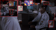
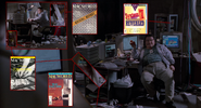
I've made some discoveries and hit some roadblocks. I spent over 100 hours trying to identify (and then find) the various books and magazines on (and around) Dennis Nedry's desk. I've looked through archived libraries for covers, looked through individual magazines, and now I'm taking a break from that and in the chance I don't post an update (or someone else wants to have a go), this is what I have:
Known books and magazines:
There is also the newpapers on top of the monitors. They are Costa Rican, but I'm not sure on which. It looks like La Nación. But the archives online aren't complete and I couldn't confirm the newpaper or front page.
I also haven't started with the books on the shelves (beside the System 7 book).
Other item that is missing (and might not actually exist) is the Omni article that Tim mentions to Alan. Might exist here OMNI Magazine Collection : Free Download, Borrow, and Streaming : Internet Archive
Known books and magazines:
- System 7 Revealed - System 7 Revealed Macintosh Inside Out 1991 : Free Download, Borrow, and Streaming : Internet Archive
- seen on the shelf behind Nedry's desk in the control room in a number of shots.
- MACWORLD magazines:
- Jan 1990 - MacWorld 9001 January 1990 : Free Download, Borrow, and Streaming : Internet Archive
- seen on the floor in front of the Silicon Graphics (SGI) IRIS Crimson. (More obvious when discussing to "shut down the system")
- Oct 1990 - MacWorld 9010 October 1990 : Free Download, Borrow, and Streaming : Internet Archive
- Seen on the floor beside Nedry's desk in 2 shots/scenes.
- Nov 1990 - MacWorld 9011 November 1990 : Free Download, Borrow, and Streaming : Internet Archive
- Seen on the floor in a couple of frames over Ray's shoulder (on top of the October issue), when Ray asks Nedry about "the headlights" just before the tour approaches the "tyrannosaur paddock".
- Jan 1990 - MacWorld 9001 January 1990 : Free Download, Borrow, and Streaming : Internet Archive
- DataClub manual
- DataClub is referrenced a LOT in the magazines of the time, but I haven't been able to find anything since, except for one of the disks on ebay.
- I have lots of clippings from the magazines where the software was advertised, including a double-page spread (but it uses a different picture by the same artist). It's referrenced a lot, but doesn't seem to be archived that I could find.
- In one shot you see the manual, and in another, there is a different manual/magazine on top.
- MacNET manual
- Similar to the DataClub problem, I can't find much archived. I found references, and a couple of photos of different versions/editions of the manual. But not the one seen on screen. Closest is in the reference picutre where it's basically inverted (black text on white), instead of the onscreen (white text on black). There's a white text on red version for sale from a reseller.
There is also the newpapers on top of the monitors. They are Costa Rican, but I'm not sure on which. It looks like La Nación. But the archives online aren't complete and I couldn't confirm the newpaper or front page.
I also haven't started with the books on the shelves (beside the System 7 book).
Other item that is missing (and might not actually exist) is the Omni article that Tim mentions to Alan. Might exist here OMNI Magazine Collection : Free Download, Borrow, and Streaming : Internet Archive
Attachments
HJRodrigo
New Member
I wanted to share this with anybody interested. Recently, I learned about the Jurassic Park Wallet Cards by O.S.P. and liked the idea behind the Meal Ticket card.

The card looks a little cheap and childish to have been released in-universe for a theme park that "Spared No Expense". I decided to make my own, and since Jurassic Park was a Universal movie and Universal has theme parks, I used the Universal Dining card as the starting point to design my Jurassic Park Dining card.

The Universal cards use a somewhat stylized version of the Universal logo, but this would be a bit too modern-looking for what I wanted. I wanted mine to feel old, like something from the late 80s to early 90s. So, I just minimally altered the design of the JP logo (JP logo is thanks to Diana Toma). The logo font is by Jens R. Ziehn. The green from the JP Explorer was used for the child dining card, and the blue of InGen for the staff dining card. I used electrical tape for the magnetic bar and grey-silver paint for the scratch-off area.


Let me know if you have any suggestions for making a template to share these for easy printing. I have been putting the images into a Word document to print them for lamination and cutting.
The card looks a little cheap and childish to have been released in-universe for a theme park that "Spared No Expense". I decided to make my own, and since Jurassic Park was a Universal movie and Universal has theme parks, I used the Universal Dining card as the starting point to design my Jurassic Park Dining card.
The Universal cards use a somewhat stylized version of the Universal logo, but this would be a bit too modern-looking for what I wanted. I wanted mine to feel old, like something from the late 80s to early 90s. So, I just minimally altered the design of the JP logo (JP logo is thanks to Diana Toma). The logo font is by Jens R. Ziehn. The green from the JP Explorer was used for the child dining card, and the blue of InGen for the staff dining card. I used electrical tape for the magnetic bar and grey-silver paint for the scratch-off area.
Let me know if you have any suggestions for making a template to share these for easy printing. I have been putting the images into a Word document to print them for lamination and cutting.
Nice one! I was just starting on some of the wallet cards.I wanted to share this with anybody interested. Recently, I learned about the Jurassic Park Wallet Cards by O.S.P. and liked the idea behind the Meal Ticket card.
View attachment 1941100
The card looks a little cheap and childish to have been released in-universe for a theme park that "Spared No Expense". I decided to make my own, and since Jurassic Park was a Universal movie and Universal has theme parks, I used the Universal Dining card as the starting point to design my Jurassic Park Dining card.
View attachment 1941101
The Universal cards use a somewhat stylized version of the Universal logo, but this would be a bit too modern-looking for what I wanted. I wanted mine to feel old, like something from the late 80s to early 90s. So, I just minimally altered the design of the JP logo (JP logo is thanks to Diana Toma). The logo font is by Jens R. Ziehn. The green from the JP Explorer was used for the child dining card, and the blue of InGen for the staff dining card. I used electrical tape for the magnetic bar and grey-silver paint for the scratch-off area.
View attachment 1941099
View attachment 1941102View attachment 1941103View attachment 1941104View attachment 1941105
Let me know if you have any suggestions for making a template to share these for easy printing. I have been putting the images into a Word document to print them for lamination and cutting.
What's the difference between the Universal cards with and without "quick service".
Depending on how you've made the cards, you should be able to print them directly, without the Word document. You can also size them to the right size in most design apps. So you don't have to worry about scale, or changing them in Word.
Apparently acrylic paint and dish soap in a 2:1 or 1:1 ratio makes scratch off paint.
I have to go into the office next week. I wonder if I can use the card printer at work
Similar threads
- Replies
- 2
- Views
- 1,966