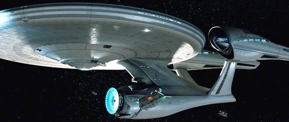
JJ ABRAMS Enterprise

Re: JJ AMBRANS Enterprise

As for the proportions anyone remember this ship?

Enterprise.jpg

How could we forget. The thalidomide baby of Federation starships.
 
Re: JJ AMBRANS Enterprise

Hooray for the Galaxy Quest Enterprise!!

Now bring on pix of the new nebulizers and the Omega 13.
 
Re: JJ AMBRANS Enterprise

Not really, no. And that particular device is not only overused and implausible, but lazy. Roddenberry's genius was contrasting the simple humanity against the fantastic backdrop; not this adolescent wank-fantasy "what if" stuff. This Enterprise design, however, absolutely matches the vibe of the look of the production design and footage, and the sort of silliness spoiled in the article. Sort of an iPod Enterprise in an Overstock.com universe.


_Mike

Thanks Mike, I couldn't have said it better.

John
 
Re: JJ AMBRANS Enterprise

Here's a shot of that tower thingy, from The Abyss...

075fe455.jpg


Compared to the nacellas of the new ship...

enterprise579_l.jpg


Versus the nacellas of the original...

1e54ad2a.jpg
 
Last edited:
Re: JJ AMBRANS Enterprise

Why???

I'll tell you why. As usual, even though Abrams & Co. are riding on the backs of others, he still has to put his own stamp on it so he can make it his own. Kinda like a dog pi$$ing on a tree to mark his territory.

I understood and approved of the added details, like the hull plating aztecing added to the big screen versions of the ship when TMP came out, but this?

This is just a mish mosh of what's come before to make a totally umpleasing design.

It reminds me of this flip book my son has where you can "Make Your Own Dinosaur!" by mixing and matching different body parts.

23rd century primary hull, 24th century secondary hull, and Joel Schumacher Batmobile lighting on the nacells for good measure.

Not impressed.
 
Re: JJ AMBRANS Enterprise

I had always thought that Gabe's Enterprise was too far from Mr. Jeffries design but now, after seeing THAT? It makes me long for something as close as Gabe's ship.
I'm thinking Gabe's enterprise is a trillion times better looking that what is posted in the first post of this thread !
I agree; they should have gone with something like Gabe Koerner's design. This might have been okay if it weren't for the disproportionate Engineering hull. Hideous.
 
Re: JJ AMBRANS Enterprise

Sorry but I would rather see that (the new one) on the big screen then this...
bigetc5.jpg

I loved the original series (as well as the ones that followed it.)
I like history, but updates and revisions do not bother me. It (to me) feels like what the Original Enterprise would be if it was designed today. And really that is what I wanted from the movie. I can accept a cannon story that is also updated. I just use my imagination:love
 
Re: JJ AMBRANS Enterprise

I don't hate it on its own.

But if you have the NX-01, this one, and the Enterprise-E sitting next to each other, it'd be pretty hard (if you weren't familiar with the various series) to put them in order chronologically.

I understand the desire to update a ship's design, especially for the big screen. But none of the artists seems to recognize that their designs (except the 1701-E) have to fit in visually with what we know comes after. The NX series should look the most primitive. The Constitution class should look somewhat more futuristic, but not all that much, and so forth.

My opinion anyway.
 
Re: JJ AMBRANS Enterprise

Thankfully I have personally already written the film off as non-canon.

I've written it off as I may rent it from the red box for a dollar.

Looks like the Enterprise to me, I have no problem with it. But of course the same bashers will tear it apart as they do anything that is shown for the first time....

I'm not a basher. I don't hate the Star Wars prequels. I supported this movie despite a new cast and and certainly new that it would be slightly updated. I wasn't looking for gabardine and and the old model to be pulled from the Smithsonian... however, these designs (aside from the uniforms) are nothing like the original- even though the people involved swore up and down that it would adhere to canon.

Sorry but I would rather see that (the new one) on the big screen then this...
bigetc5.jpg

I loved the original series (as well as the ones that followed it.)
I like history, but updates and revisions do not bother me. It (to me) feels like what the Original Enterprise would be if it was designed today. And really that is what I wanted from the movie. I can accept a cannon story that is also updated. I just use my imagination:love

Updating to show scale streamlining slightly to keep it from looking dated is one thing. Those would be necessary for the big screen. This is nothing more than another case of change for the sake of change.

If it's an alternate universe, fine. It's the same lazy storytelling that keeps me from buying D.C. comics.

Either way, go ahead and give Paramount and J.J. your ten bucks. I've got other things to waste my money on. I'd rather toss it into a group of homeless people and watch them fight over it.
 
Re: JJ AMBRANS Enterprise

I guess I'm just not having much damage with this design. Yes, it's different from what came before.

But does anyone remember seeing the first images from ST:TMP in 1979? I do. After more than a decade of there being only one and only one "Enterprise", lots of people (myself included) voiced many of the same or similar objections as voiced here.

(Time warp to 1979):

- What's up with the shape of the nacelles? They're not round?
- I don't like the swept-back shape of the pylons.
- This is heresy - the spinning red thingies on the nacelles are gone.
- What's with the blue deflector dish?
- why are there bands around the prinary hull? Where are the three windows on the front?
- what the frig are spotlights doing on this thing?

And I for one grew to love that design more than any of the others.

Not saying that you (or I) will ultimately grow as fond of this new design, nor am I criticizing anyone here for not liking what they see. Just noting that, as ST fans, we've been through what appears to be a major redesign from what we were familiar with once before, and we appear to have made it through just fine. :)

MKS
 
Re: JJ AMBRANS Enterprise

Well if you can't tell the imbalanced proportions from that profile sketch, then I don't know what to tell you. That's ridiculous.


_Mike
 
Back
Top