Harry Potter Platform 9 3/4 ticket

juno

Sr Member
RPF PREMIUM MEMBER
*UPDATED WITH A NEW PIC*
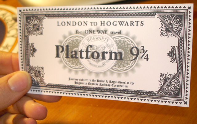
So I decided a great way to learn Illustrator would be redoing the Platform 9 3/4 ticket from Harry Potter. I've already gotten a pretty good price on the gold foiling -- I'm going to go the Adamata route when it's finished and offer it to the board at cost. (eBay pricing. . . now that's another matter...)

I should note that this wouldn't have happened without Division 6 sharing his awesome reference photos.

Here's a screenshot:
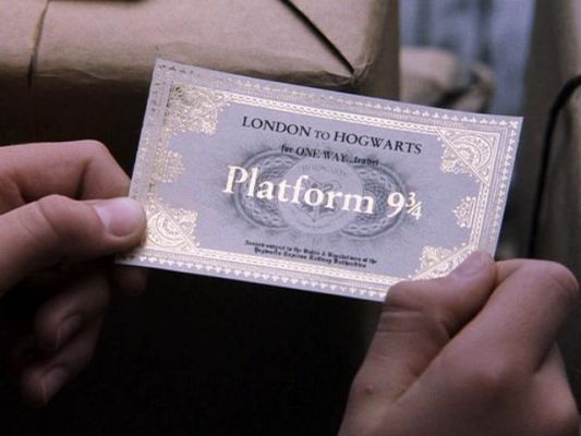
96966346_96757badf9_o.jpg


Here is my version:
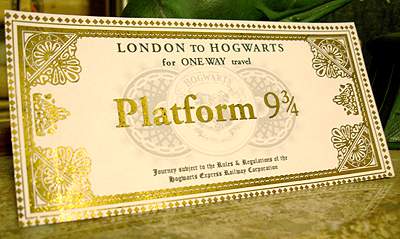
100595722_2329ce5928_o.jpg

One thing I should note is that although the middle finials look odd, they gold leaf pretty closely to the orginal. (That was one of my big worries.)
 
Wow. I would so love a couple of these. I think it looks great.
 
I'm not familiar with the source material, but, as an Illustrator user myself, kudos on the good work so far. I just spent several hours earlier in CS2 (police work though), so I can appreciate how you know every detail that needs to be changed.

In your second photo it almost looks like you've used foil stamping for your border, or is that just a really high gloss paper? Looks really sharp.
 
It's actually a foil that you iron on. I print the gold part on my inkject, photocopy it (the foil only adheres to toner) then print the second part. I'm not extremely happy with this foil though, so I'm waiting for more to come in.

My grandpop did police sketches when he was a detective, it always seemed like it'd be interesting work.
 
"Be gentle. . . I feel I'm close...but it still feels off."
"The size of mine seems off, but Harry's a kid and I'm just not sure if it's just the camera angle."

not to be nitpicky...but i guess i'm going to be...

your ticket is a little too wide...just holding a ruler to my moniter both tickets measure 2 1/8" tall but the screen grab ticket is 4" wide while your's is 4 3/4"....if you look at the space between "london to hogwarts" and the corner design the screen grab has 1/4" of space and your's has almost 1/2"...

the words "platform 9 3/4" are slightly too narrow...in the screen grab the design in the center of the ticket touches the inside of the vertical of the "P" and the inside edge of the "3/4"...in your's it touches the outside of the vertical and almost completely encompasses the "3/4"....

also there looks like there should be another line of space between "from london to hogwarts" and "for one way travel"...

that said...they really do look amazing and even if you don't fix a thing i'd still buy at least one...but if i was making them i'd want feedback that let me know exactly what needed fixing...skott
 
That's exactly what I wanted. The reason I did it in Illustrator was because the vector art can be infinitely tweak.

Thank you, thank you, thank you. Will post revisions sometime tomorrow.
 
I've added the most recent revision to the top. Comments would be REALLY appreciated :)
 
It seems the 'dirt' aroudn the background circles is larger.. and just different. but it looks great already.
 
I think it washed out a bit when I lightened the levels in Photoshop to upload it :-/ it's a bit bigger / darker IRL.
 
Looks spectacular.

Thought about paper stock yet? I don't know from paper weights and such, but I've got some great grey medium weight paper I print certificates on.

I'd be very interested in one of these.

Great work.

Steve
 
I think the paper is actually white -- it's just got a "velvety" nap that makes it look a little different in that screenshot, not all the shots of the ticket have the bluish tinge.

I was thinking about using a cotton paper -- maybe a 32 lb weight.
 
Wow. That one looks much more accurate than the one I made awhile back. Have you considered the Avery metallic print stock yet? I used that one myself, and it worked great. It's a card stock, though. I would much rather have made mine from paper, but it was the best I could find at the time, though I haven't been able to find any more lately.
 
Here's what I did for gold foil on my auctions:
100781184_3bedb1d02b_o.jpg


It's a foil you iron-on. Hope that helps.
 
  • Like
Reactions: JPH
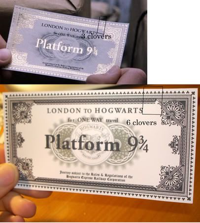
not to be a jerk...but it's still a little too wide...check this out...count the clovers...
hogwarts.jpg

...the one in the movie only has 3 clovers between the letters and the corner design while your's has 6...i'd suggest keeping the text exactly as is but just cut the frame a little (if that's possible...i don't know illustrator at all)...but aside from that tiny nitpick it looks perfect...great work...skott
 
I actually thought my clovers looked too small -- but you think they're the right size and it's the frame that's too small?

I think cutting it to three might be too much, maybe cut a couple and enlarge the clovers a bit? I haven't gotten anal enough to count the clovers in the top of the screenshot...but I guess I could.
 
"I actually thought my clovers looked too small -- but you think they're the right size and it's the frame that's too small?

I think cutting it to three might be too much, maybe cut a couple and enlarge the clovers a bit? I haven't gotten anal enough to count the clovers in the top of the screenshot...but I guess I could."

the clovers look about the right size to me...it's the space between the text and the corner design...it's too wide...you can also see it in the space between the 9 3/4 and the corner design...skott
 
Will these be free.
If they are post them in the Fre paper props forum. If you don't have anywhere to host the file(s) i can help you ;)
 
It's done, it's done.

102775942_84fe7e43f1_o.jpg


I've been selling versions on eBay -- but I really think that this one is almost on-the-money with the screencap.

Just wanted to show it off.
 
Back
Top