nalyom9
Well-Known Member
Hi Joberg and mrwax,Ooh, pretty. Which lens is that?
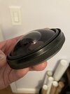
This is my glass lens with the plastic moebius one over it. Glass lens is more shallow than the plastic. Cant decide what to do for the best look.
Hi Joberg and mrwax,Ooh, pretty. Which lens is that?
Hi MarkusI am really interested in how you achieved the colors - that yellow glow in the middle and the surrounding red.
For my HAL builds I have (so far) been using the 100mm plastic arcade buttons.
For the first version I followed the suggestion from the Adafruit tutorial, using a red colored button, and I added a white 0.5W 8mm LED.
View attachment 1354052
The center looks somehow realistic (the size of the bright area is defined by an aperture, a black cardboard disk with a hole, which could maybe be reduced). But I did not like the red color over the whole area. So, for my second version, I opted to use a clear lens and a red 0.5W 8mm LED.
View attachment 1354053
I think this looks better, having the bright red center fading into black - but it's missing the yellow center. So, I am still looking for improvements (that's why I asked you how you achieved your look).
Please notice that both photos do not exactly reflect how they look in reality. For the first one, the red area is not as bright as seen in the photo - and for the second one, the area around the light is also much darker, making it look much more like the movie (again: except that it's missing the yellow center).
View attachment 1354055
")
Thanks!I like the shallow one better
Hi Markus
I assume you are asking me about the yellow glow in the centre of my Hal? If so what you are looking at is the Mobieus kit with its plastic dome, however I have a glass 70mm lens under it, but you can see how much more shallow it is compared to the Mobieus one. As regards the yellow glow, this is just a bit of a trick of the light, I just moved the camera around until I caught that flare. It seems it is the nature of an led under a spherical dome that it can look so different from angle to angle. This you can see in the last pic. I don't know if my glass lens is adding anything to the look. I'm not so sure how to go about maintaining that glow from any pov.
PBateman
Hi MarkusI agree, that this depends a lot on the POV. Furthermore it will likely also look different in a photo as compared to perceived by eye. I will probably add a photo-mode in which the LED intensity is strongly reduced, so that the contrast between the eye and the rest of the faceplate is lowered, so I can take photos that resemble HAL's appearance in the movie. This will also require to adopt the exposure to get the overall dark look. As a little test, I reduced the brightness in the two photos from my previous message. And this already makes a significant difference. If the LED brightness was lowered, it would probably look much closer to the screen capture from the movie.
View attachment 1354289 View attachment 1354290
The left image (with the red lens) has too much red (which would be reduced if the LED was less bright). The right image has too little red around the bright center. But maybe this could be improved with a second (inner) lens element.
<svg width="1449" height="282" viewBox="0 0 1449 282" xmlns="http://www.w3.org/2000/svg"><g fill="none" fill-rule="evenodd"><path fill="#45A9B9" d="M0 0h1449v282H0z"/><path fill="#000000" d="M747 5h697v272H747z"/><g stroke="#FFFFFF" stroke-width="5"><path d="M394.212 221V64.372h35.457v59.094h20.884V64.372h35.571V221h-35.571v-75.503h-20.884V221h-35.457zm137.81 0H501.73l30.293-156.628h35.342L599.953 221H562.89l-4.016-27.998h-22.95L532.023 221zm23.753-49.34l-8.606-58.75-8.261 58.75h16.867zM615.56 221V64.372h35.915v125.99h41.997V221H615.56zM795.637 175.943l23.266-.665c-.75 4.566-1.127 7.811-1.127 9.806 0 11.094 4.283 17.303 12.712 17.303 8.592 0 13.789-6.52 15.555-18.546.48-3.364.865-12.007 1.173-26.126l.1-4.586-3.908 2.401c-5.966 3.666-12.056 5.482-18.313 5.482-12.016 0-21.056-4.783-27.398-14.474-4.982-7.654-7.509-18.166-7.509-31.563 0-19.041 4.124-32.363 12.194-40.075 6.443-6.16 16.193-9.29 29.368-9.29 8.943 0 16.496 1.67 22.689 4.982 8.698 4.63 14.637 15.213 17.651 31.974 1.651 9.532 2.485 23.402 2.485 41.554 0 28.905-2.82 48.46-8.299 58.468-3.909 7.036-9.794 12.035-17.74 15.041-5.056 1.878-10.499 2.822-16.327 2.822-10.704 0-19.832-2.473-27.442-7.401-7.588-4.874-11.366-12.672-11.366-23.72 0-3.816.741-8.282 2.236-13.387zm35.77-93.417c-4.246 0-7.647 1.95-9.933 5.665-2.763 4.577-4.042 12.89-4.042 25.177 0 10.903.955 18.423 2.991 22.752 2.264 4.716 6.243 7.172 11.557 7.172 4.282 0 7.775-1.65 10.248-4.882 2.902-3.719 4.186-11.782 4.186-24.583 0-14.913-1.859-24.165-6.072-28.103-2.236-2.14-5.268-3.198-8.936-3.198zM945.12 65.839c7.822 0 14.485 1.062 19.993 3.163 9.61 3.508 16.017 12.464 19.217 27.225 2.402 11.185 3.615 28.28 3.615 51.22 0 18.534-.758 32.142-2.258 40.766-1.682 9.871-4.846 17.098-9.416 21.738-6.74 6.954-17.92 10.5-33.675 10.5-17.611 0-29.15-5.236-35.001-15.597-3.013-5.381-5.114-13.6-6.23-24.611-.679-6.859-1.02-16.73-1.02-29.582 0-26.886 1.516-46.178 4.51-57.781 2.322-8.996 5.99-15.408 10.947-19.316 6.463-5.114 16.217-7.725 29.318-7.725zm-1.033 17.031c-6.684 0-10.933 3.85-12.213 10.888-1.335 7.15-1.99 20.722-1.99 40.838 0 30.68.19 47.852.585 51.88 1.043 9.736 5.503 15.107 13.16 15.107 6.176 0 10.423-3.308 12.263-9.472 1.242-4.223 1.826-12.938 1.826-26.419 0-42.201-.573-66.061-1.768-72.194-1.373-6.867-5.485-10.628-11.863-10.628zm112.796-17.031c7.822 0 14.485 1.062 19.993 3.163 9.61 3.508 16.018 12.464 19.217 27.225 2.402 11.185 3.615 28.28 3.615 51.22 0 18.534-.758 32.142-2.258 40.766-1.682 9.871-4.845 17.098-9.416 21.738-6.74 6.954-17.92 10.5-33.675 10.5-17.611 0-29.15-5.236-35-15.597-3.014-5.381-5.115-13.6-6.231-24.611-.678-6.859-1.02-16.73-1.02-29.582 0-26.886 1.516-46.178 4.51-57.781 2.322-8.996 5.99-15.408 10.947-19.316 6.463-5.114 16.217-7.725 29.318-7.725zm-1.032 17.031c-6.685 0-10.934 3.85-12.214 10.888-1.335 7.15-1.99 20.722-1.99 40.838 0 30.68.19 47.852.585 51.88 1.043 9.736 5.504 15.107 13.16 15.107 6.176 0 10.423-3.308 12.263-9.472 1.242-4.223 1.826-12.938 1.826-26.419 0-42.201-.573-66.061-1.767-72.194-1.374-6.867-5.486-10.628-11.863-10.628zm112.795-17.031c7.822 0 14.485 1.062 19.993 3.163 9.61 3.508 16.018 12.464 19.217 27.225 2.402 11.185 3.615 28.28 3.615 51.22 0 18.534-.758 32.142-2.258 40.766-1.682 9.871-4.845 17.098-9.416 21.738-6.74 6.954-17.92 10.5-33.675 10.5-17.611 0-29.15-5.236-35-15.597-3.014-5.381-5.115-13.6-6.23-24.611-.68-6.859-1.02-16.73-1.02-29.582 0-26.886 1.515-46.178 4.51-57.781 2.321-8.996 5.99-15.408 10.946-19.316 6.463-5.114 16.218-7.725 29.318-7.725zm-1.032 17.031c-6.685 0-10.933 3.85-12.213 10.888-1.336 7.15-1.991 20.722-1.991 40.838 0 30.68.19 47.852.585 51.88 1.043 9.736 5.504 15.107 13.16 15.107 6.176 0 10.423-3.308 12.263-9.472 1.243-4.223 1.826-12.938 1.826-26.419 0-42.201-.573-66.061-1.767-72.194-1.373-6.867-5.486-10.628-11.863-10.628z"/></g></g></svg>I have taken the image of the nameplate from earlier in this thread and recreated it as a high fidelity vector graphic suitable for printing.
The font was "Grotesque Becker" which has been converted to outline format for the file. (So no font required.)
Fun timing! I've been researching the typeface used on the HAL 9000 logo for the last while. I'm afraid I don't think you're quite correct, since Grotesque Becker is a modern digital recreation of an older font, but you're really close.
The original faceplates used custom-printed decals, and the artwork to make them most likely used Letraset dry transfers. Specifically they appear to have used Letraset Grotesque 9 Outline White. This is Letraset's version of the Grotesque No. 9 typeface that was developed by Sheffield, UK-based type foundry Stephenson Blake, in 1906. Stephenson Blake Grotesque was a series of somewhat strange sans-serif typefaces, which had something of a revival in popularity in Britain in the 50s and 60s.
For more obsessive details, read on:
HAL 9000’s faceplates - The Age of Plastic
- NK Guy
Wonderful resources, NK Guy.
I am working on my own Hal replica, based on the Moebius kit (due to cost concerns). I am simulating the mitered corners with razor cuts, but the chamfered edge detail I won't be replicating. I tend not to worry much about the screws on the outer edge, as they were never shown or the side profile, which is an accommodation for electronics, etc. The real trick with the Moebius kit to my mind is the lens, and painting it to reasonably look like machined aluminum. I will know if I have succeeded...shortly.
Wow great page you linked to.Fun timing! I've been researching the typeface used on the HAL 9000 logo for the last while. I'm afraid I don't think you're quite correct, since Grotesque Becker is a modern digital recreation of an older font, but you're really close.
The original faceplates used custom-printed decals, and the artwork to make them most likely used Letraset dry transfers. Specifically they appear to have used Letraset Grotesque 9 Outline White. This is Letraset's version of the Grotesque No. 9 typeface that was developed by Sheffield, UK-based type foundry Stephenson Blake, in 1906. Stephenson Blake Grotesque was a series of somewhat strange sans-serif typefaces, which had something of a revival in popularity in Britain in the 50s and 60s.
For more obsessive details, read on:
HAL 9000’s faceplates - The Age of Plastic
- NK Guy
Wow great page you linked to.
I’m currently working on the Moebius kit which arrived in the mail today and am using a Master Replicas/Artifactory lens I found on eBay. I’m looking into recreating the nameplate as a printed aluminum plate and I’m using brushed dark aluminum vinyl for the main faceplate as opposed to painting it. I’d like to scratch build the whole thing but I don’t know where to get the aluminum sides from.
Can you share which dark brushed alum. vinyl you are using? I am starting to think black is too...black.Wow great page you linked to.
I’m currently working on the Moebius kit which arrived in the mail today and am using a Master Replicas/Artifactory lens I found on eBay. I’m looking into recreating the nameplate as a printed aluminum plate and I’m using brushed dark aluminum vinyl for the main faceplate as opposed to painting it. I’d like to scratch build the whole thing but I don’t know where to get the aluminum sides from.
This is what I bought. Black Brushed SteelCan you share which dark brushed alum. vinyl you are using? I am starting to think black is too...black.
Gunmetal? Graphite?