Firefly/Serenity

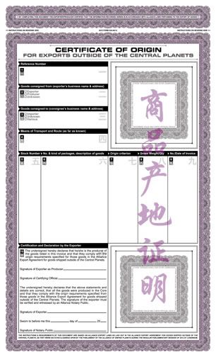
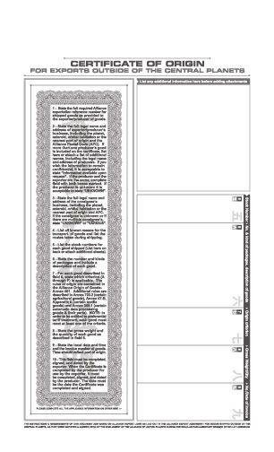
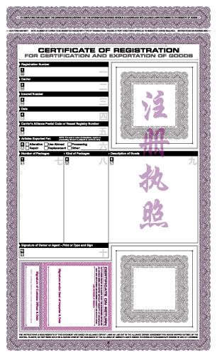
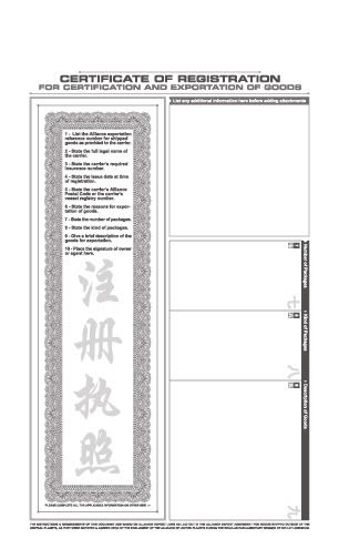
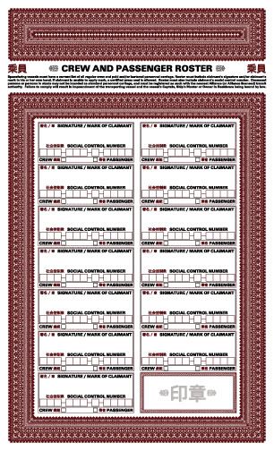
I went to make the changes provided by Brigandia36 when I paused and thought, "Why not leave it wrong on purpose?" A lot of the mistakes come straight from the original form, and I find it ironic that an official form should have so many issues. I also think that it says something about governments in general. It's a good example of the Alliance trying to get everything right and always falling short. In fact, the more I think about it, the more I like the idea of it being as it is, an 'official' Alliance document. Official yet inefficient.

It takes me back to the days when I worked at Empire Graphics. So many of the forms that we were asked to recreate for State and Federal organizations were filled with grammar mistakes and spelling errors. It makes it all the funnier when a government agency demands forms in triplicate that are blatantly incorrect.

Also, a big thanks to Brigandia for offering to help me edit all future documents. It's nice to have fans of many languages assisting the cause.
 
  • Like
Reactions: Emz
This is one I made specifically for our Can't Stop the Serenity screening back in October of last year. I was hesitant to put it up at first, as it is so specific to CSTS, but it's for a good cause and it is very Fireflyish.

PACE-BigDamnTakeaway.jpg


http://pics.fireflyprops.net/PACE-BigDamnTakeaway.pdf
 
Thank you.

Shortly after the Official Map of the Verse came out, J. Chris Bourdier created the Verse in Numbers, and shortly after that I threw the ARC (Astrogation Reference Charts) together. I recently discovered a few subtle mistakes I made and I always wanted to expand the ARC to include mining facilities, remote docks and outposts in the asteroid belts of the Verse. Of course, the Kuiper belt around White Sun is simply too large for the format of the ARC as it is now, but I took the liberty of adding two far flung dwarf planets and their satellites. As for Motherlode (around Red Sun) and Uroborus (around Blue Sun), they now sport dozens of outposts and mining facilities. The names listed are nicknames or shortened version of much longer titles, such as CMC - N1, which stands for 'Corone Mining Consortium - New Facility 1'. My many thanks to the fans who contributed names for these lonely, remote rocks.

This is version 1.3
http://pics.fireflyprops.net/PACE-ARC1.3.pdf
 
You're welcome. I'm already working on Version 1.4, as a few subtle errors in spelling were found within hours of posting this by a few faithful fans. During the recent updates I was surprised to find a whole planet mislabeled for almost a year, and no one mentioned it before.

There are numerous space stations that have been added to the canon, so that may be my next big addition.
 
Crew and Passenger Roster

No set of ship's papers is complete without a Crew and Passenger Roster, so I had to make my own at least once. I went with a very simple red and black design. Well...simple in color. The border was a nightmare to design and build. I borrowed a little from the border of an old mining certificate, but added and added and added until I went a bit blind.

I'll go and rest my eyes now.

PACE-PassengerRoster.jpg


http://pics.fireflyprops.net/PACE-PassengerRoster.pdf
 
Just beautiful documents. These are incredible. I love every one of them. I want to get a wallet for them. Need to save up.

Thank you for sharing with us.
Best,
DBCooper
 
Yes, indeed! Thank you for posting all these. It's great to see that all new Firefly/Serenity stuff is still be created. Great work!

Cheers,

Chris
 
Also: my Fruity Oaty Bar wrapper.

The green bars indicate the width of the various segments: front, sides, back. There are two 'backs' because of the folded-over seam on the back side, like real cereal bars have. Look at one and you'll know what I mean.


-Mike J.
 
Thank you :)

You're not so bad yourself.

Best part is, it's all something anyone can do. Fold 'em up, crumple 'em up, stuff them in your pocket and lightly drag them across a 'dirty' color stamp pad.


-Mike J.
 
Best part is, it's all something anyone can do.

-Mike J.

On that point I must disagree. People can fold a bill and crumple a piece of paper, but you demonstrate a sense of 'random weathering' that a lot of people can't grasp. Your bills bear the look of transient wear and tear, rather than just dirt for dirt's sake. They give a sense of erosion by events over the course of their passage from one wallet to another.

I work with a lot of living history fans that think a map doesn't look used unless it was strangley burned evenly around all four sides. What kind of fire is that forgiving?
 
Researching your subject helps.

I have a lot of pictures of old Chinese banknotes gathered from the internet.

I've used their condition as a rough guide to what 'Verse banknotes might look like, away from the core worlds, out in the sticks.

Are they counter-stamped? Punch canceled? Scribbled on?

The same goes for financial, identification or business documents.

Maintaining a reference material archive can be fun and inspiring. There's also the small chance that you may get something high-resolution enough to be able to 'use' directly.


-Mike J.
 
Back
Top