Defined Green Lantern Comic Rings

Screenshot_2.jpg


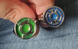
Got some good news and some less good news - the Blue and Green signet rings came back from the jeweler today. The polish is perfect, and looks like it may have fixed a slight warping in the shanks, but they didn't polish the symbols smooth. It never occurred to me to specify that part... I'm hoping I can do something to fix that myself before I go in and add the resin and glow dust. Other than that I'm very pleased with how these turned out.
 
View attachment 1710972

Got some good news and some less good news - the Blue and Green signet rings came back from the jeweler today. The polish is perfect, and looks like it may have fixed a slight warping in the shanks, but they didn't polish the symbols smooth. It never occurred to me to specify that part... I'm hoping I can do something to fix that myself before I go in and add the resin and glow dust. Other than that I'm very pleased with how these turned out.

And that would be tricky work to do yourself, too, as a result of all the fine details and shapes.
 
This is partly why I designed my signet rings as multi-part assemblies, so that they'd be easier to polish without missing spots or damaging the symbols.
 
This is partly why I designed my signet rings as multi-part assemblies, so that they'd be easier to polish without missing spots or damaging the symbols.
Yes, I've always liked your approach to that. I doubt it'll work as easily with steel though. Originally these were supposed to arrive fully polished. I don't know why the printing service skipped that part. Next set of rings I'll make sure they polish them thoroughly before shipping.
 
As for me, I'm taking another break to recharge and focus on other projects. I find it valuable to get some distance and then come back to the project with fresh eyes and new ideas.
 
As for me, I'm taking another break to recharge and focus on other projects. I find it valuable to get some distance and then come back to the project with fresh eyes and new ideas.
Take all the time you need, sir. We'll all be here whenever you get back to it ^_^
 
This has again got me thinking about My own project. It's always good to rethink these things from different angles, and I again find myself wondering about the best material and coloration. I've always leaned toward anodized aluminum, but what about, say, powder-coated silver?
 
This has again got me thinking about My own project. It's always good to rethink these things from different angles, and I again find myself wondering about the best material and coloration. I've always leaned toward anodized aluminum, but what about, say, powder-coated silver?
Personally, I prefer stainless steel because it maintains a good shine and it's very sturdy. It's also *allegedly* hypoallergenic, or at least doesn't contain the amount of materials that usually lead to reactions. I had some trouble with a few older rings over the past couple years. That's one of the reasons I switched. It's also a surprisingly affordable metal to print out.
 
Personally, I prefer stainless steel because it maintains a good shine and it's very sturdy. It's also *allegedly* hypoallergenic, or at least doesn't contain the amount of materials that usually lead to reactions. I had some trouble with a few older rings over the past couple years. That's one of the reasons I switched. It's also a surprisingly affordable metal to print out.

And it looks great. My only issue, of course, is having rings which are actually GREEN, like in the comics, and not just steel or silver with a green inlay.
 
And it looks great. My only issue, of course, is having rings which are actually GREEN, like in the comics, and not just steel or silver with a green inlay.
Ah yeah, I see whatcha mean. I went that route because, in addition to everything else I said, I find that color coated rings wear off far too easily. As far as I can tell nobody's found a cost effective way to color coat rings in a way that won't wear off with time and use. The Ring Foundry's occasionally experiments with different techniques. So far their stuff is some of the best. I have two rings from them, one of which was anodized, but has some edge wear on it. It'd be awesome to have a truly green ring but I'm just not confident in any of the coating techniques available right now.
 
I finally got around to adding the glowing resin inlay to my custom "standard" Green and Blue Power Rings. The resin in the Green ring is still a bit soft, but the Blue cured perfectly. I still need to wet sand and polish both, but I'm gonna wait a bit for the Green to cure some more first.
 

Attachments

  • 20230821_143638.jpg
    20230821_143638.jpg
    209 KB · Views: 103
I’ve begun dipping my toe back in. Tinkering with the REBIRTH band to improve its shape, and playing with shank thickness. Nothing really notable to show off, just yet.

But I’m slowly getting back into the game.
 
Okay, so, some tinkering.

Approaching the REBIRTH from a fresh perspective, I had a few goals in mind, regarding the shape and size.

Due to the nature of how Shapr3D works, I’ve had to use filleting to give the bottom of the shank the proper curved cross-section, rather than the flatter look I initially get when revolving my sketch shape into the basic ring. This tends to result in the shoulders of the ring (circled in red, directly below the disc) looking very rounded and a bit wonky. Depending on how various elements are mixed together (finger-hole position, degree of filleting, etc,) this area can appear to either bow out or sink in. Looking at real-world rings, this area tends to either slope out and down, or angle near 90 degrees. This current version slopes out and down, but with a more rounded look, which isn’t too bad.


IMG_1560.jpeg


Meanwhile, I found myself wondering if the disc wasn’t too big, after all. The previous iterations had a diameter of 20mm, which is slightly smaller than the BLACKEST NIGHT promo rings. I just changed that to 19mm, and it does make a difference in terms of the sleekness and proportions of the design.

I threw together a quick mock up (right) to compare with the previous version from months ago (left). This new version is based upon the old, but with the aforementioned tweaks. The disc is 19mm, the shank is 7mm wide/2.5mm thick, and the distance from the top of the ring-hole to the bottom of the disc is 3.5mm, which makes this version sit a little higher.


IMG_1553.png
IMG_1554.png
IMG_1555.png
IMG_1556.png
 
Tweaked the V2 and V3 to include the thicker, 2.5mm shank, so as to match the tweaked REBIRTH. also added a bit of material between the V2 symbol and its finger-hole, thus increasing its overall height by 1mm.

These versions both have 24mm symbols. Still struggling with just how big (or small) they should be.

IMG_1561.png
IMG_1562.png
IMG_1563.png
IMG_1564.png
 
Back
Top