You are using an out of date browser. It may not display this or other websites correctly.
You should upgrade or use an alternative browser.
You should upgrade or use an alternative browser.
Defined Green Lantern Comic Rings
- Thread starter Gregatron
- Start date
More tweaks to the Earth and Fire rings. I’ve increased the height of the bezels to 5mm, and have also applied this change to the Wind/Water/Heart designs. Still not sure about the bezels’ diameter, though. The versions below are 20mm, but the bezels always look so BIG on the show itself, and I want to be true to what was actually seen onscreen.
That being said, I’m very happy with the shape and height of the domes/gems, now.


I’m still not entirely happy with any of the rings’ symbols, but there’s just not a lot of reference to go with. Some of the DIC character model sheets and whatnot can be found online, but nothing on the rings themselves. The Tiger Toys rings which came with the CAPTAIN PLANET action figures aren’t exactly the best reference, since I don’t think they actually used the cartoon’s model sheets for the toy rings’ versions of the symbols. That said, the goal of this project is to examine all of the different references (cartoon, toys, etc.) and extrapolate what the Planeteer rings would look like when translated into the real world. As noted many times, that’s why I’ve been having such a hard time pinning down the proper height and diameter for the bezels. TOO big, and the rings look…well…cartoony. Too small, and they don’t look like what was seen on TV.
Of course, the Tiger Toys rings (the ones which came with the figures, not the light-up ones) were pretty chunky, but, that said, they don’t look too far off from what’s in the show.

There’s also the promotional art and whatnot used for merchandising, as well as the short-lived Marvel Comics series, both of which clearly used the animation models as their basis.

As previously noted, probably the best close-up of Linka’s Wind ring in the show itself is this shot from “The Conqueror”, which has been my primary reference for the symbol:

Of the five rings, this one’s symbol has been the hardest to get right. Still not happy with the overall shapes, but I do think 0.50mm is the correct height. We’ll see. It doesn’t help that the show has yet to be remastered for Blu-Ray, which would make my reference screencaps a lot clearer. Maybe someday…
Meanwhile, here’s the current version of the Wind symbol:

And here are all of the current designs:


I need to get the Planeteer rings nailed down first before I can even begin to think about the Rings of Destruction. There’s far less reference on them, especially their symbols. The overall designs look to be the same as the Planeteer rings, but without good reference for the symbols, I’d be flying blind.

That being said, I’m very happy with the shape and height of the domes/gems, now.
I’m still not entirely happy with any of the rings’ symbols, but there’s just not a lot of reference to go with. Some of the DIC character model sheets and whatnot can be found online, but nothing on the rings themselves. The Tiger Toys rings which came with the CAPTAIN PLANET action figures aren’t exactly the best reference, since I don’t think they actually used the cartoon’s model sheets for the toy rings’ versions of the symbols. That said, the goal of this project is to examine all of the different references (cartoon, toys, etc.) and extrapolate what the Planeteer rings would look like when translated into the real world. As noted many times, that’s why I’ve been having such a hard time pinning down the proper height and diameter for the bezels. TOO big, and the rings look…well…cartoony. Too small, and they don’t look like what was seen on TV.
Of course, the Tiger Toys rings (the ones which came with the figures, not the light-up ones) were pretty chunky, but, that said, they don’t look too far off from what’s in the show.
There’s also the promotional art and whatnot used for merchandising, as well as the short-lived Marvel Comics series, both of which clearly used the animation models as their basis.
As previously noted, probably the best close-up of Linka’s Wind ring in the show itself is this shot from “The Conqueror”, which has been my primary reference for the symbol:
Of the five rings, this one’s symbol has been the hardest to get right. Still not happy with the overall shapes, but I do think 0.50mm is the correct height. We’ll see. It doesn’t help that the show has yet to be remastered for Blu-Ray, which would make my reference screencaps a lot clearer. Maybe someday…
Meanwhile, here’s the current version of the Wind symbol:
And here are all of the current designs:
I need to get the Planeteer rings nailed down first before I can even begin to think about the Rings of Destruction. There’s far less reference on them, especially their symbols. The overall designs look to be the same as the Planeteer rings, but without good reference for the symbols, I’d be flying blind.
Those are great!
There is a new process that allows finer detail of 3D prints
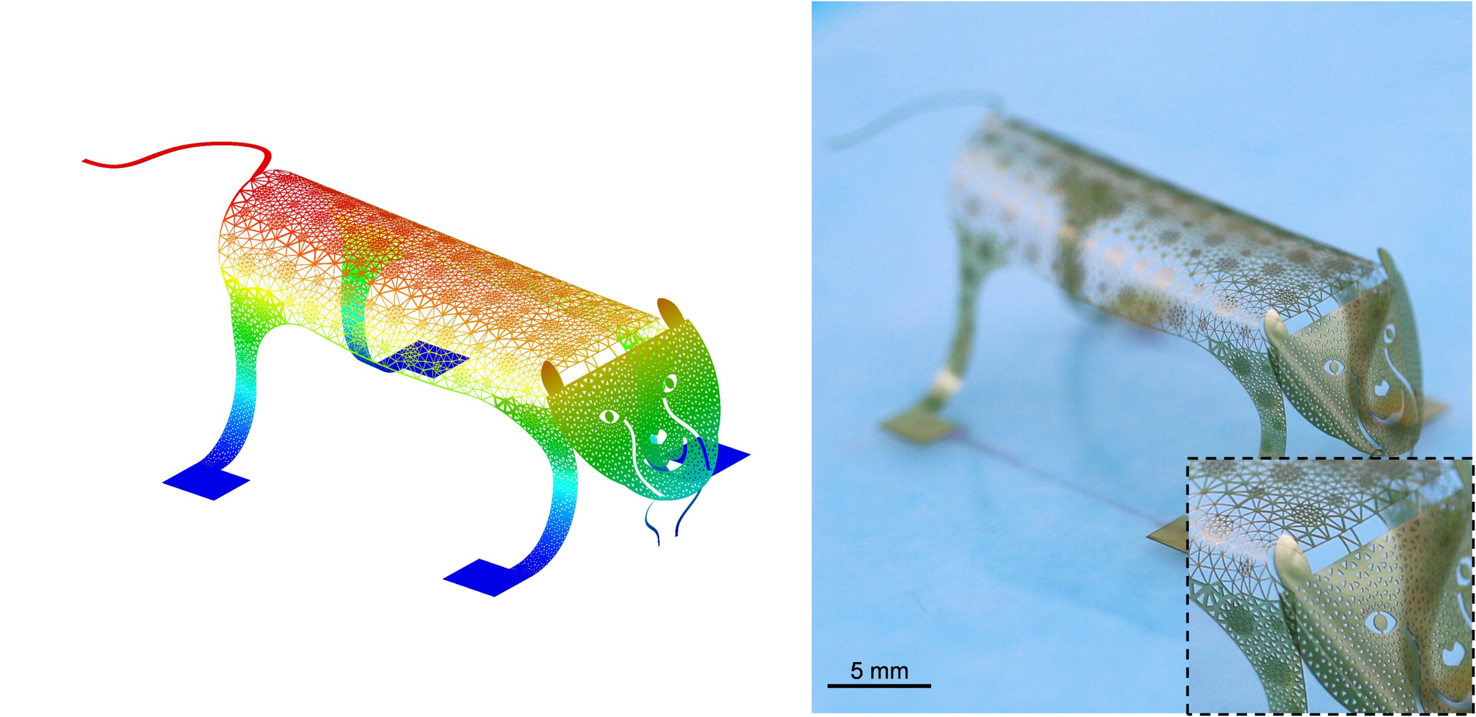
 techxplore.com
This lattice work would make a fine bezel
There is a new process that allows finer detail of 3D prints
Inverse design method used to improve porous surface texture of 3D printed objects
A multi-institutional team of mechanical engineers and materials scientists has developed an inverse design method to improve the texture of porous surfaces on 3D printed structures. In their paper published in the journal Science, the group describes developing micrometer-sized triangles and...
This lattice work would make a fine bezel
Last edited:
Refining the tri-band. For such a simple idea, it’s been surprisingly hard to model, given that it has to have a certain look, but also be a certain shape/size.
Getting closer, though. Old on left, new on right. The new one is far less flat-sided, and has proper ribs.


One new problem has arisen from this revision, though: As a result of the curved ribs of the tri-band, there’s now an undercut between the bottom of the symbol and the band. This problem also existed with the previous iteration, but it was far less noticeable. To compensate, I added a filler piece with the same diameter as the symbol’s central ring. However, on this new iteration, the filler piece (the gray section seen on the right-side model in the image below) really stands out, and it also kinda interferes with the elegance of the tri-band. Hmmm.


Getting closer, though. Old on left, new on right. The new one is far less flat-sided, and has proper ribs.
One new problem has arisen from this revision, though: As a result of the curved ribs of the tri-band, there’s now an undercut between the bottom of the symbol and the band. This problem also existed with the previous iteration, but it was far less noticeable. To compensate, I added a filler piece with the same diameter as the symbol’s central ring. However, on this new iteration, the filler piece (the gray section seen on the right-side model in the image below) really stands out, and it also kinda interferes with the elegance of the tri-band. Hmmm.
Something that’s been nagging at me:
The domed gem on the Patrick Gleason model stands only just slightly proud of the face of the ring. If it was either more prominent or was completely inset, I’d feel better about it.
Here’s the previous iteration (left) with a slight tweak (right): the arc of the gem has been reduced from 90 degrees to 60 degrees. Dunno which way to go on this.
Last edited:
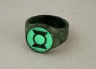
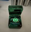
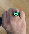
Is it alright to share here a really great ring I just got? It’s bronze and antiqued with a glow coat applied to the symbol.
Attachments

Back to tweaking the V1 band. Subtle shape improvements. And I keep waffling back and forth between the more squared-off band (left) and the curvy, organic band (right). The semi-curvy version (middle) Is what I’ve been sticking with, lately.


Also been tweaking the curvature of the sides of the band in front view. The previous iteration (left) looked a little too bulbous. Slimmer is better.

Also been tweaking the curvature of the sides of the band in front view. The previous iteration (left) looked a little too bulbous. Slimmer is better.
Back to tweaking the V1 band. Subtle shape improvements. And I keep waffling back and forth between the more squared-off band (left) and the curvy, organic band (right). The semi-curvy version (middle) Is what I’ve been sticking with, lately.
View attachment 1688131View attachment 1688132View attachment 1688133
Also been tweaking the curvature of the sides of the band in front view. The previous iteration (left) looked a little too bulbous. Slimmer is better.
View attachment 1688130
Really nice job on these rings, Gregatron! I also like that you took on the Planeteer rings from Captain planet!
Last edited:
Really nice job on these rings, Gregatron! I also like that you took on the Planeteer rings from Captain planet!
…look at the date.
LOL I forgot to include the quote and pic from your post yesterday! I also went back in the thread and saw the Planeteer rings,…look at the date.
(keyboard no like me
 )
)A slight tweak to the attachment system— I added a raised collar to the top platform of the band to properly sandwich the resin insert between the band and the outer disc (ensuring better alignment and structural integrity), which will also serve to retain the glow powder in a very shallow “bowl” underneath the insert.


The mod was added to both flavors of band, which are looking nice.


The mod was added to both flavors of band, which are looking nice.
More V1 work. From left to right: Early Gil Kane straight-band (flat-sided), early Kane straight-band (curve-sided), monotone signet-style (as per most of the comic coloring), duo-tone signet-style, duo-tone signet style with curvy band.
The three monotone designs have a deeper negative space (1mm) around the symbols so that the symbols are more visible, whereas the two-tone models don’t need that extra emphasis.


The three monotone designs have a deeper negative space (1mm) around the symbols so that the symbols are more visible, whereas the two-tone models don’t need that extra emphasis.
A tweak to the Gleason model, but I’m not sure I want to go with it. Slimmed down the band so that its edges don’t extend past the inner edges of the symbol sidebars. This is how I’ve handled the other V2 rings, and it actually appears more accurate to the comic art, but I do wonder if it doesn’t make the band look a little too dainty. Hmmm.


…okay, I think I found a good balance. Originally, I’d just stuck the modern symbol on top of the standard V2 band, without really thinking about the alignment of the parts.
Now, I’ve created a compromise version, where the edges of the band align with the inner sidebar edges on the TOP face of the ring, rather than the bottom (as in the previous post). The reason that the previous iteration looked too dainty is because I was syncing up the band edges with the bottom of the inner sidebar edges, which slimmed the band down by a full 2mm. The chamfering which ramps up from the bottom of the symbol to the face creates a 1mm difference between the top and bottom edges.


Aligned with the bottom of the inner edge of the sidebar, which results in the dainty band seen in the last post:

Aligned with the upper edge of the inner sidebar:

And compared with the original iteration (left), which just used the standard V2 band (not aligned with anything), and so the band appears slightly too wide, as a result. A subtle difference, but that extra degree of precision makes it just right.


Now, I’ve created a compromise version, where the edges of the band align with the inner sidebar edges on the TOP face of the ring, rather than the bottom (as in the previous post). The reason that the previous iteration looked too dainty is because I was syncing up the band edges with the bottom of the inner sidebar edges, which slimmed the band down by a full 2mm. The chamfering which ramps up from the bottom of the symbol to the face creates a 1mm difference between the top and bottom edges.
Aligned with the bottom of the inner edge of the sidebar, which results in the dainty band seen in the last post:
Aligned with the upper edge of the inner sidebar:
And compared with the original iteration (left), which just used the standard V2 band (not aligned with anything), and so the band appears slightly too wide, as a result. A subtle difference, but that extra degree of precision makes it just right.
Last edited:
DexAntares
Well-Known Member
Glad to see this thread is still going. I've actually done a little more work on my own ring customs. The Ring of Volthoom actually has a sort of concavity to the "X" symbol too. I'm rather proud of that.


