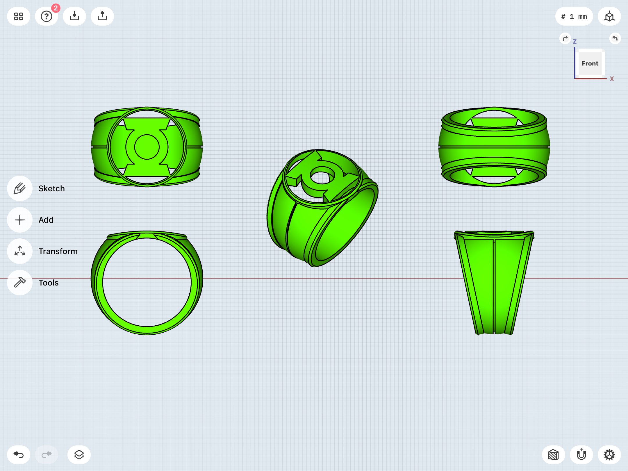
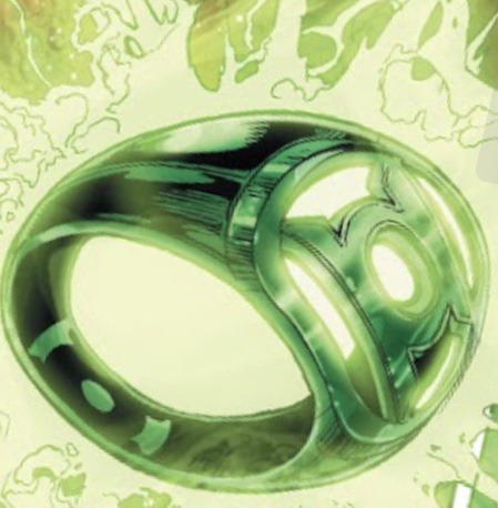
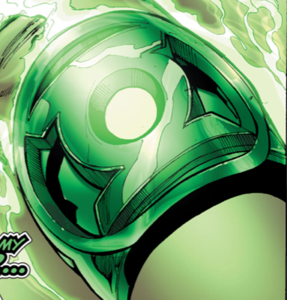
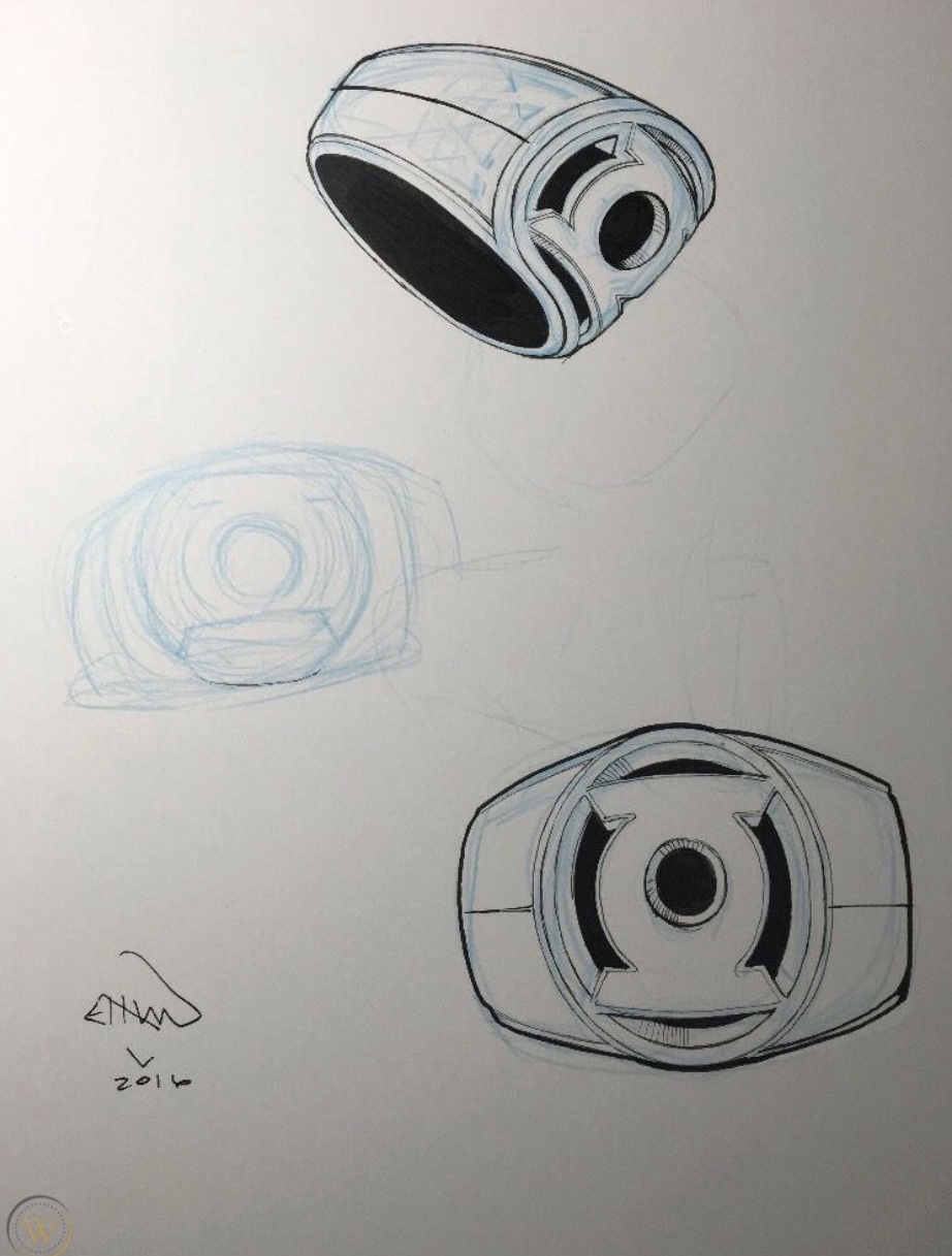
Tackling the Van Sciver 2.0 ring from scratch yet again. It’s a really tricky design, to say the least. The concept art posted upthread shows raised ribs surrounding either side of the finger-hole, which blend into the bezel surrounding the symbol. The bezel itself may actually be conical, rather than a disc. The actual comic art may have dispensed with the ribs, and the outer edges of the disc appear to be cut flush with the leading edge of either side of the finger-hole.


You are using an out of date browser. It may not display this or other websites correctly.
You should upgrade or use an alternative browser.
You should upgrade or use an alternative browser.
Defined Green Lantern Comic Rings
- Thread starter Gregatron
- Start date
xcelsior
Well-Known Member
I didn't realize how much variation there's been in the rings over the years (it totally makes sense considering all the different artists and animators that have worked on Green Lantern; just something I've never thought about). This thread has been both informative AND entertaining. I hope the project is still ongoing for you.
I didn't realize how much variation there's been in the rings over the years (it totally makes sense considering all the different artists and animators that have worked on Green Lantern; just something I've never thought about). This thread has been both informative AND entertaining. I hope the project is still ongoing for you.
Been taking a breather to recharge my batteries. Gonna be gearing up to read the Geoff Johns run, eventually.
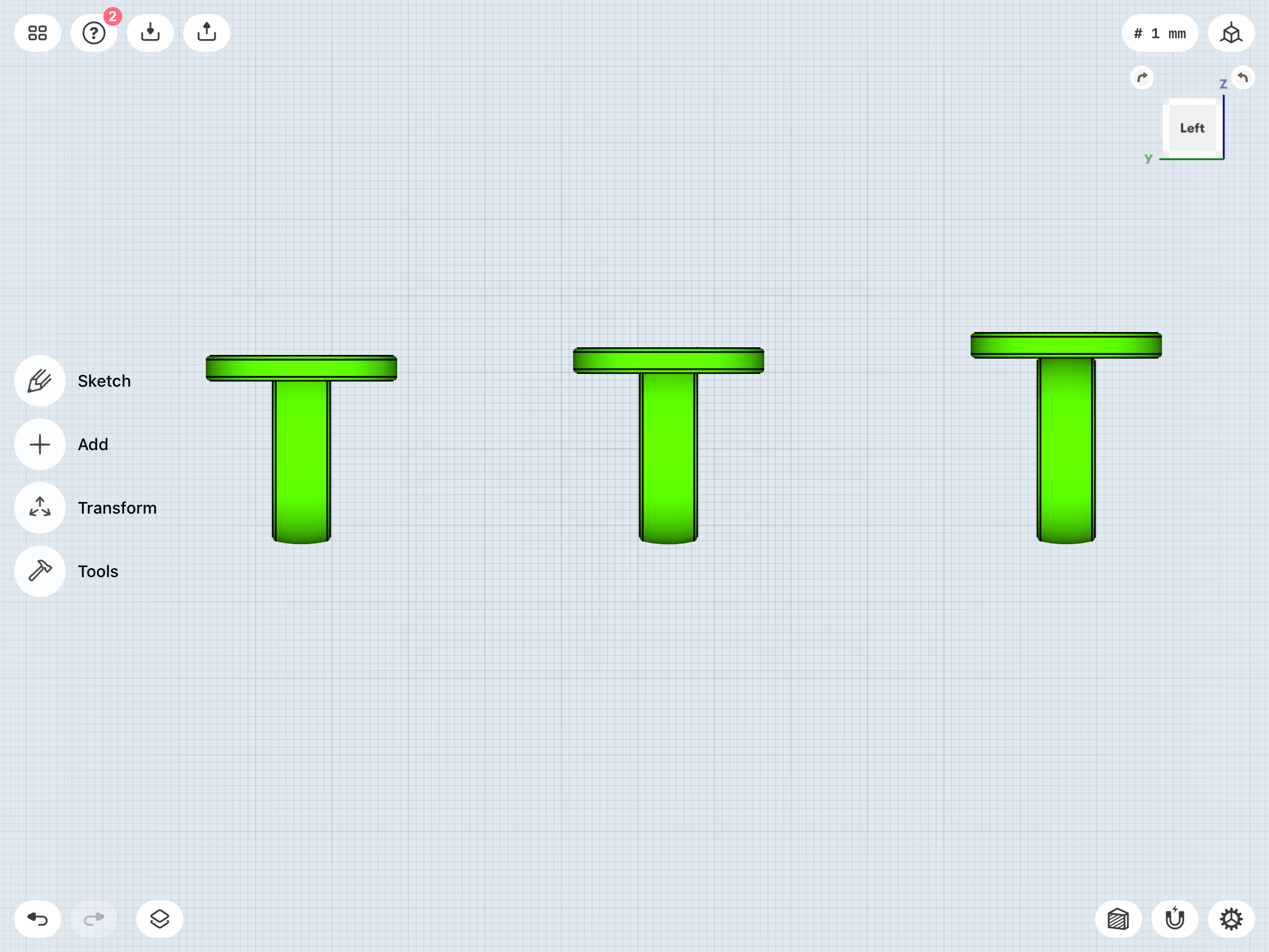
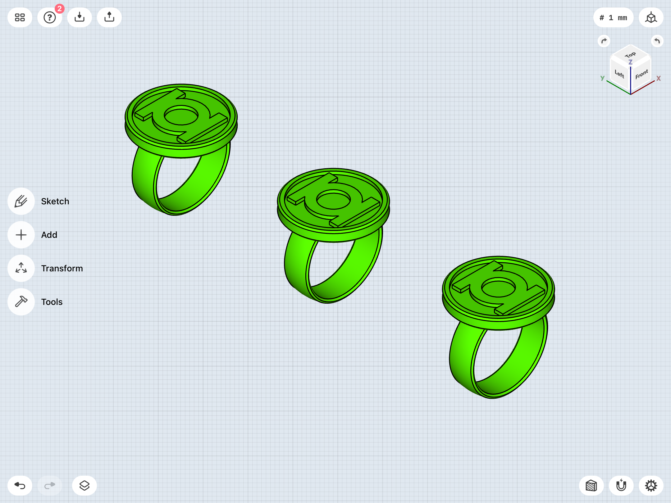
Dipping my toe back in the water. Still vexed by the Gil Kane design. Been playing with variants of the Ross design to try and find that perfect Kane. Slightly enlarged the diameter of the disc to create a very slight overhang, then created variants with the disc positioned at different heights relative to the top of the band.
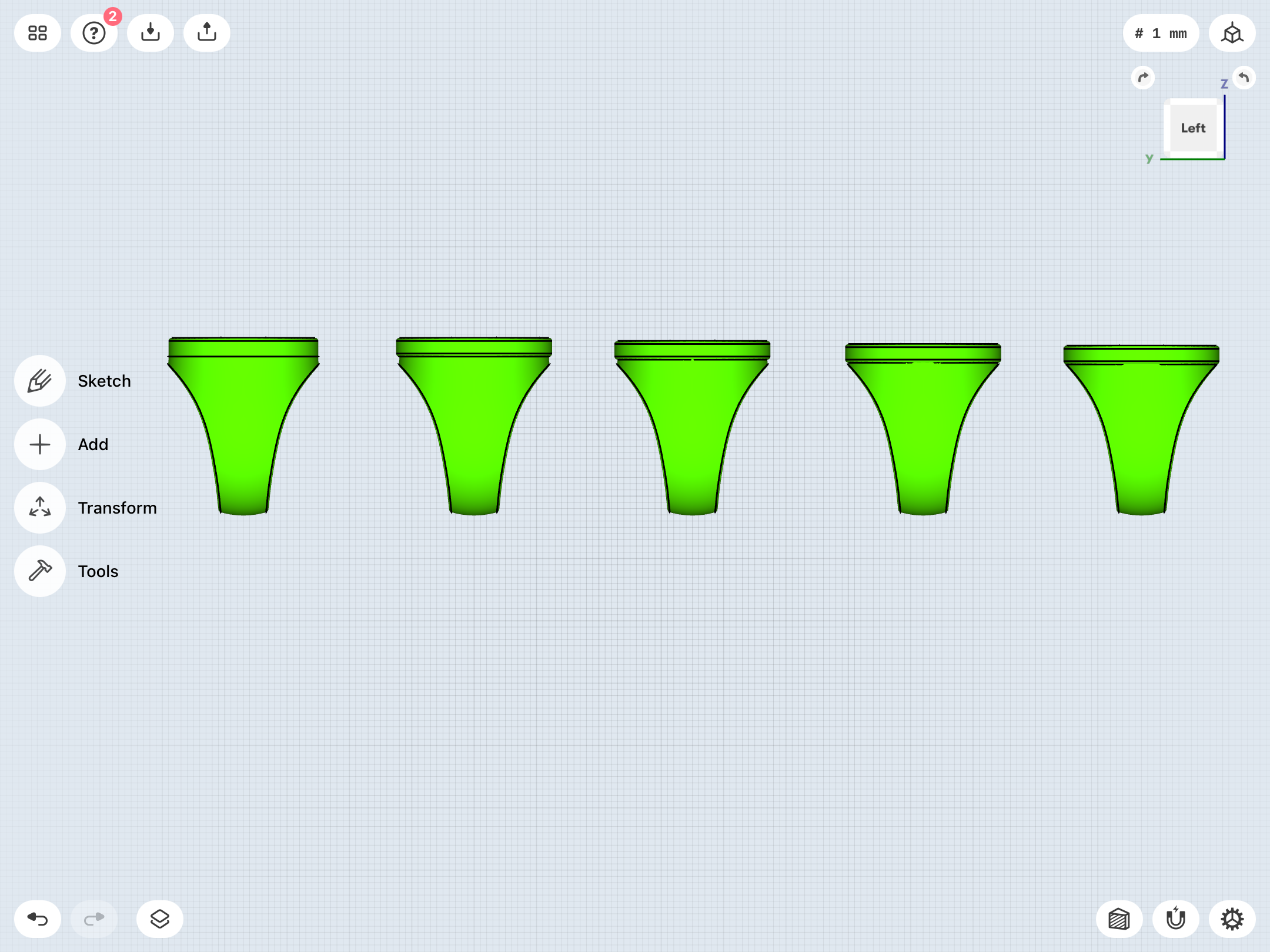
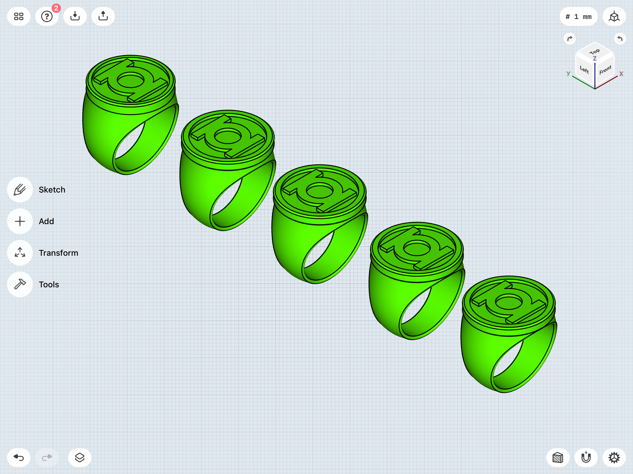
As has been noted before, the straight-band V1 (with variations in symbol design and whatnot) is perhaps the most-seen version during that Silver Age/early Bronze Age run from 1959-1976. Literally just a simple ring-band with a signet disc (of varying sizes, but usually BIG) stuck on top.
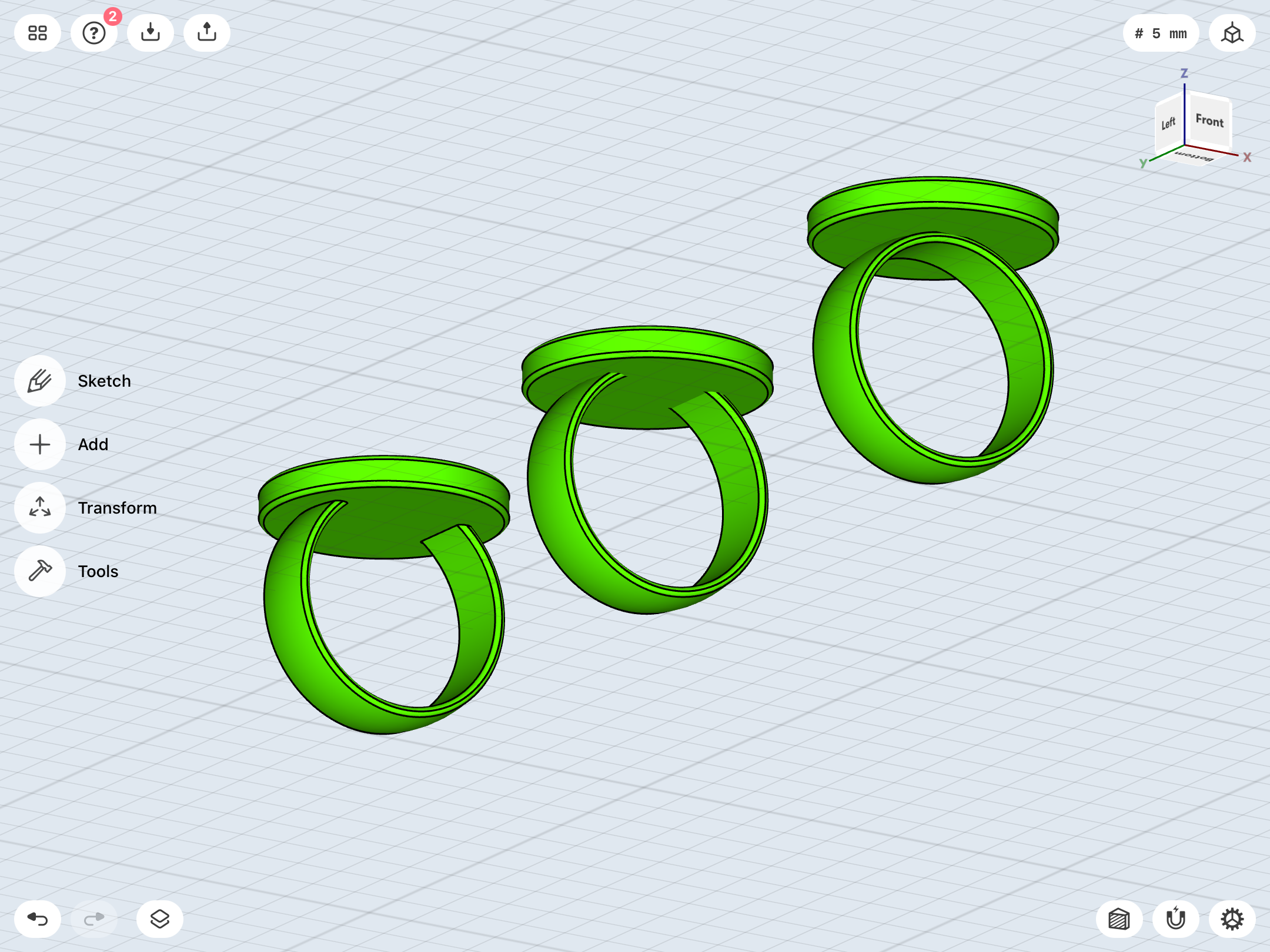
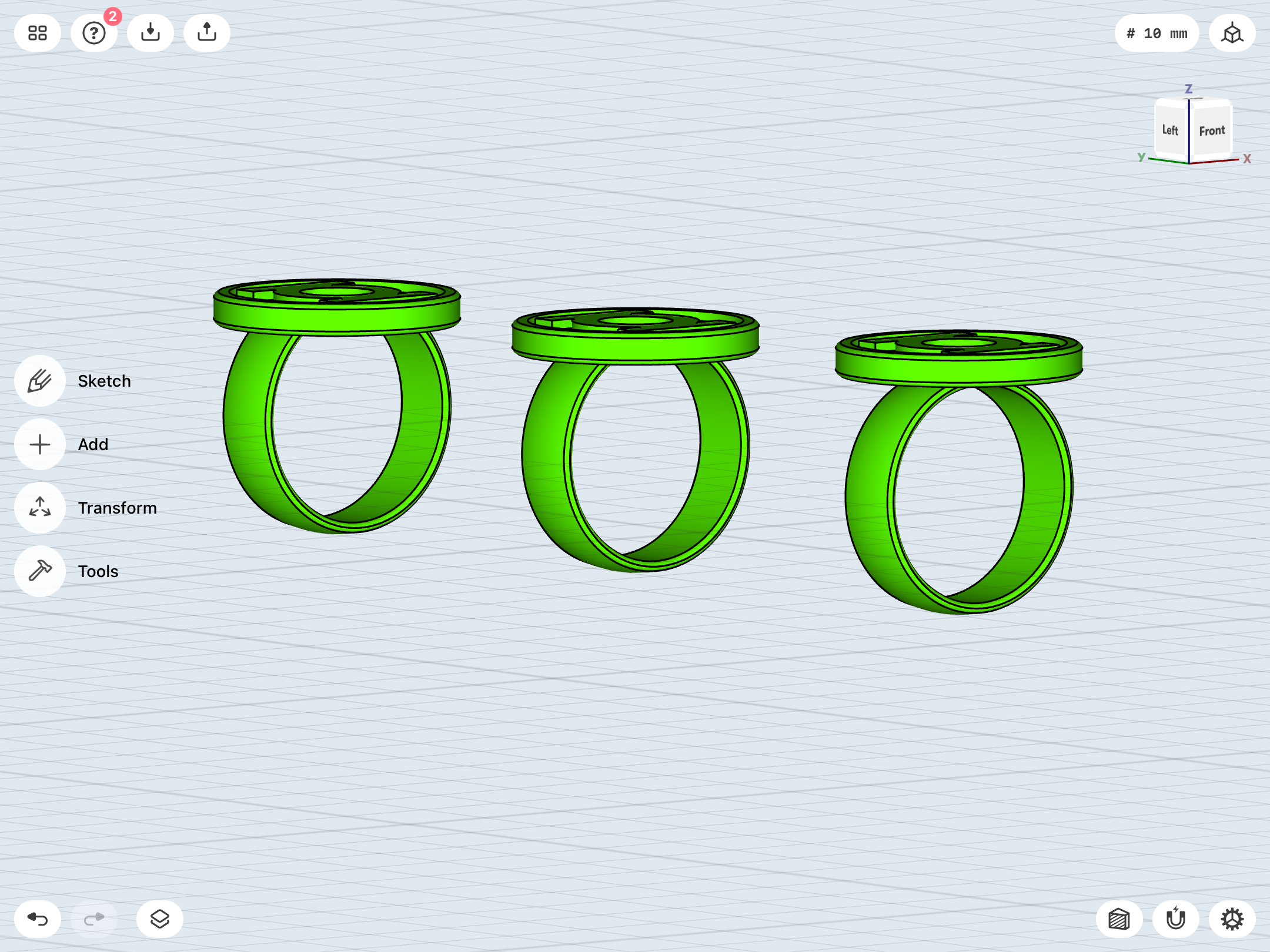
But, the devil is in the details, and so I’ve come back to refining it yet again. Time and again in this thread, I’ve shown how difficult it has been to get the right balance and proportions for such a simple design. Also, the actual attachment point where the disc meets the band has been a big question mark. As has been demonstrated, the art was inconsistent, to say the least. Sometimes a solid ring with the disc stuck on top, and sometimes a “U” band, with the ends attached to the bottom of the disc. In studying real-world rings of this type, I’ve come across both styles. Kane himself drew both styles, athough the the full-band with the disc on top generally seems more prominent in his work…but is not necessarily something which translates well to a real ring.
That being said, going the latter route really does seem a bit too clunky, to my eye. The result is a much higher profile, and a huge undercut between the top of the band and the bottom of the disc. And a goal with this project is to find a balance between sleek and comic-accurate.
As it stands, I’m getting closer. This latest iteration has a thinner band (about 8mm wide, rather than the previous 10mm), and a thinner (3.25mm) disc. The disc size is currently back to 25mm, but I have smaller variants, too. I think the “U” band versions pictured below provide that sleeker and more integrated look, compared to the full-band with the disc sitting on top. This current version also has the slightly “D” shaped/rounded band, rather than being flat-sided.
Now, I’m playing with just how high the disc should sit in relation to the band, with (from left to right) low, medium, and fully on top. There are other variables to be questions, too, such as the thickness of the ring and the depth of the signet engraving, although those seem pretty spot-on. We’ll see.
What do y’all think?
Also, I’ve again been thinking ahead. At the moment, the tentative plan is for machined and anodized-green aluminum rings. However, I’ve also been thinking about other materials and techniques, such as powder-coating. I suppose it comes down to which finish would be more durable, and which would better simulate polished, green metal.
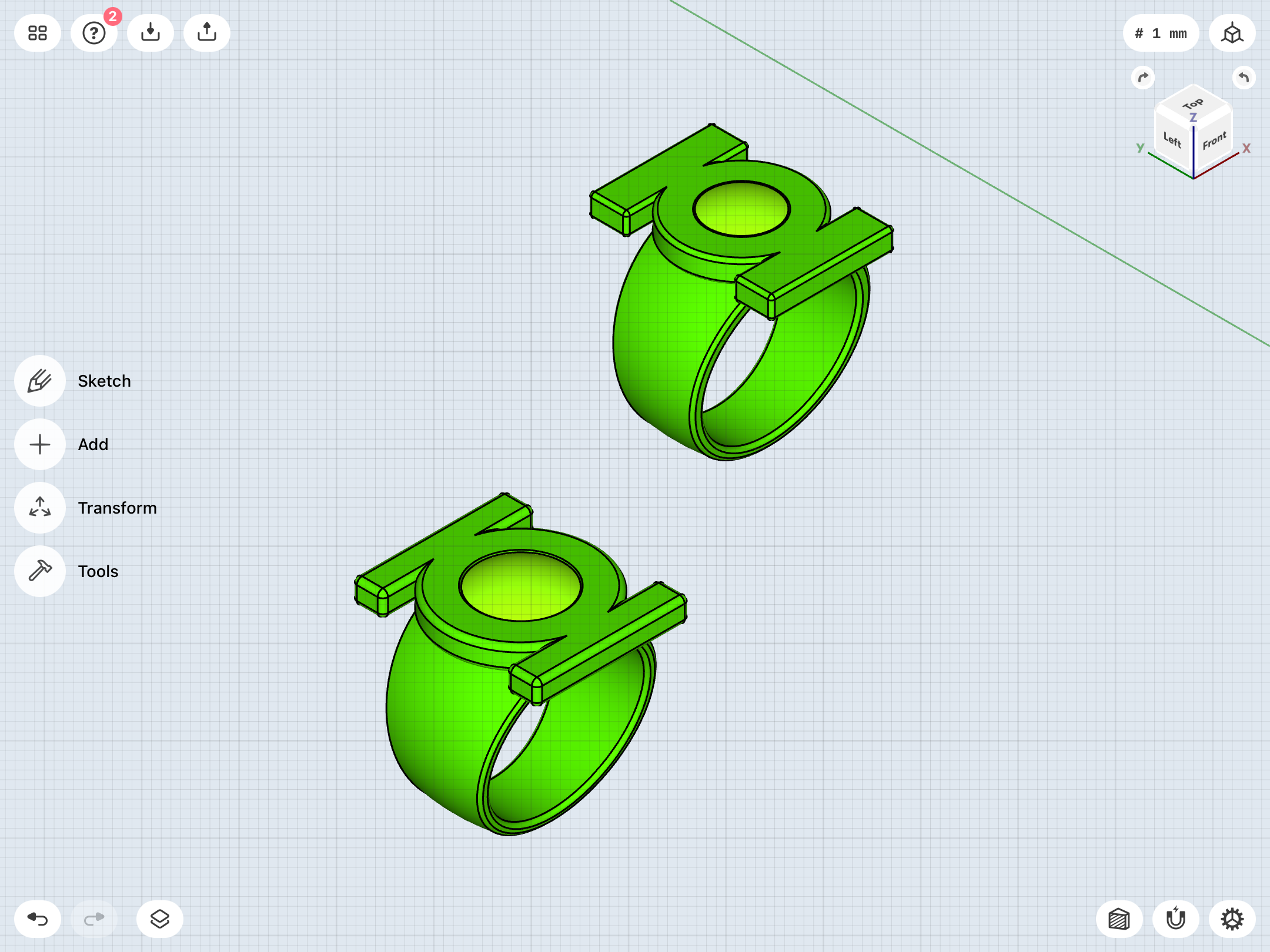
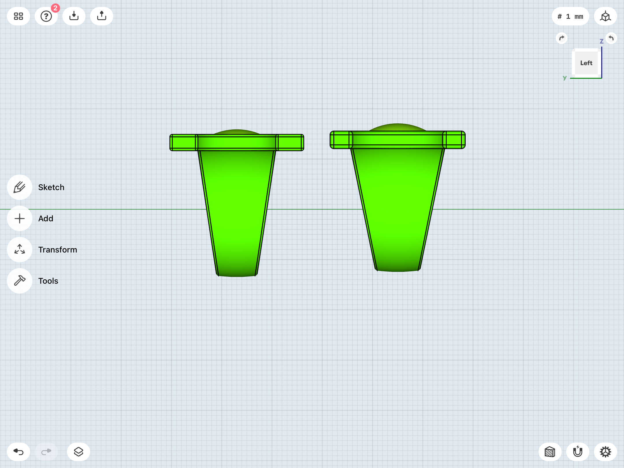
And I’ve again been thinking about the proportions of the V2. By the nature of the official GL symbol used for licensing, with its thin and long sidebars, the symbol does not look as chunky on the band as it should (per the art of Joe Staton, among others, who drew the symbol with thick sidebars, giving it a more vertical and less squat look), and the band has to be rather wide at the top to avoid those unsightly gaps between the band and sidebars in top view.
As has been noted, it seems like most artists were looking at the version of the symbol drawn by Kane as a graphic element in some 1960s stories, which also became the basis for the alternate licensing symbol used in the 80s and 90s. That version is more compact, yet allows for better proportions in terms of matching Staton’s art.
So, again, the question becomes—should this project adhere to the standard GL licensing symbol across all rings which use it, or go more historically-accurate, with the earlier Kane/alternate symbol? I’ve kept the symbol consistent, but mixing and matching is tempting, in this instance.
Standard licensing symbol on left, alternate symbol (with modified/larger gem) on right. As you can see, the new version provides a sleeker look, but maintains the same length for the symbol.
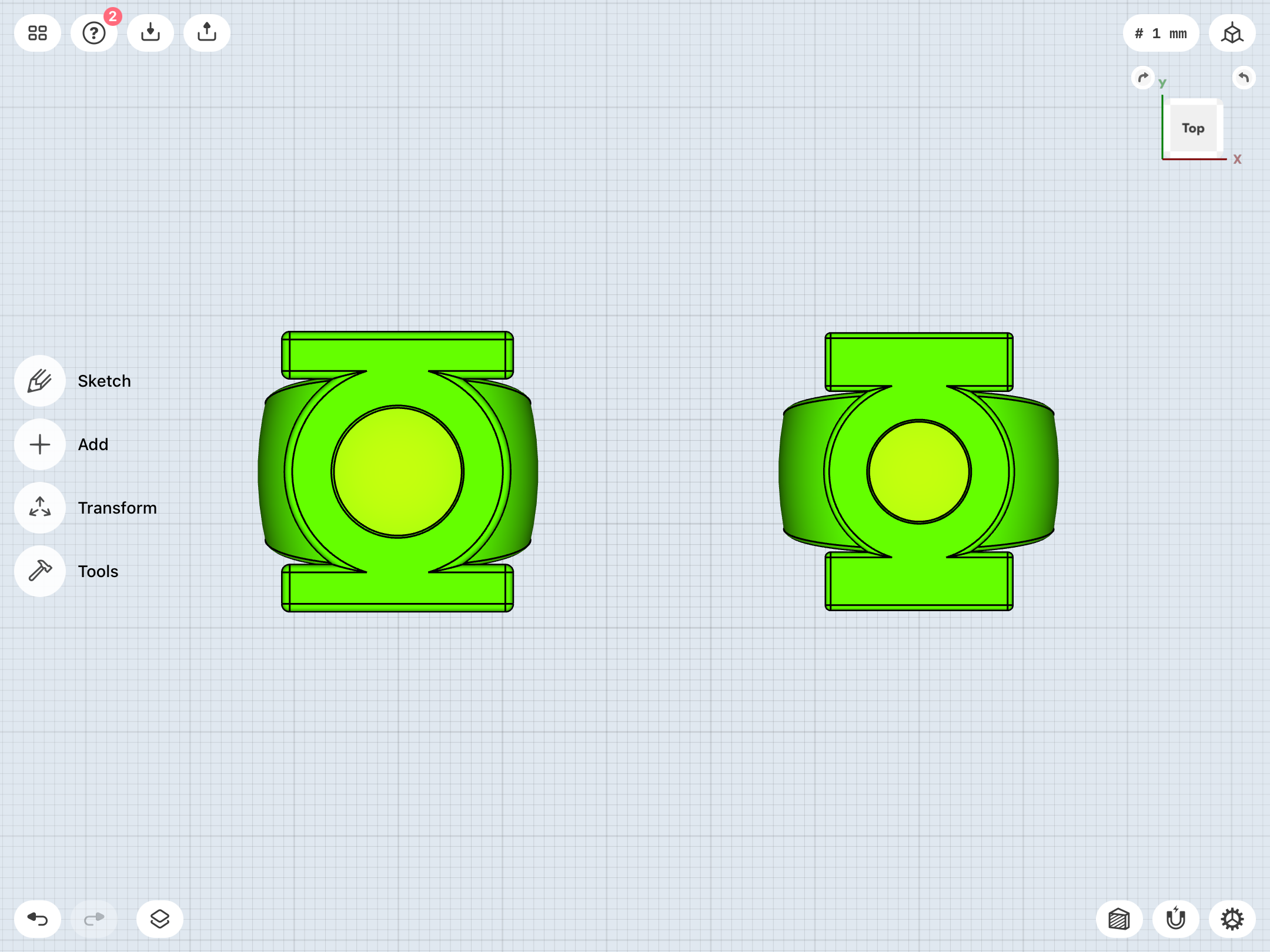
Coming back ‘round to my old nemesis, the EMERALD DAWN. Been rethinking the shapes, and have come up with something a bit simpler and sleeker. Although I find myself wondering if the band isn’t a little too flat and not organic/rounded enough. But I’m much happier with the blending of the band and the disc, with this iteration.
That all being said, this shape actually looks like a very good match for the Gardner.
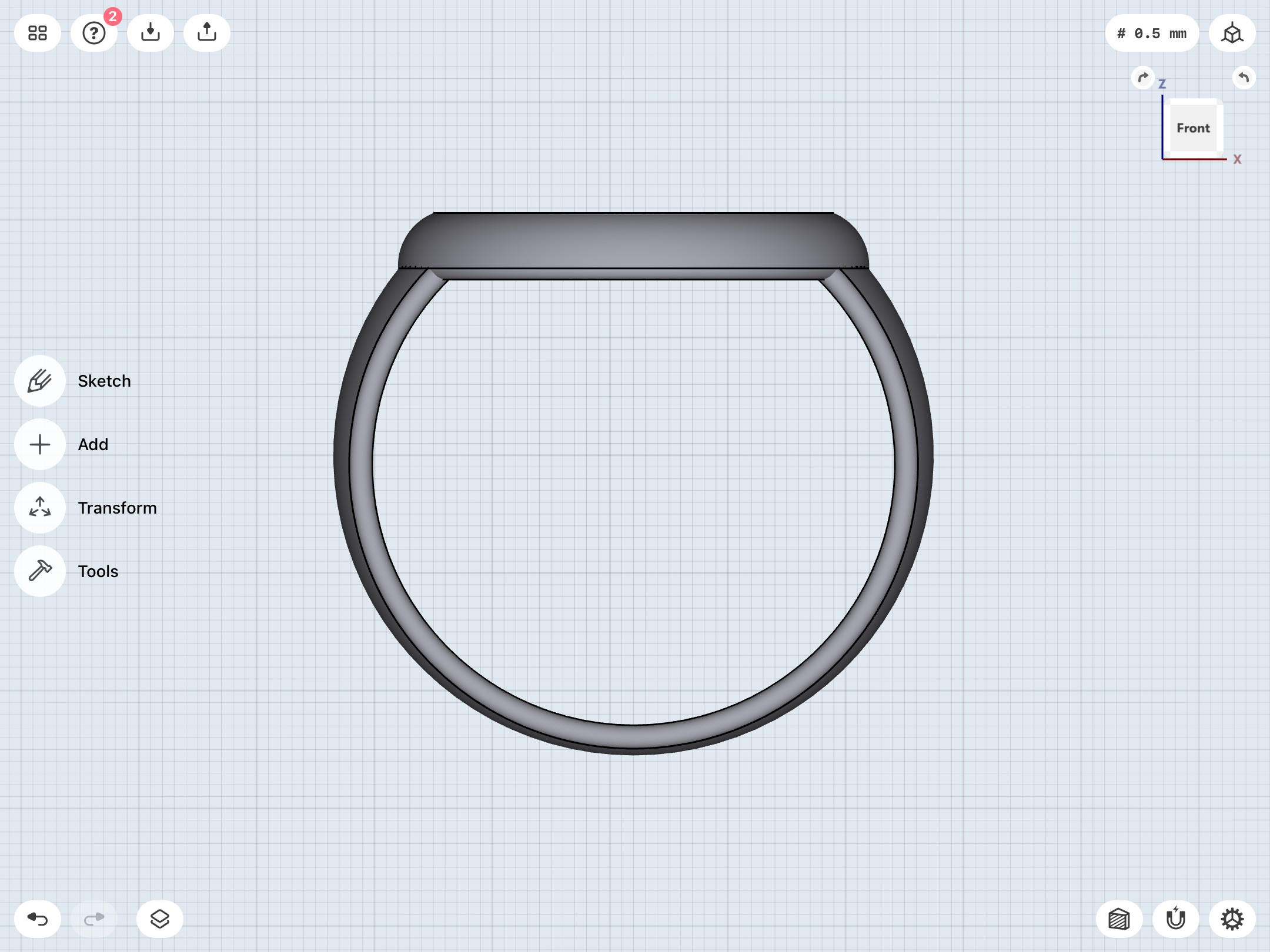

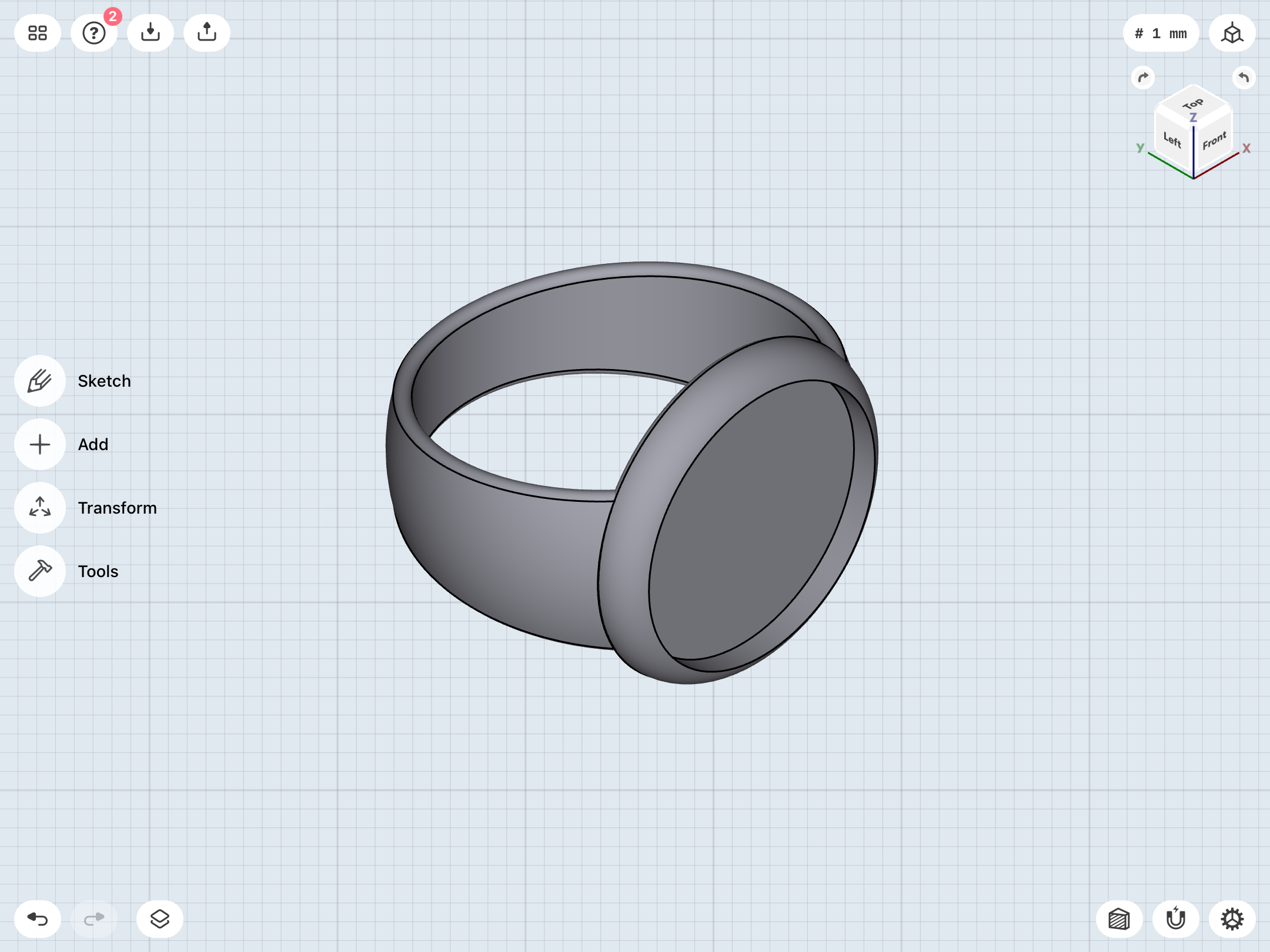

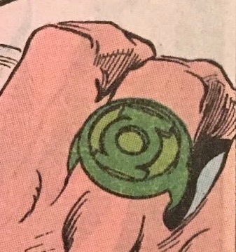
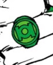

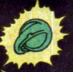
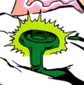
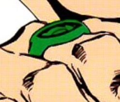
That all being said, this shape actually looks like a very good match for the Gardner.
More tweaks and tinkering to increase the disc sizes and improve the shapes. As previously noted, the disc sizes varied quite a bit during this era, particularly on the Gardner ring. With the EMERALD DAWN, I find 22-23mm to look just about right, and am keeping the Gardner in that same ballpark, because A) I prefer the larger disc; B) I’m still running with the idea of the two designs being essentially the same, given that Sinestro’s ring was supposed to be a bootleg, yellow copy of the Green Lantern Corps rings. It just so happens (intentionally or not) that Bright and Staton drew them with very similar design elements (round-lipped disc, tapered band), aside from the Gardner’s gem, raised gem bezel, and different symbol.
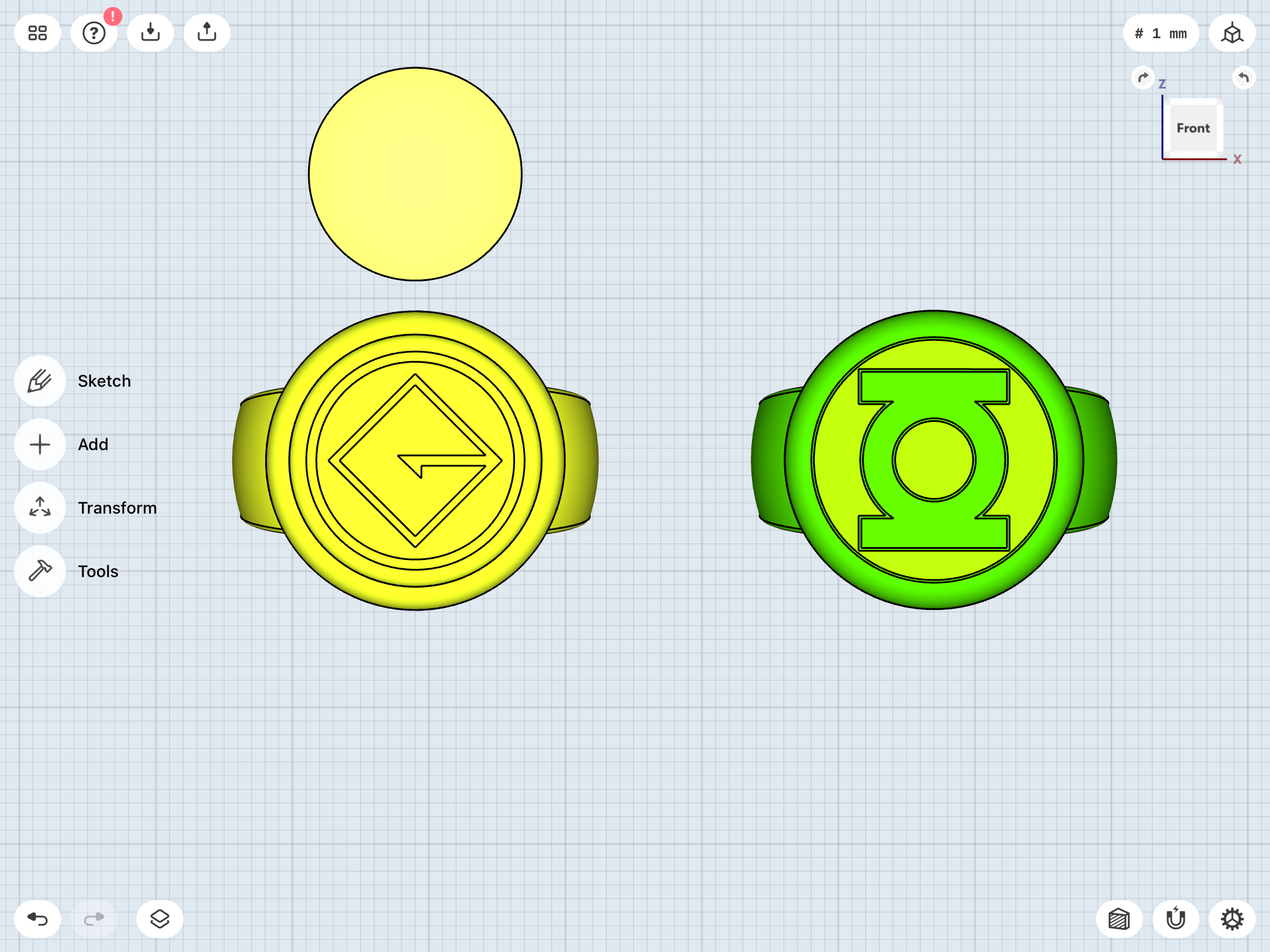

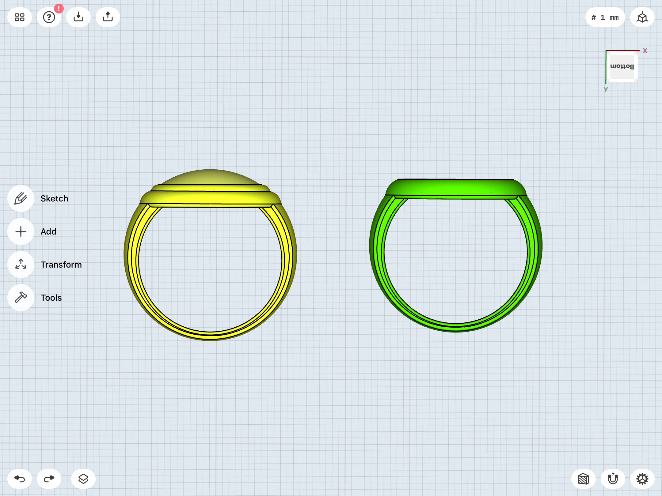
Perfect
We’ll see!
I think it’s become clear that I’m not in a hurry with this. I don’t want to proceed to the next stage until I’m properly satisfied with the designs, and the printed prototypes look and feel just right.
Just updating my loyal readers—
I’ve been taking a break, since A) I find easing off and taking time to think about new ideas and fresh approaches to modeling is helpful; B) I’ve been VERY busy, since the rest of the world can’t be bothered to, y’know, WORK, as well as dealing with an imminent death in the family.
Rest assured that the project continues. I’m currently doing some palate-cleansing by reading some Superman and Batman comic runs. When that is completed, I’ll finally dive into the Geoff Johns era of Green Lantern.
I do feel it’s a good idea to actually read all of that material before locking anything down, since it may influence my designs from that era, as opposed to the quick-and-dirty skimming for ring reference panels I’ve been doing, ‘till now.
Found some time to work on the Van Sciver REBIRTH ring. Implemented a few ideas I’ve been toying with, such as larger chamfers for the edges of the finger-hole (0.75mm instead of my usual 0.50, which makes me think that I should make sure that all chamfering/filleting on all ring designs is consistent), a slightly more inset resin disc for the GL symbol’s negative space, and a slightly shorter disc.
Getting the disc-height right on the signet-type designs has been tricky, due to all of that pesky artistic variation. Van Sciver’s art has a wide range, going from thick to relatively thin discs. I’ve decided to stick more with the close-up panels of the ring as my guide, which seem more properly proportioned and less chunky.
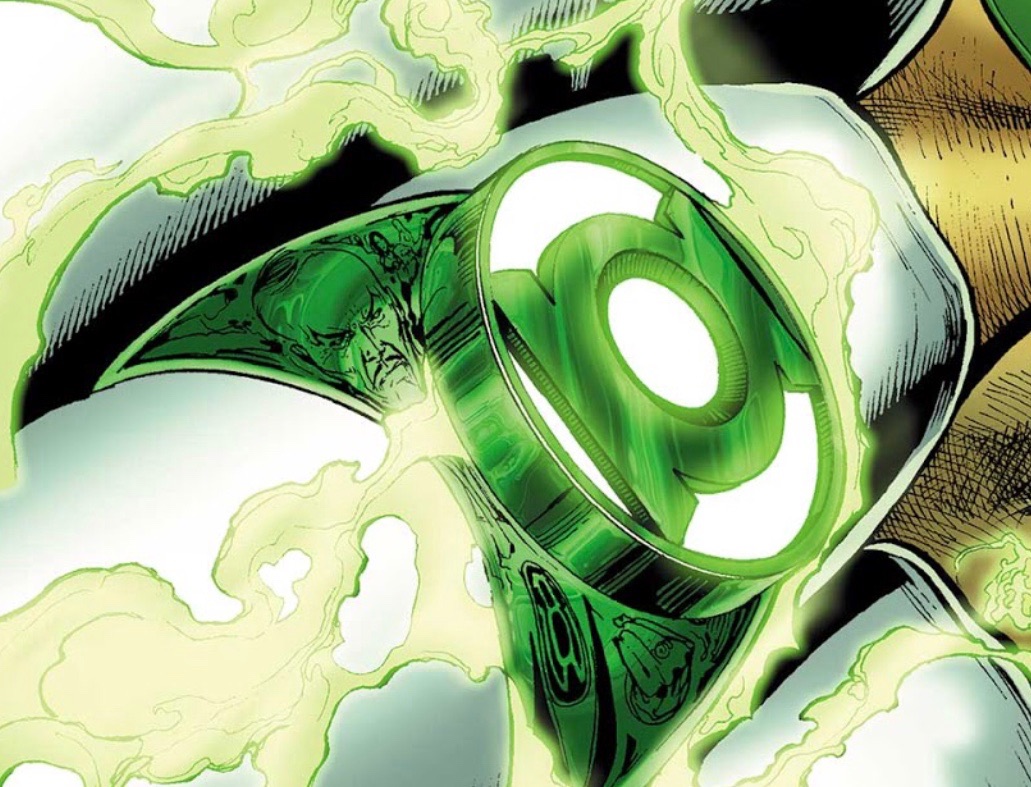
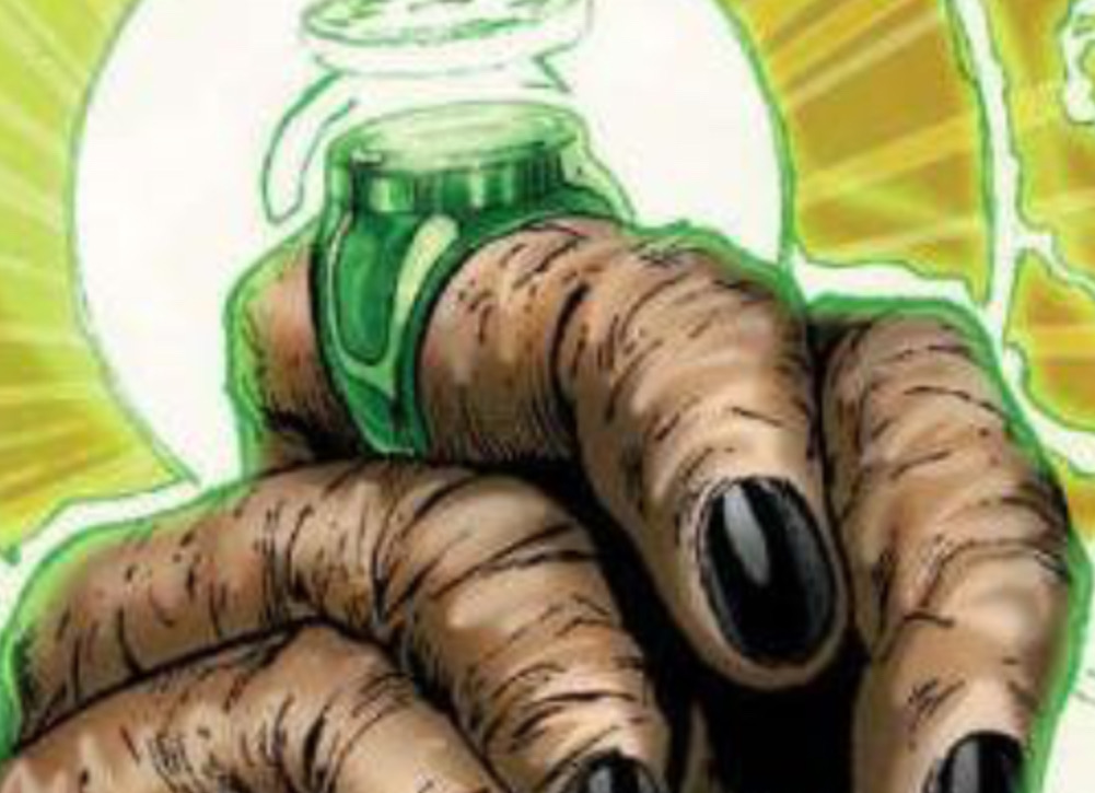

This current iteration seems properly sleek and elegant without being too dainty. The previous iteration that I was toying with (and didn’t show, here) was a bit TOO sleek, and therefore dainty.

Getting the disc-height right on the signet-type designs has been tricky, due to all of that pesky artistic variation. Van Sciver’s art has a wide range, going from thick to relatively thin discs. I’ve decided to stick more with the close-up panels of the ring as my guide, which seem more properly proportioned and less chunky.
This current iteration seems properly sleek and elegant without being too dainty. The previous iteration that I was toying with (and didn’t show, here) was a bit TOO sleek, and therefore dainty.
Last edited:
ExtremeSail
New Member
If you weren't already planning on reading it, the concurrent Green Lantern Corps run was really good.When that is completed, I’ll finally dive into the Geoff Johns era of Green Lantern.
If you weren't already planning on reading it, the concurrent Green Lantern Corps run was really good.
Yes, I picked up ALL of the trade paperbacks from that era, minus the non-GL BLACKEST NIGHT and BRIGHTEST DAY tie-ins (Superman, Batman, JLA, etc,). So, GLC is also in the “to read” pile.
