You are using an out of date browser. It may not display this or other websites correctly.
You should upgrade or use an alternative browser.
You should upgrade or use an alternative browser.
Defined Green Lantern Comic Rings
- Thread starter Gregatron
- Start date
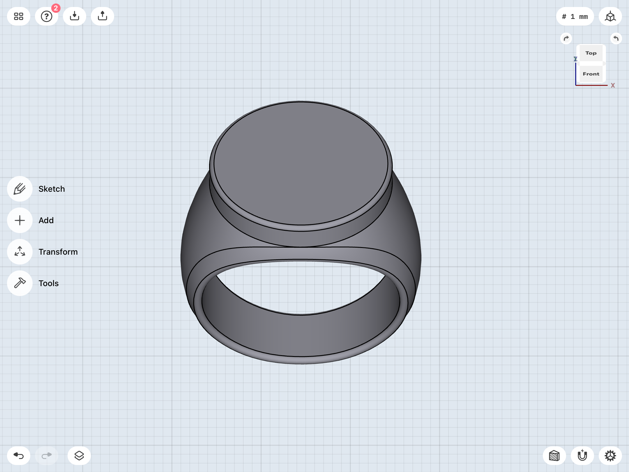
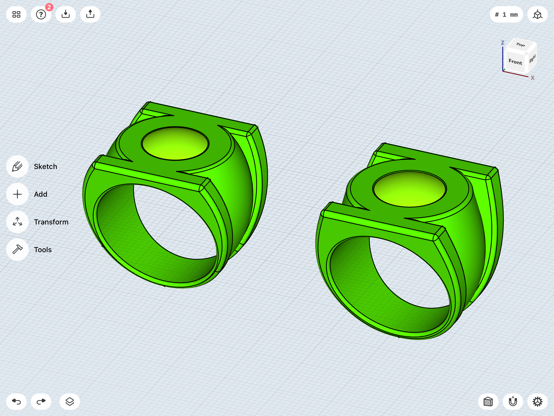
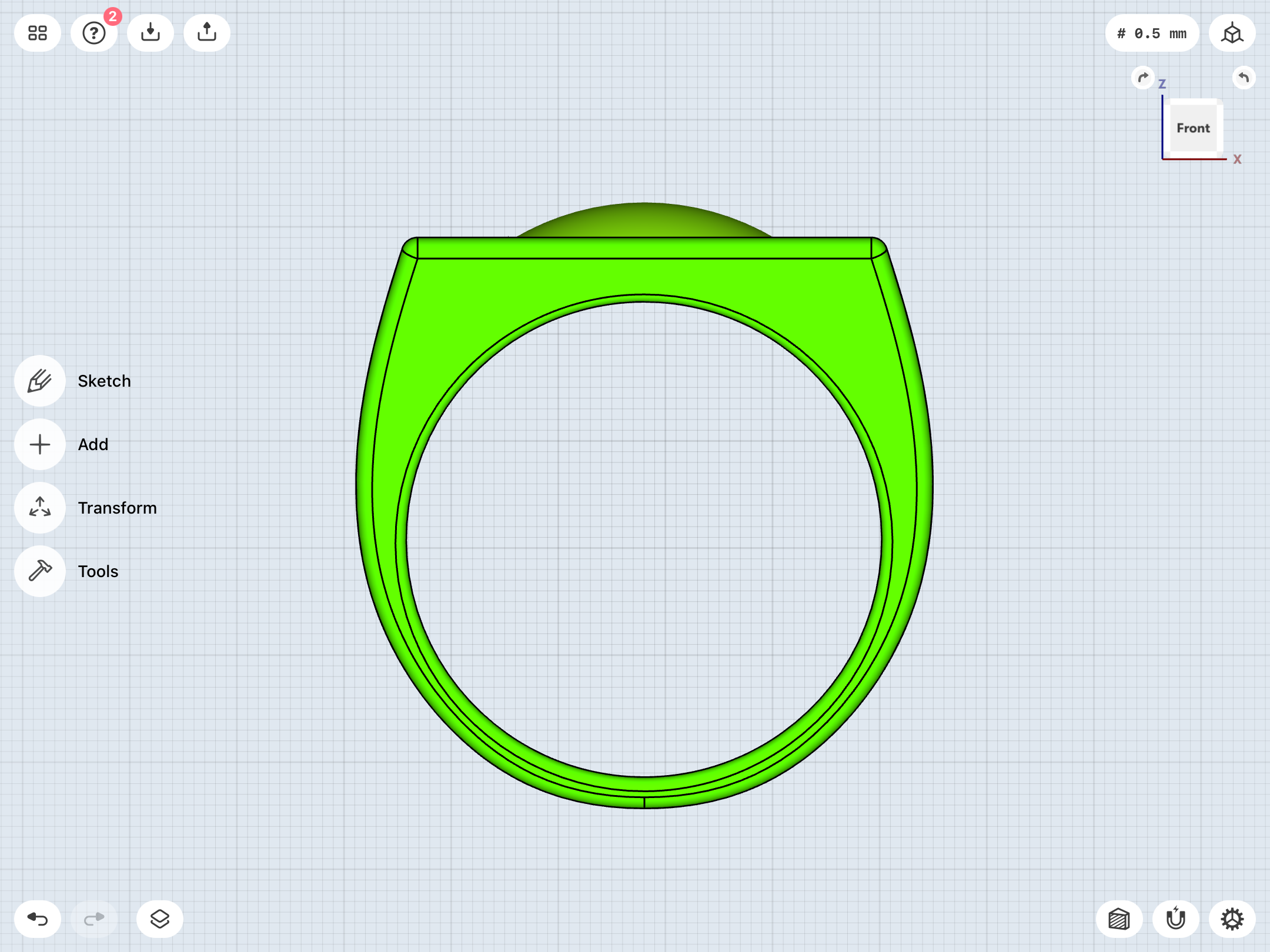
Experimenting with using the “fillet” function to add curvature to the leading edges of the band before chamfering the edges of the finger-hole, resulting in a rounder and more organic band shape, with much more of a “V” profile (with straighter, more diagonal edges, rather than arcs), which seems to better match both the reference art and the BLACKEST NIGHT promo rings.
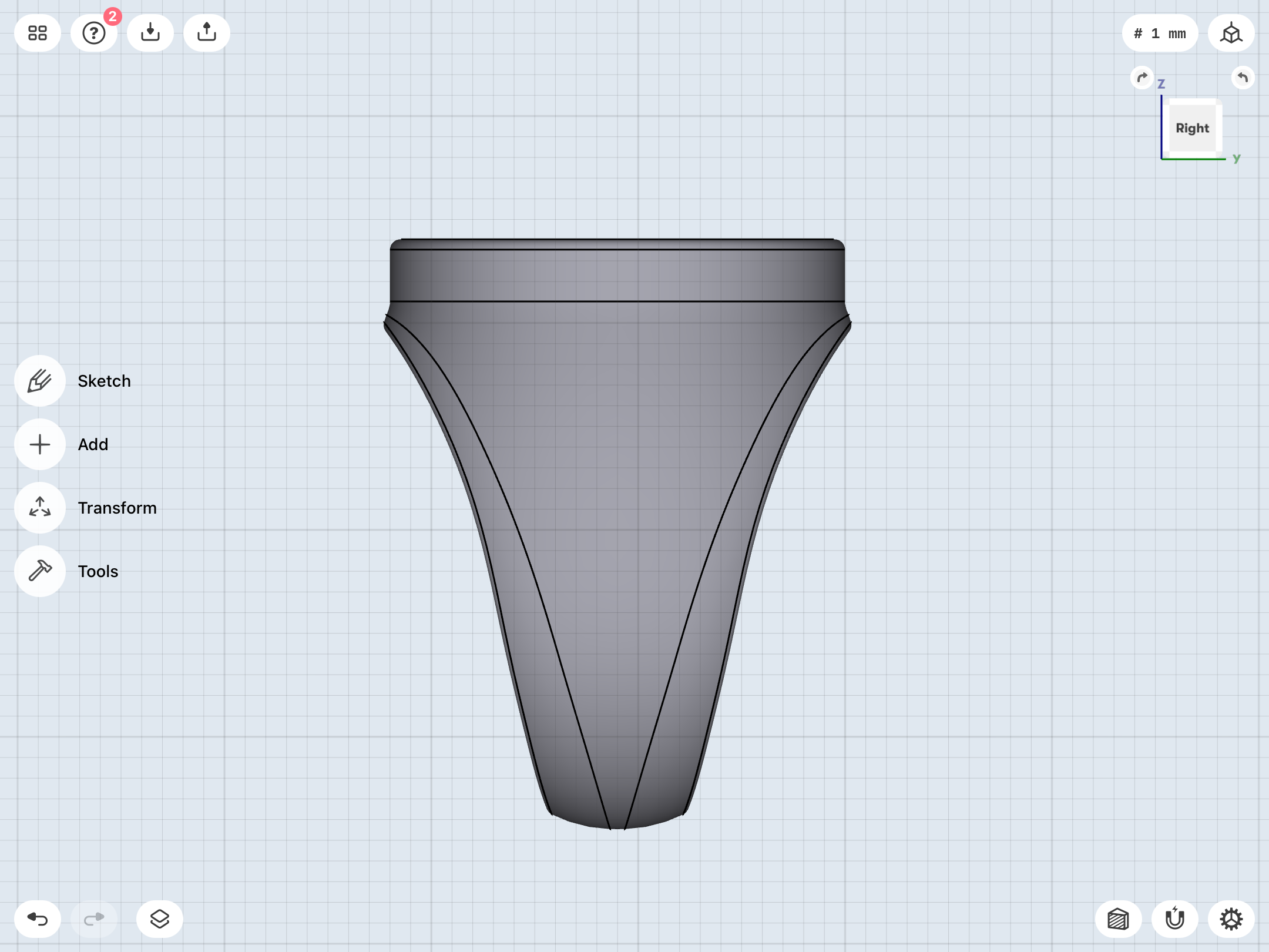
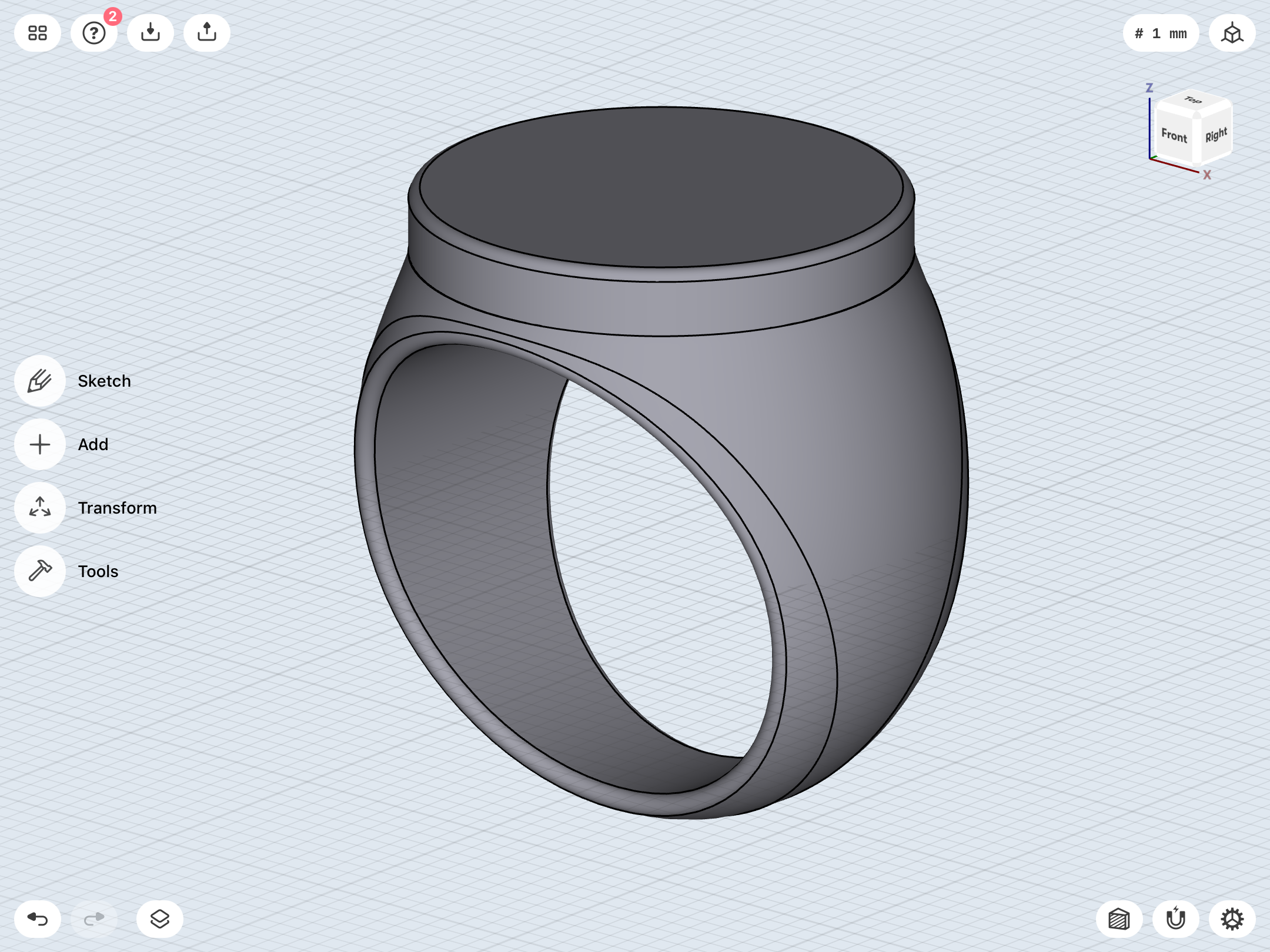
More tweaks. Chamfering the sides of the band before adding the finger-hole really helps the band’s profile with that fairly straight-sided “V” which flares out at the top into in platform for the disc. The edges are straighter and have less of an arc than the older model on the right in the image below.
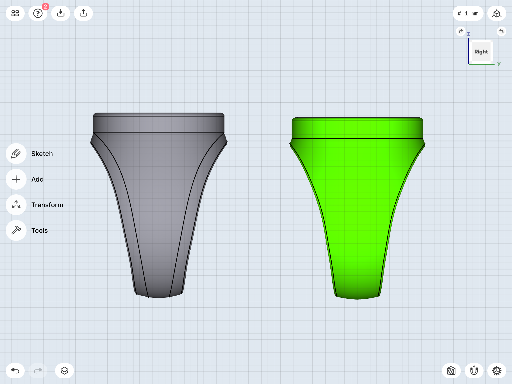
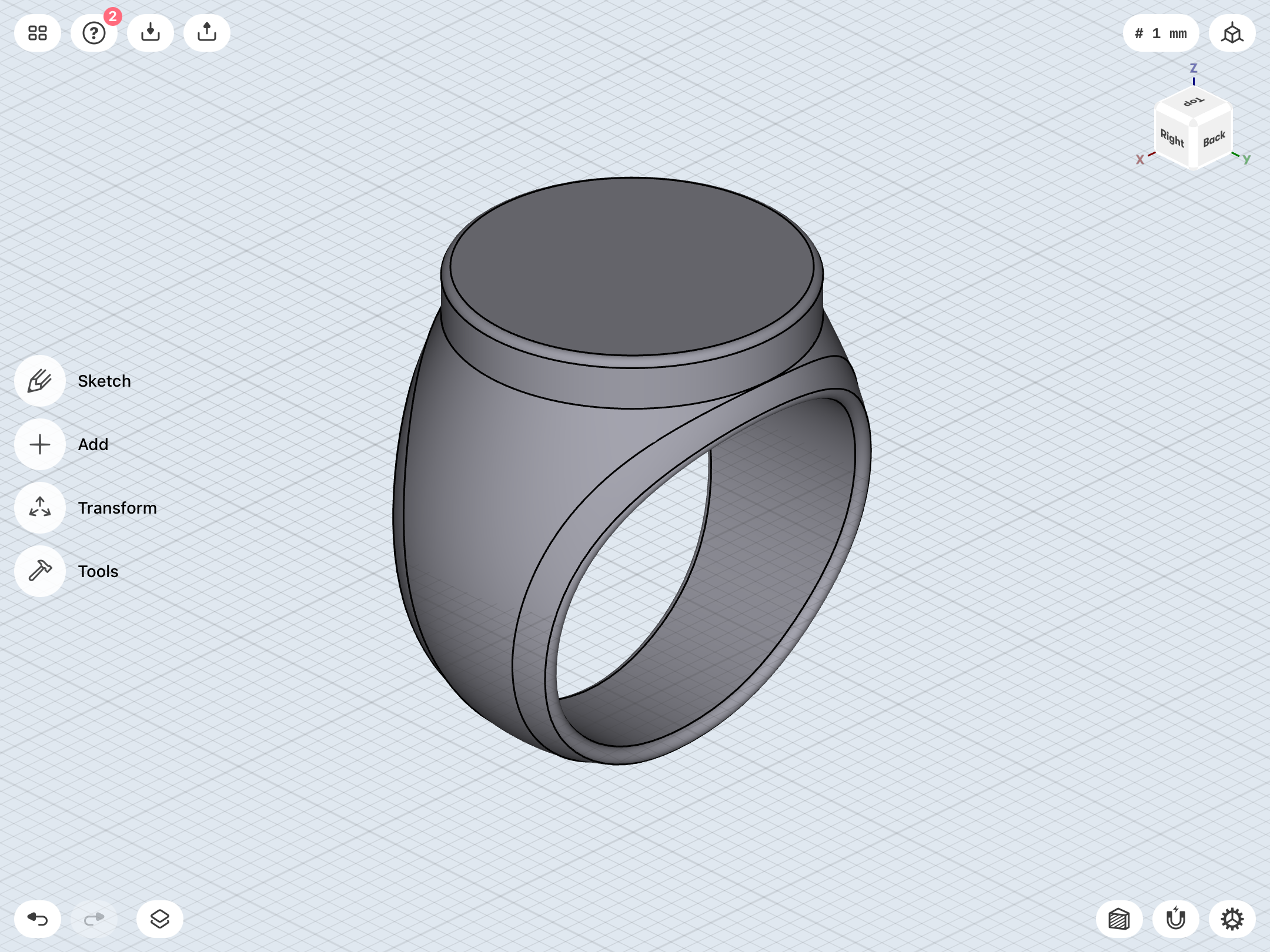
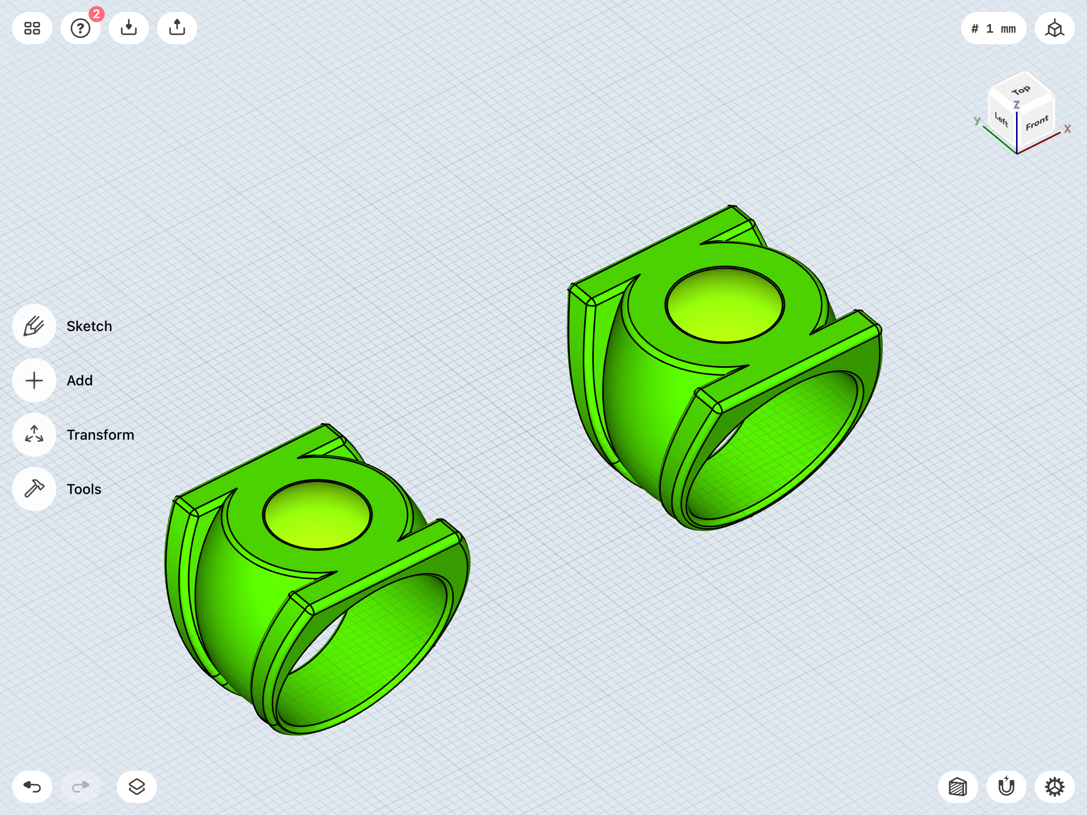
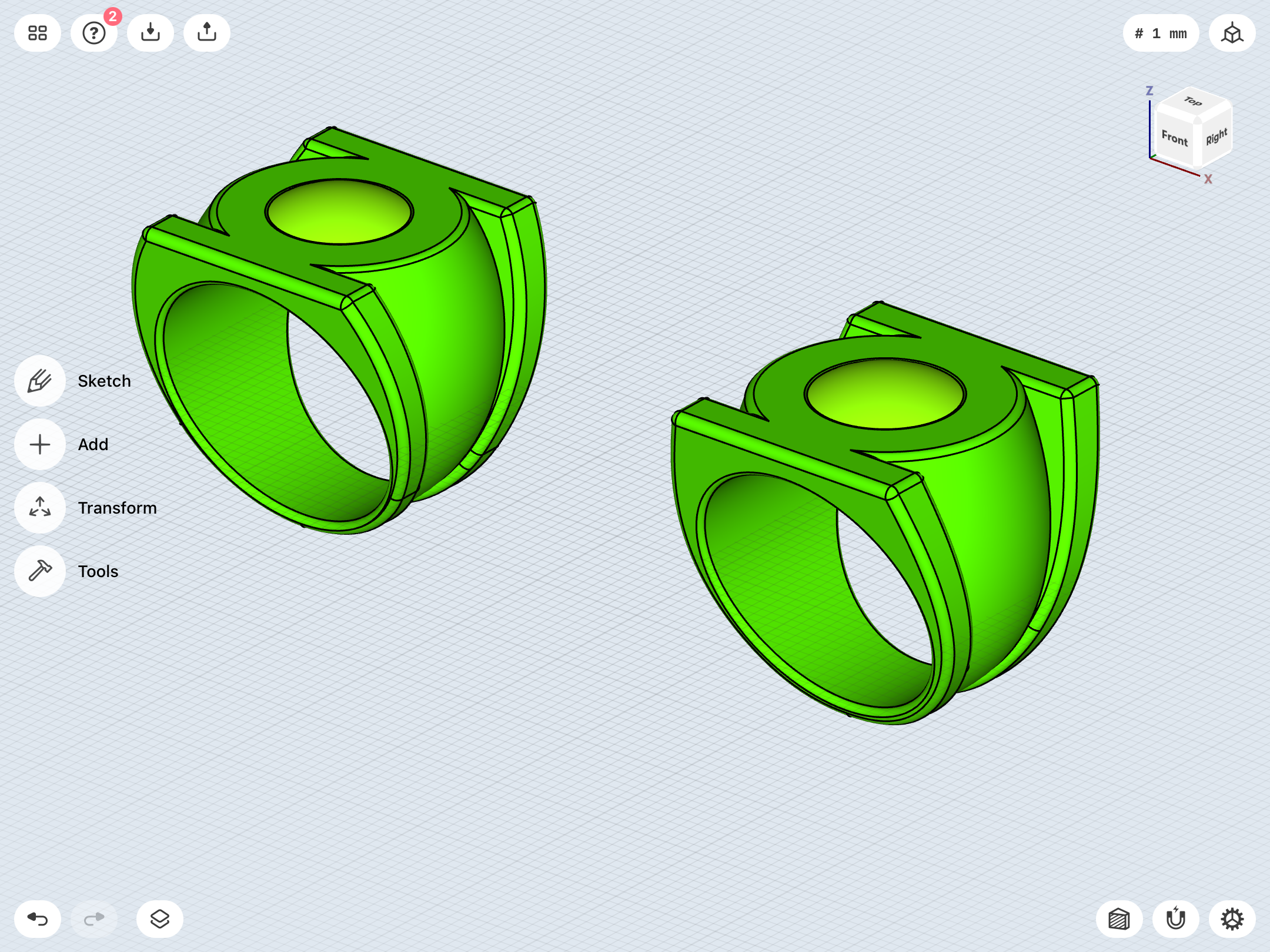
Back to the V3. Thanks to using splines, I’ve been rebuilding the ring from the ground up, improving the shape, size, and proportions. The previous iteration (left) was a little too bulbous and top-heavy, and also wasn’t quite tall enough, with not enough material between the finger-hole and the face/top of the ring.
This new iteration (right) has a smoother shape, is 1mm or so taller, and about 3mm wider from top to bottom of the symbol/face (so that the symbol is bigger, but the overall ring is not too wide to fit comfortably), and about the same width as the previous version at the bottom of the band. So, the fit should be the same, but the symbol/face is a bit bigger and taller.
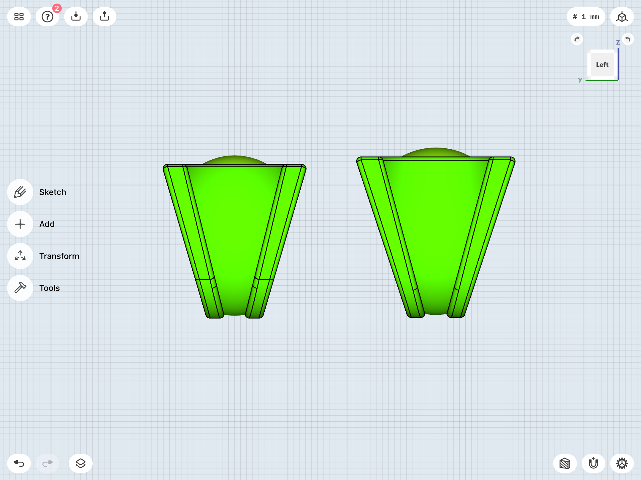
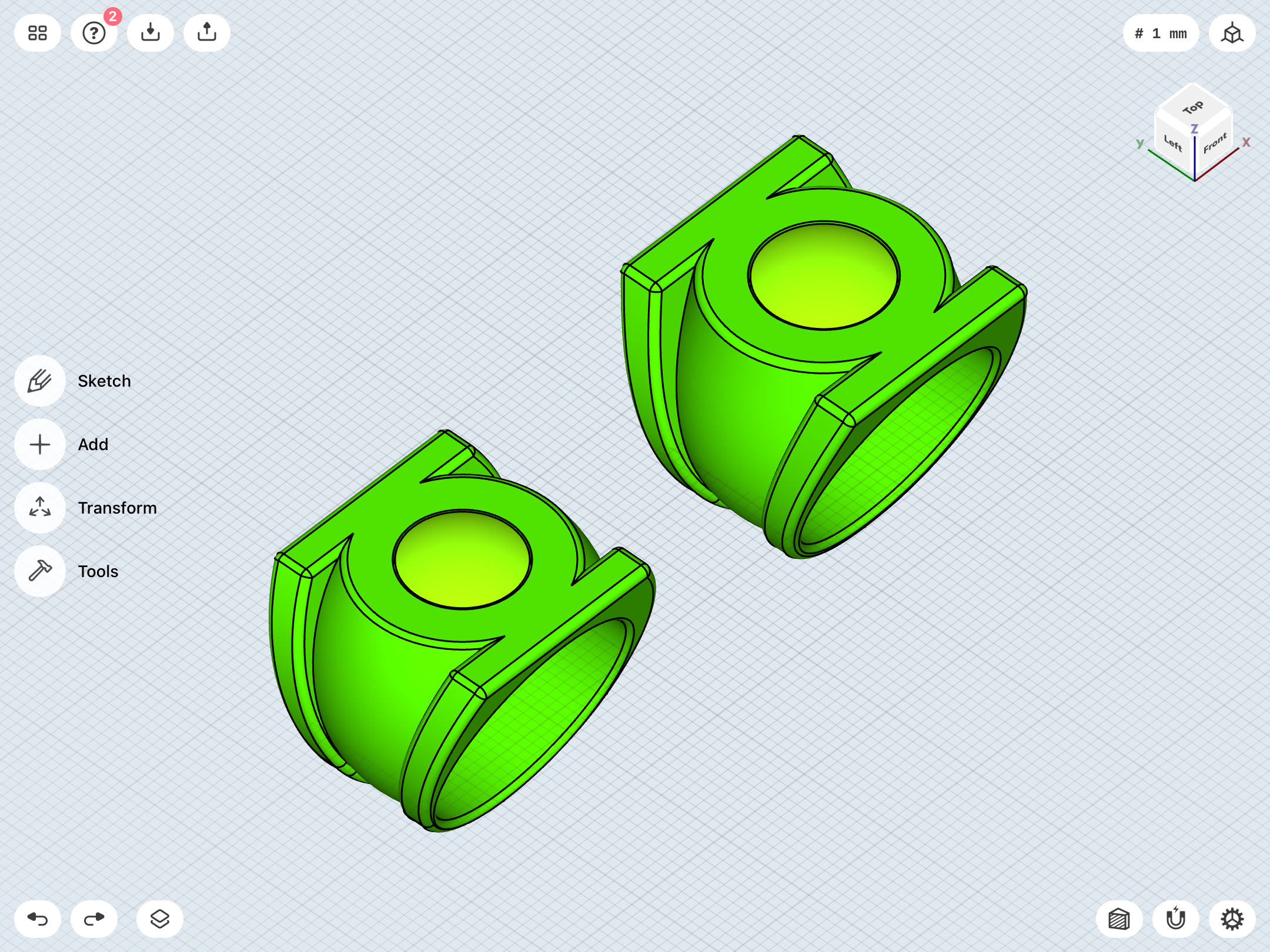
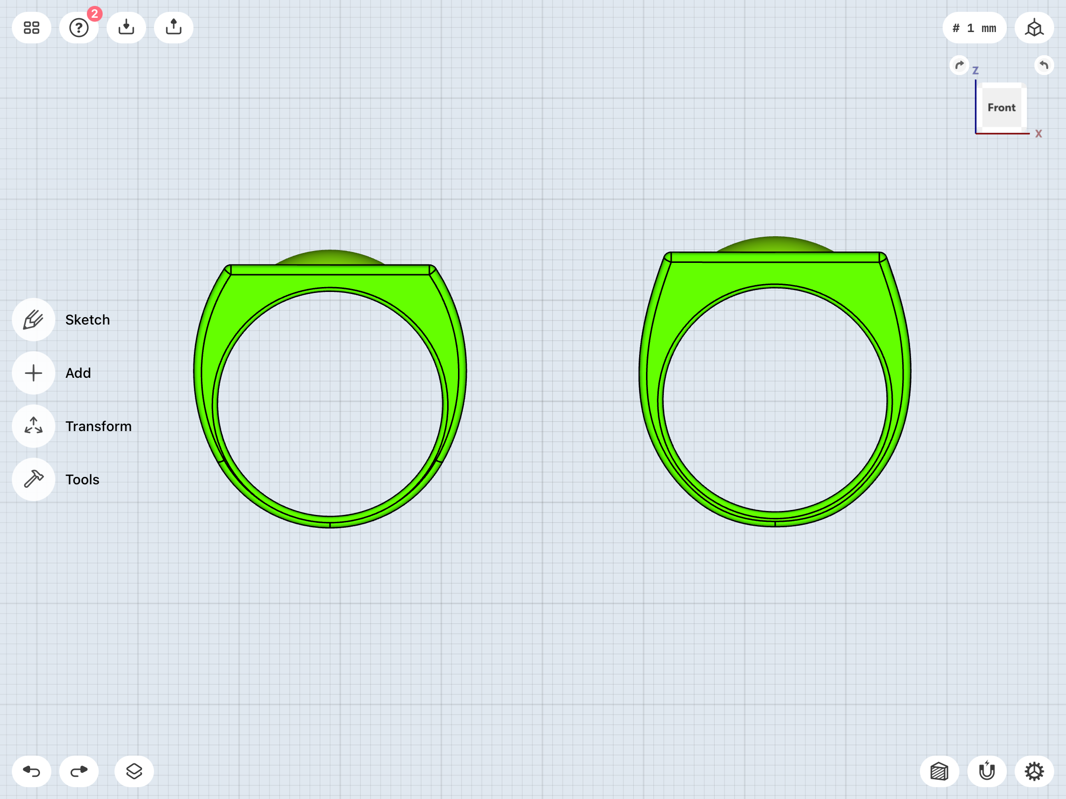
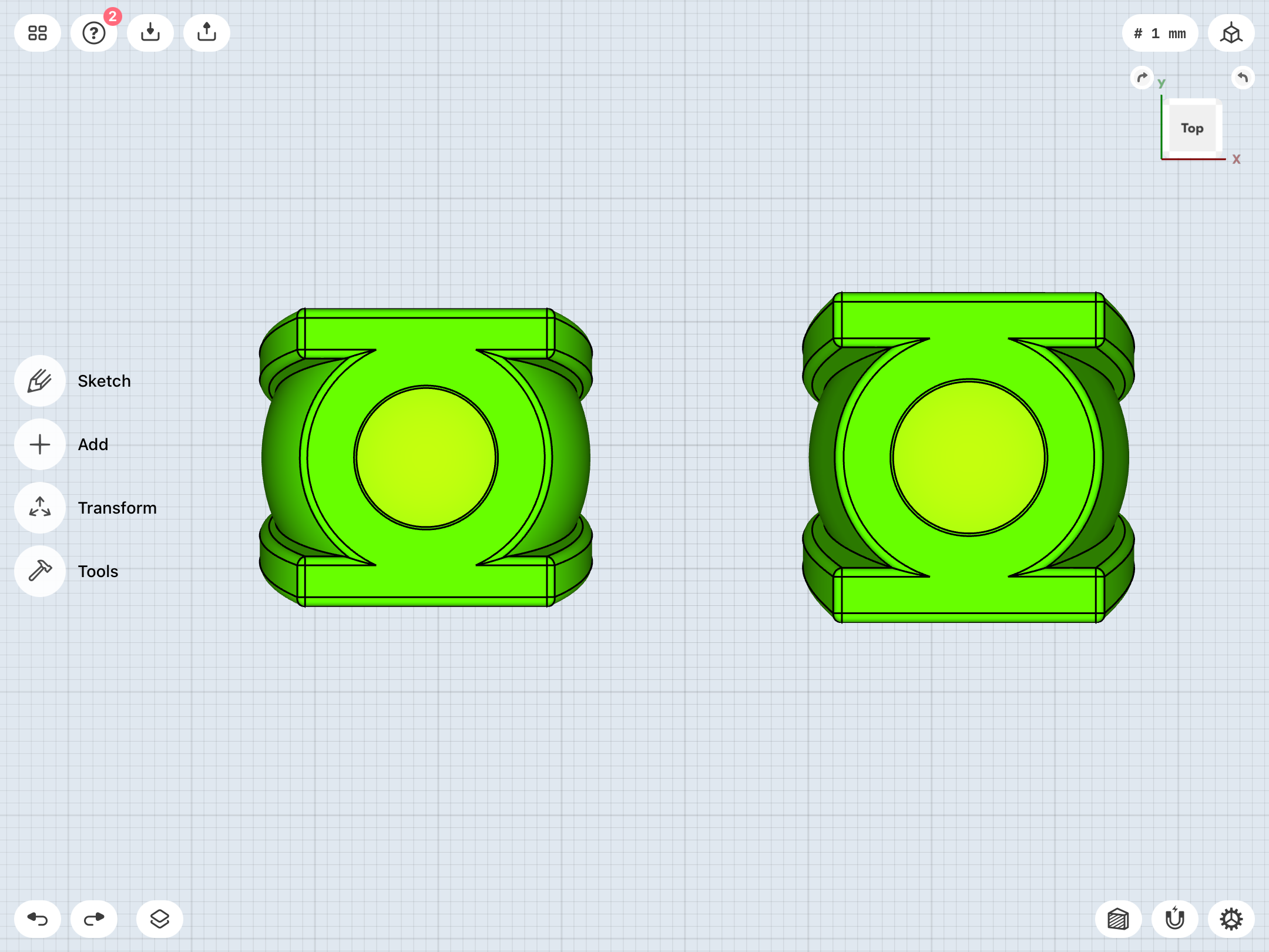
This new iteration (right) has a smoother shape, is 1mm or so taller, and about 3mm wider from top to bottom of the symbol/face (so that the symbol is bigger, but the overall ring is not too wide to fit comfortably), and about the same width as the previous version at the bottom of the band. So, the fit should be the same, but the symbol/face is a bit bigger and taller.
Last edited:
More subtle tweaks for accurate symbol proportions and whatnot.
Also, a detail I’d neglected to mention, until now: As previously noted, most artists tend to draw the V3 in such a way that the sides (in profile view) are at right angles to the face of the ring. Straight sides, in other words.
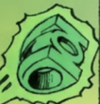
Here’s a quick and dirty mockup:
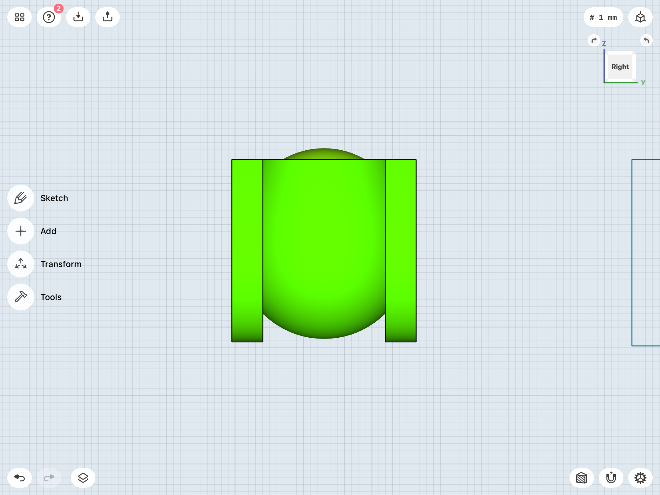
In 3D reality, however, that’s really not practical or comfortable, since the bottom of the band needs to be fairly narrow (my own max comfort width is about 10mm). So, licensed versions of this design—as well as my own—cheat things a bit by adding that “V” profile taper to the ring, just as I’ve done.
However, after the initial Mike Grell run which introduced the design, Alex Saviuk put his own unique spin on it. Rather than a straight-line, diagonal taper, he used arcs for the lower band (allowing for that narrow bottom shank) which then flared out into straight lines:
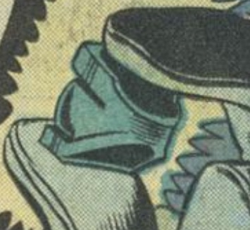
It’s a unique take on the design, although I won’t be replicating it.
Also, a detail I’d neglected to mention, until now: As previously noted, most artists tend to draw the V3 in such a way that the sides (in profile view) are at right angles to the face of the ring. Straight sides, in other words.
Here’s a quick and dirty mockup:
In 3D reality, however, that’s really not practical or comfortable, since the bottom of the band needs to be fairly narrow (my own max comfort width is about 10mm). So, licensed versions of this design—as well as my own—cheat things a bit by adding that “V” profile taper to the ring, just as I’ve done.
However, after the initial Mike Grell run which introduced the design, Alex Saviuk put his own unique spin on it. Rather than a straight-line, diagonal taper, he used arcs for the lower band (allowing for that narrow bottom shank) which then flared out into straight lines:
It’s a unique take on the design, although I won’t be replicating it.
Last edited:
So, as a result of the latest V3 changes, I jumped back to the V2 to rework it. Going with the art I’m using as reference, a goal of mine has been to either have the V2 symbol slightly bigger than the V3, or have them both the same size, but NOT have the V3 symbol bigger than the V2. The V2 has traditionally looked either as big or a bit chunkier than the V3.
My previous iteration of the V2 was headed toward the small side—about 24mm long for the symbol. However, these new V3 changes have now prompted me to again embiggen the V2.
As it now stands, the symbols and gems of both the V2 and V3 are identical (about 27mm long), with only the bands differing. As I’ve previously noted, I rather like that consistency. Two different designs for Corps members of that era to choose from, but with the symbols and gems as the consistent element.
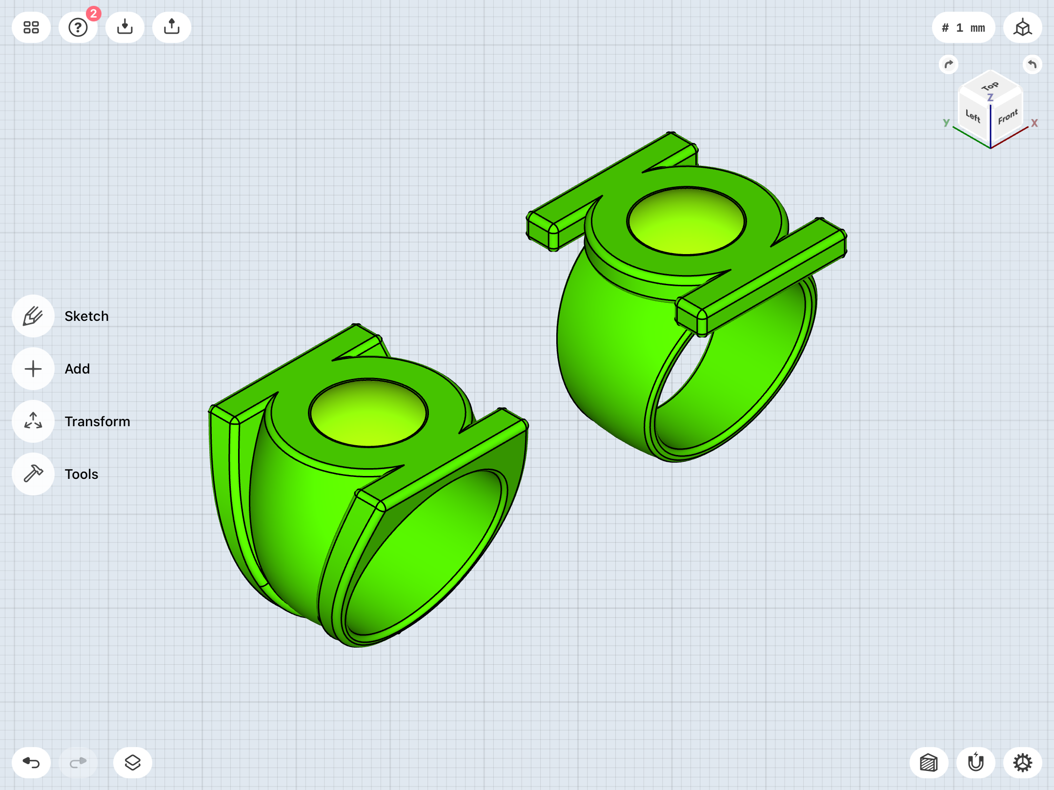
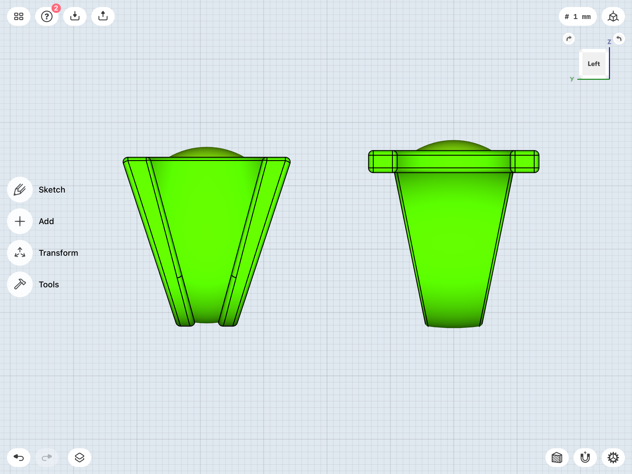
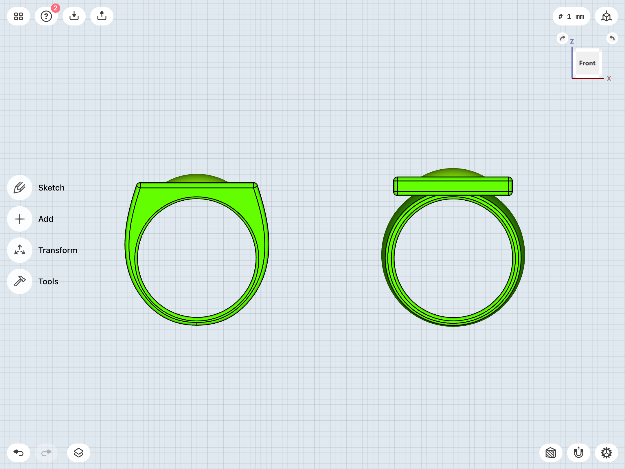
Last edited:
Went back to the original, Mike Grell version of the V3 and rebuilt it from the ground up, using the components of the current V3 model as a basis. As noted, months ago, this one’s a bit tricky. Hard to tell if the sidebars should wrap all the way around the bottom of the band or extend from the sides of the central sphere section. I went with the full-wrap, a la the regular V3.
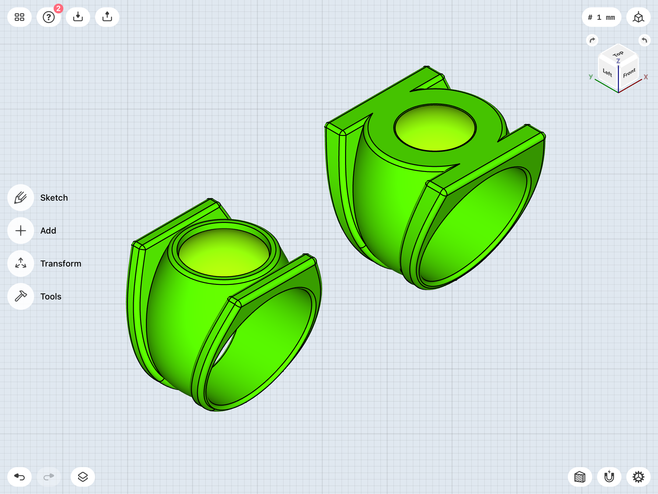
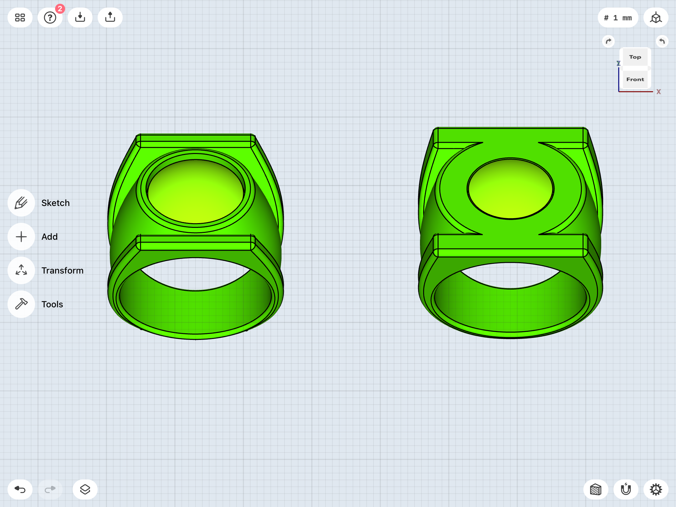
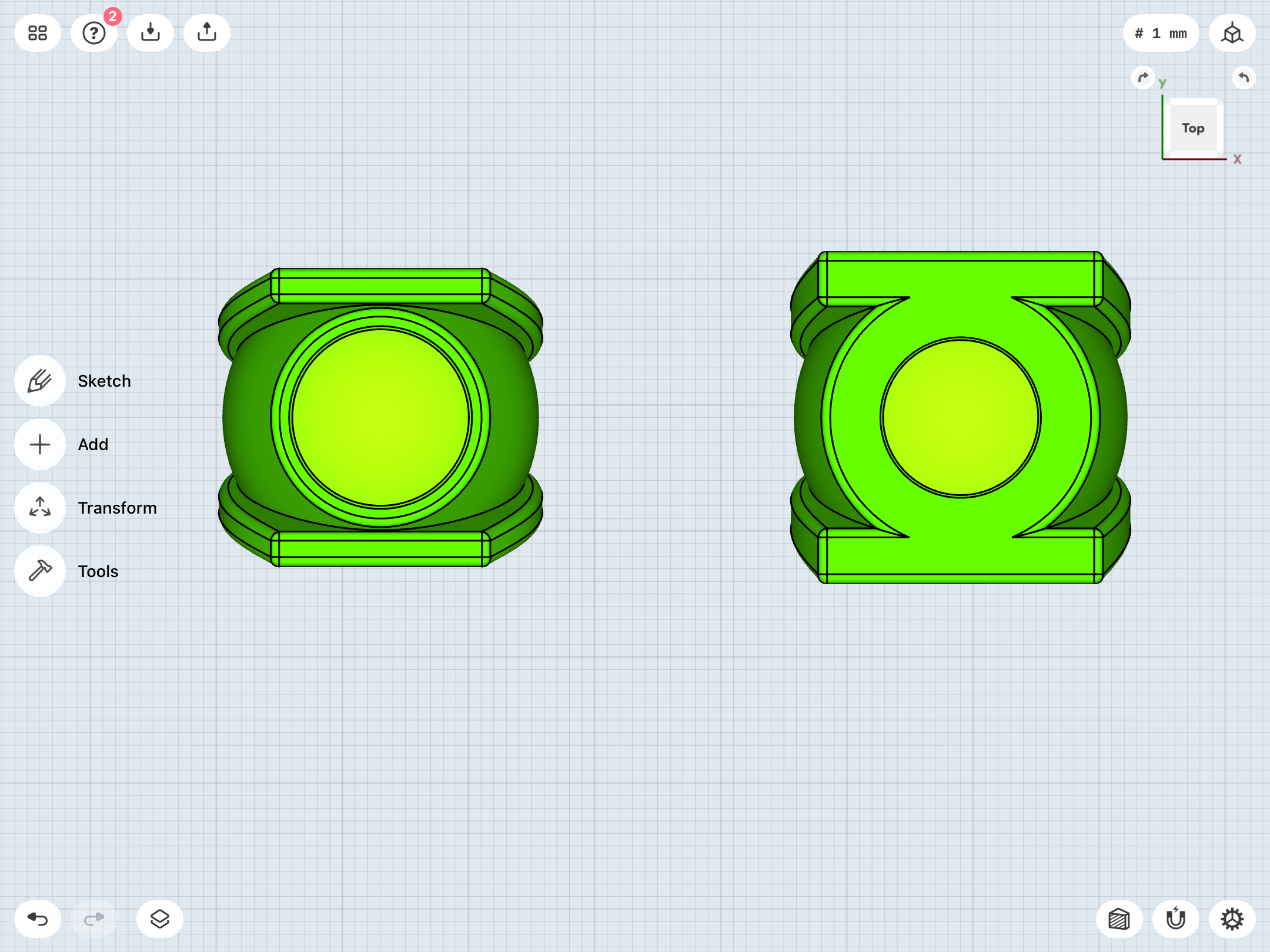
Last edited:
Continuing to tinker with the Grell. Sometimes he draws it with straight-sloping sidebars at the top (in front view), and sometimes with curving sidebars which match the curvature of the central section. I’ve tweaked the model to make the sidebars a bit rounder at the top.
Y’know, for a design which only appeared in five issues before it was revised into the V3 we all know, the early Grell design has really captured my attention, I must say.
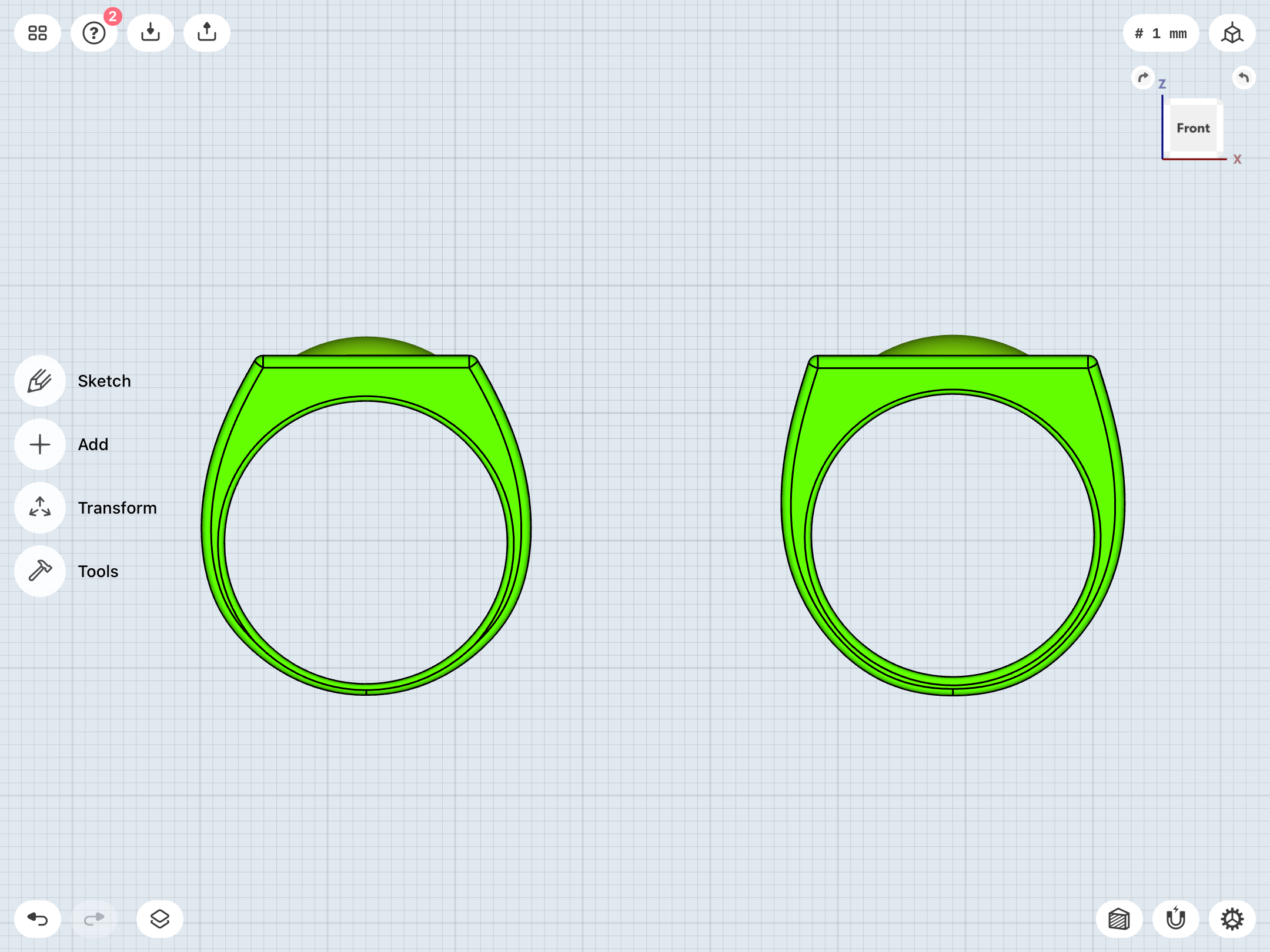
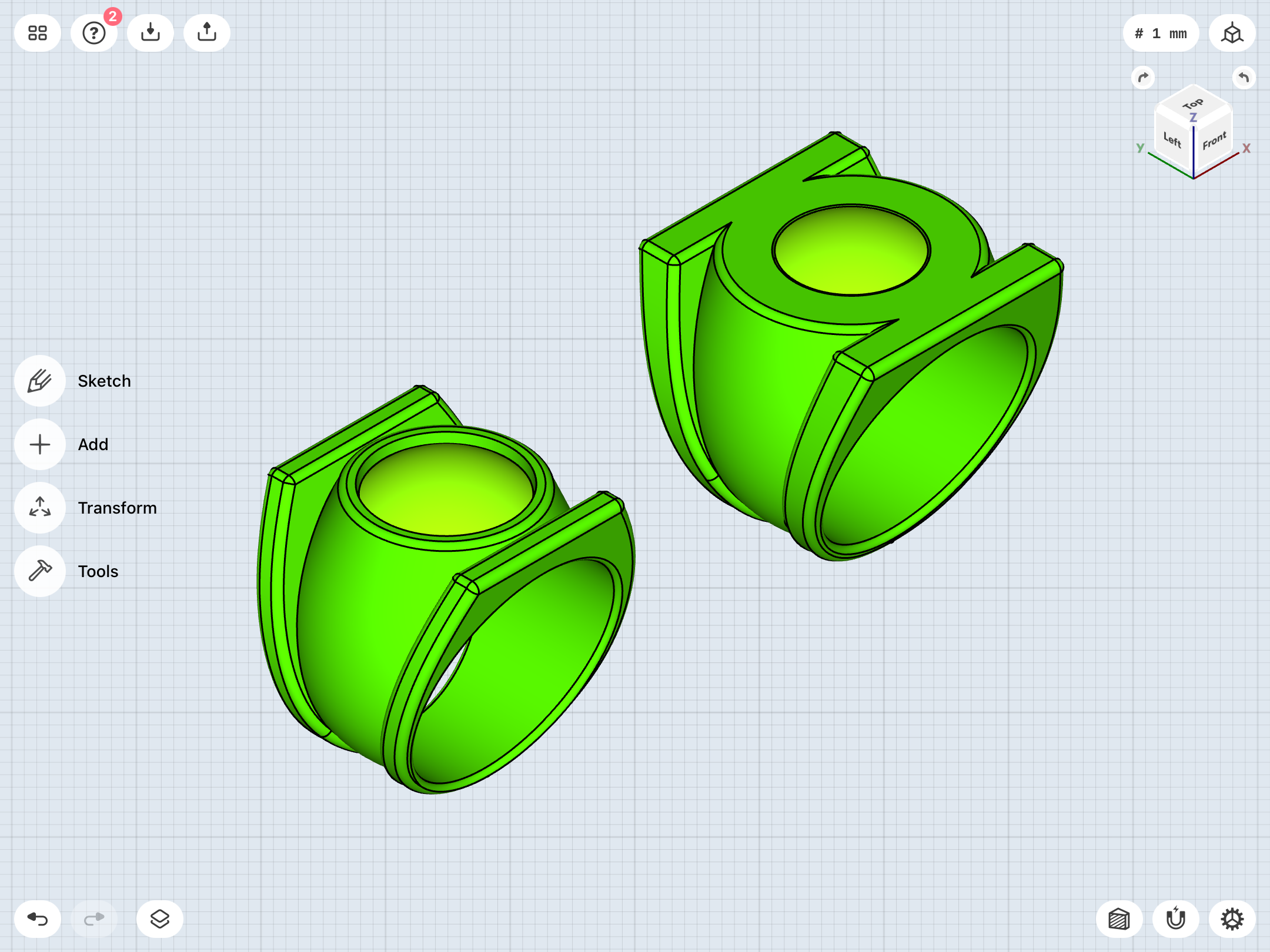
Y’know, for a design which only appeared in five issues before it was revised into the V3 we all know, the early Grell design has really captured my attention, I must say.
