You are using an out of date browser. It may not display this or other websites correctly.
You should upgrade or use an alternative browser.
You should upgrade or use an alternative browser.
Defined Green Lantern Comic Rings
- Thread starter Gregatron
- Start date
Shifting gears back to the straight-band V1. As noted, this earlier version (which still popped up often later on in Kane’s run) is a bit easier to deal with. Playing with different band widths and disc diameters, and I’m leaning more toward having the “U” band attached to the bottom of the disc, because having the disc sit on top of an “O” band looks a lot clunkier, with a very tall and slender profile and a huge undercut between the disc and band.
Still a lot of inconsistency in how the design was drawn. Sometimes the band flares slightly and blends into the sides of the disc, sometimes the disc clearly sits on top of the band, and sometimes it’s the “U” band mounted to the bottom of the disc.
Kane usually drew the ring with a smaller and more realistic symbol-disc in the first half of his run, before he began to get more cartoonish and experimental with his art (as well as inking his own pencils), with that HUGE disc.
Setting aside the constant design changes from early on as Kane slowly refined and simplified the GL symbol design, the basic look of this iteration is probably the most-seen, iconic version of the Silver Age GL ring. Yes, I’ve been fixated on the more complex and curvy band design from later in the run, but I really should give this one more attention. And, once I lock the designs down and get some prices on doing these in metal, I may well end up doing both the straight-band and curved-band, just to cover both bases. From a head-canon point of view, it could be said that Abin Sur’s ring was the straight band, while any or all of the replacements from GL # 37, # 44 (which was made from the remains of both Sur’s ring and the replacement from # 37), or # 68-69 had a slightly updated and more complex band design.
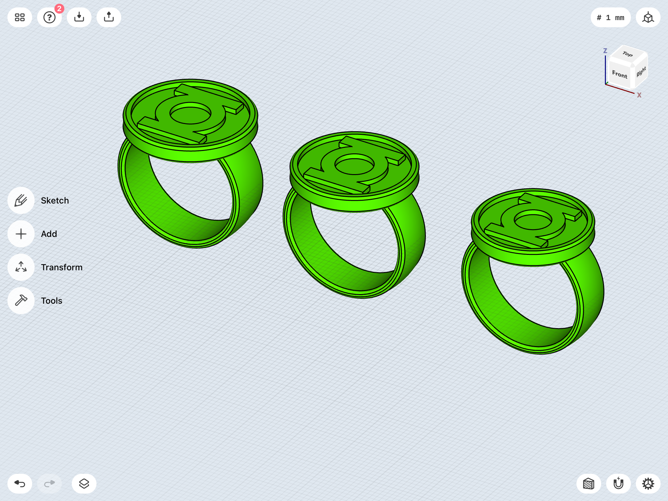
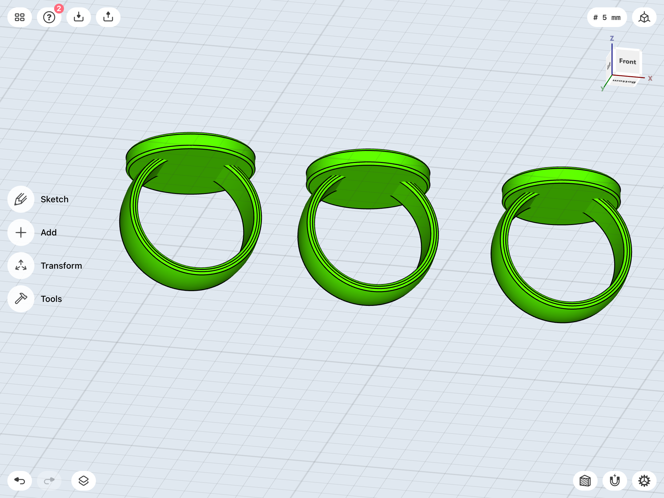
Continuing to slave away on the V1.
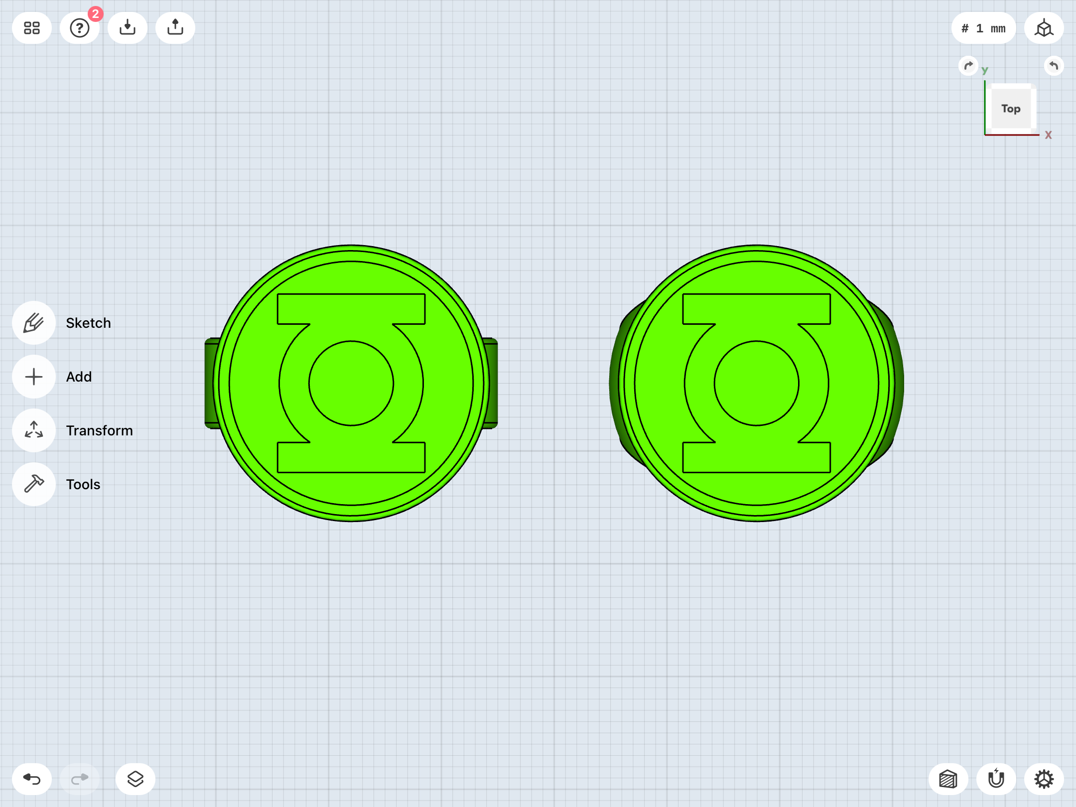
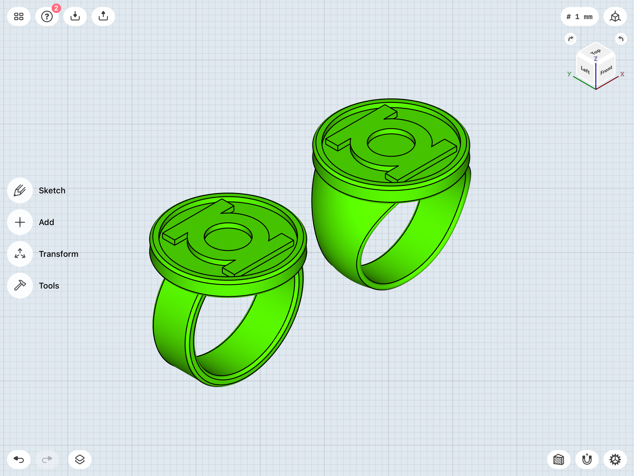
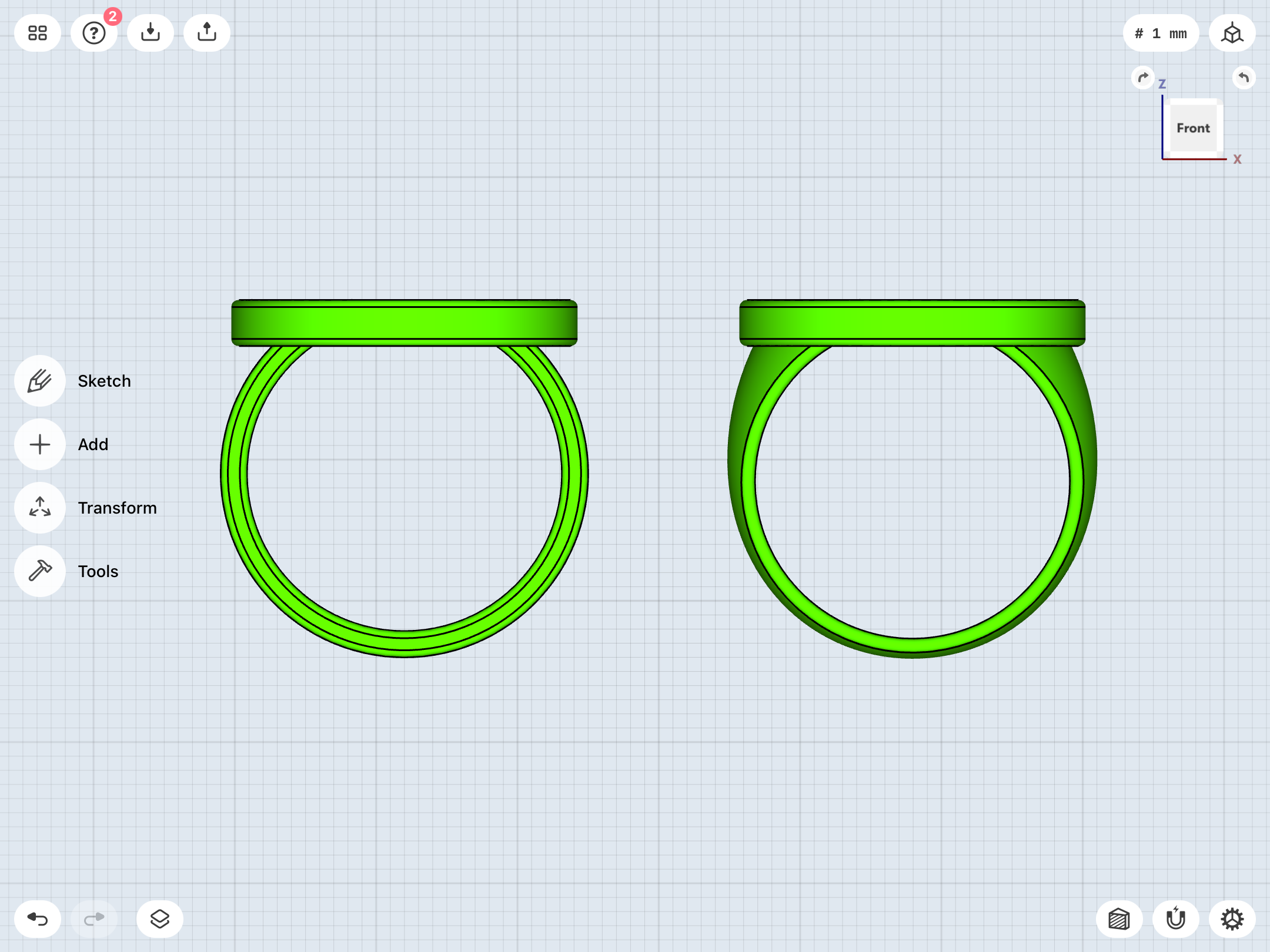
A concern of mine throughout many of these design iterations has been the height/thickness of the disc and just how tall it sits on the band. A low-profile disc just seems sleeker and more accurate to the look of the comics. However, literally sticking the disc on top of a ring inevitably raises it up as much as a few millimeters, giving it a tall, chunky look, as well as creating a very severe undercut between the disc and the band (and a very small point of attachment between the parts).
As noted, Kane’s artwork varied considerably. Sometimes the disc was clearly stuck on top of an “O” band, and sometimes a “U” band was attached to the bottom of the disc.
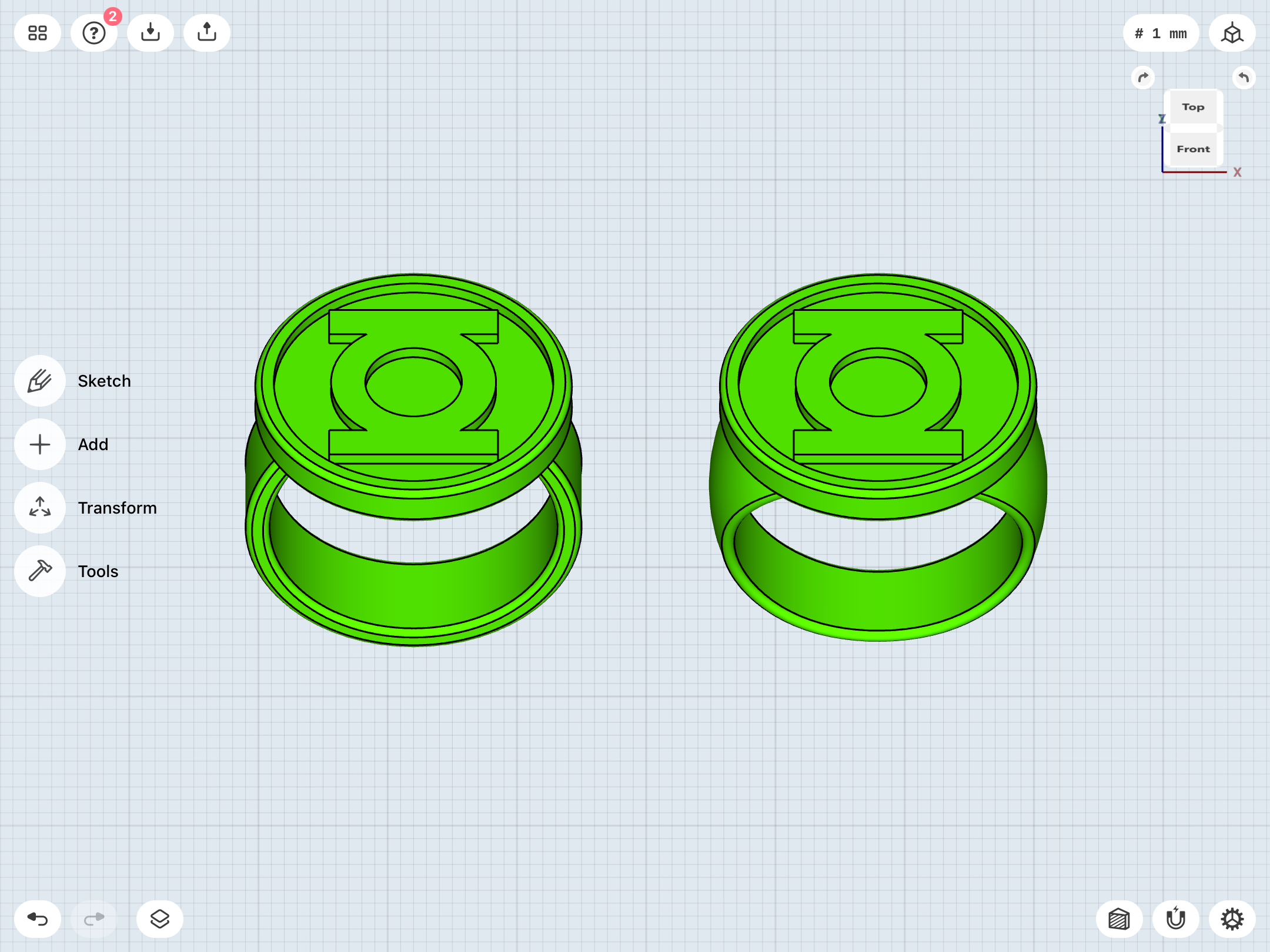
Now, in regards to the curved-band variants, replicas like the DC direct toy rings feature the disc on top of a full “O” band. However, oftentimes Kane’s art does make it look like the disc sits very low on top of a (curvy) “U” band, with the bottom of the disc thus intersecting the top of the finger-hole.
So, in playing with lower-profile designs, I’ve come up with these—a flat-edged straight-band (8mm wide) with a 24.5mm disc, and a curved-band (also with a 24.5mm disc) sunk into the finger-hole.
Last edited:
Okay. Paint is cured. I’ve got silicone rubber curing over the resin insert masters.
Meanwhile, here are the prints. The tolerances for the top caps are fine, and shouldn’t need adjusting. As for the designs, the Ross is pretty much where I want it. I need to check my references on the REBIRTH, again. I dunno if I’m sold on the height of the disc or the curvature of the band. We’ll see.
Even without resin inserts, the prints still look good.
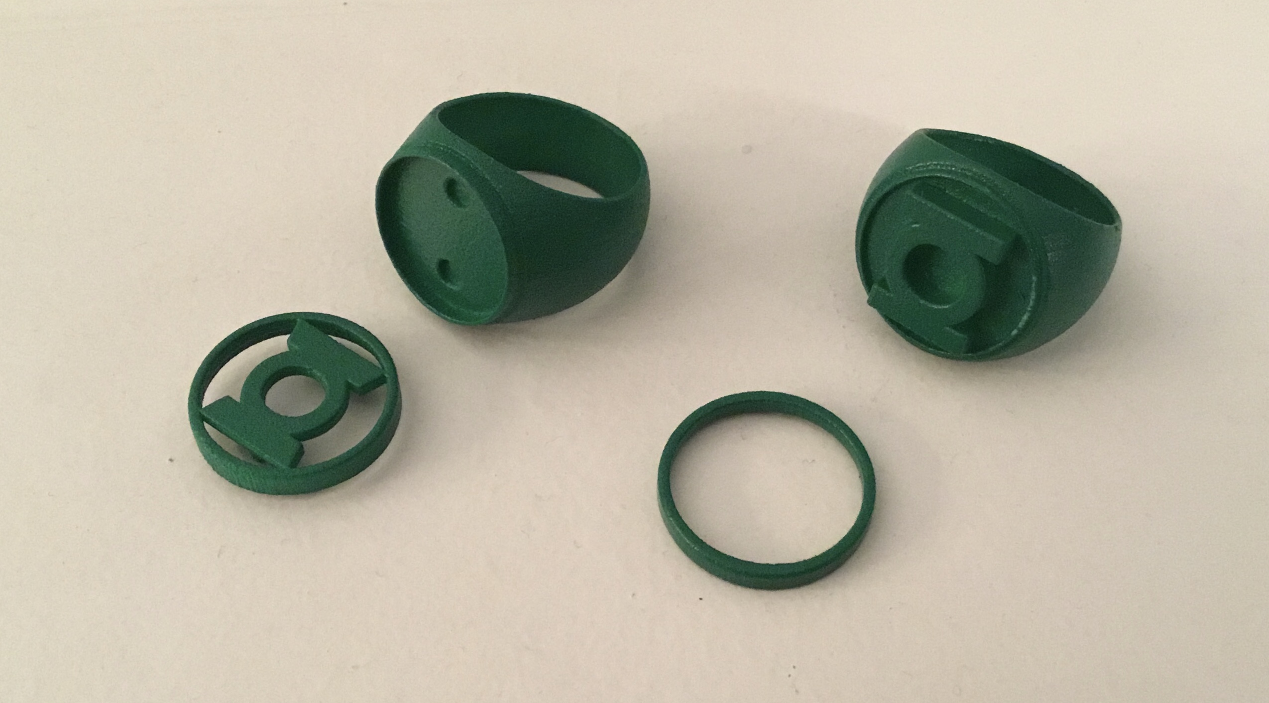
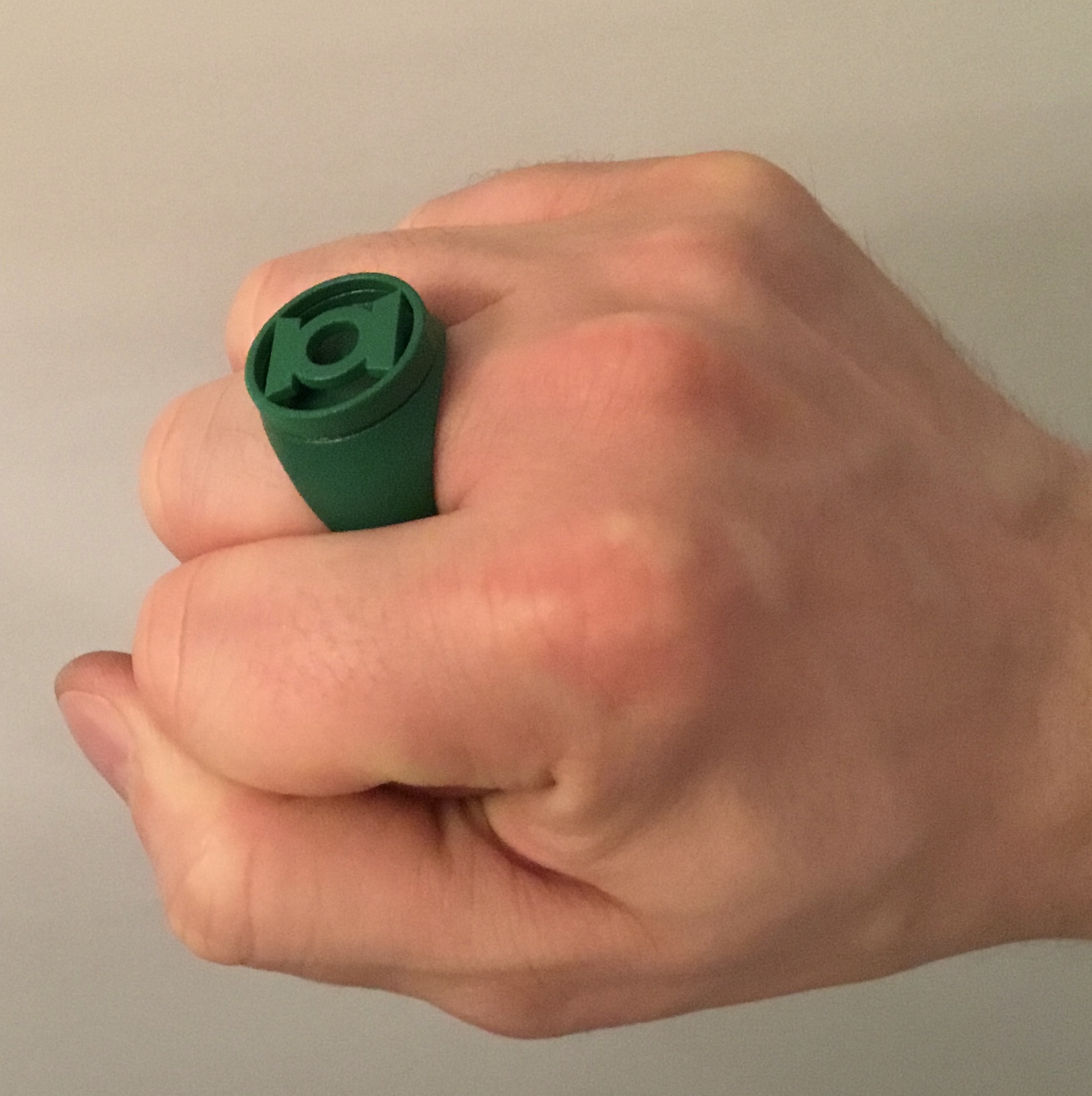
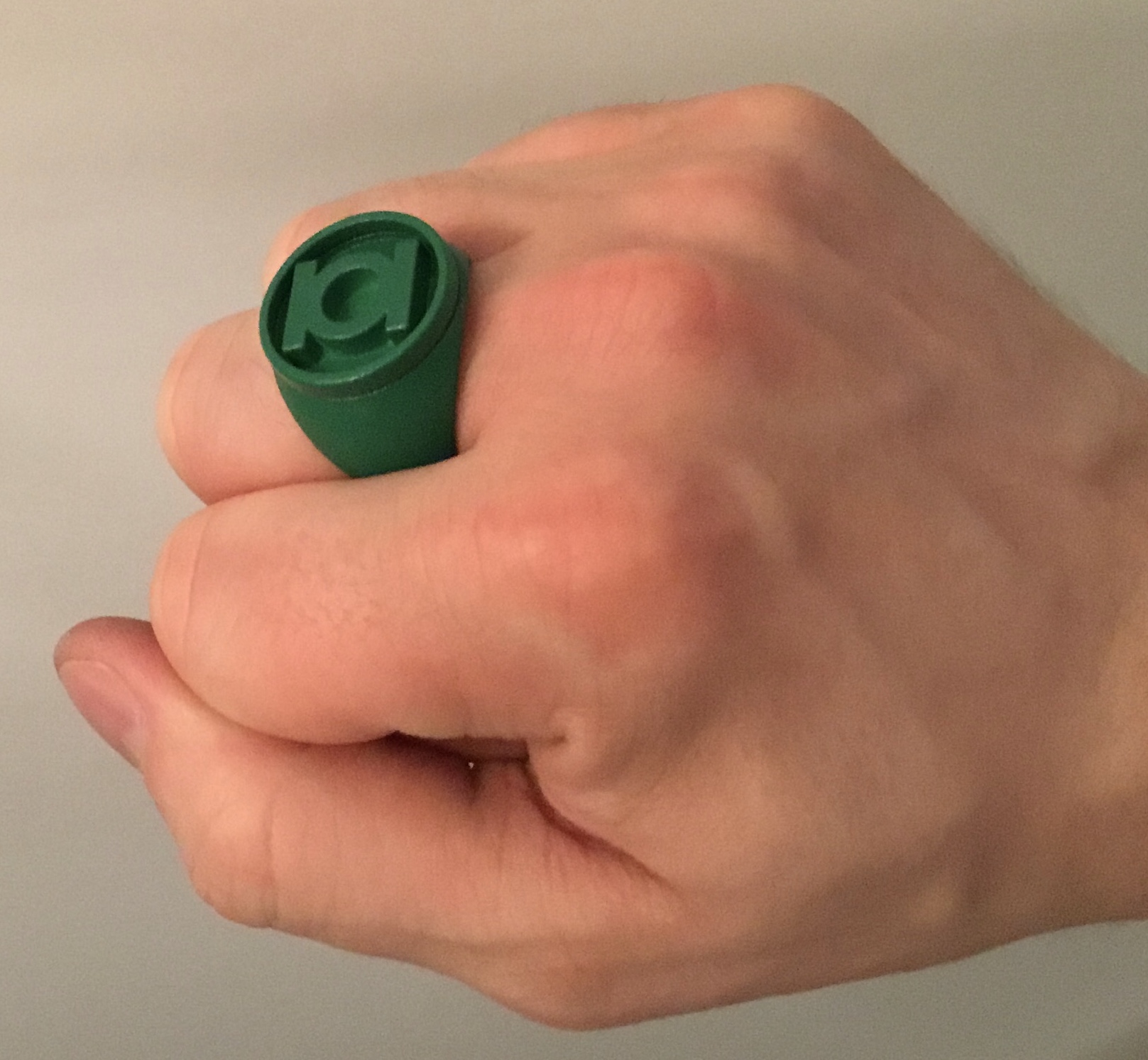
Checked the resin inserts. Still rubbery, still have a few air bubbles. Argh!
That being said, the fit is pretty good, although I’ve already tweaked the models to add a little more clearance.
The glow powder isn’t having much of an effect with this batch. Very dim. Also, there’s not enough contrast between the lime green on the insert and the dark green paint of the ring, presumably due to the translucency of the resin. Probably gonna have to back the inserts with white paint, or something.
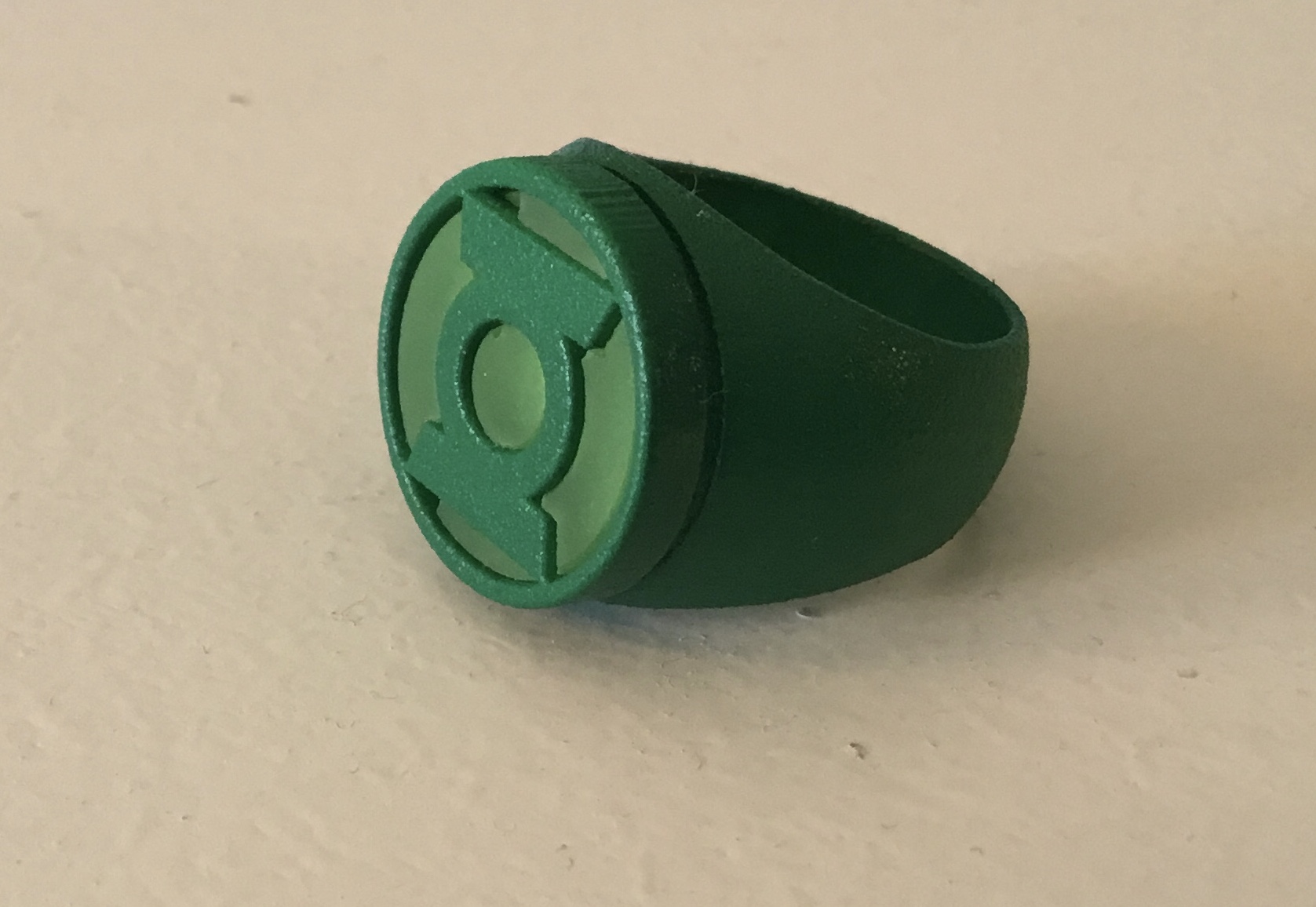
Tweaks to the REBIRTH ring. I’m a bit surprised to realize that I actually prefer the look of the Ross test print over the REBIRTH now that I have them in (and on) hand to examine.
As noted upthread, I did previously create a version of the REBIRTH based directly on the Ross model, but nixed it due to Ross’ artwork of the ring depicting it as looking a bit chunkier and with a shorter disc than Van Sciver’s.
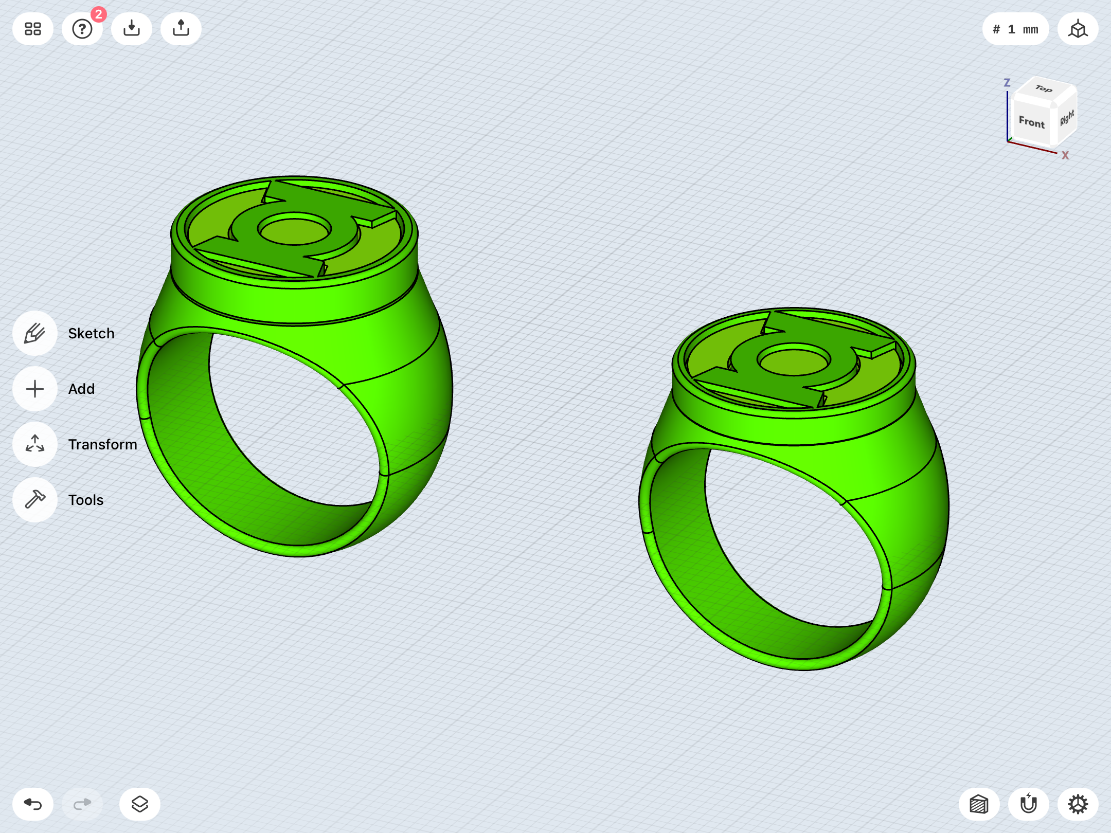
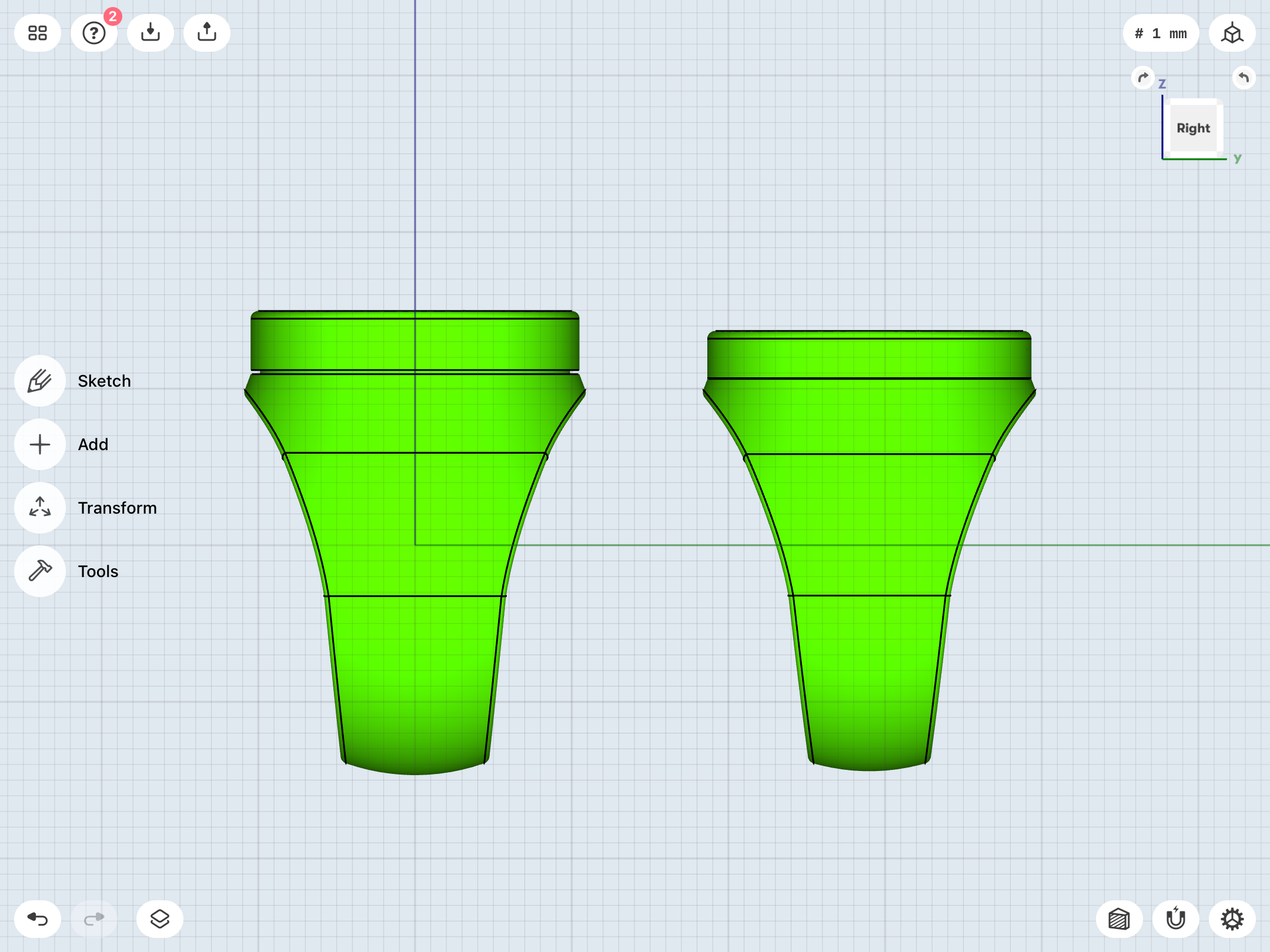
So, instead, I’m bringing a bit of the Ross print’s design traits to my REBIRTH model—a slightly thinner band (the test print seems a bit too wide at the bottom of the shank—9mm vs. the 7mm of the Ross) and a shorter symbol-disc (with this new iteration still being 0.5mm higher than the Ross). Other changes include loosening up the tolerances very slightly and having the bottom of the disc fit flush to the top of the ring body, since the test prints prove that there’s no need for a built-in gap to emphasize the separation line between disc and band.
Old on left, new on right.
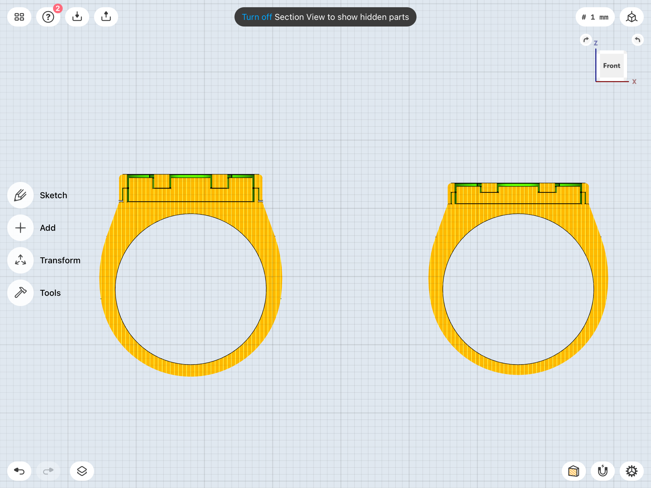
Last edited:
Going back to that idea of the Ross and REBIRTH being the same design, but with the symbols being switched out, I went back to a Ross-based design for the REBIRTH, then bounced the two off of each other until they were identical (except for the symbols). Looking again at Van Sciver’s art, there really doesn’t necessarily seem to be that shift/flattening in the upper band shape (a la the BLACKEST NIGHT promo rings) that I’ve been chasing.
Maybe this IS the way to go.
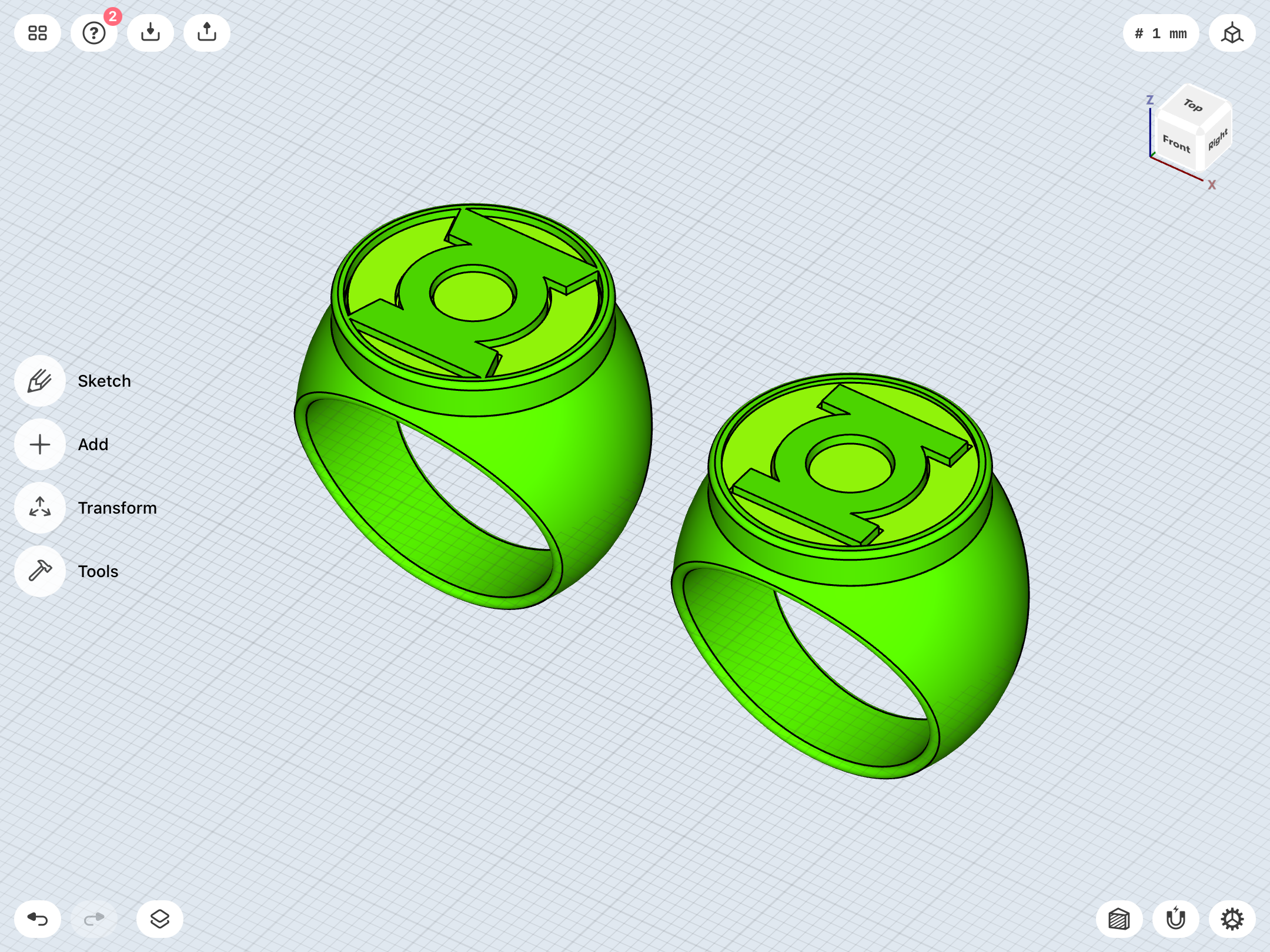
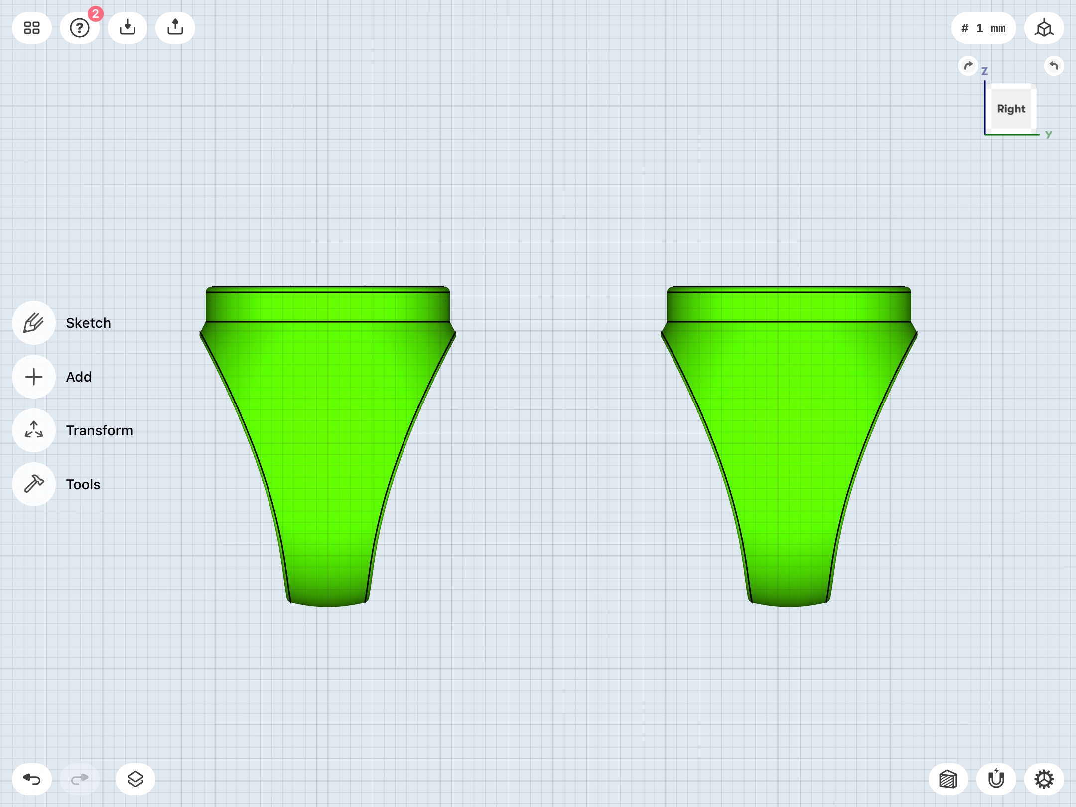
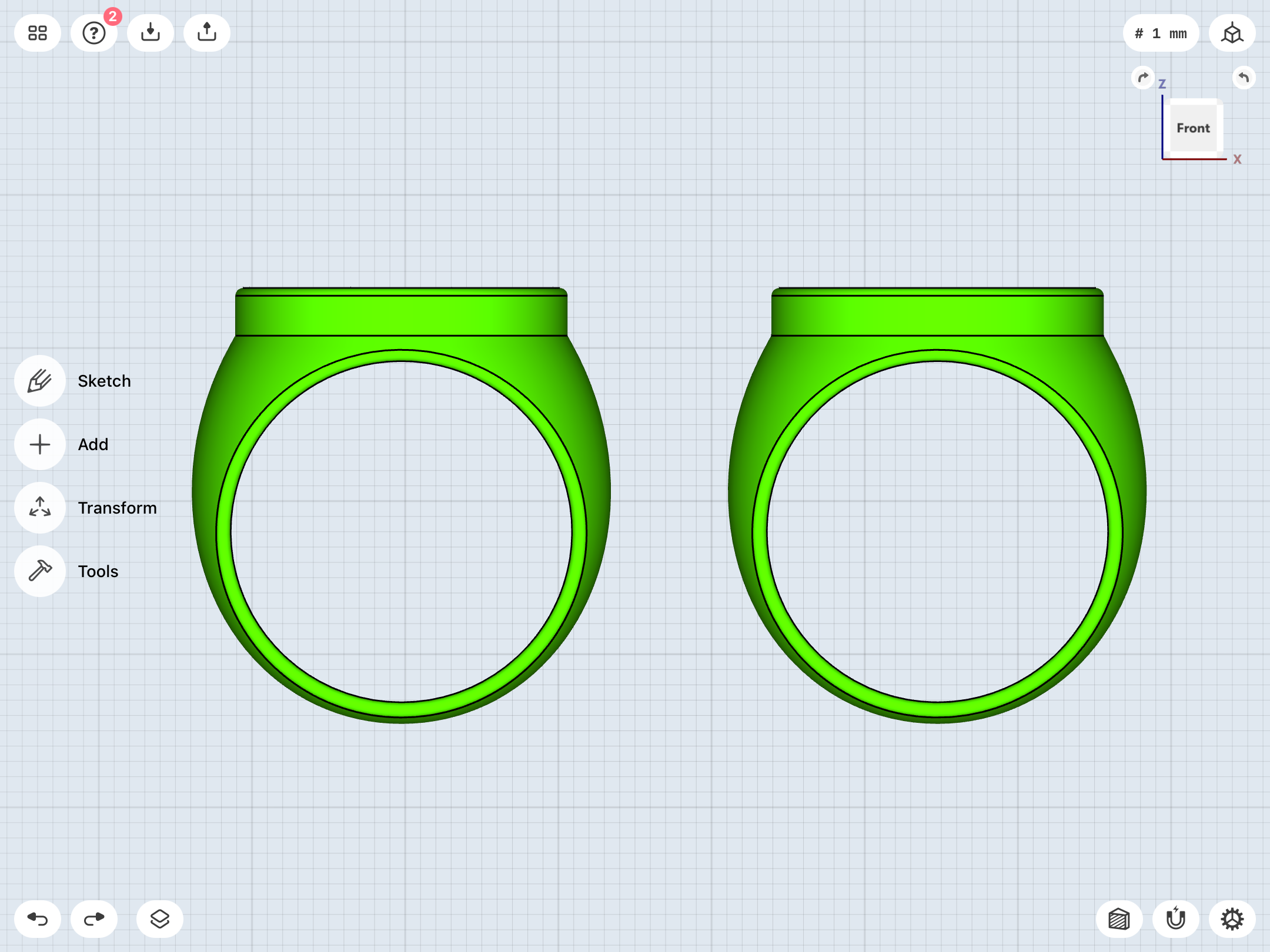
Maybe this IS the way to go.
Just wanted to say that it's been crazy fun to watch your obsessive dissections of old drawings and your itterative process of deciding on how to physically realise them.
Keep going! You've got a fan watching closely.
Keep going! You've got a fan watching closely.
Just wanted to say that it's been crazy fun to watch your obsessive dissections of old drawings and your itterative process of deciding on how to physically realise them.
Keep going! You've got a fan watching closely.
Thanks! Keep the feedback coming, people. Any suggestions/comments are appreciated, and could help solve certain problems.
I was recently looking at some of my early test prints from a year(!) ago, and they are shockingly huge and clunky compared to my recent output. It also helps to bounce from design to design. This whole journey has been very exciting in terms of developing modeling skills and whatnot. I gotta say that these newest test prints look really slick. Once I nail the resin-casting issues, and get the rings done up in polished metal, my childhood dream will finally be realized.
I’ve just never seen a licensed (or even fan-made) replica which has scratched my nagging itch for this iconic weapon. That’s why I’m taking so much time and being so obsessive. If I’m gonna do it, I’m gonna do it RIGHT.
Part of the fun (and frustration) of all this is the fact that there are no definitive physical models to replicate, as opposed to all of the other movie and TV props I’ve built. Lots of leeway for creativity, there, as a result. It becomes less about matching specific artwork than about looking at numerous different drawings and trying to suss out what the artists were going for, then finding an average/ideal which ticks certain checkboxes. And so much of the time, the art was often in flux. As noted, Gil Kane’s design for the ring—even after the symbol design was locked down—was constantly shifting, be it due to him doing some tweaking, or his different inkers bringing their own ideas to the table.
Also, the amount of continuity errors from artists to artist and book to book is rather staggering. For example, Jordan, Stewart, and Gardner are all wearing the Pat Broderick ring design in issues # 1-8 of GL Vol. 3, then all of them are wearing the Joe Staton design in the next arc (# 9-12), then each of them are wearing a different design (Jordan/MD Bright, Stewart/Mike Grell, Gardner/Joe Staton) in # 13 and beyond. Stuff like that. And that’s just the tip of the iceberg.
You’d think that they’d keep a closer eye on the key item of the entire series, or at least create model sheets to work from, or something. Some artists seem to draw their preferred versions of the rings no matter what the continuity of the time had previously presented. Jim Lee seems to always draw the Mike Grell design, and even did so during, for example, the BLACKEST NIGHT era, when the Van Sciver/Ivan Reis signet ring design was the standard.
I suppose part of it is each artist wanting to put their own stamp on the design. Or perhaps they’re constantly tinkering to find a design they’re happy with.
Not unlike me!
…see, just when I think I’m on to something with the near-identical Ross/REBIRTH designs, then I double-check my Van Sciver reference file, and find something like this, which is very close to my current REBIRTH test print, with the slope-shouldered upper band and the thick disc. Decisions, decisions. Argh!
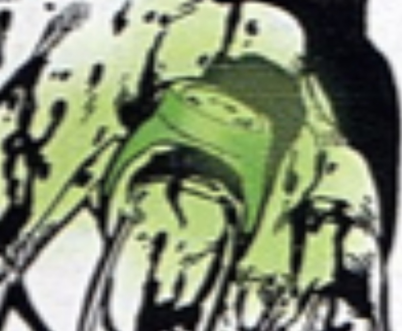
On a related note, the Ross/Van Sciver dilemma has me thinking about the question of faithfulness to specific artists vs. the canonical history of the rings and a logical, consistent design evolution. My latest designs presuppose that the Guardians used the Kane/Ross V1 design during the Silver and Bronze Ages of comics (as well as during Ross’ JUSTICE series, which is ostensibly set during the DC continuity of the mid-1970s or so), then reused it (albeit with the modern symbol design) when rebuilding the Corps after GREEN LANTERN: REBIRTH.
Not that DC Comics has anything remotely resembling a cohesive canon, of course. After all, Ross’ JUSTICE series is sort of its own little universe (…based on SUPER FRIENDS, to a degree, and not really matching the specific details of any DC era. For example, John Stewart appears in the series, yet Hal Jordan is still working for Ferris Aircraft—which only works if JUSTICE is set after Jordan met Stewart and after he got his job at Ferris back, post-GREEN LANTERN/GREEN ARROW run. Thus, Jordan should be wearing either the V3/Grell or V2/Staton rather than Ross’ idealized Kane design.), and Van Sciver’s REBIRTH design comes from a Post-CRISIS, pre-INFINITE CRISIS, pre-NEW 52 era. So, there’s no real need to link the designs, because the continuity and the multiple reboots are just all over the place.
However, in terms of “head canon”, tracing the ring designs would be fun, despite all of those massive continuity errors and canon reboots.
So, here’s my own head canon, in spite of artistic discrepancies…
Pre-Crisis:
Abin Sur gives Hal Jordan his ring (SHOWCASE # 22), which is the straight-band V1. The ring is later destroyed and replaced with a slightly updated/redesigned (curved-band) duplicate (GL Vol. 2 # 37), which is then reforged along with the remains of Sur’s into an identical duplicate (GL Vol. 2 # 44). Jordan wears this ring until its yellow impurity is destroyed (GL Vol. 2 # 68), and is given another duplicate (although perhaps this time with the design tweak of the green crystal negative space, a transitional step leading toward the V2/V3 round gems, which also ties in with the ring’s occasional two-tone coloring later in Kane’s run…although a “crystal”/“gem”/“power element” IS mentioned in stories prior to the destruction of Abin Sur’s ring).
All of the Corps’ rings are then replaced with the Mike Grell design in GL/GA # 90, with the straight band V1 (and original uniform design) still being issued to new recruits, like Dalor of Timron and Arisia of Graxos IV. The V3 rings can change shape, and so Jordan (among others) eventually adopts, as a personal preference, the variant V2/Joe Staton design seen circa GL/GA # 120. John Stewart is given this V2 ring when Jordan quits, and then wears Tomar Re’s V3/Grell ring afterward after Jordan gets his own ring back. Guy Gardner is given a V2 to battle to Anti-Monitor during the Crisis, and wears it until he’s drummed out of the Corps.
Post-Crisis:
Jordan wears the MD Bright design from the start (the standard GL ring of the era), which retroactively replaces the (very similar) Gil Kane design. Events proceed mostly as before, with Stewart and Gardner wearing the V3 and V2, respectively. Jordan’s V2 is destroyed by Malvolio, and so Jordan takes his (Bright-style) ring, which he wears until he becomes Parallax, crushing it under his heel. Ganthet reforges the remains into a new V2 for Kyle Rayner.
I have yet to read the Geoff Johns material, so I’m stopping here!
Really, the only murky area is the V1 straight band/curved band inconsistency, as well as whether or not the original Kane design “really” had the two-tone look (emerald metal ring with embedded GL symbol-negative-space crystal/gem). As noted, the ring was usually colored a single tone of dark green, and was two-tone on only a few occasions during Kane’s run.
Although…the thought occurs to me that the gem/“power element” could also theoretically be a small, round crystal located only in the circular center of the GL symbol on the face of the V1 ring (rather than both the center of the symbol and the negative space around it being crystal), foreshadowing the V2/V3 gems which came after. Hmmm.
Last edited:
Upon checking and rechecking my reference, I do think that my REBIRTH test print is probably the direction to continue in for that design, rather than the modified Ross version. Just a bit sleeker than the test print version, with a thinner band and slightly shorter disc, akin to the revisions in post # 410. But how to smooth out the curves on the edges of the band…?
Looks like I’ve had a small breakthrough.
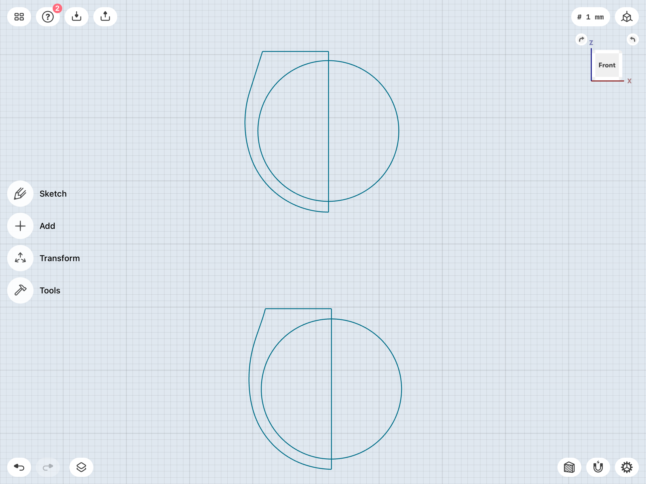
As noted, and as can be seen in various screencaps of my work, I’ve been using multiple construction lines to create the more complex, slope-shouldered REBIRTH band designs, which is resulting in joints/kinks in the curvature of the edges of the finger hole on either side when the band is viewed in profile.
However, Shapr3D has a “spline” function, which allows one to create a single line with multiple control points along its length. These control points can used to fine-tune the position of a given section of the line set between two control points, allowing one to create very curvy, organic shapes.
I’ve played with this function in the past, but never quite got the hang of it.
Well, coming back to it out of necessity, I’ve recreated my REBIRTH band’s construction sketch pretty accurately, but now as one smooth, organic line attached to the straight top and center lines.
Needs tweaking, but those nasty little joints appear to no longer be a problem.
Top: Previous, multi-line sketch. Bottom: recreation of the sketch with spline function.
Left: Multi-line version of band. Right: band created with spline.
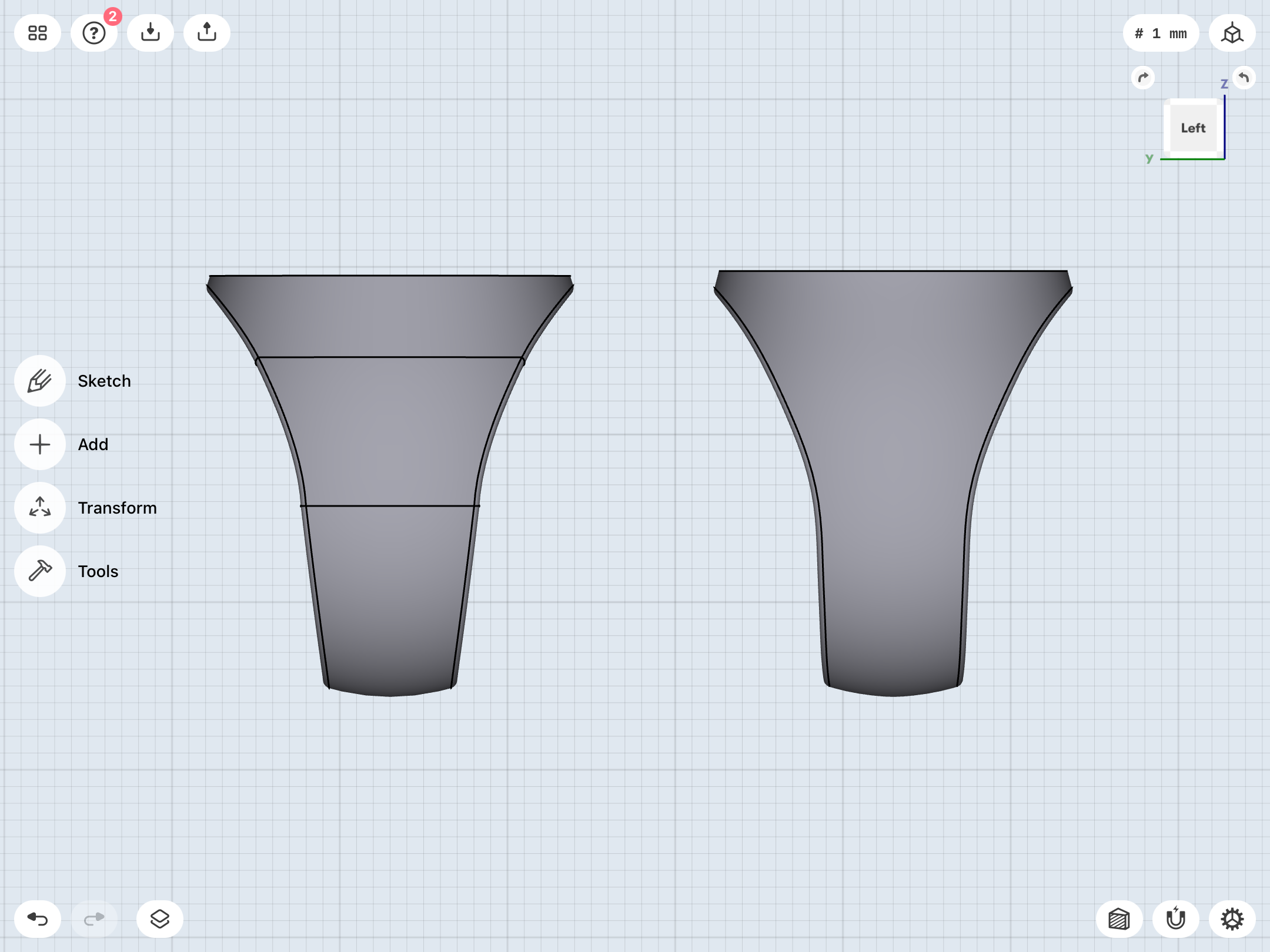
As noted, and as can be seen in various screencaps of my work, I’ve been using multiple construction lines to create the more complex, slope-shouldered REBIRTH band designs, which is resulting in joints/kinks in the curvature of the edges of the finger hole on either side when the band is viewed in profile.
However, Shapr3D has a “spline” function, which allows one to create a single line with multiple control points along its length. These control points can used to fine-tune the position of a given section of the line set between two control points, allowing one to create very curvy, organic shapes.
I’ve played with this function in the past, but never quite got the hang of it.
Well, coming back to it out of necessity, I’ve recreated my REBIRTH band’s construction sketch pretty accurately, but now as one smooth, organic line attached to the straight top and center lines.
Needs tweaking, but those nasty little joints appear to no longer be a problem.
Top: Previous, multi-line sketch. Bottom: recreation of the sketch with spline function.
Left: Multi-line version of band. Right: band created with spline.
Last edited:
