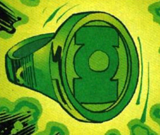
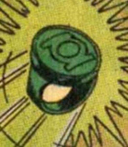
Defined Green Lantern Comic Rings

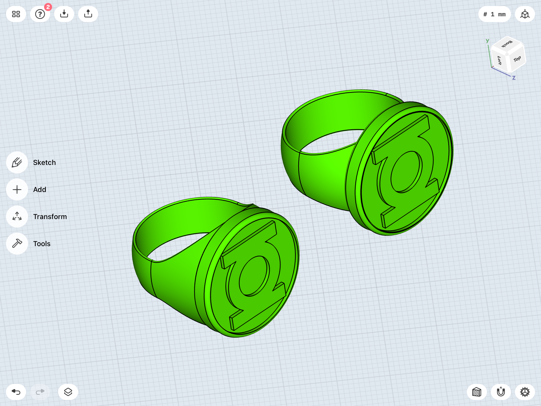
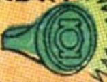
Have...have I been wrong about the V1 for all these years? Because, as I tinker around, a signet ring with a raised bezel/cap/lip seems to line up more and more with certain Gil Kane artwork, as well as that of people like Alex Ross and Neal Adams.

I’ve always liked the “disc sitting on band” look, but the signet ring look DOES look very accurate when compared to certain pieces of reference art.

Thoughts?

9BF20456-D89D-43F7-ABB9-144CEAD6A2F1.png
DA237C52-1B00-4608-A31D-38A8D04DA0E1.png
FC1B5166-D5F5-4573-B975-A1462DFCD70A.png
7FB6FE7A-CD2F-4760-9F5F-E582A3675B3A.png


1684E4B5-A0A4-4005-82BF-0E71A7E29726.jpeg
ED013BF5-8268-4FA4-973C-668F560ACE90.jpeg
4BCCEF4B-BBCC-4A99-926C-84C3BFC9F938.jpeg
C144BC7C-77CF-4DF1-A12D-360208C0CC99.jpeg
 
Last edited:
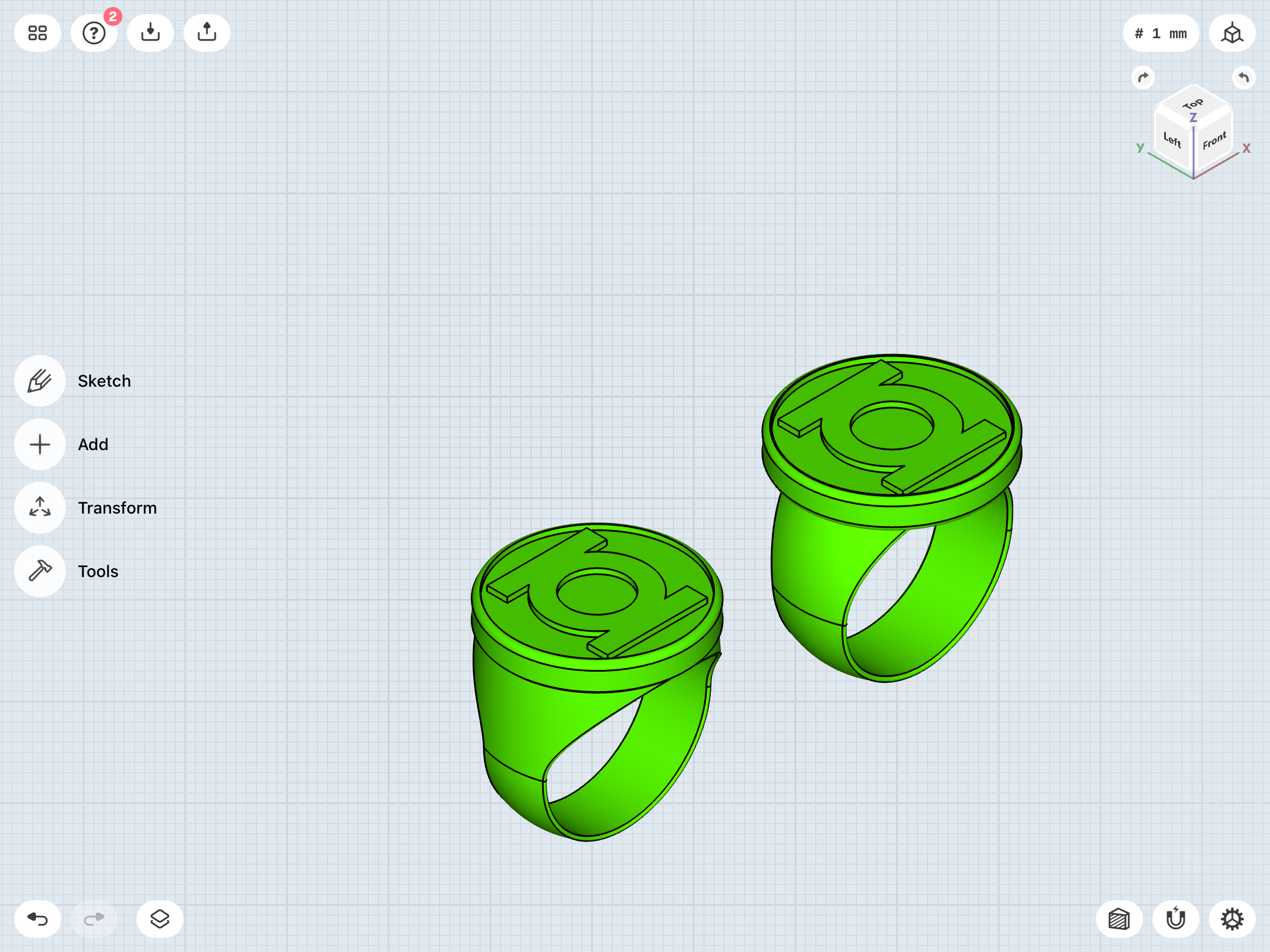
Tweak, tweak, tweak. Playing with band size/width/shape and disc size/height/position.


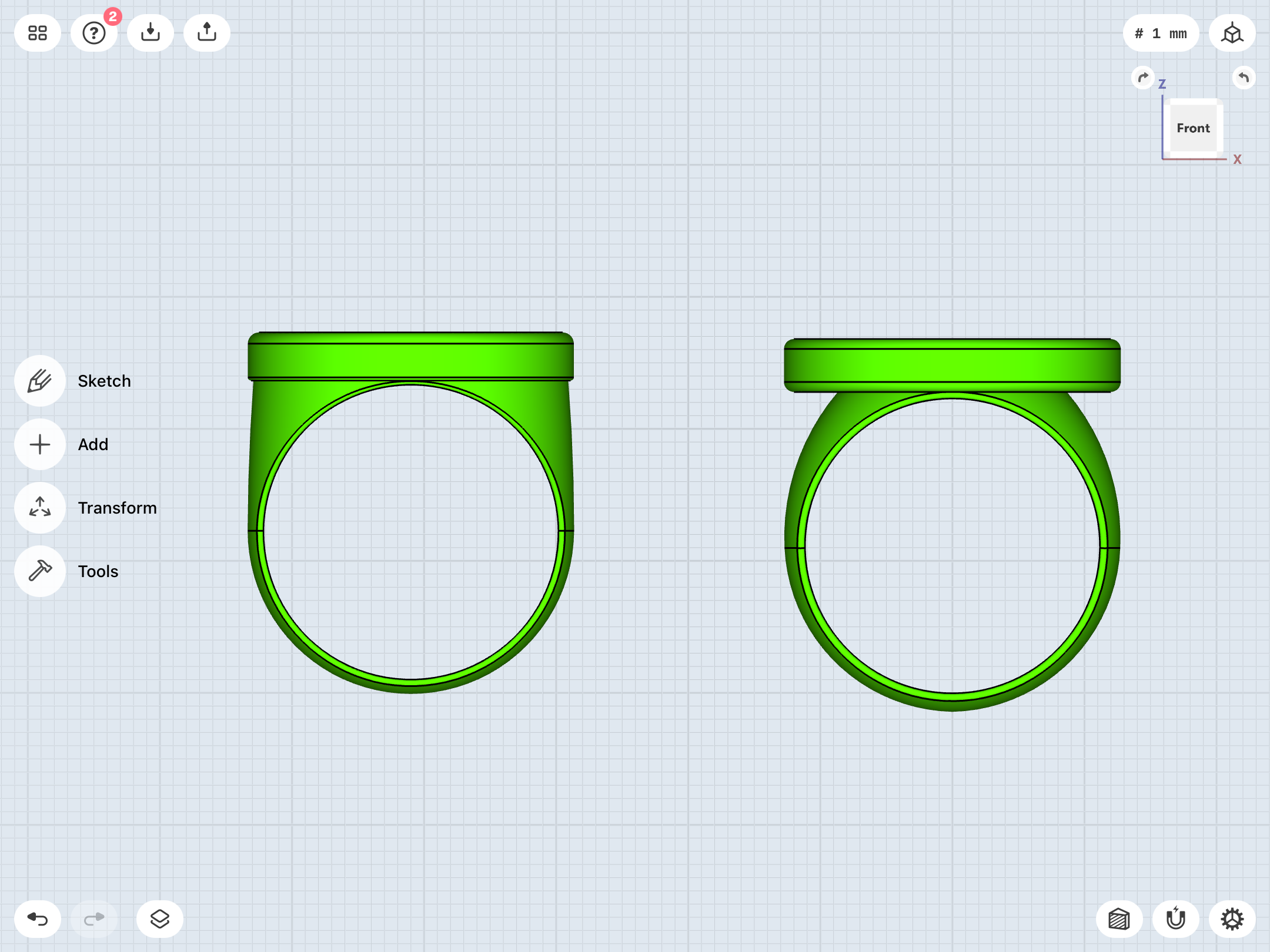
On the right is the “disc-stuck-on-band” model I’d previously completed. In the middle is a version with the disc flush to the top of the band, creating the “signet ring with bezel” look. On the left is something of a hybrid, akin to the DC Direct prop replica, among others.

What do y’all like?

24C640EF-BE3F-49B3-85BC-8B3E7C8F1983.png
7E5966DF-4F4E-434C-879E-D78375A5F33A.png
3763EB1E-EB22-4C6C-8FCE-3332AC477A54.png
 
Endless tweaking. The one on the left is the current front-runner. The thinner band and wider disc is looking pretty darn close to some of that Gil Kane art.

856F9F79-B6AE-4029-B3B2-7AF14466694A.png
504D850B-0FBB-4B0D-ADB9-B0B5189FEA1C.png
1AB76A94-6055-45E0-8A4F-DE79C4B89F8F.png
 
...that being said, I’m also digging the Alex Ross-ish look, too.


The inherent problem with the many decades’ worth of Green Lantern ring designs is that there have been SO many versions. Choosing a single favorite is tricky business. I’d be hard pressed to answer that question.

C533D0EB-B235-428F-ACFE-8ABB64B62F51.png
EB536D14-1A53-40D3-AC16-9E48DDCF96EF.png
 
As I continue to obsessively tweak the V1, I’m confident enough in several other designs (V2, V3, Gardner, EMERALD DAWN, modern) to place a new test print order. In terms of overall size/shape/geometry, I’m pretty confident that these shouldn’t need too much more tweaking, if any. The primary variable I’m wondering about is finger-hole size, especially on the EMERALD DAWN and Gardner, since the bottom of the symbol-discs intersect with the tops of the finger-holes. Might be a tight fit.

I’ve also ordered prints of the gems for the V2, V3, and Gardner. Having now received all of my molding and casting supplies, I just need to fill/sand/polish the gems, then I can begin experimenting with taking molds and resin casting. First, I think I’ll try simply mixing resin with the colored glow powders. If that doesn’t turn out well, color-wise, I’ll start introducing the resin dyes I also bought.


Here’s a nice little group STL shot, including the Grell and V1, which aren’t being printed this time around.

46354619-A956-4F82-AF2B-6325EE749AEC.png
 
Tweak, tweak, tweak. Playing with band size/width/shape and disc size/height/position.


On the right is the “disc-stuck-on-band” model I’d previously completed. In the middle is a version with the disc flush to the top of the band, creating the “signet ring with bezel” look. On the left is something of a hybrid, akin to the DC Direct prop replica, among others.

What do y’all like?

Of the ones shown here, I really like 1 & 2 (from left to right). I really just don't care for the "disc-stuck-on-band" as you so eloquently put it. In my mind, it's just not sophisticated looking enough for one of the most powerful weapons in the universe. And probably reminds me a bit too much of how I used to make my GL "ring" as a kid: masking tape around my finger with one of those tracer gun discs stuck to it.

That said, I'm really loving the Alex Ross version.

And the group shot is just gorgeous. I'm loving 2, 3, and 6!
 
Last edited:
Thanks for the input!

Still lots of tweaking to be done.


Listen, I loves me some Gil Kane art, but, man, he was not the king of technical illustration or consistency. Trying to suss out what he and his inkers were going for has been a chore, considering the almost constant changes in the ring’s design.

Perhaps most often, we had the disc-atop-simple/parallel-band...

93C88D20-8E7D-4F88-ABE0-EDAFC6DF23AE.jpeg


...and, most often in closeups of the ring itself (which are probably more indicative of the actual design than all those panels of the ring actually being worn, with the band mostly obscured), we had the curvy/signet band...

F0941279-0A0E-44B4-ABA9-F2ED4A182B87.jpeg


...and, on occasion, there was the very organic-shaped, dramatically-tapered-at-the-bottom band...

2131FC3B-7180-41E7-95F1-8867A59362AA.jpeg


...and, late in Kane’s career (on those occasions where he’d revisit the character for one-shot stories in the 90s), we usually saw some traditional signet-style rings (with bezels of varying thickness), as well as the thin, flat disc atop a tapered band.

9CD37EC1-CF58-4C3F-A582-1EBF3CFAC28A.jpeg

4142F04A-8695-427B-A212-4A07F3B067BD.jpeg

F9CEBD64-D6B6-411C-A1DE-AB8D0DAD3D9D.jpeg


There’s also some major variance in terms of the shape, height, and detailing of the bezel/disc itself. Sometimes flat- sided (like a hockey puck), sometimes more of a dome with a circular depression in the center (where the symbol is). Some of the earliest versions even indicate a clear, domed gem in the center, with the symbol underneath it, similar to the yellow Sinestro/Gardner ring.

I’m trying to find some kind of definitive version of Kane’s design without going too far and making a hybrid version that doesn’t really match the overall vibe of ANY of the versions that he was usually going for.

The easy solution would be to go for the simple (parallel) ring band with the disc stuck on top, but I’m rather fond of the
signet-style band, and like yourself, find it to be a little more sophisticated and visually interesting. Also, it provides some contrast with the simpler look of the original SHOWCASE # 22 version, and other early iterations of the design.
Kane also tended to go for a rather thin band, but I think a slightly wider and chunkier band gives the design more heft and visual strength.

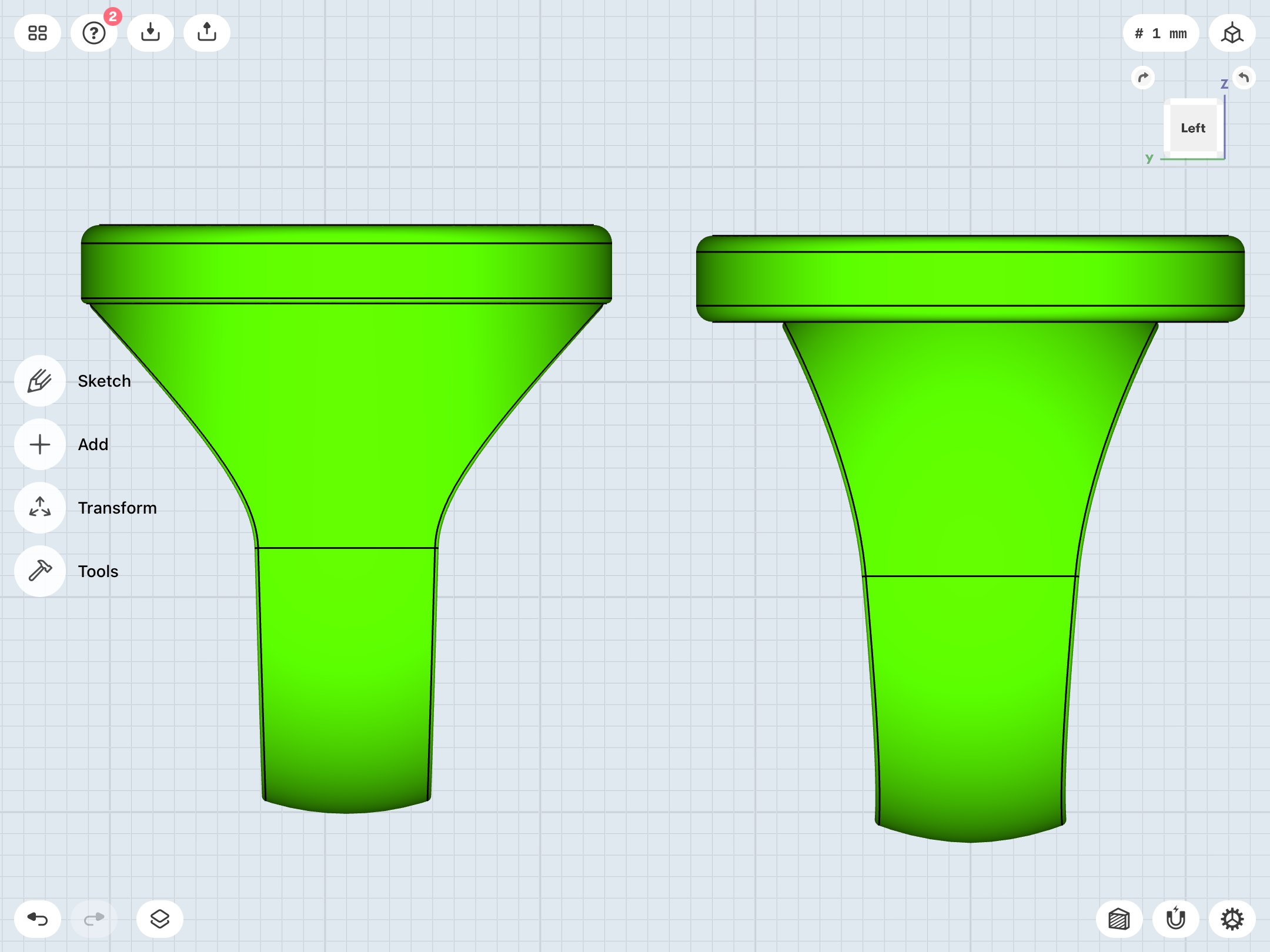
Personally, I do like the disc-atop-band look, and think the stronger undercuts in-between the band and the disc (in front view) are more visually pleasing than the very slight disc overhang in design # 1 (left side) in post # 302. It’s a tricky balance, to be sure.

And, you’ll notice that the three designs in post # 302 look virtually identical to each other in the 3/4 angled view, which is an excellent example of how the comic artwork also makes it difficult to determine whether Kane was going for the signet look or the overlapping-disc look. It’s only in the front view where you can see how the disc overhangs the band (if at all).

Certainly, in the Kane art depicting a simple, parallel band, the disc absolutely overhangs the band. I’ve always assumed that the signet-band version was drawn with that same intent, but perhaps I’ve mistakenly conflated two different design choices.

The Ross-style signet ring is very visually-pleasing, but, somehow, the utter lack of a disc overhanging the band (even slightly) doesn’t feel like Kane, to me. Remember, Kane usually drew the disc REALLY BIG. Now, I don’t necessarily have to take that literally, but, going with a big disc/bezel would also mean a virtually flat-sided upper half of the band, and I think having a bit of curve/doming to the upper band as it blends into the disc/bezel is more aesthetically- pleasing.
 
Last edited:
Of the ones shown here, I really like 1 & 2 (from left to right). I really just don't care for the "disc-stuck-on-band" as you so eloquently put it. In my mind, it's just not sophisticated looking enough for one of the most powerful weapons in the universe. And probably reminds me a bit too much of how I used to make my GL "ring" as a kid: masking tape around my finger with one of those tracer gun discs stuck to it.

That said, I'm really loving the Alex Ross version.

And the group shot is just gorgeous. I'm loving 2, 3, and 6!

Thanks!

The V2 is now essentially a recreation of my last TinkerCad version, which is my preferred, near-final(?) design. The last TinkerCad print’s finger-hole was a bit small, and the band a bit wide at the bottom, and both of those issues have been tweaked. We’ll see how the new test print comes out. I actually imported the TinkerCad STL and overlaid it with this new model, and the dimension are virtually identical. So, the new test print should be a slightly comfier version of the last one, with the added bonuses of the chamfering on the symbol and the edges of the band, and the printed gem which will be used to cast a resin one.

I’m also very pleased with the new V3, since I’ve finally managed to make it much more compact, both for comfort/aesthetics and to contrast a bit with the V2 and its bigger symbol-piece. A bit smaller and sleeker suits the design well.

And, as previously noted, I’m also pleased to have cracked the code on the modern design, which now has a slightly curvier and less stubby look.
 
More tinkering with the Alex Ross-style ring, which itself seems inspired by the Neal Adams version, more than anything.

Ross’ version also has some variants, including a proper signet ring (no cap/disc/bezel, just the symbol inset within the face of the ring), a capped/bezeled version (as seen on my model), a capped/bezeled version with a tall, cone-based bezel (sloping sides instead of straight) bezel, and a symbol-disc overhanging the band.

BE2BFED9-1882-4CF5-AB8C-FB6D77A7DE0C.png
C9565D90-6C04-470C-89ED-5D89F1703101.png
FF2DBD82-86F8-49C7-A894-4CEA4E962A55.png


986AC299-5B67-4AEE-A6BE-8B4CD1CF0971.jpeg
08575F1B-FA96-471B-B6A5-15E45BD61677.jpeg


Fun fact: Ross’ GL model sheet...

9BF257EB-DD37-447A-9FCF-D87F5C520501.jpeg


...is based directly on Alex Toth’s animation model for the old SUPER FRIENDS cartoon, albeit with the switch from the “separate sidebars” version of the GL symbol to the standard/licensing one.

FB0A357B-3194-43F4-BCFA-3B6B2AE92D61.jpeg
 
Last edited:
...and here’s the traditional signet look, without the bezel. It has an elegant simplicity, but I kinda think a V1 needs some kind of disc/bezel/separation line distinct from the band.

3E72D580-1135-411F-B988-8E53B1B28227.png
5662C0F9-D4ED-4E52-8852-C850766EDCC1.png
 
Last edited:
Continuing to experiment. I’m currently playing around with multiple variants by tweaking the shape and overall size of the band, the amount of chamfering on the finger-hole, the size/thickness/position of the disc, the amount of chamfering of the edges of the disc, etc.

I’ve boiled it down to four distinct design philosophies, all of which can be interpreted in various artists’ work at different points.

Numbered 1-4 from left to right...


E00D6223-82B9-459D-896D-893AE463E6CB.png
97B518E9-6961-4A47-8351-C7272EFC854D.png
64F0E0ED-206E-4704-86AD-C79BF2DE576F.png
FEA961AF-33AD-4611-BCE7-F065C8DFF763.png
F07F8C2A-7665-4E0A-A905-CDE50D6FCA59.png

E071C50F-C85F-4B8C-8B7C-199CA4C45DFD.png


1. A straight-sided upper band which is parallel with the bezel/disc.

PROS: Matches some of the art of Gil Kane and Alex Ross; Allows for large-diameter symbol-disc, a la Gil Kane.
CONS: Clunky, chunky, and squared-off, especially in front view.


2. A traditional signet ring with a small-diameter bezel.

PROS: Sleek, compact, elegant. Evokes real-world signet ring designs. Matches some Alex Ross art, among others. Essentially an earlier version of the modern Van Sciver/post-REBIRTH design.
CONS: Small-diameter symbol-disc which allows band to be seen in top view, and therefore does not match much of Gil Kane’s art.


3. Signet band with large symbol-disc that overlaps the band.

PROS: Matches Gil Kane art, as well as DC Direct ring replicas. Allows for large symbol-disc without losing the curviness of the band.
CONS: Weak undercuts between underside of disc and top of band in front view, making the look not as strong as designs 2 and 4.


4. “Disc stuck on top of signet band”.

PROS: Matches Gil Kane and some Neal Adams/Alex Ross art (among others). Evokes Kane’s earlier, “disc stuck atop simple/parallel band” design, but with a more elegant/curvier band design. Strong undercuts between underside of disc and top of band in front view, giving a stronger definition/delineation between disc and band.
CONS: May not be what Kane was going for, doesn’t match real-world signet ring designs.

Thoughts?
 
Last edited:
...I’ve gotten into a pattern of making designs with numerous slight tweaks, comparing the resulting multiple variants, then deleting the ones I like least. Whittling the choices down by process of elimination.


Still...so many variants, so similar, yet so different...


07FEE143-40A9-4B03-93C5-780C982FDD32.png
 
Came back to the Abin Sur ring. As seen throughout this thread, my initial idea was for a 3D-relief version of the early GL insignia. But, upon reflection, that’s probably not what the intent was when Kane was drawing SHOWCASE # 22. Also, the more complex 3D look would add more difficulty in terms of a machined-metal version, down the line.

So, I’ve rebuilt the symbol from flat pieces with slightly offset heights (and a conical reflector cone in the center) to be more in sync with the later designs. Still tweaking.


B3318CE2-788E-4F77-8C2E-D27EF7429605.png
EB2183F3-EBFB-4917-BD77-CD259FBB6D52.png
 
Last edited:
More tweaks. As noted, the shape, details, and proportions of both the power battery and the symbol in that first story varied wildly from panel to panel. Getting the right balance is tricky.


C52F082F-0A30-4BB2-AB4E-5061AE5E4FDA.png
 
The madness continues. Sketching and adjusting and comparing and deleting.

Yes, it’s obsessive. But I feel a certain obligation to nail this particular design, both to finally satisfy my childhood self and because I consider the V1 the classiest of the rings (to say nothing of it being THE classic and perhaps also the most iconic version), and so it deserves the deluxe treatment.

B328E4C5-DA2D-46BA-BAED-858E04972A70.png
 
Getting close, now, I think. Down to the nitty-gritty of fine-tuning the amount of finger-hole chamfering, which affects the width of the band, which then affects the overall curvature and profile of the band.

Kane tended to go for a rather narrow band which flared out about 3/4 of the way toward the top. I’m going for something along those lines, but not TOO thin. Somewhere in the 8-10mm range at the bottom is comfy, for me.

117BD1E6-7818-47CC-B9E3-44AB2C38E118.png

51B1F2BD-2102-4E34-8CB3-6B8F54AA6799.jpeg
9FB2D5F9-C177-4985-BCA2-15D467E80FB2.jpeg
5AED2B51-8C50-4B76-B0AE-3D7954629FAB.jpeg
4E7652D3-326F-41A1-A736-FADED7D84487.jpeg
D9AE643F-8680-411C-91FD-1786355E3B13.jpeg
4B6ADAE8-AAB5-4F61-B993-856742672A35.jpeg
66F489A4-F6C1-44BD-B5FC-CB23CCBCBA5B.jpeg
C39FC5AE-FFD3-4D88-B93E-2A5277613BC1.jpeg
 
First things first: The latest test prints have shipped.

Once they come in, I think the next batch will exclusively be V1 variants, including the flat-sided Alex Ross version (with bezel), the smaller, slope-sided signet version, and the current revision. We’ll see.

Speaking of the current revision...after much, MUCH revision, and dozens of iterations, I’ve finally landed on one that I’m seeing fit to test print. The curvature of the band starts out wide at the top (avoiding the “disc stuck on band look”, then tapers down into a thin (but, at 10mm wide at the base, not TOO thin), parallel-sided band.

Very reminiscent of certain Gil Kane art, but without looking too much like a cheap, thin-band, Cracker Jack-type ring, or having a band that’s a little TOO chunky.

CBA4DBC4-FB58-473F-AE43-F3E526B331BA.png
048EE857-0692-4404-A1BF-7D92C8C728E3.png
E63B8944-E2B2-4ACC-89A7-BEE643E22372.png
 
...that all being said, more aggressive chamfering (as well as having the disc lowered so that it slightly intersects with the finger- hole) gives an appearance perhaps even closer to Kane’s art. I may end up printing this one, too, for comparison.

9DBDC52F-A2EE-4F28-9421-9864BA6B08A7.jpeg

BABC8D7C-880F-4A43-92E0-29A3FE18834D.png
98A13A5D-A35D-40A3-BC18-C945659A0C74.png
16A5FF17-8821-4C2E-AB67-96F5E77F2464.png
 
After taking a few days off to rest and recharge, I’m looking at things from a fresh perspective.

The current V1 model looks nice, and even matches some of the actual signet rings I’ve found while doing online research for inspiration. The one pictured here has a curved band which tapers down to a vertical one, as on my current model. And it even has a disc on top (as opposed to an inset design on the round top of the band), which has been a rarity in my research.

19AC384F-00B8-49AC-B70F-CEE72968102E.jpeg


That being said, my sense of aesthetics is nagging at me, and is telling me that a smoother, cleaner curve on the sides of the ring (in profile) is the way to go, rather than the curve-transitioning-to-vertical band I currently have. Been tinkering with new ideas to implement this, and then compare the results to the current revision.

D01335BD-DB5D-4C0B-AF40-ACC976161F5C.jpeg
 

Your message may be considered spam for the following reasons:

If you wish to reply despite these issues, check the box below before replying.
Be aware that malicious compliance may result in more severe penalties.
Back
Top