Defined Green Lantern Comic Rings

Well, after many hours of tinkering, I have a solid V3/chunk design. Some interpretations of this design (such as the STL file I linked to upthread, as well as the 2011 movie ring) have the “bars” on top and bottom of the insignia sloping down at a straight angle, then blending into the curve of the actual ring band. Here’s a comparison of my design with the aforementioned STL file:
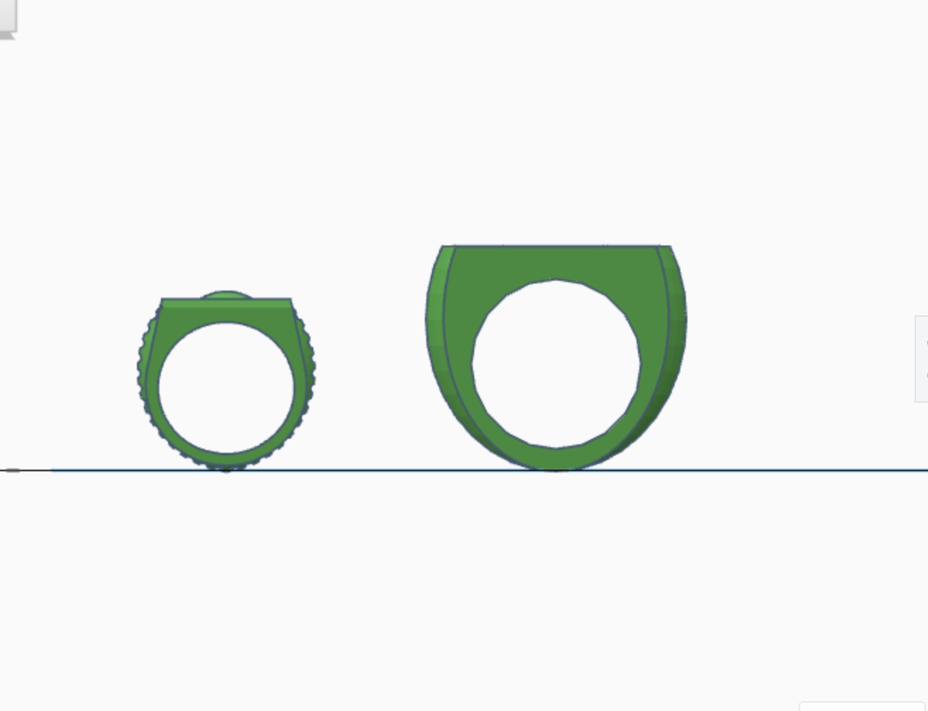
AC546D13-9114-4EC5-B2F7-BAE8FC25DE55.jpeg


I went with something closer to Darryl Banks’ version seen in GL (3rd series) # 49-50, with all three bands being consistently curved, and smoothly intersecting with the flat face of the GL symbol. I also went with Banks’ version in that the three bands maintain their distinctiveness all the way ‘round, rather than the outer two bands blending into the center band about halfway down the ring (as with the movie version). I may yet attempt to create the “blended” version (as seen on the licensed metal version of the “chunk” ring, and as drawn by several comic artists), as well.
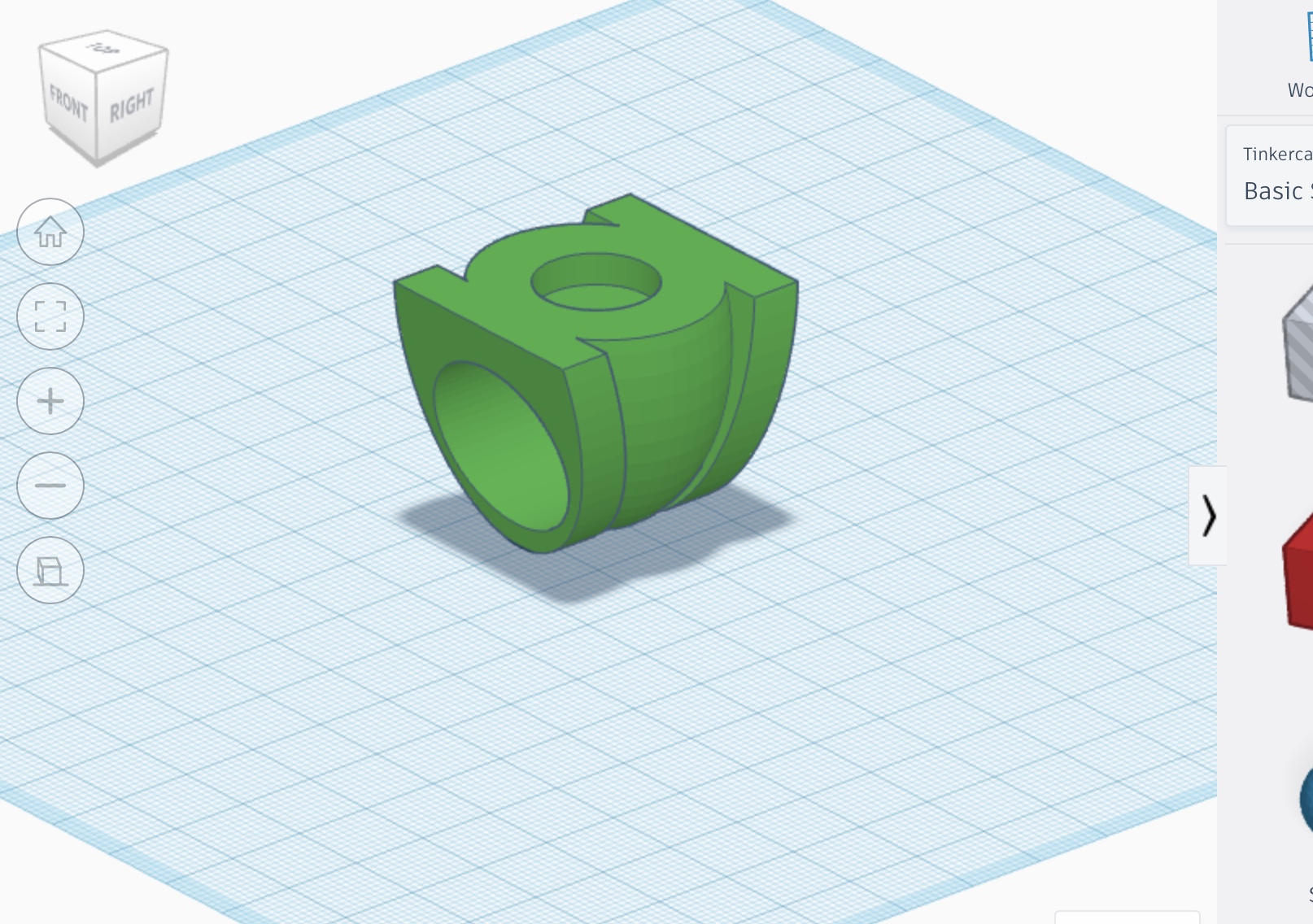
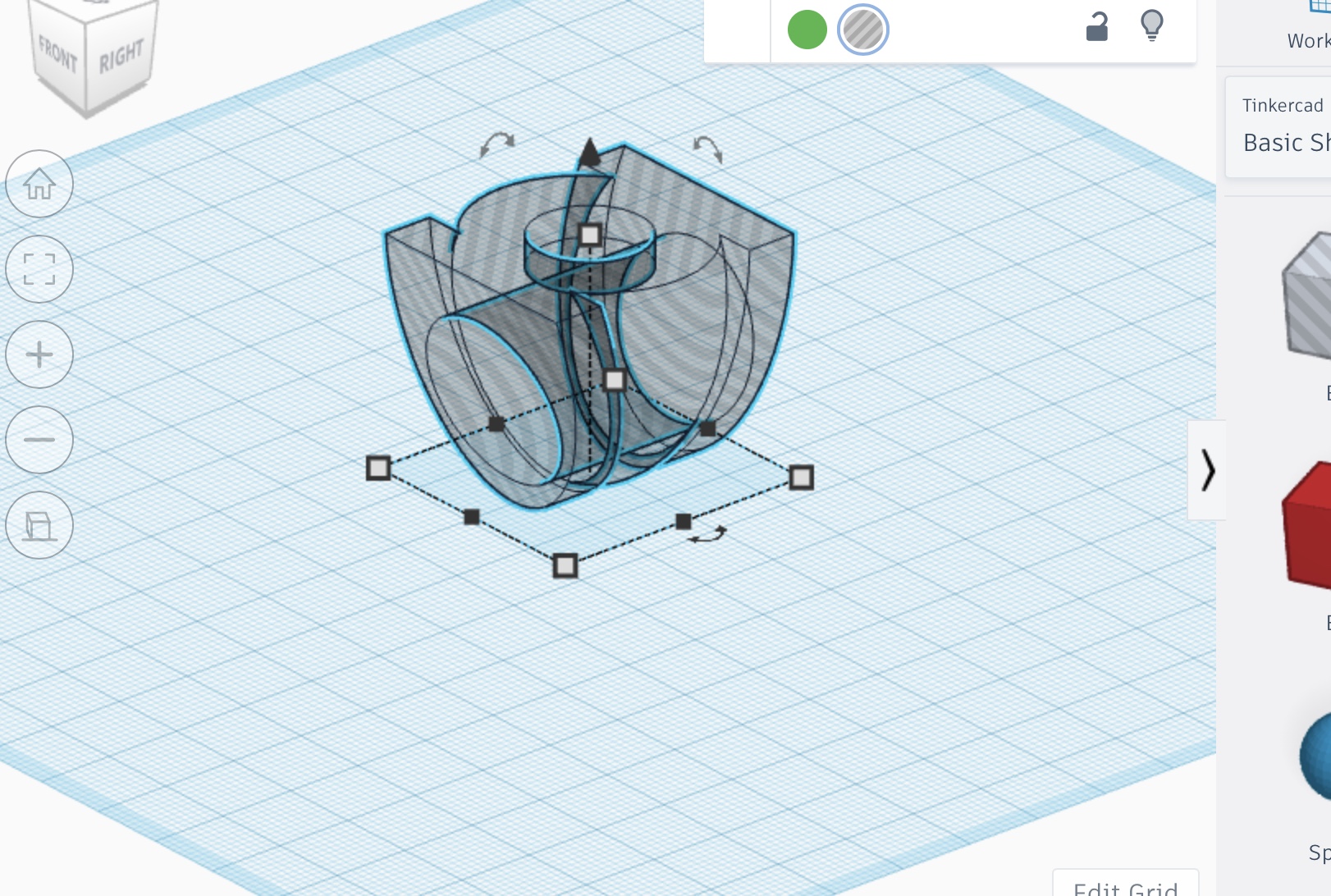
0841015B-A9A6-4EA1-A53E-A7B92D7DFF80.jpeg


1A3F5E44-9A67-4353-A097-6B5D3695D922.jpeg


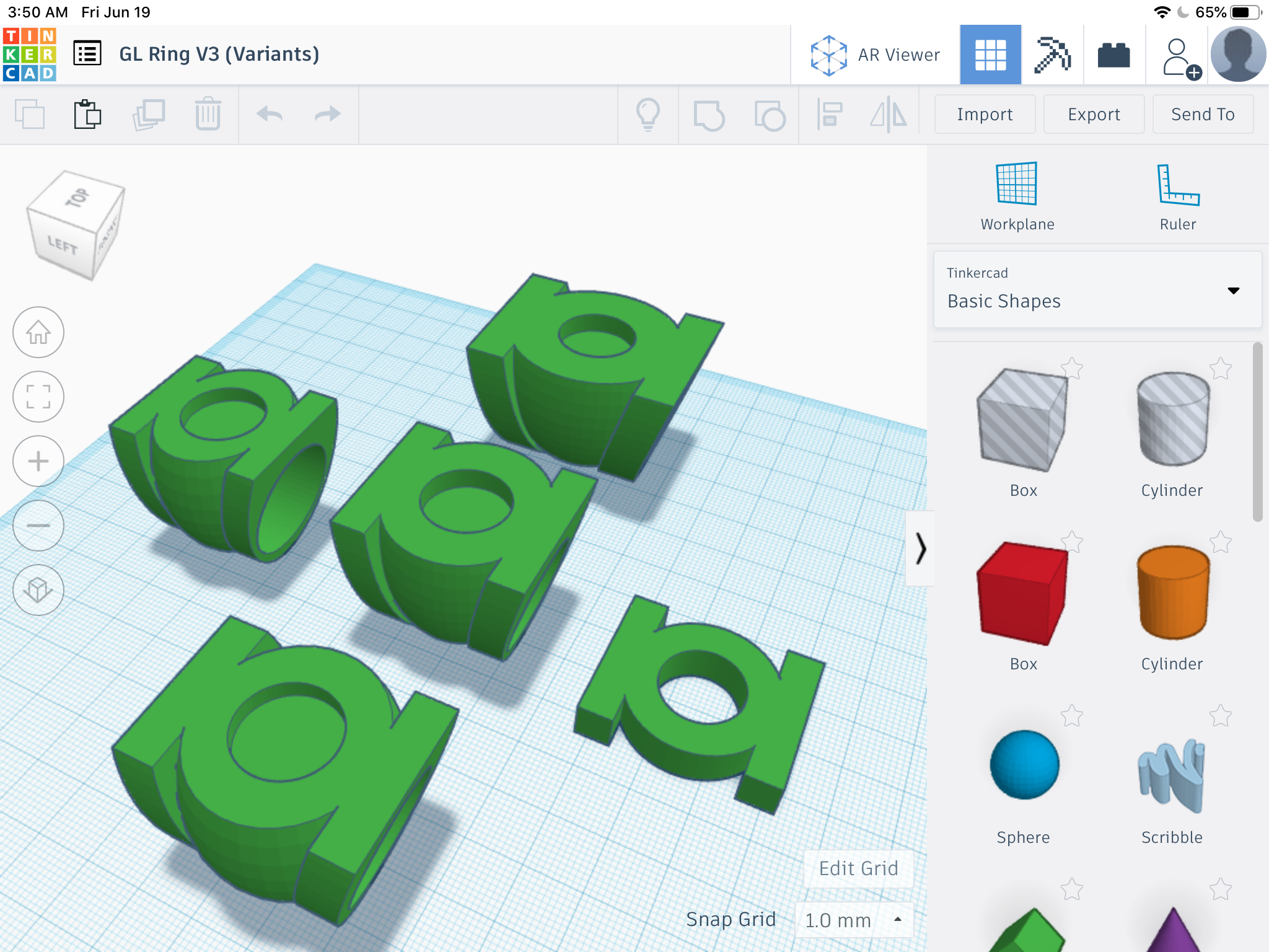
I also created a few variants with different proportions. The original model is in the center, and the official version of the GL symbol (as used for licensing and merchandise) is on the bottom. Extended and squashed” versions surround them.
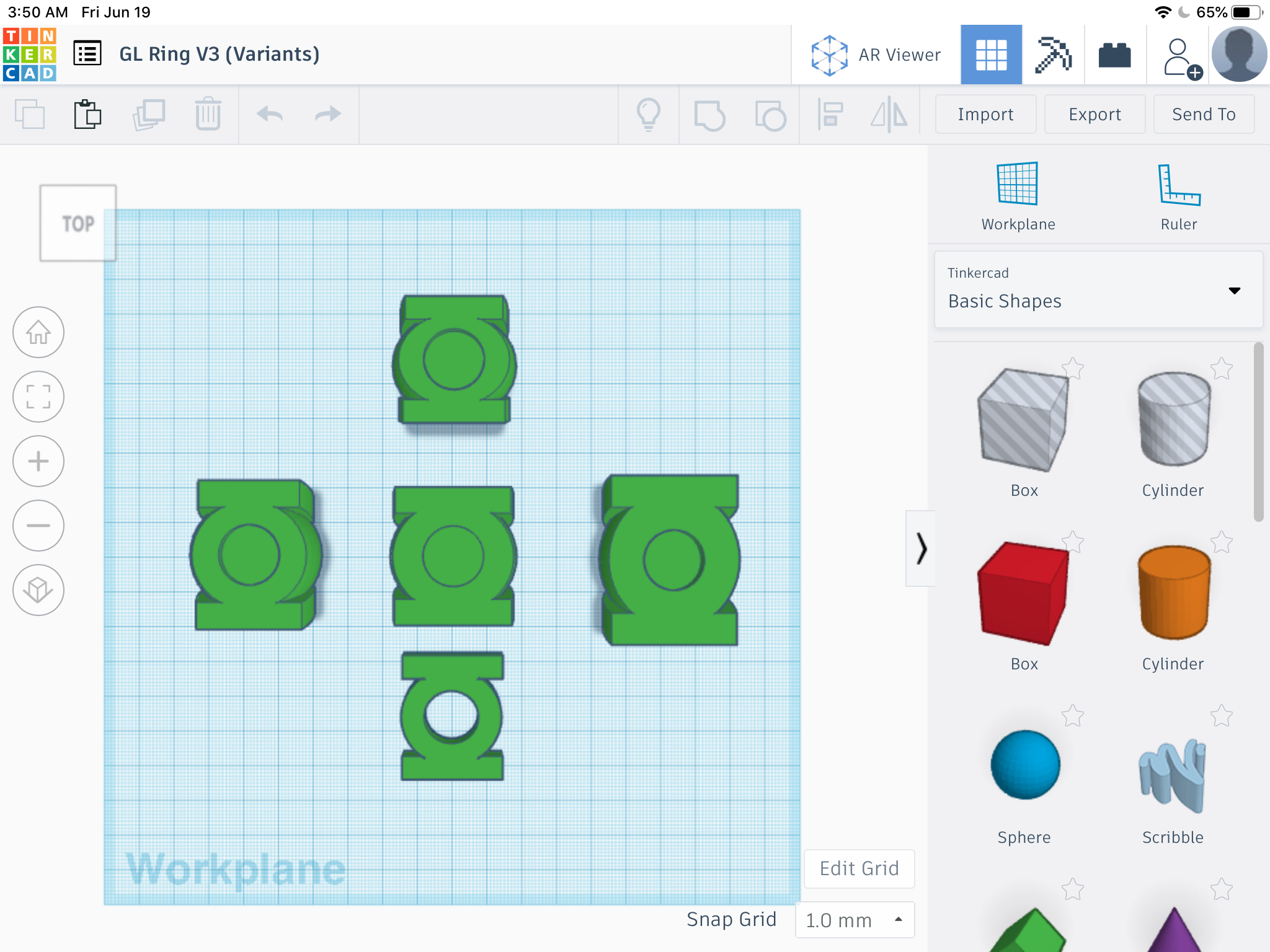
F64122F3-9A69-46C4-B267-939D906478FA.png


DC2C5CD5-8DAE-403D-8A95-64F29067E57A.png


Feedback and suggestions are welcome. The hole in the ring is currently at 23.5 mm. I’m around a size 13, but I left some extra room, for now. And the holes at the center of the symbol on all versions are either 15 or 16mm, which will allow the installation of a 15mm green cabochon.
 
Last edited:
Working on the “straight sides” variant by carefully tweaking and sandwiching multiple sections of the flat face of the ring. Getting pretty close. Any stepping between sections would easily be eliminated during sanding/polishing.

EED60AD2-B9EB-4D68-9886-7FAFD5733C26.jpeg
 
...well, since I’ve gotten the bug for modeling, I’ve decided to rethink my plans. The Silver Age-style model I found online is already being printed by Shapeways, but I think there’s room for improvement. I can use it as a “beater” ring, and to practice polishing and experiment with paint. Might even leave it as polished aluminum, for more of a discreet look in public.

Anyway, I started from scratch, and built my own V1. It’s a little cleaner and more accurate than the online model I had printed. The ring band has more thickness, and a beveled edge. The symbol-disc’s rim is a little thicker, and has beveled edges. And the insignia stands only slightly proud of the inner disc. The online model I found has a much deeper inner disc, and the symbol is about 2mm thick. My current version is around 0.25 thick, which looks a little nicer, and seems more accurate.


After some more tweaking, I’ll send these models to Shapeways to be printed in cheap plastic for test purposes. After any other necessary tweaks, I’m going for aluminum.

V1:

1449AE46-40AB-49E5-BCF1-4A6CA038DCBE.jpeg


V2:

7F3A4E7C-318E-4BE5-8D38-3039D9C8675F.jpeg


V3:

1ED7F44D-C8EE-4C06-8ABD-C02A6D484DD5.jpeg
 
Last edited:
The three designs together and in scale, along with the official GL symbol as a reference. Tweaked the size and shape of the V3 to improve the proportions, and to have the center band extend slightly below the side bands, which was a detail I’d missed. Gonna have to wait until the initial plastic test printing of the early V2 model arrives in order to determine the proper ring sizing. Being a size 13 or so, I’d originally scaled and ordered the existing STL I’d found online in aluminum (pictured upthread), but that test print is a very tight fit, and required Dremeling to get it on my finger). A little loose is the way to go. Size 13 should be about 22.2mm for the finger hole, but I’ve been using 23.5mm as a temporary figure, just for wiggle-room. The center symbol-holes on the V2 and V3 are sized at 16mm, so as to allow 15mm green flatback cabochons to fit (with a bit of extra wiggle-room, so as to avoid any desperate drilling or grinding to get them in).

It’s a delicate balance between getting the finger hole sized correctly, keeping the ring design proportions correct, and keeping the two chunkier designs from being ridiculously huge and cumbersome. I’ve also tried to keep the two chunky rings properly proportioned so as to match the official GL symbol (easy for the V2,but not the V3), although most artists, drawing freehand as they do, tend to stretch the symbol horizontally to make it more rectangular so it lines up better on the wearer’s finger. And the V3 is a lot of cheating and slight compromises in order to get those side bands properly aligned with the flat symbol face.

DD346079-AEE5-4B6C-95E5-ECB10EA16B73.jpeg
 
...I just can’t stop! Now, I’ve modeled the original Gil Kane design from SHOWCASE # 22. I created the more complex lantern design, then flattened it just enough so that it stands very slightly proud of the surface of the disc. About as much as the symbol does on the standard ring.

68CE33F1-4E2E-42DE-AB0B-16786C561AE1.jpeg
 
As it turns out, a friend of mine has a 3D printer, and has volunteered to rapid- prototype these files. I’ve created a few variations in terms of ring-hole size to help determine proper fit, as well as a smaller version of the V2 ring, with a thinner band and smaller symbol. As it stands, the symbols on both the V2 and V3 are about 34mm long, which is pretty darned big.

Once I have these prototypes in (and on) hand, I can do more tweaking.
 
A few more variants of the modern-style rings.

3568EF3E-CDBA-4EB5-B48F-EAAAD7D97C53.jpeg


And, just for funzies, Sinestro’s yellow ring, which was later appropriated by Guy Gardner. There’s also a variation of this one which features Guy’s stylized “G” insignia from that era. Tinkercad can produce transparent yellow for the dome on top of the ring, but joining it to the rest of the model would result in it becoming transparent, as well. Of course, for printing, one would just need to find a clear dome and paint it transparent yellow.

92850C48-ACE9-467E-9852-798AC8F537E1.jpeg
 
...couldn’t resist, so I created Guy’s symbol, and added it to the yellow ring. The dome is set to “translucent”, but isn’t actually attached to the ring.

B508F491-0E4D-49AE-80D1-406AD0195CC1.jpeg


D4877A14-11D2-4497-A9C1-79C49D362E51.jpeg
 
After checking more reference material, I remembered that Guy Gardner’s symbol from his solo series is actually far simpler than the version used for the series’ logo. A shame, too, since my initial rendering of the symbol took a lot of time and work to make. Regardless, I just finished creating the actual symbol.

7136DC51-2B3B-4217-8583-8995D62467D3.jpeg


However, it seems my memories of the ring itself including the symbol may be based solely on this house ad for the series, since I can’t find any other images depicting it looking like that. After, all, how could the ring physically be altered to add the symbol? That being said, I still like the look.

61DC8144-F52F-4423-80B7-BA82E8B8E61B.jpeg


Meanwhile, I took a step back and rethought the V3/chunk ring by adjusting the size and relationships of the various parts which make it up. I’m MUCH happier with the result. It’s smaller, shorter, and the proportions are much more spot-on to the official GL symbol. Aside from the size of the finger hole (which should be buttoned up when my friend finishes the test prints), I think this one is pretty much locked in.

Left is the old version, right is the new version.

4C66D1FB-A08B-4617-B6A5-BCEE76F9588F.jpeg


1F62E370-EF8C-4851-A171-4C1D209B48A9.jpeg
 
Well, this project keeps getting more ambitious. I started thinking about a 3-D display stand, composed of multiple printed parts. A sort of “Green Lantern through the ages” multi-ring display, from Silver Age to modern.

This first doodle would be a wall-mounted design, with the GL symbol and support wedge being Command-stripped flush to a wall:

A5BD7D1D-1621-4BA4-833D-5CCF58DD958A.jpeg


The second would be more of a traditional display stand:

A0D05879-6A5A-4DB8-8889-9978BF29B8C8.jpeg


Also, a friend suggested that LED lighting be incorporated, and I think an illuminated outline of the big GL symbol would be really neat, particularly on the second design, as it would be a bottom-lit look. Something like this:

4482CA4F-31E1-4AA5-B976-928FDA55123E.jpeg


Still coming up with ideas. Suggestions are welcome.
 
Last edited:
Still coming up with display ideas. Thinking about incorporating one of the vintage GL cover logos into it, by way of converting the line-art into a vector-graphic to be applied to the display base model. It’s been tricky finding clean (to say nothing of black-and-white, which is required to convert from JPEG to vector-file) versions of any of the logos.

Meanwhile, here’s my latest version of the M.D Bright version of Jordan’s ring, circa EMERALD DAWN up through EMERALD TWILIGHT. Basically, it’s a riff on the Gil Kane ring (which it’s sitting next to, for comparison), but with a flatter and more convex symbol-disc which blends into the band, as well as a two-tone color scheme (not shown here). Been tinkering with this design for nearly two weeks, and it’s been by far the hardest to get even close to right. No other design has been more challenging, largely because getting the disc and the band to properly mesh has been a royal pain.

0A1039FB-B923-4E0C-B821-A9332C42D48F.jpeg
 

Your message may be considered spam for the following reasons:

If you wish to reply despite these issues, check the box below before replying.
Be aware that malicious compliance may result in more severe penalties.
Back
Top