Ok. First:
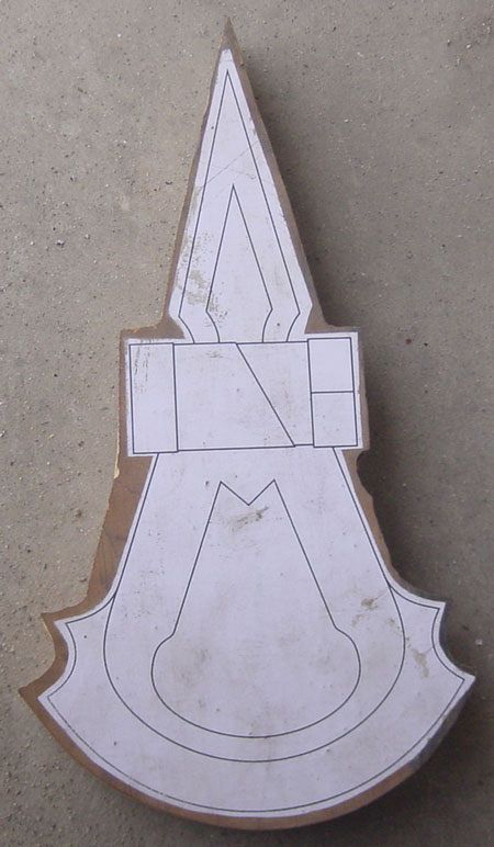
I think you have the whole head too tall and skinny. In this picture:
View attachment 130962
the whole head looks a little wider, more like the logo of the franchise.
The thicker parts of the center piece I believe are angled, not just thicker.
These things, I mean:
View attachment 130968
If you zoom in on the tomahawk on this pic:
View attachment 130959
you can see they point slightly away from the center, not just as raised strips.
I don't think these lines on the sides of the main blade:
View attachment 130963
should touch the sides of the axe. Rather, it seems there is a taper from that line to the edge of the axe. See the view above, and:
View attachment 130961
^ That's a pretty big, clear picture of it. I don't know how official it is, but it sure looks good.
The negative space inside the main blade is definitely off a little bit. It should be wider and more weather-balloon shaped.
Also, the two points on the main blade that are
closer to the handle are, I think, actually equal width or slightly wider than the points closer to the blade.
I posted a picture of what I think the outline should like
here.
Granted, none of these are official production shots, but they're pretty good.

")