clancampbell
Sr Member
That's one hell of a conversion!!! Movie standard modelling!
Rich
Rich
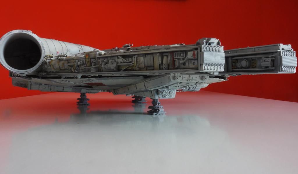
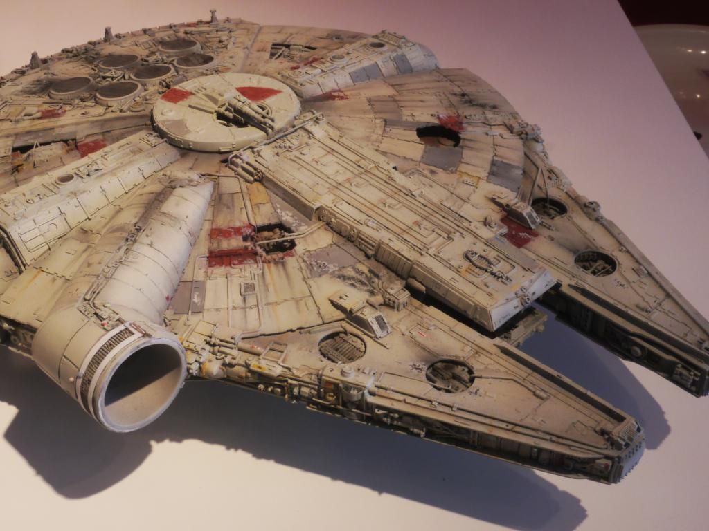
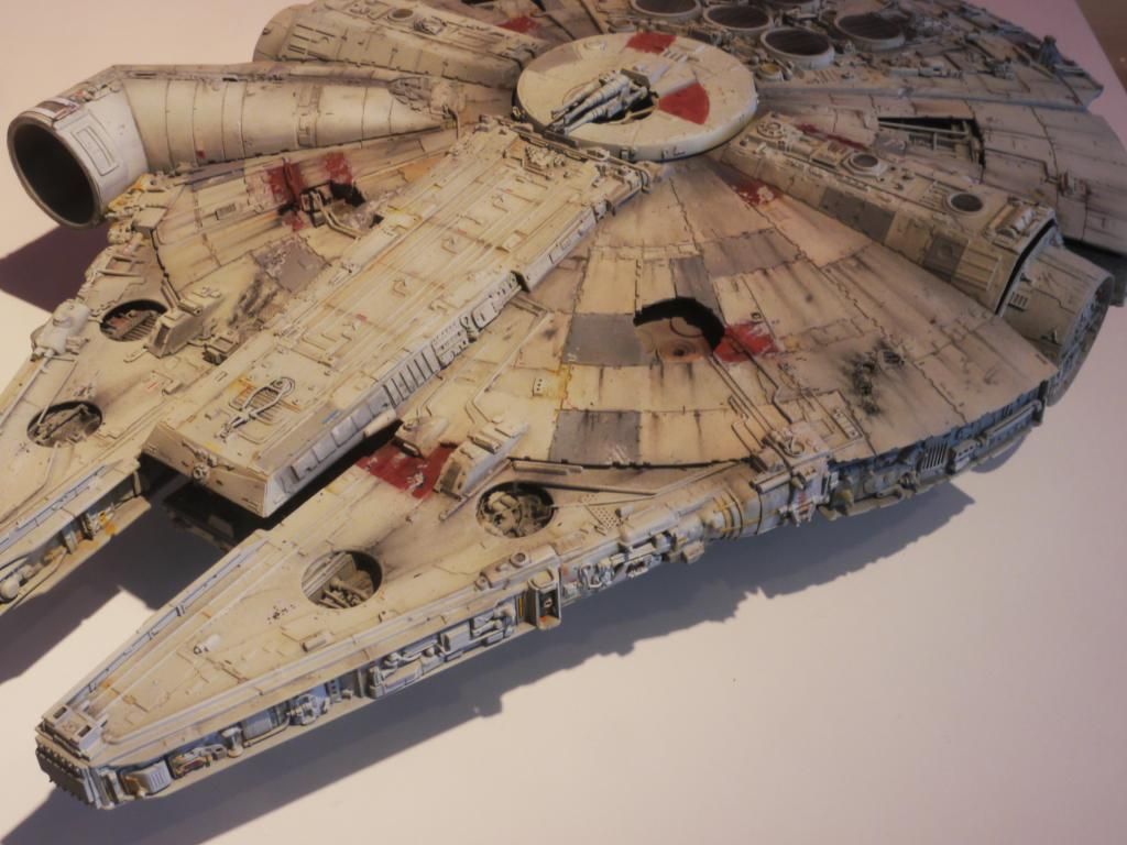
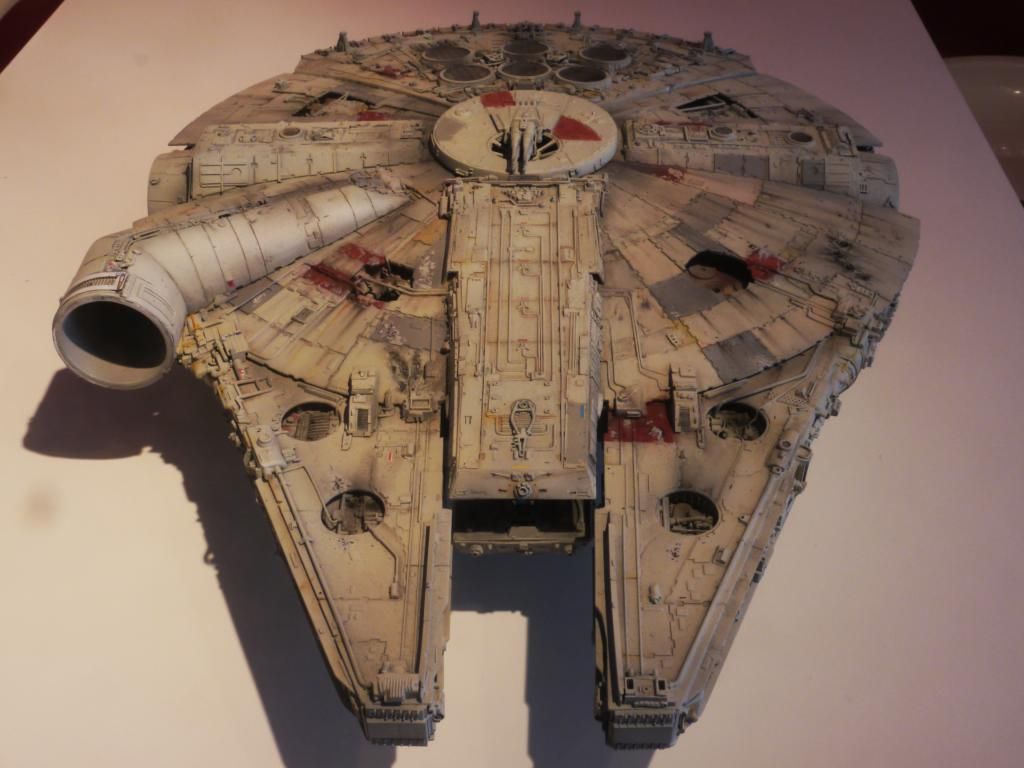
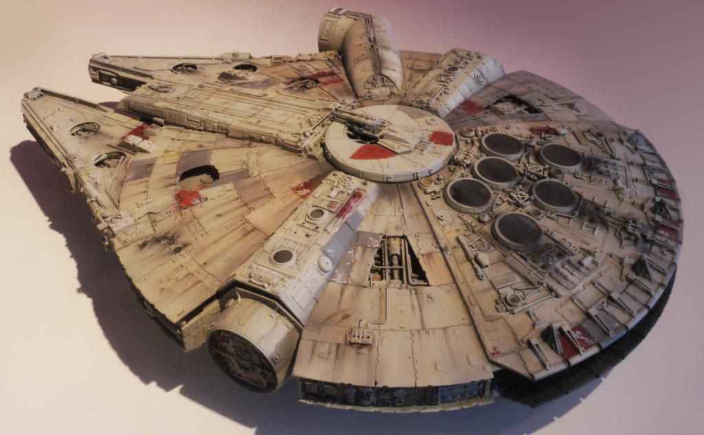
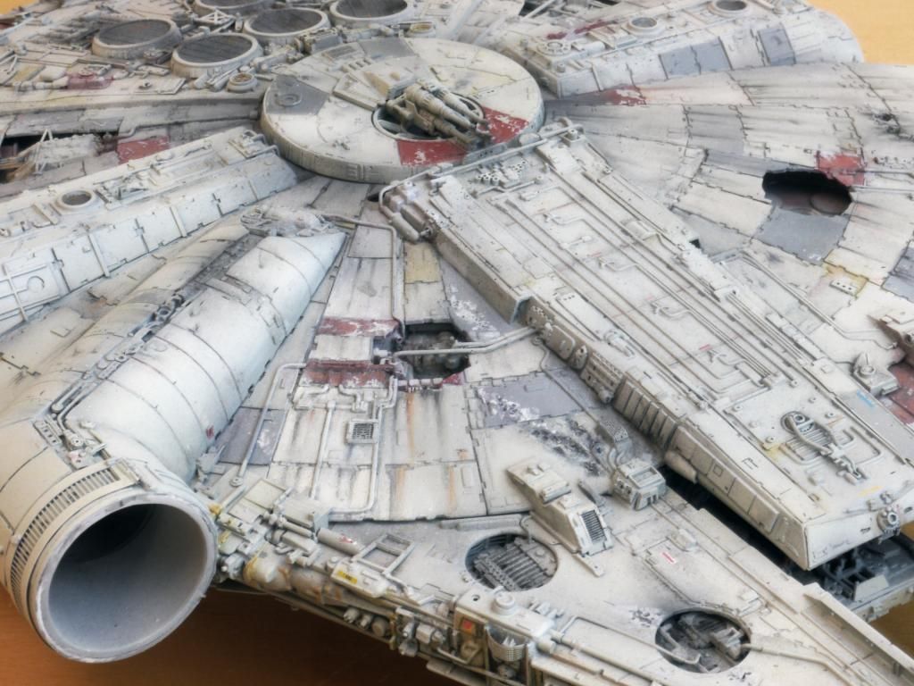
It's easy for me to comment from my armchair way up here in the cheap seats, but in my amateur opinion the red is a bit too bright and vibrant (in comparison to the way the Falcon looks on-screen, that is). Perhaps a misting overspray with the base color to tone them down might do the trick?...I wasn't happy with the red areas (apart from one) so I restarted them; masking, spraying them with the body colour, applying latex for the chipping, then respraying with the red...to tell you the truth I still think its not the way I want it...
It's easy for me to comment from my armchair way up here in the cheap seats, but in my amateur opinion the red is a bit too bright and vibrant (in comparison to the way the Falcon looks on-screen, that is). Perhaps a misting overspray with the base color to tone them down might do the trick?
Painting is one aspect of model building that scares the crap out of me. Wonderfull work!!!!, Ozzy
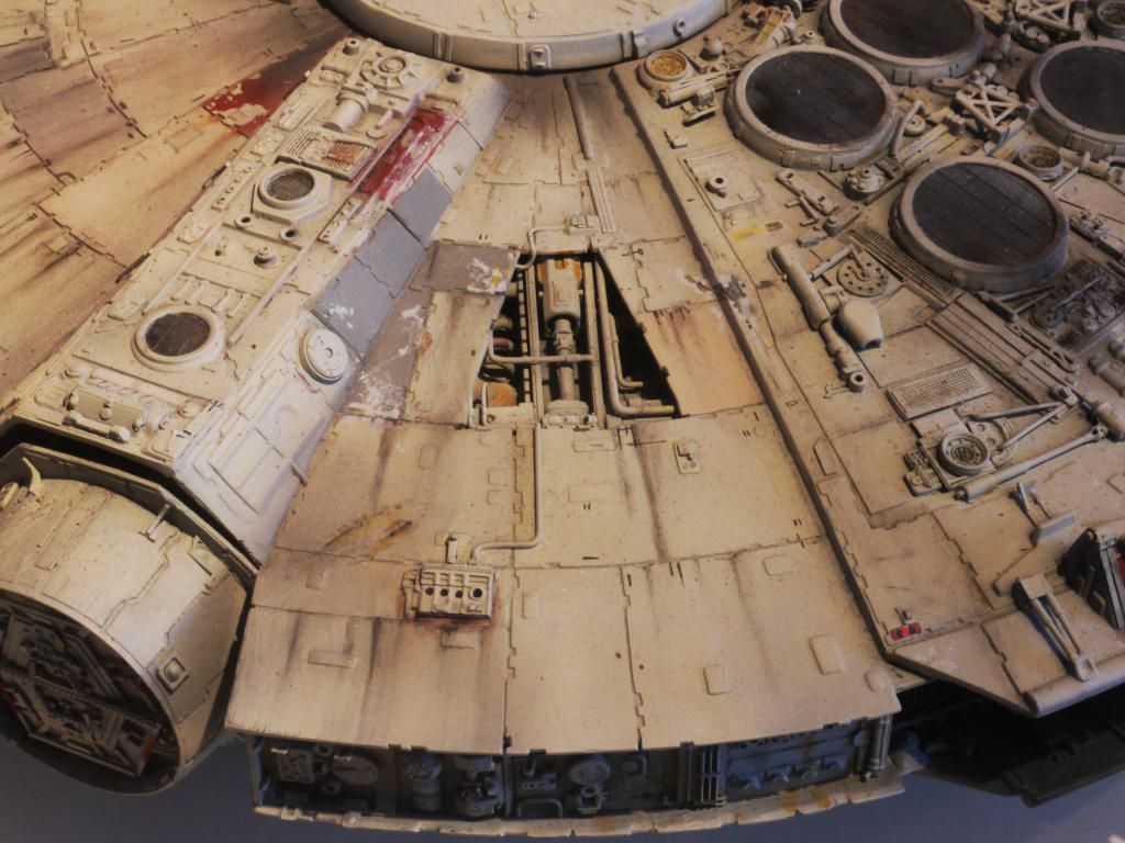
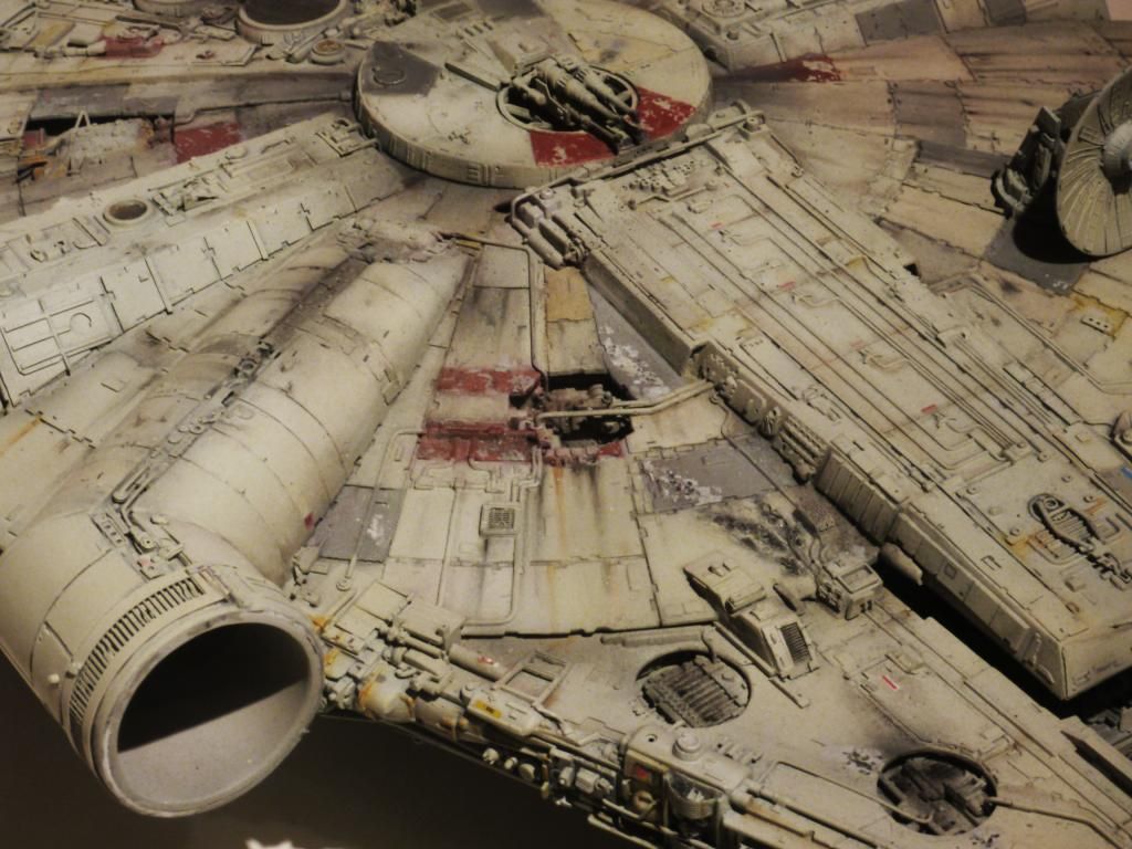
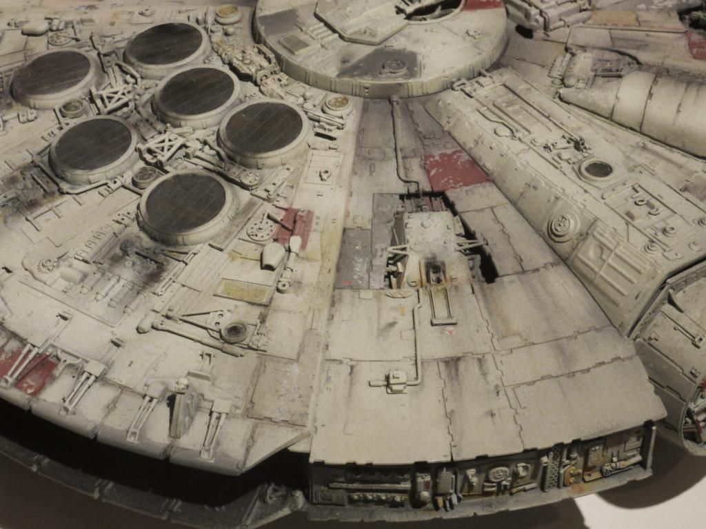
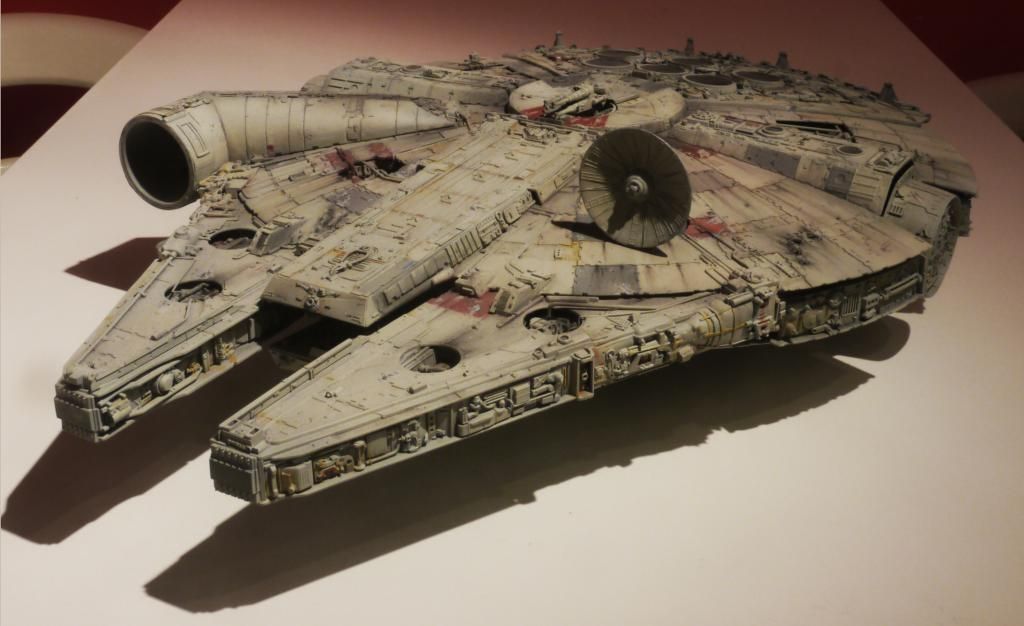
That's an amazing amount of detail! Awesome job!
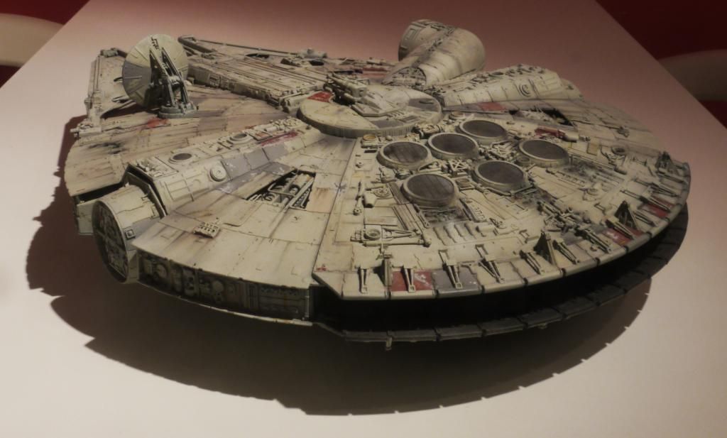
Superb weathering John! God how we love our Falcons!
If you did want to tone down the red, just wash over it with green. Green is opposite on the colour wheel so in effect it neutralises the red. Too much and you'll turn it grey/brown but just a hint will knock the vibrancy down. If you are unsure you could always do it in watercolour so you could blot it off again.
This is the best Falcon I've ever seen. Truly.
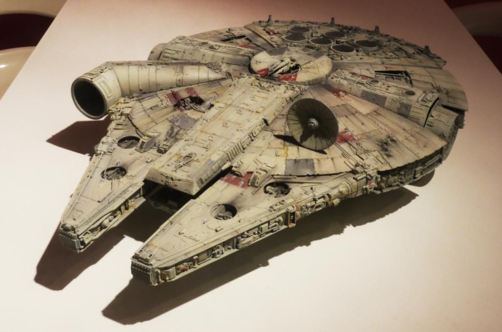
Any chance you're in So Cal? The paint is stellar.
Extraordinary. I love it. --Alex
wow, what an inspiration..... I am prepping to do an mpc build with the sidewall kit from SSM, and you are now my muse!
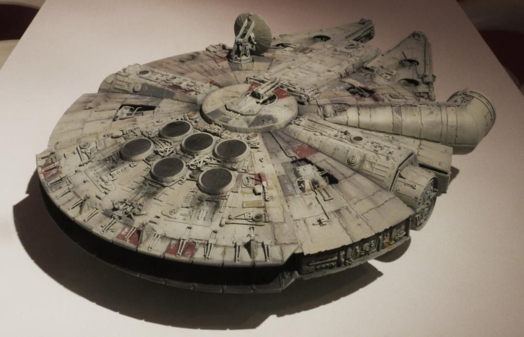
It sounds to me like you're your own worst critic; I'm the same way....Well......not a lot of progress.....toned down the reds,....but I'm still not happy,...
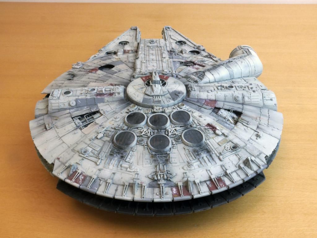
 I think the red panels look MUCH better! They blend in far better now instead of drawing attention to themselves. Nicely done!