You are using an out of date browser. It may not display this or other websites correctly.
You should upgrade or use an alternative browser.
You should upgrade or use an alternative browser.
AMT Enterprise D Build
- Thread starter PHArchivist
- Start date
PHArchivist
Master Member
That is a fantastic shot.
Which model / version is that? Also answers the question I had about the gold rectangles and which decals to use.
Are there more images from that set?
Brace yourself... Also, here's a good album of original construction. The first link is the final Generations deco. There are a bunch of other minor changes besides the lifeboat hatches, but it's a very good reference.
But as you can probably see in that pc I posted a couple above, there is a line there where the model kit goes together -- it's just much finer. I still need to get to the point with stuff in my garage that I can pull out some of my Trek kits, blow off the dust, and take some pics, but for those two... A little bit of Milliput or similar to not so much extend the upper hull piece as pull that upper-outer corner out a little. Since I sanded off the panel lines, it was easy to just add a thin bead of the putty along the edge and, once it had cured, take fine files to blend it in to the surface contour and, once I could see where plastic ended and putty began, file it back to make it a more flush fit with the raised lip on the fantail. It's about 1/32" added. A big PITA, but makes it look a lot cleaner. Then, once glued together, you can see from the studio model the panel(s) flanking the aft torpedo launcher are seamless across that, so that got filled and blended completely.
PHArchivist
Master Member
But as you can probably see in that pc I posted a couple above, there is a line there where the model kit goes together -- it's just much finer. I still need to get to the point with stuff in my garage that I can pull out some of my Trek kits, blow off the dust, and take some pics, but for those two... A little bit of Milliput or similar to not so much extend the upper hull piece as pull that upper-outer corner out a little. Since I sanded off the panel lines, it was easy to just add a thin bead of the putty along the edge and, once it had cured, take fine files to blend it in to the surface contour and, once I could see where plastic ended and putty began, file it back to make it a more flush fit with the raised lip on the fantail. It's about 1/32" added. A big PITA, but makes it look a lot cleaner. Then, once glued together, you can see from the studio model the panel(s) flanking the aft torpedo launcher are seamless across that, so that got filled and blended completely.
It's amazing how eff'ed up the scaling on the original model was.
Compare, just as one example, the size of the observation lounge windows to that of Ten-Forward.
Well, Ten Forward wasn't planned yet when the ship was designed...
PHArchivist
Master Member
Well, Ten Forward wasn't planned yet when the ship was designed...
Yup...
Even the long, oval windows, which are presumably quarters windows, in reality would be about 30 feet long or so.
Seems the overall team that designed and built the model neglected to really attend to detail with regard to scale. Many of the ship features are scaled more so for a ship sized as the 1701-A.
For instance, the photon torpedo tubes. They look fine on the 1701-D as the size fits with the overall ship. But compared to the tube portals of the 1701-A, the tube openings on the D would be four to five times larger, though the torpedoes are presumably the same size.
Nerd / geek nit-picking, and I'm not that sort of a hobbyist... And I understand that the features on the model need to be able to "read" visually to the viewer.
But one thing the Death Star has taught me is that to convey scale - especially that of a larger vessel - the more finite and minute the surface detail is, the more effectively the large scale is conveyed.
The Ent-D model fails to do that...
Based of the scale of it's exterior features (shuttle bays, for example), it really would not have been much larger that a Constitution class ship.
In the end, its just a TV show, and a fictional ship...
The Photorp launchers do not bother me that much- they used them to launch more than just torpedoes. Having them large enough to use for various probes gives them flexibility.
PHArchivist
Master Member
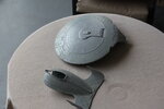
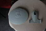
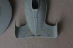
On-and-off project...
(not liking the RPF Gestapo hounding me on necro-posting)
Latest progress:
(not liking the RPF Gestapo hounding me on necro-posting)
Latest progress:
Attachments
PHArchivist
Master Member
Look at the pics...
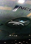
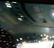
I'm using Tamiya J.N. Grey for the "green".
On the primary hull, you can see the sheen variance between the pure flat green, and the semi-gloss grey. I love that look...
On the secondary hull, it has been clear-coated, which homogenizes the sheen, and deepens the green.
What is best?
I'm using Tamiya J.N. Grey for the "green".
On the primary hull, you can see the sheen variance between the pure flat green, and the semi-gloss grey. I love that look...
On the secondary hull, it has been clear-coated, which homogenizes the sheen, and deepens the green.
What is best?
Last edited:
PHArchivist
Master Member
I prefer the saucer but that’s just me. I haven’t built one of these since the first release,but have the latest clear release and have been collecting accurizing stuff. Some day. Some day. Lol
Yeah... Am strongly considering going back over the clear-coated parts (that includes the nacelles as well).
But all the J.N. Grey has been hand-brushed. That's a lot of double work!
It shouldn't count as necro-posting if it's your own thread...
I have Opinions™ about the various colors and glossinesses (is that a word?) the various filming miniatures have been painted and desaturated from. I do not like the exaggerated texture the later 4-foot Enterprise-D filming miniature was created with, far preferring the effect given the TMP Enterprise refit -- the close shades for the "aztec" patterning, but then the carefully masked and airbrushed pearlescent clear inks and differing reflectivities of clear finish. All of that created the impression of an actual large, constructed object better than anything before or since. I don't want to suggest you go to all that painstaking work on this model, but I've seen some good work done with, essentially, radial digicam masks to lay down gradually increasing mists of glossiness to recreate the sense of hull plating in small scale.
That secondary hull is looking very nice. I have to check the J.N. Grey to see what I think of it as a color, rather than go by how it looks in posted photos. One of the things I've been experimenting with has been seeing how the gray/blue/green hue of the TOS and TNG models looks applied to other ships like the movie Enterprise, the Excelsior, the Voyager, etc. I like the idea of metallurgical hallmarks in Trek. Klingon ships are a sort of oiled bronze color. Romulan ships are blood-green (oxidized copper). I have never liked that Starfleet ships go from greenish-gray to white to light gray to bluish-gray to ash gray, etc. I've been working to nail down the best-looking palette, that I can then stick to with much more minor evolution from Daedalus to Majestic. To that end, I've accumulated something like thirty shades of blue, green, and gray in the right neighborhood to see how they play together.
Also, I've been committing sacrilege as I have worked to refine my approach to these models. I want to have rooms behind as many of the windows as I can for at least one model, so I've been experimenting with carefully thinning the plastic from the back-side. But that's also run me up against how Ten-Forward doesn't work. I have Andy's concept work. I know the rim was supposed to be a single slightly-overheight deck thick, with upper and lowers flanking the sensor band. I feel the lounge we got in season two should have been Two-Forward. I'm considering the arboretum/community center for behind the big aft windows. The scaling actually mostly works... They just should have had more flexibility with the hull wall of the sets. I would love to see an accurate rendition of Picard's quarters, with the floor-to-interior-wall windows/skylights in the main living/meeting area.
PHArchivist
Master Member
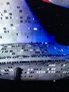
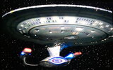
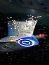
Here are screen-grabs from the TNG opening sequence, where you can really see how green this baby was.
And - to my eye - the Tamiya J.N. Grey (before its saturated with Clear) captures the light green hue well.
And - to my eye - the Tamiya J.N. Grey (before its saturated with Clear) captures the light green hue well.
Attachments
-
 IMG_4008.JPG1.4 MB · Views: 202
 -
 IMG_4131.JPG1.2 MB · Views: 193
 -
 IMG_4141.JPG1.5 MB · Views: 186
 -
 IMG_4144.JPG1.3 MB · Views: 171
 -
 IMG_4146.JPG1.6 MB · Views: 168
 -
 IMG_4151.JPG1.1 MB · Views: 160
 -
 IMG_4153.JPG1.4 MB · Views: 164
 -
 IMG_4154.JPG1.1 MB · Views: 160
 -
 IMG_4166.JPG1.2 MB · Views: 164
 -
 IMG_4893.JPG1.2 MB · Views: 181
 -
 IMG_4895.JPG1.3 MB · Views: 155
 -
 IMG_4900.JPG1.2 MB · Views: 165
 -
 IMG_4910.JPG1.6 MB · Views: 199
Excellent. My LHS has it in stock, so I'll be securing a few. I know this stuff can be thinned out pretty far and retain opacity -- especially over a gray primer base versus white... But I'm looking at *thinks* ...close to a hundred models scattered across 1:500 (the Daedalus, at the end of the pre-Federation scale era), 1:1000 (Founding through Great Experiment), and 1:1400 (Excelsior on up). Plus a couple of oddballs (the big Defiant and Voyager models, Loknar and Larson models converted from old AMT Enterprise kits, and then my big 1:350 ships). I will probably end up with a case worth of the base hull colors. *lol*
Also, random observation... I utterly hate that the illuminated windows on the saucer are symmetrical. The rest of the ship is fine, but the upper and lower saucer windows are the same lit/dark pattern right and left.
PHArchivist
Master Member
Excellent. My LHS has it in stock, so I'll be securing a few. I know this stuff can be thinned out pretty far and retain opacity -- especially over a gray primer base versus white... But I'm looking at *thinks* ...close to a hundred models scattered across 1:500 (the Daedalus, at the end of the pre-Federation scale era), 1:1000 (Founding through Great Experiment), and 1:1400 (Excelsior on up). Plus a couple of oddballs (the big Defiant and Voyager models, Loknar and Larson models converted from old AMT Enterprise kits, and then my big 1:350 ships). I will probably end up with a case worth of the base hull colors. *lol*
So... Thinking its a pretty good match?
I also played with Tamya's Sky and J.A. Grey.
Sky was a bit to 'bright' for the scale, though at first glance looks 'right".
J.A. Grey was too drab...
PHArchivist
Master Member
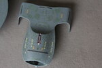
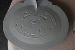
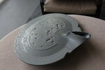
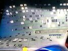
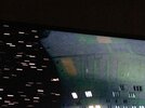
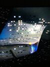
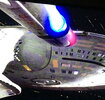
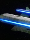
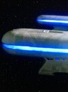
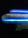
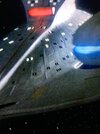
Progress..
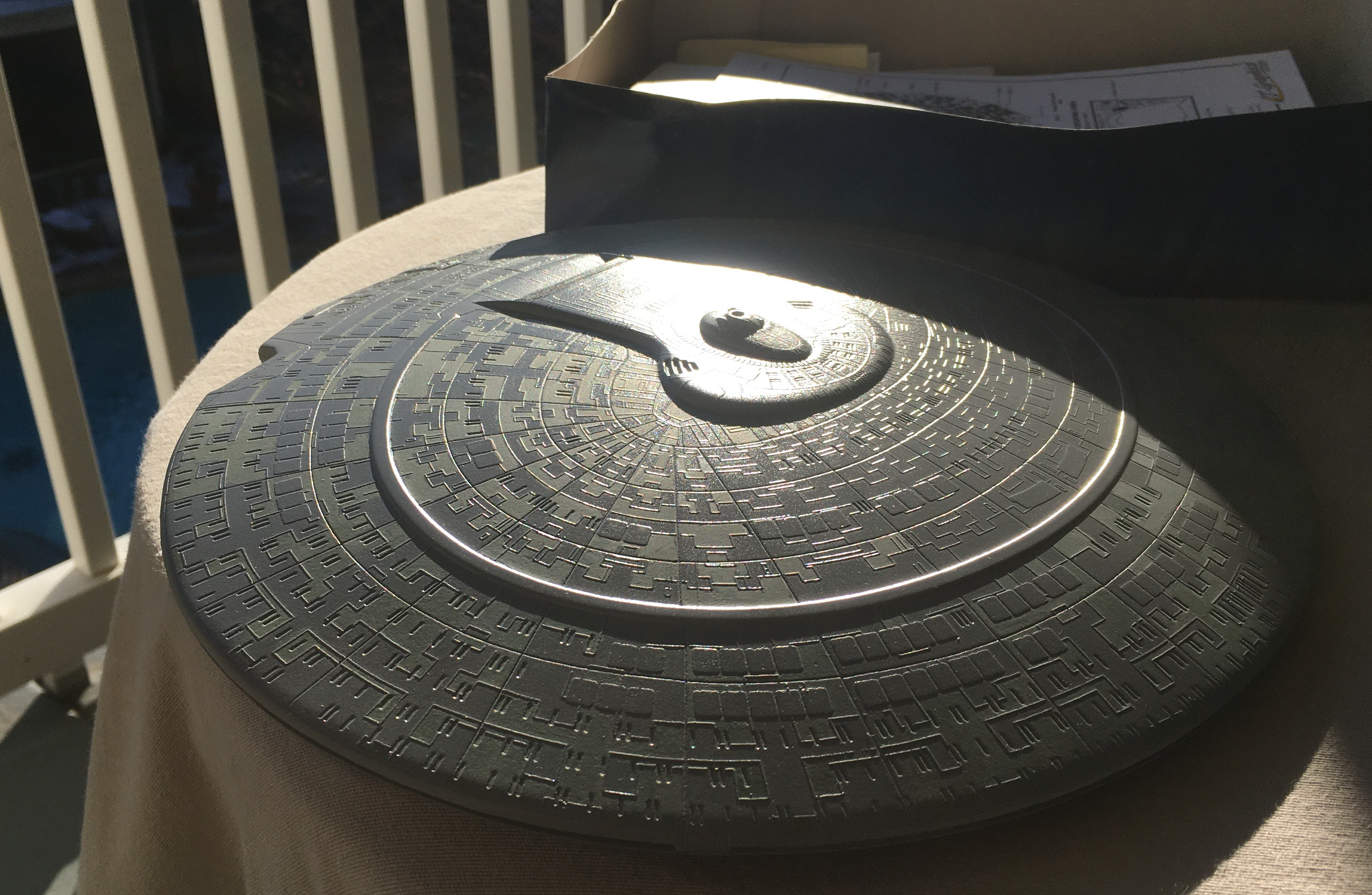
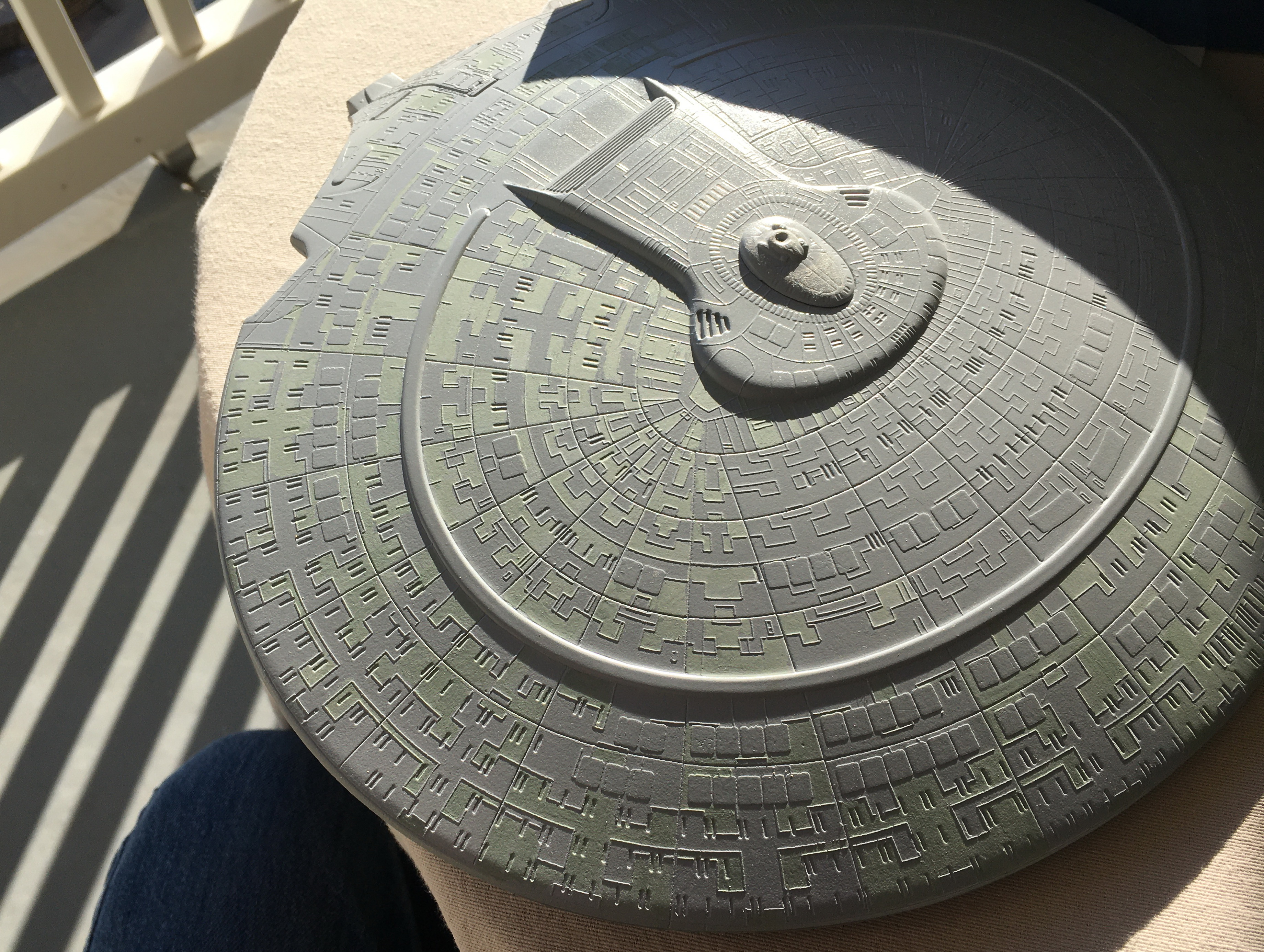
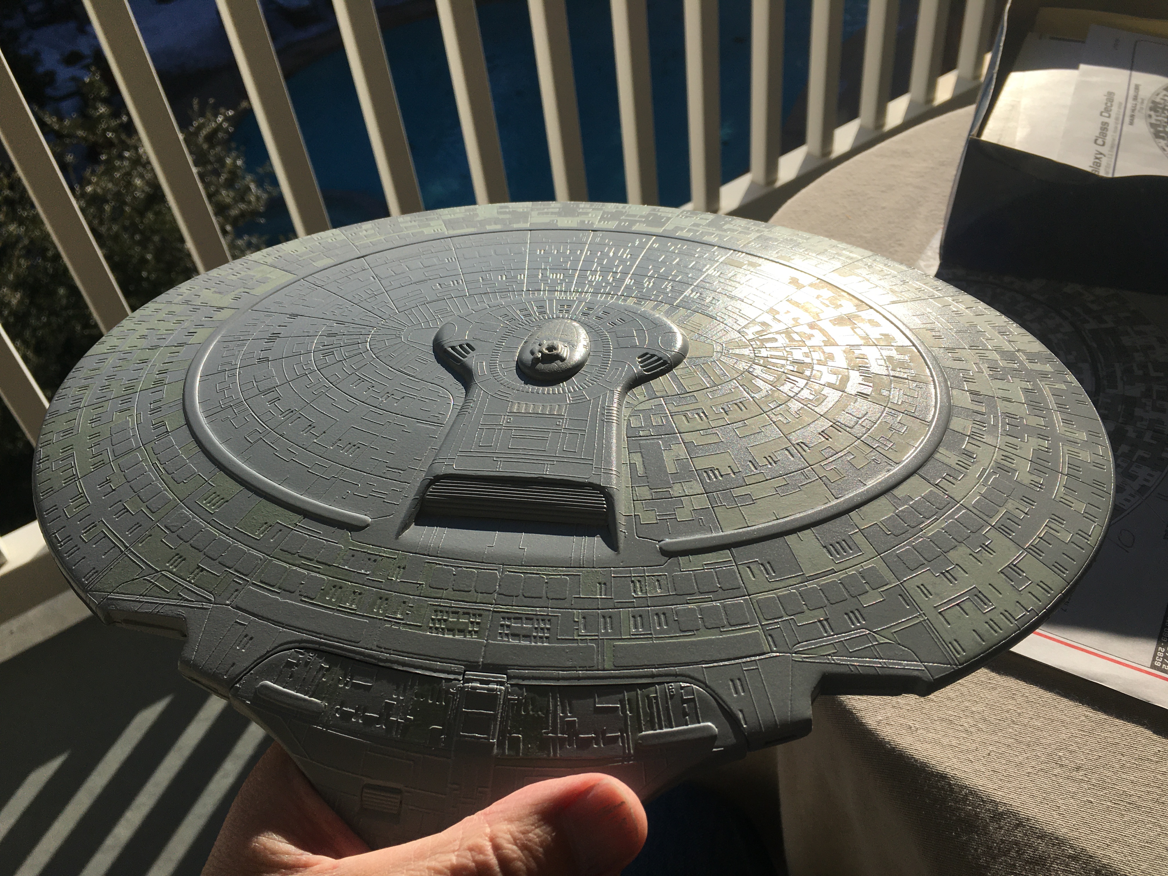
On this shot, I adjusted the light on the image, slightly enriching the green.
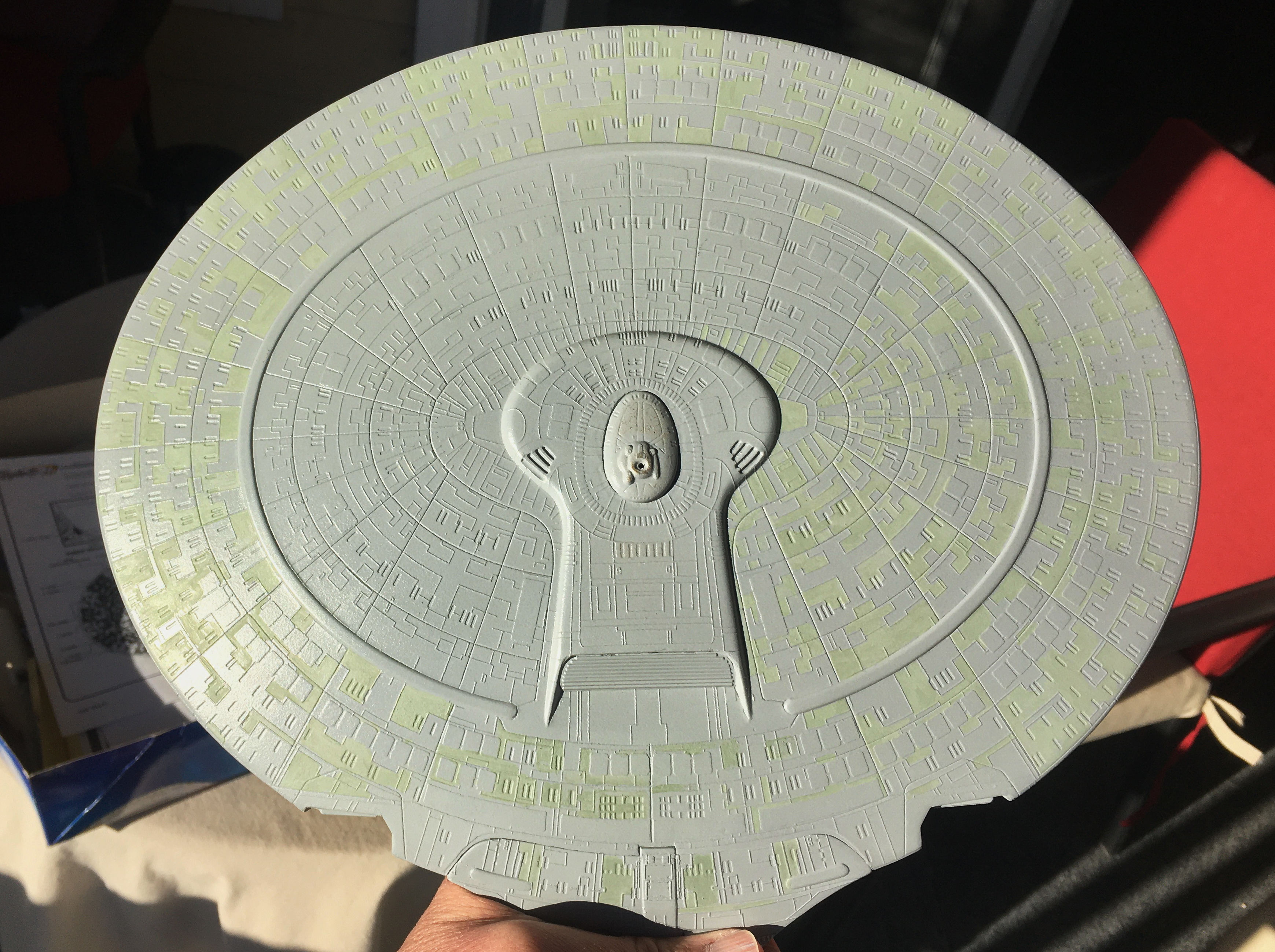
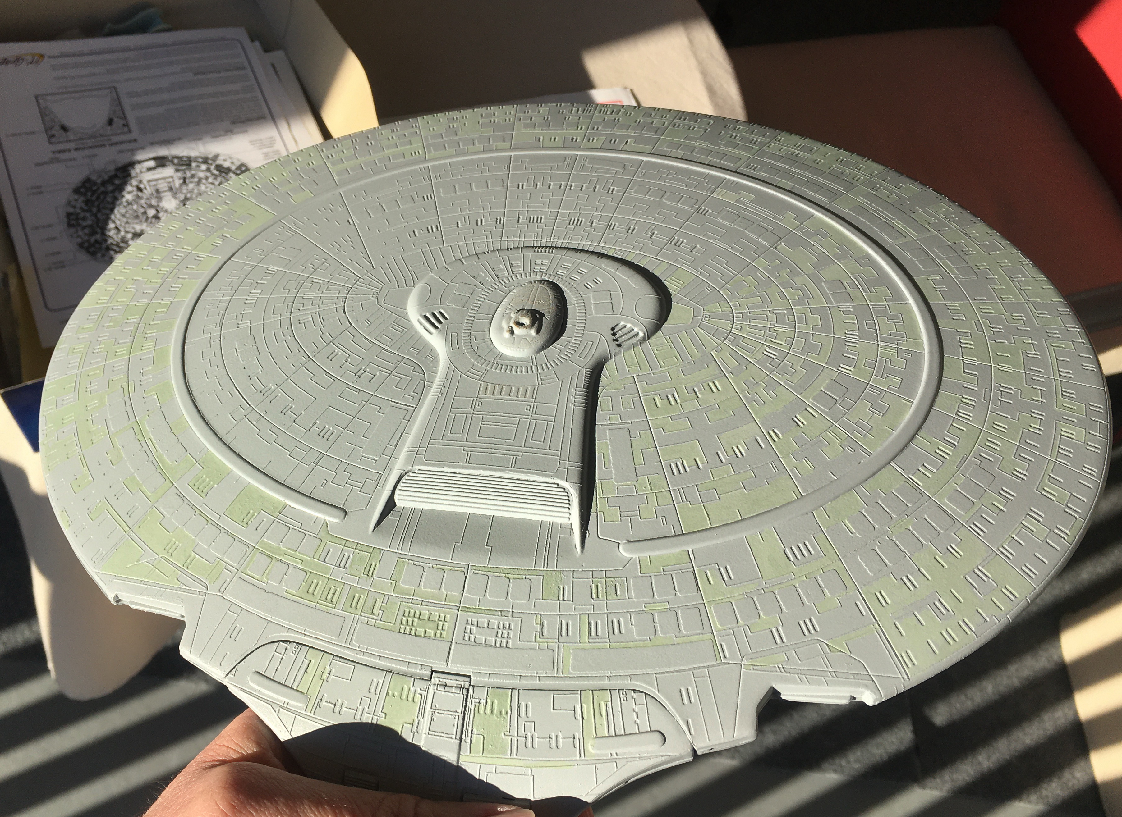
On this shot, I adjusted the light on the image, slightly enriching the green.
That top shot looks very Star Trek: Generations.Progress..View attachment 1542865View attachment 1542866View attachment 1542867
On this shot, I adjusted the light on the image, slightly enriching the green.
View attachment 1542868View attachment 1542869
PHArchivist
Master Member
I thought so too! On approach to the Armagosa Observatory...That top shot looks very Star Trek: Generations.
Similar threads
- Replies
- 88
- Views
- 10,874
- Replies
- 31
- Views
- 5,306


