You are using an out of date browser. It may not display this or other websites correctly.
You should upgrade or use an alternative browser.
You should upgrade or use an alternative browser.
Polar Lights Kronos One 1:350
- Thread starter PHArchivist
- Start date
Hunk a Junk
Sr Member
Seams are always an issue with light blocking, though - right...?
Tulip paint from Michaels is your friend. That and a roll of silver HVAC tape from a home improvement store. Just those two inexpensive items can cover a LOT of crimes.

star-art
Sr Member
Well, it helps if you don't turn the entire inside of the model into one giant super-bright light box. LOL
The kit is well engineered to help people light it up with minimal problems. For example, I designed back-beveled edges wherever possible to make the seams almost disappear. They also added "dams" and strips behind many areas to help aid in blocking light from escaping.
The best practice is to build little light boxes behind groups of windows in specific areas to keep light confined to just those spots. You can also seal around each LED to keep it from shining anywhere but where you want its light to go. But, of course, that can be a lot more work so many people wouldn't be inclined to do that. The alternative is to simply build it as designed and then try to address any individual problem areas as they crop up.
PHArchivist
Master Member
Well, it helps if you don't turn the entire inside of the model into one giant super-bright light box. LOL
The kit is well engineered to help people light it up with minimal problems. For example, I designed back-beveled edges wherever possible to make the seams almost disappear. They also added "dams" and strips behind many areas to help aid in blocking light from escaping.
The best practice is to build little light boxes behind groups of windows in specific areas to keep light confined to just those spots. You can also seal around each LED to keep it from shining anywhere but where you want its light to go. But, of course, that can be a lot more work so many people wouldn't be inclined to do that. The alternative is to simply build it as designed and then try to address any individual problem areas as they crop up.
Good information!
Thanks!
Fett_Ish
Sr Member
I didn’t find light leaks to be an issue, I did use plastruct glue and Tamiya extra thin so my kit was welded pretty sold and I used next to no putty. I did shoot the inside of the front with white and also the outside of the light pipes in the nacelles,masking the end bits of course. The only problem I had (still) is those damn clear parts on the bottom back of the head. I have shot so much paint in there and they still leak.
Hunk a Junk
Sr Member
I haven't seen this commented on, but did Round2 correct the slight twist in the neck from the K'tinga kit?
star-art
Sr Member
The only problem I had (still) is those damn clear parts on the bottom back of the head. I have shot so much paint in there and they still leak.
People also had similar complaints about the two highly detailed clear parts in the 1/350 Grissom kit. This is 100% caused by trying to spray paint those parts. You are unlikely to light-block a detailed clear part like this by spraying it! Instead, such pieces should be painted by hand with a brush. That’s the only way to get the paint down into all the little crevices.
As you noted, in order to maximize light transmission the outside of the part can first be painted FLAT WHITE (using a brush). A white primer would be ideal for this purpose. Just make sure not to get any paint on the inner recess where the light needs to be transmitted. That area should remain clear.
star-art
Sr Member
I haven't seen this commented on, but did Round2 correct the slight twist in the neck from the K'tinga kit?
There is no "twist" in the tooling for that part. So, it could be caused by warping due to internal stresses during the molding process. TBH I'm not sure what could be done to try and correct this during manufacturing. In theory at least, it shouldn't be too hard to remove a slight twist in a part like this by heating it in hot water.
Hunk a Junk
Sr Member
To be clear, I'm not trying to knock on R2 or anyone associated with the design. I just know the twist was noted on many kits and I definitely see it on mine. I would've taken steps to address it had I known it was a problem beforehand. I'm only wondering if R2 knew about the problem and modified it's molding process for the Kronos to try to eliminate the issue. If its still there, it won't stop me from buying the kit. Believe me, I've had to fix far worse flaws on most other kits.
star-art
Sr Member
It's been so long since the K'T'Inga kit came out that I'd quite honestly forgotten about this issue. I don't recall having any discussions with R2 about it back then and the subject never came up during the design process for Kronos. So, if they did take any steps to address this, I was not aware of it. Sorry!
I remembered a modeler who first brought this up about the original K'T'inga kit. It took a while to find it, but here is his take on addressing this issue. My kit had a very slight twist and this tip helped me to fix it.

 www.hobbytalk.com
E
Lighting and Detailing the PL 1/350 K'T'inga
E
Fett_Ish
Sr Member
Mine has the twist. My understanding from watching it play out was that it was some of the first batches to go out and whatever was causing it,pulled too early from the mold,stacked in some way,whatever was remedied one way or another. Thanks star-art for the painting clear part tip,gonna do that from now on out! probably should have figured that on my own,lol,live and learn!
kermet
Sr Member
You got that rite, sometimes just depends a bit of putty can solve that problem. Only just how the model fits together if it is tight, good to go if not then putty time and that is only if it looks right cant wait to see how this comes outSeams are always an issue with light blocking, though - right...?
star-art
Sr Member
I posted this on Facebook and thought I'd share it here:
A few tips for those building the new 1/350 Kronos One, from the guy who designed the kit.
A: Unlike on the K'T'Inga, there is only *one* glowing red bridge light visible in the film. It's the one directly in front. I can find no evidence of other red lights being lit around the bridge tower. On K'T'Inga there were 3 forward-facing lights grouped together with more lights on either side. I suspect only the front 3 lights were used in Star Trek VI.
B: There are NO SPOTLIGHTS under the Cobra Head! These were damaged after filming ST:TMP and not repaired so they were not lit in Star Trek VI.
C: These small POINT LIGHTS might sometimes be confused with the spotlights but they are separate. They were present on K'T'Inga and Kronos One.
D: The "Stair Step" lights on the side of the Cobra Head were actually lit on K'T'Inga, but they were so faint I didn't discover them until it was too late and the kit had already gone into production. They were prominently lit, however, for one scene in Star Trek VI but turned off in another. That's why these parts are molded in clear for the new kit.
E: This small point light is just briefly visible in one shot, but I didn't actually notice it before so I haven't studied the filming model to confirm if I can actually see anything there.
Also, while the front bulkhead of the main body (i.e. left, right, and below the base of the "boom" or "neck") had various lights present on K'T'Inga, these were all painted out for Star Trek VI. As a result, there should be no lights in this area of the model.
Finally, a note on the paint scheme: The colors were very "muted" i.e. de-saturated on screen. Overly bright colors and/or too much contrast can make an otherwise beautiful model look more like a toy. That's why I'd recommend toning down the colors as much as possible. Hope that helps!

Hunk a Junk
Sr Member
I posted this on Facebook and thought I'd share it here:
Terrific research! This is my favorite part of this art: finding the details others didn't notice and getting them right.
Agree on muting the colors down. First few times I saw the film I didn't even realize the majenta panels were a different color. I just thought they were a darker gray.
star-art
Sr Member
Some more lighting thoughts/tips/notes for this kit (and also the K'T'Inga). All comments IMHO of course!
On screen, the "bulb" and "Cobra Head" lights on K'T'Inga appeared pale cyan. They were also quite faint. For ST:VI these lights were a bright "natural white" color (about 5000K).
I'm not a fan of using "cool white" LEDs (>6000K). These create a very harsh glow that's not only hard on the eyes but also turns a very ugly blue in digital pics and video. It's a very different type of light than was used back in the day, so it's not really suitable for recreating the look of the models as we remember them.
I do like using both "warm white" (2700-3000K) and "natural white" (4000-5000K) LEDs. There is a subtle but important difference in the color of these as seen by the naked eye and you can tint them to get very pleasing effects. Warm white can be quite effective at recreating a vintage lighting appearance. Natural white also looks good but, unfortunately, also tends to show up as bluish in digital pics and video.
While I realize a lot of people love using them, I'm also not a fan of using "pure color" LEDs. The red ones don't look too bad, but these emit a very different type and quality of light that is very different than anything that might have been used back in the day. IMO it's not a good way at all of creating light effects in these sorts of models. I find it looks far better to use either warm white or natural white and then tint them using gels or transparent paint. Try it and you should be able to see a real difference! There's a much broader spectrum of light being emitted and you might notice that it looks and feels more pleasing to the eye.
There are some problems with both kits when it comes to lighting. The biggest trouble spot is inside the bulb and Cobra Head. The windows on the bulb have been compromised by the molding process and this was difficult to avoid. I developed a workaround for this problem that was used on the 1/350 Grissom but unfortunately it was not possible to get this updated for Kronos One.
The plastic around the bulb windows needs to be carefully *thinned* on the inside as much as possible so the windows can pass more light at off angles. As an alternative, you can open them up and overlay the photoetch on top. Same goes for the lights in the Cobra Head. Either way, the light inside needs to be an even glow that's not overly bright. For this, diffusion is required.
[BTW, the PE window strips in the K'T'Inga kit were way too thick. I requested they make these just 0.005 inches thick for the Kronos kit but I haven't yet received one so I don't know if that happened. The design of the strips for the bulb doesn't really work well as the underlying surface has a compound curve so the PE strips can't sit flush against the hull. I really wish they had made each row as a separate piece.]
I strongly recommend frosting the clear parts that go behind the bulb windows. I'd also try adding some fiber fill inside the hull to further scatter the light and create a more even glow.
But, for all this to work, the LEDs inside the head need to be adjusted for brightness. That can be difficult using a stock off-the-shelf lighting kit. I dial in my LEDs using a voltage divider made from a small potentiometer or "pot." Wired correctly, this can let you adjust the brightness of a single LED from OFF all the way to full brightness. Just be sure not to overload the pot!
The wiring might be more tricky if the LEDs are in series. The pot would adjust the voltage for all LEDs wired in series in a particular strand so you could not control the brightness of each one individually. Again, the pot must not be overloaded. 20mA should be the max current flowing through that part of the circuit and it should be rated accordingly.
There are of course many ways to wire LEDs. If you want to use the lighting kit, that's a good start. But, it might be best to at least add some additional wiring of your own to fix some of the problem areas. I'd also much rather run the power off a wall wart than rely on a battery pack.
Other problem areas (assuming you're using only the latest version of the lighting kit and not the older K'T'Inga lighting kit):
* All cool-white LEDs should be swapped with natural white.
* The point lights on the sides of the bulb (above and behind the windows) should not be too bright.
* K'T'Inga only: Because of the design of the light pipe, the point light on the back of each nacelle is too bright; It needs to be adjusted to be in balance with the point lights on the sides of the nacelles; As they all share the same source, this can be done only by sanding the point light to diffuse it and then painting over with white paint until the brightness is just right.
* The "spotlights" under the Cobra Head are for K'T'Inga only! These should NOT be lit on Kronos One; If lighting these, be sure to PAINT THEM WITH A BRUSH and don't try spray painting them; The only way to light-block parts like this is using a brush to get paint down into all the nooks and crannies; Use FLAT WHITE PRIMER and apply it with a brush, then use silver or black to block the light, followed by the final color; Be sure not to get any paint on the inside of the part where the light needs to be transmitted.
star-art
Sr Member
Regarding the paint scheme, I'm not really a fan of the example color guides provided with either kit. While I totally respect all the work and effort that went into them (and the incredible job Jim Small did building and painting the kits shown on the box), I respectfully disagree with many of the color choices. They are simply too bright and high-contrast IMHO. To me, following these guides could result in a model that looks more like a toy than a filming miniature. I'd strongly recommend toning down these colors a LOT.
To maintain a realistic appearance, the smaller the model, the lighter the colors need to be. To get a better match to the filming model, make your colors muted and washed out. Also, reduce the contrast between colors as much as you can.
On screen, the K'T'Inga looked mostly steel grey with subtle hints of green and brown tinting here and there. On stage, it was very green but without anywhere near the degree of contrast between colors shown on the box. That's because they misted the model with tan overall and this helped to blend all those colors together.
The Kronos looks very warm grey/brown on screen and it has a more subtle variation of color than is shown on the box. The red, for example, should definitely not be a bright red color. The filming model was more of a washed out pinkish-red. By the time it was onscreen, however, it was more of a washed out brick red.
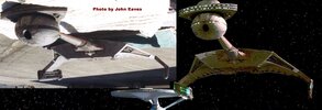
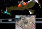
Also, be careful what photos you use as reference. There is a set of images taken by Bill George at ILM when the model was still being finished. The paint scheme in these images is different than what was seen on film. For one thing, the weathering and blending had not yet been accomplished. Many details are different and some are still missing. A better set of reference pics (IMO) is those taken by John Eaves. You can recognize these by the fact the model was out in a parking lot in full sun. They were taken circa 2000 I believe, so it was many years later, and yes the model was filmed a couple of times since ST:VI so some things could have been altered. For sure, the impulse engine shrouds were completely different in these pics. But, IMO, the paint scheme seems to match what we saw on screen pretty well.
I'm attaching some comparison photos of the model as it appeared on screen and in the John Eaves photos. I had to lighten the screen-captures a bit so you could see the details. Hope that helps!
To maintain a realistic appearance, the smaller the model, the lighter the colors need to be. To get a better match to the filming model, make your colors muted and washed out. Also, reduce the contrast between colors as much as you can.
On screen, the K'T'Inga looked mostly steel grey with subtle hints of green and brown tinting here and there. On stage, it was very green but without anywhere near the degree of contrast between colors shown on the box. That's because they misted the model with tan overall and this helped to blend all those colors together.
The Kronos looks very warm grey/brown on screen and it has a more subtle variation of color than is shown on the box. The red, for example, should definitely not be a bright red color. The filming model was more of a washed out pinkish-red. By the time it was onscreen, however, it was more of a washed out brick red.
Also, be careful what photos you use as reference. There is a set of images taken by Bill George at ILM when the model was still being finished. The paint scheme in these images is different than what was seen on film. For one thing, the weathering and blending had not yet been accomplished. Many details are different and some are still missing. A better set of reference pics (IMO) is those taken by John Eaves. You can recognize these by the fact the model was out in a parking lot in full sun. They were taken circa 2000 I believe, so it was many years later, and yes the model was filmed a couple of times since ST:VI so some things could have been altered. For sure, the impulse engine shrouds were completely different in these pics. But, IMO, the paint scheme seems to match what we saw on screen pretty well.
I'm attaching some comparison photos of the model as it appeared on screen and in the John Eaves photos. I had to lighten the screen-captures a bit so you could see the details. Hope that helps!
Attachments
Hunk a Junk
Sr Member
I'm not a fan of using "cool white" LEDs (>6000K). These create a very harsh glow that's not only hard on the eyes but also turns a very ugly blue in digital pics and video. It's a very different type of light than was used back in the day, so it's not really suitable for recreating the look of the models as we remember them.
Beginning with TESB, ILM started using neon tubes to light some of their models, like the SSD Executor and the Space dock in Star Trek III. It would be interesting to note what warmth of light those kicked out and how they compared to non-neon lit models. The lights on the SSD, for example, were decidedly bluer than those on the regular star destroyer. On the E-refit, I've been using a mix of warm and cool LEDs because some of the lights have a yellowish cast and others a pure white/bluish cast.
star-art
Sr Member
Neon light, at least to my eye, mimics natural white LED at around 5000K. On the SSD, the blue lights were electroluminescent. From what I've read/heard, due to the complexity the lighting design wasn't working out as planned. Someone came up with the idea of etching windows onto brass strips, placing EL material behind that, and taping it over the model. Hence, the mixture of blue and white.
I really don't like cool white LEDs as the light appears garish to my eye. The blue tint is harsh and is even worse when photographed. Natural white tinted blue seems much more pleasing to my eye.
I really don't like cool white LEDs as the light appears garish to my eye. The blue tint is harsh and is even worse when photographed. Natural white tinted blue seems much more pleasing to my eye.
Fett_Ish
Sr Member
For the top two rows of lights on the head,I actually cut the plastic front portion up and put the PE windows directly on the clear parts,and glueing the parts above and between separately. Fiddly but it looks good. On the bulb windows I carved them all out and filled the giant holes with canopy glue 9for this build I’ll use up resin) and then photo etch over that. I used the green strawberry PE for the bulb as it is in 3 pieces,eac side and the middle. I will cut the stock one in 3 parts for this build.
Similar threads
- Replies
- 11
- Views
- 1,452
- Replies
- 67
- Views
- 8,778