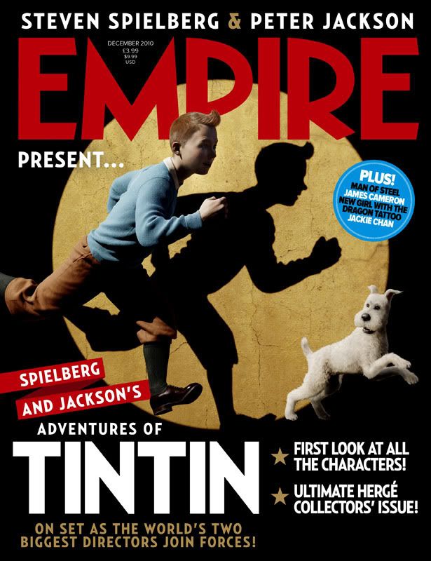
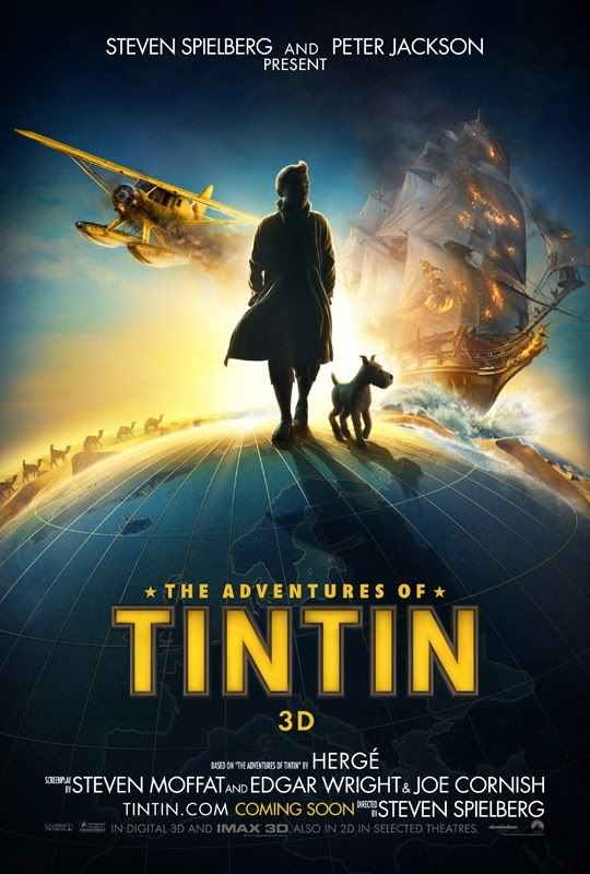
Looks sort of interesting as a style... but only because the characters look like freaks, an inevitable result of any exercise in a halfway-house morphing of cartoon face to human face. They didn't look freakish in Herge's graphics because we know we're looking at highly stylised, highly simplified cartoons.
And there's another problem. Herge did dots for eyes. Replace Haddock's dots with full eyes and it's not Haddock any more. It's another character entirely. This was always the problem with live-action attempts to do Tintin. Seems daft to saddle yourself with that bugbear when you're doing animation and can do anything you want. Still, the characters do seem quite sensitively done here though, I'll give them that. But not Snowy. Snowy's too ugly, too mean-looking.
I don't hate these images, but I so love Herge's drawn characters as graphic masterpieces that it's hard for me to celebrate this type of radical tampering with the look. Might be good as a film in its own right, but I think I'd just, you know.... miss Tintin, Haddock and Snowy too much!


