Philip,
Thanks for sticking with this as I now see where your confusion is coming from.
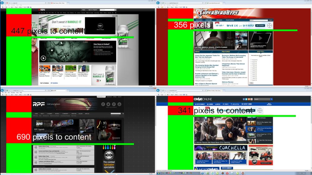
Take a hard look at each of the images you have posted above because you actually have made my point for me. In the three other sites, you have counted ONLY their header, while considering their featured area as part of their content. With us, you have counted our header AND featured area together! Our featured area is almost identical in form and function to the featured areas on those sites. Why? Because featured areas are very effective ways in which to share CONTENT with the visitors of the site! Sure, if you dismiss our featured area as content then our "header" by your definition is 558px tall (not quite sure how you got 690px). However, that isn't applying the same rules to us that you are applying to the other sites. If you revisit those sites and apply your rules the same way for us and them, you get the following:
Counting the header as everything above the featured area.
RPF Header: 286px
Superhero Hype Header: 260px
IGN Header: 396px
Crave Online Header: 238px
Counting to the bottom of the featured area
RPF Header + Featured Area: 558px
Superhero Hype Header + Featured Area: 512px
IGN Header + Featured Area: 674px
Crave Online Header + Featured Area: 594px
As you see, when you apply the same rules to all four sites, we fall right in line with those other sites, just as I said. I maintain that we did emulate those sites as we intended and considering just how many sites have implemented a featured area to share their content, it isn't a bad practice. With that being said, if you simply don't like the idea of a featured area, I can understand, but personal preference doesn't not equate to a bad practice.
In regard to the needs of a forum... well, that is highly subjective. If you mean to say that your argument is the traditional approach to forum design, yes, some do minimize their headers and I have only seen a very few who have implemented a featured area on a forum. Obviously, based on Rebelscum's forum layout, you prefer to put everything on your home page and leave your forum stripped down... which is fine if that is the approach you like best. However, we are trying something new based on a number of initiatives we are now implementing.
I have said for years, (and I think you and I have even shared a conversation about this in the past), that forums are a slowly dying platform, giving way to new technologies and to social media. Our entire community is based on this platform, so I have two choices... I can either sit idly by and watch as we sink because we refuse to change with the times, or I can make efforts to reinvent ourselves and our platform to better compete with all the new technologies that are pulling potential members away. This is but one very small step in that direction. Is it the right step? Only time will tell, but I'd rather make a misstep, trying to better serve our community than make no step at all and accept our fate silently.
The point I'm trying to make is the design has too much stuff before actual content. All of the sites you mentioned have less. Way lots less. So, if they were your intended design parameter, you might revisit how well you did emulating them.
I realize you did what you intended to do, what I'm arguing is that intention is bad practice, it's not supported by even the sites you said you were using as examples to prove your point. And a forum has much more stringent needs to have content up top, so you can't even really compare content site design, to forum design.
Sorry for the large image, but I put therpf, and the other three sites up on my four 1920 x 1080 screens and took a screen capture. Below demonstrates the home page of each of them roughly shown.
The very worst of the three is 447 pixels to content, while the best is just 341. Therpf is 690, which is more than the worst of them.


")