Man of Steel costume thread

Does the fact that he isn't a modern character that he is forever doomed to wear a costume created for another era? I understand if people don't like the new design, but for those that feel that the red manties are the ONLY acceptable look for Superman are stuck in the past and not acknowledging that his costume design was a result of when he was created and if he had been created today, he wouldn't look the same way.
Since we're talking "facts"...

Does the fact that it's worked for all of those years mean anything?

What about the fact that this look is "classic" and instantly recognizable?

Or the fact that the 'red undies' (and c'mon.. calling them "manties" is just silly and demeaning - you're trying to poke fun to help make your argument) break up the costume and make more design sense than unitard look? The aesthetic is just poor in my opinion (but, then again we could just add every texture and kiddie-Photoshop trick to the logo for the sake of modernizing - sorry ;) ).

Stuck in the past!? Dude... that costume has been around longer than any of us. To say it/we're stuck in the past because they're changing a character design just to "modernize" or change for change sake is just writing off history. It's forgetting what works and has worked. You can make changes that do work and retain the history and the elements that are successful (see John Byrne) - I don't think they're even trying with the new Superman look... it's just poor IMO.

...and once we accept that Superman is a classic character recognzied instantly by millions if not billions and changing his look merely for ego (hi, Jim Lee) or just for allegedly modernizing him is just silly.

You can't realistically claim that taking away his shorts, darkening his color and adding a texture isn't following a trend or a fad in today's comic book movie world rather than just letting Superman be Superman.

Let the icon win. Be above trends and fads.
 
I just have to say that seeing Superman Return's design laid over the 2nd Fantastic Four movie suits looks SO weird to me. Almost wrong.

Just browsing around and found this
superman__man_of_steel_by_jamce-d3bujx4.jpg


From Here thought going to put it here:)

I like the new design overall,but yes,it can be better,and too dark for Superman as the character,if only they change the blue a bit brighter.....and the crotch 'bump' is disturbing :facepalm:lol
 
Since we're talking "facts"...

Does the fact that it's worked for all of those years mean anything?

What about the fact that this look is "classic" and instantly recognizable?

Or the fact that the 'red undies' (and c'mon.. calling them "manties" is just silly and demeaning - you're trying to poke fun to help make your argument) break up the costume and make more design sense than unitard look? The aesthetic is just poor in my opinion (but, then again we could just add every texture and kiddie-Photoshop trick to the logo for the sake of modernizing - sorry ;) ).

Stuck in the past!? Dude... that costume has been around longer than any of us. To say it/we're stuck in the past because they're changing a character design just to "modernize" or change for change sake is just writing off history. It's forgetting what works and has worked. You can make changes that do work and retain the history and the elements that are successful (see John Byrne) - I don't think they're even trying with the new Superman look... it's just poor IMO.

...and once we accept that Superman is a classic character recognzied instantly by millions if not billions and changing his look merely for ego (hi, Jim Lee) or just for allegedly modernizing him is just silly.

You can't realistically claim that taking away his shorts, darkening his color and adding a texture isn't following a trend or a fad in today's comic book movie world rather than just letting Superman be Superman.

Let the icon win. Be above trends and fads.
(y)thumbsup(y)thumbsup(y)thumbsup:thumbsup
 
Does the fact that it's worked for all of those years mean anything?

What about the fact that this look is "classic" and instantly recognizable?

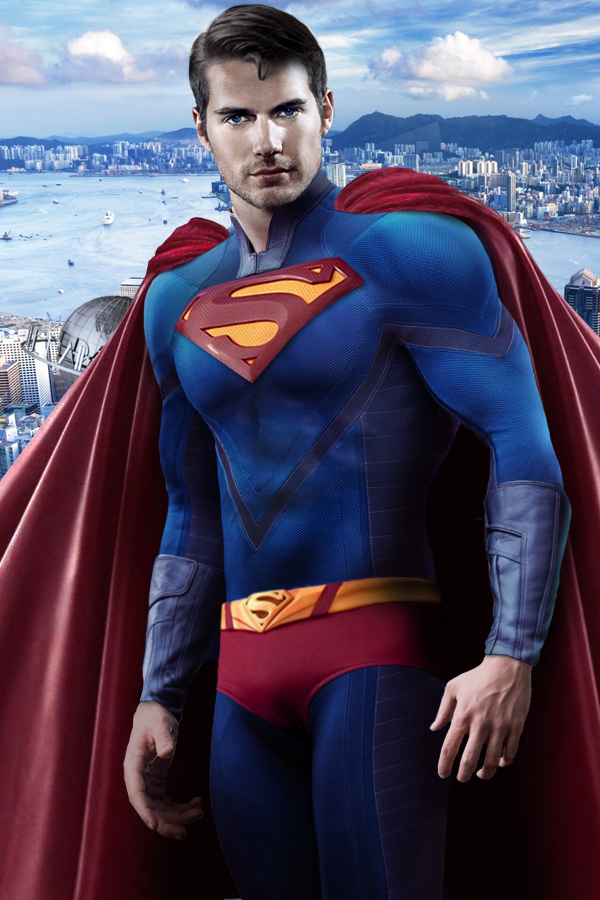
So, your basic argument is "if it isn't broken, don't change it," right? I guess for me, I look at the classic version and I feel like it IS broken, or at least very dated. Certainly, that is just my opinion and not fact, but the underwear-out look just doesn't look like something that would appeal to a modern audience to me and seems to be a relic from a bygone era, just like bellbottoms and zoot suits. Now, if the movie was a period piece, sure, why not, but I am assuming it will be set in modern day, not in the 30s.

Or the fact that the 'red undies' (and c'mon.. calling them "manties" is just silly and demeaning - you're trying to poke fun to help make your argument) break up the costume and make more design sense than unitard look? The aesthetic is just poor in my opinion (but, then again we could just add every texture and kiddie-Photoshop trick to the logo for the sake of modernizing - sorry ;) ).

The "manties" thing isn't demeaning. That term started (for me) getting tossed around when we bought the costumes from 300, which included leather manties. It certainly isn't shoring up my argument.

Yes, they do break up the costume design, but the question is whether or not the design needs to be broken up. I suppose that simply comes down to another opinion, but the issue I see is that again the underwear on the outside immediately dates the costume and if the goal is to break up the suit, I am sure there is another way that could achieve that goal without making the costume look so old.

In regard to a unitard look being a poor aesthetic choice, what makes you think that is a poor choice? I would say for someone who flies, the more aerodynamic the better (which could also make for a good argument against the texturing used on the new suit).

Stuck in the past!? Dude... that costume has been around longer than any of us. To say it/we're stuck in the past because they're changing a character design just to "modernize" or change for change sake is just writing off history. It's forgetting what works and has worked. You can make changes that do work and retain the history and the elements that are successful (see John Byrne) - I don't think they're even trying with the new Superman look... it's just poor IMO.

We just aren't going to agree here, but I think this goes far beyond Superman and touches on a difference of core beliefs that you and I both have and already know that we don't see eye to eye on. I am, typically, all for change and modernization and not feeling the need to stick to dogma. You are not. Neither of us are necessarily wrong, it is just a difference in outlook. For me, most of the amazing things we have today is because someone decided to break the mold, throw away the past and try something different. Many times this fails, but when it succeeds, we take a giant step forward. If we always looked to the past and said, "this works fairly well and has worked fairly well for a long time, so why change it?" we wouldn't have much of the modern things we have today. I see the Superman suit the same way. It has been the same for 70 years... but the world is not the same as it was 70 years ago. In fact, the world today barely resembles the world of 70 years ago at all. People and human nature is more or less the same and always will be, but the world around us is drastically different, so why wouldn't Superman's outside appearance change to match that, unless you were doing a "man out of time" kind of thing like is done with Captain America, and even he got a costume update!

...and once we accept that Superman is a classic character recognzied instantly by millions if not billions and changing his look merely for ego (hi, Jim Lee) or just for allegedly modernizing him is just silly.

See my above comments. I couldn't disagree more. Now, I can't argue about the motivations of this or that person for making changes, but not every change is motivated by ego.

You can't realistically claim that taking away his shorts, darkening his color and adding a texture isn't following a trend or a fad in today's comic book movie world rather than just letting Superman be Superman.

Let the icon win. Be above trends and fads.

I can see the merit of this argument from a certain POV, but at the same time, I still think you are relegating Superman to a past that is barely relevant in modern day society. Do trends and fads change? Of course they do. Why wouldn't Superman or any superhero keep up with them on some level? Let me ask, do you think the modern Batman movies would have done better and more iconic if Batman were wearing the Adam West costume? Do you think a modern audience would take him seriously? They definitely modernized his costume, even from the already modernized costume of 1989, yet no one seems to be confused about who Batman is and those movies don't seem to have suffered financially due to the changes. So, what is the downside?
 
Sigh... as they said in the song: "you don't tug on Superman's cape." That is, you respect the legacy... you respect the heritage, the icon. You don't change for change's sake, you don't cop to trends and fads when you deal with icons.

You don't change the American flag because we can Photoshop a better one. You don't reboot Star Wars and redesign Vader... because the new trend is bad guys wear purple. You respect the lineage and build upon it if it's necessary.

Batman is a great example. The costume has always been dark and has changed... but the core elements have remained. Yeah, he had shorts just like Superman at one point - but, those shorts have always been dark on dark and non-contrasting like Superman. Nolan's costume(s) don't have shorts per se, but are things incorporated into the design that give an illusion and break the design up (ala not a unitard) - that said, I think Nolan's design's are all terribly weak but, they do maintain the iconic imagery we associate with Batman.

I do think you can modernize Superman's design and keep the iconic imagery. Superman's design has evolved over the years and has kept up somewhat with modern times without sacrificing the core concepts.

This seems forced and it seems to be following trends instead so starting them - which is what Superman started and what Burton's Batman did in 1989.

Obviously, we're going to disagree and it's not worth beating a dead horse over it. Above dismissing the classic, iconic imagery I just don't think it's a good design... even the comics which changed the costume with the new 52 last year is keeping the classic look around, because they know it's the classic look.
 
Batman is a great example. The costume has always been dark and has changed... but the core elements have remained. Yeah, he had shorts just like Superman at one point - but, those shorts have always been dark on dark and non-contrasting like Superman. Nolan's costume(s) don't have shorts per se, but are things incorporated into the design that give an illusion and break the design up (ala not a unitard) - that said, I think Nolan's design's are all terribly weak but, they do maintain the iconic imagery we associate with Batman.


JD, what in the Wide World of Sports are you talking about, bud?

View attachment 98742
 
I do think you can modernize Superman's design and keep the iconic imagery. Superman's design has evolved over the years and has kept up somewhat with modern times without sacrificing the core concepts.

Perhaps that is where the issue lies? You have touched on it already, but what do you feel are the core concepts of the Superman costume?

For me they would be:

  • Blue and Red and yellow color scheme
  • Red cape
  • Red boots
  • Yellow belt (yeah, they kind of missed this one on Man of Steel and only gave a passing nod by giving him and on/off button)
  • BIG "S" on the chest

Now, if you want MY idea of what you are talking about, this would be it... This totally trashes even the most basic concept of Superman. I guess they did get the "S"...

electricboogaloosupes.jpeg
 
Well, we could mention the Burton/Cage Superman designs... and sitll thank god they didn't happen.
 
...both have the classic elements of Batman while one worked well for the campy Adam West TV series and the other in the campy-dark Nolan Batman.

I guess the difference between those two and the difference between the old and new Superman look seem VERY similar to me. I don't understand how you see one as just par for the course and the other as a trampling of a classic design.

I totally get it if you don't LIKE the new Superman design, but to me, it still has a lot of the basic Superman elements... what I would consider the most important elements, just like the new Batman retained the most important elements from the original costume (pointy ears, cape, utility belt, dark look).
 
I do think you can modernize Superman's design and keep the iconic imagery. Superman's design has evolved over the years and has kept up somewhat with modern times without sacrificing the core concepts.

It really hasn't. Ignoring the Electric Superman costume and the black shield from after "Our Worlds At War" the only evolution in the costume after 1941 was the shield generally getting larger over the years and slight differences in how each artist drew the S. The only DC superhero whose costume was more static than that was Barry Allen's Flash, and he's got half the publishing history of Superman.
 
It really hasn't. Ignoring the Electric Superman costume and the black shield from after "Our Worlds At War" the only evolution in the costume after 1941 was the shield generally getting larger over the years and slight differences in how each artist drew the S. The only DC superhero whose costume was more static than that was Barry Allen's Flash, and he's got half the publishing history of Superman.
I'll disagree. Superman's look/costume has evolved - these aren't huge changes, but small steps. Whether its cape length, the way it attaches, hair, belt, boots, that horrid 3D S on his chest or just the way the S is drawn/colored.
 
I'll disagree. Superman's look/costume has evolved - these aren't huge changes, but small steps. Whether its cape length, the way it attaches, hair, belt, boots, that horrid 3D S on his chest or just the way the S is drawn/colored.

How much of that is just variation in the artist? Are any of those changes ones that can be referenced without photo evidence?

There's an easy example for Batman: yellow oval or no yellow oval. Not just the artistic license but an actual design change. How many variations that aren't just artistic interpretation has Superman's costume gone through?
 
I'll miss the man more than the suit - I hope Cavill can carry his own!

reeve_MOS.jpg


Good point bud!:thumbsup Truth is he looks great in your manip too. I think Cavill is perfect in the roll and will be fantastic, but until now it has been the 'man' that has been lacking more so than the suit.
That said, I love this new suit....and cant wait to see the film!

David
 
I'm not sure about the new design to be honest.

I guess to me the movie lives or dies by the script and overall feel if that makes sense.

To me it just feels like they changed the costume to make it feel more textured or so it's like the Avengers costume and TASM costume.
 

Contrasting this with the reeve pick above doesn't fill me with lots of hope, and maybe it's the setting or pose. I don't know. What he did here is simply awesome and the kid will always remember it as will his parents i'm sure.

Thing is, in that photo he doesn't really look like Superman to me. He looks like a guy in a superman suit. Maybe it's the pose, but he doesn't look to have the build for it.

Now, the reeve shot above, even in the new suit, just says superman.
 
if you really think about it they haven't made a movie about Superman since the first Reeve film. Superman Returns wasn't really ABOUT Superman - it was a more of a question - "What if Superman left for five years then came back? What if Lois moved on and was with someone else and had a child? What if the world had moved on? (Something the movie pushed only in brief scenes - everyone applauded when he first showed up at the stadium). This movie is not really about Superman either - it's some skewed take, reworked with a military aspect to it. Jor-El is not as he was, neither is Lois - or Jimmy or Clark/Superman. The Costume (as I've been told) is somehow linked to Krypton and the S insignia is more than a family crest or a letter - it represents Jor-El's military rank or occupation or something stupid like that. The source material has almost totally been tossed aside to make way for what Zack Snyder and the fine folks as Warner consider hip or cooler than what has been established. This is their version - it's not really Superman.

I remember when I went to see the Deviln/ Emmerich Godzilla and about 3/4 of the way through the film I heard a kid behind me ask his dad "When is Godzilla going to show up and fight that lizard monster?" Ha!
 
Back
Top