Kirk's TWOK "A Tale of Two Cities"

BTW - How much thicker is the 1980 edition? Mine look about right - At least to my eye.

Thanks, Todd
 
Well after having my copy sit in my display case for over a month I figured I'd have a stab at the custom title bar tonight...


ATOTC101-1.jpg


Took me about half an hour to choose a font I felt looked close- CarlsonOldFace HV BT. And again chose a dark blue I felt looked right. Totally eyeballed everything. I took a bit of liberties adding Rafaello's credit in italics on the cover.

I just printed it out on matt photo paper, trimmed and glued it on with white glue. Kind of a Hail Mary move, but I'm happy with the end result.

Just have to work up the guts to weather it now.


Kevin
 
BTW - How much thicker is the 1980 edition? Mine look about right - At least to my eye.

Thanks, Todd

Also - Mind sharing the font you used?

Sorry I completely missed this.

My 1948 edition is half an inch thinner. 1 3/16 vs 1 11/16

I think I used Times New Roman Bold, figured the prop makers wouldn't have put much effort into picking a font, the most standard serifed font seemed likely.


SSgt Burton, any particular reason you didn't include the upper and lower white bars? Or do you see something different when you look at the movie?
 
Last edited:
SSgt Burton, any particular reason you didn't include the upper and lower white bars? Or do you see something different when you look at the movie?

Well to be perfectly honest...


I totally forgot about them. :lol :confused :(

I suppose I could "fake" them when I weather the whole thing.


Kevin
 
Rekindling this old thread. ;)


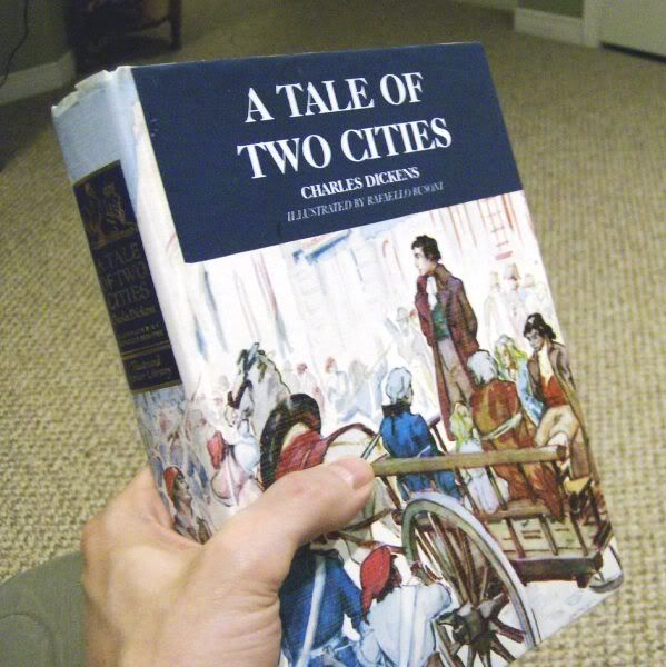
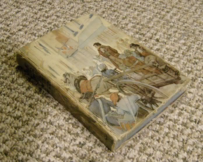
I won a copy of the 1948 edition of TOTC recently (for 99 cents :)... too bad shipping was $12 to Canada :lol).

It was faded, yellowed and beaten up- looked in terrible shape...


ATOTC202.jpg


Which of course was perfect! :)

(Notice the '48 edition is completely devoid of the title on the cover- unlike the editions from the 80s)

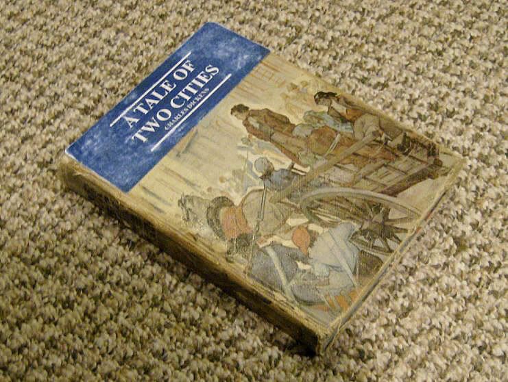
So I took a second stab at the title bar- this time I tried my damndest to get it as close to the SU prop:

ATOTC201.jpg


The only thing I'm a little displeased with is the colour of the blue- my black ink cartridge quit on me so I was working off the colour cartridge only. The blue could be a wee bit darker for my taste.

I was going to weather it by misting paint- but ended up just scraping the blue arears with the edge of an x-acto knife.

I still have to glue it to the book- just want to be sure it's to my liking.

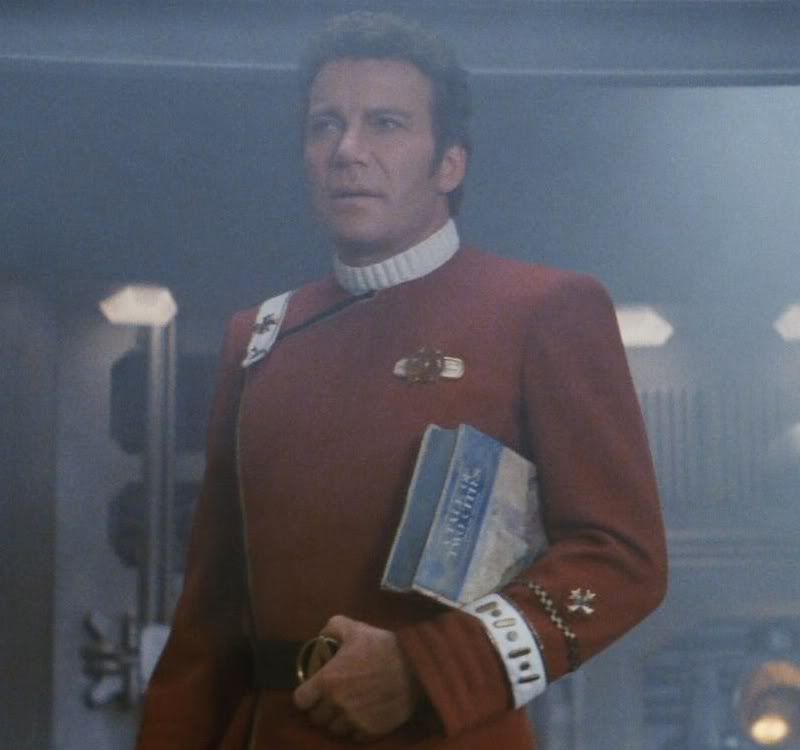
So what do you guys think? Here's the SU prop again:

TOTC002.jpg


Be honest. I'm considering doing the title bar over again.

Kevin
 
Back
Top