You are using an out of date browser. It may not display this or other websites correctly.
You should upgrade or use an alternative browser.
You should upgrade or use an alternative browser.
Jurassic World Paper Props
- Thread starter MooCriket
- Start date
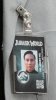
Well, I'm not too far off, what do you think?
By the way I've printed my design to go on the universal cup, what do you guys think?


By the way I've printed my design to go on the universal cup, what do you guys think?
http://s16.postimg.org/aergdow45/DSC_0512.jpg
http://s16.postimg.org/b30awmutx/DSC_0513.jpg
http://s27.postimg.org/jazg3kbnn/plastic_cups.jpg
To paraphrase Lord Vader: the illustrator skills are strong with this one
") :thumbsup
:thumbsupTo paraphrase Lord Vader: the illustrator skills are strong with this one
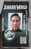
Aww thanks! It's meant to be my job (well still studying it for it
)! So I hope so haha Mike J.
Master Member
Cup sticker looks good.
I suspect the name / title font is two weights of Gotham, but I can't be sure.
-MJ
Well, I'm not too far off, what do you think?
I suspect the name / title font is two weights of Gotham, but I can't be sure.
-MJ
Aww thanks! It's meant to be my job (well still studying it for it
You're very welcome
I started out using it professionally five years ago.. but the thing is I had never used it before :lol soon after I took a course and learned the basics. After that I started to become quite good with it
The important thing is that you enjoy it, not that anyone thinks you are good at it. You get "better" a lot faster when you enjoy it.
Cup sticker looks good.
I suspect the name / title font is two weights of Gotham, but I can't be sure.
-MJ
It looks like Futura Heavy to me, I'll try a few, now that I have a better resolution picture, i'll work with it under my design, so hopefully it will be a better match!
If you guys want the file I can email it, don't really want to share it on the thread, for obvious reasons, don't want it to end up on ebay haha
DIN Black Alternate is also close to the name font, but not the title font.
I have used the Nexa family, and tweaked it, what do you think?

I have tried a dozen plus the ones used for this sign:
http://www.therpf.com/showthread.php?t=229032&page=8&p=3718421&viewfull=1#post3718421
no match.
One thing is for sure, the graphics designers for Jurassic World really didn't do what would have been done in the real world. That is to create a graphical profile with a few select fonts that is used for everything.
Good job Emma using the actual JP font which not even the folks who worked on the film bothered to do :facepalm
I have tried a dozen plus the ones used for this sign:
http://www.therpf.com/showthread.php?t=229032&page=8&p=3718421&viewfull=1#post3718421
no match.
One thing is for sure, the graphics designers for Jurassic World really didn't do what would have been done in the real world. That is to create a graphical profile with a few select fonts that is used for everything.
Good job Emma using the actual JP font which not even the folks who worked on the film bothered to do :facepalm
There are so many typefaces in this world that it could be anything, and many of them are look a like, I think the Nexa works well for the badge ^^
Mike J.
Master Member
I compared the name text to Avenir, and it didn't seem close enough. DIN Alt is close, but the D's don't match to my satisfaction. It's possible that Gotham has an alternate W hidden in it somewhere. Additionally, the width / height of the letters and kerning may be off in some subtle way, though I can't quite imagine how: This was not hand drawn... Eh. I'll be satisfied using Gotham.
Terminator, did you try any of the DIN or Alternate Gothic fonts for your Gyrosphere sign?
I hate having to ID fonts. If I don't recognize it, and it's too low rez to run through What The Font, it's a needle in a haystack. Alternatively, you can join one of the font websites and 'ask a human.'
-MJ
Terminator, did you try any of the DIN or Alternate Gothic fonts for your Gyrosphere sign?
I hate having to ID fonts. If I don't recognize it, and it's too low rez to run through What The Font, it's a needle in a haystack. Alternatively, you can join one of the font websites and 'ask a human.'
-MJ
There are so many typefaces in this world that it could be anything, and many of them are look a like, I think the Nexa works well for the badge ^^
*sigh* don't remind me :facepalm :lol once upon a time I got hooked on a specific font. I could not find it... that is until one joyful christmas eve years ago. It only took me some seven years and looking through some two hundred thousand fonts. I was more than happy to cough up the $2 they wanted for the font :lol
I compared the name text to Avenir, and it didn't seem close enough. DIN Alt is close, but the D's don't match to my satisfaction. It's possible that Gotham has an alternate W hidden in it somewhere. Additionally, the width / height of the letters and kerning may be off in some subtle way, though I can't quite imagine how: This was not hand drawn... Eh. I'll be satisfied using Gotham.
Terminator, did you try any of the DIN or Alternate Gothic fonts for your Gyrosphere sign?
I hate having to ID fonts. If I don't recognize it, and it's too low rez to run through What The Font, it's a needle in a haystack. Alternatively, you can join one of the font websites and 'ask a human.'
-MJ
Yes and I was even kind enough to name them
Engschrift is aka "DIN 1451 Std"So you don't like Nexa? xD *cries*
So you don't like Nexa? xD *cries*
awww poor lil Emma
Never heard of Nexa before... I like that it's free, if that is of any comfort? heheI too tried Avenir and while it is the closest I could find, it was not "it".
We need better references, that is for sure.
Well if you compared the typeface from my screenshot with nexa, I think it's the closest I could find. Ref post #230
Well if you compared the typeface from my screenshot with nexa, I think it's the closest I could find. Ref post #230
Yes I saw that, well done
Yes I saw that, well done
I'll try to have it printed see how it looks, also, what do you think is written on the blue badges? For normal employees? Do you think it's just "employee"? Or something else, according to their placement in the park?
Similar threads
- Replies
- 2
- Views
- 1,967
- Replies
- 249
- Views
- 39,077
Done / Completed
The Expanse - MCRN pistol - machined aluminium conversion kit
- Replies
- 103
- Views
- 8,574
- Replies
- 0
- Views
- 616
- Replies
- 3
- Views
- 3,845