You are using an out of date browser. It may not display this or other websites correctly.
You should upgrade or use an alternative browser.
You should upgrade or use an alternative browser.
Defined Green Lantern Comic Rings
- Thread starter Gregatron
- Start date
Okay, I finally got a pull from the REBIRTH resin insert’s mold which wasn’t rubbery, and which had a lime green-ish color that looked good. I sanded and trimmed the insert piece down to remove excess resin, which also ended up frosting the backside, just as planned. The resin remains translucent, with a bit of polishing to give it a shine. I didn’t go all-out for this prototype with polishing compound, or anything. Just a quick bit of wet-sanding on the face of it to remove imperfections and give it a slight sheen.
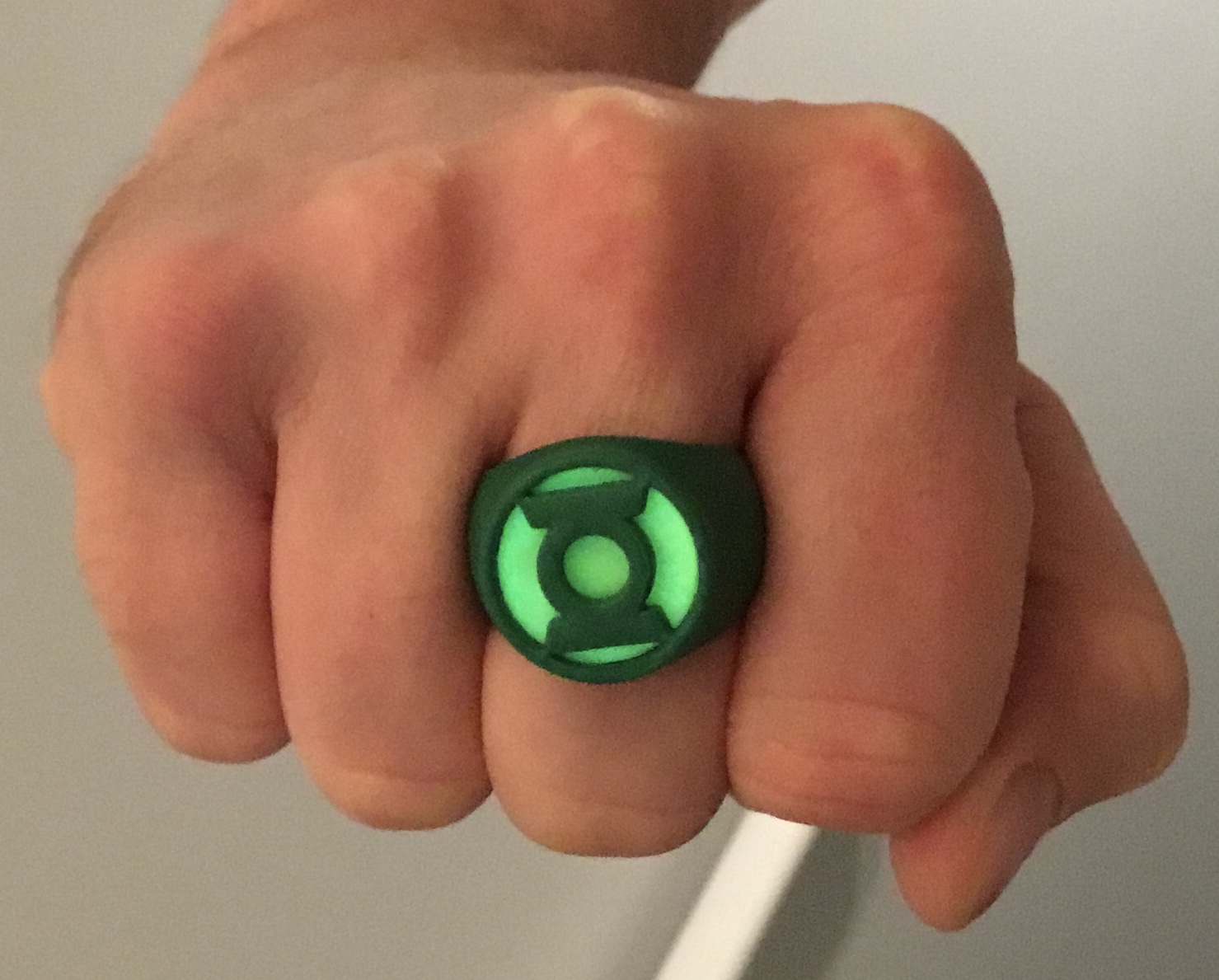
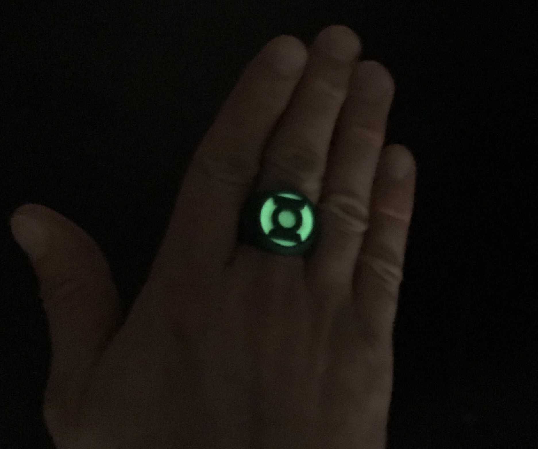
After that, I applied a watered-down mix of white Elmer’s glue into the socket for the resin insert on the main body of the ring, then evenly sprinkled green glow powder onto it. After that, the three pieces of the ring were glued together. The results are encouraging. I’ll need some time with the ring to wear it and study it, but we’re headed in the right direction.
I’m still not entirely sure how deep the negative space around the symbol should be. At the very least, I need to modify the model so that all the parts have deeper/stronger connections with each other, to assure a proper lock-fit.
Having the frosted resin insert piece suspended above the raw glow powder works great. When the powder is not charged with light, the lime-green resin insert looks nice and comic-accurate. When the powder is glowing, the frosted backside of the insert evenly diffuses the glow, which is quite bright.
Too tired to trim and install the V2 and V3 gems in a similar fashion, tonight, but this is a good start.
That looks so sick. Will you be doing that on the others?
Just finished. Even as rough prototypes, they look good. The color of the gems actually appears MORE intense than I’d been expecting. Still need to find the right balance, in terms of tinting the resin. This is a little too much of an intense neon green. Backing the gems with glow powder adds to the intensity of the color.
For the final versions, I expect that I’ll mask off the gem sockets, evenly coat them with spray adhesive, and then apply the glow powder, so as to avoid uneven patches. And the gems will be properly polished to a shine, and maybe the backs frosted with dulling spray, rather than just being sanding.
greatwazoo42
Master Member
Even as rough prototypes - those are beautiful.
Pursuit
New Member
If you start to sell these, let me know. I would so be interested. (Classic SInestro one tooJust finished. Even as rough prototypes, they look good. The color of the gems actually appears MORE intense than I’d been expecting. Still need to find the right balance, in terms of tinting the resin. This is a little too much of an intense neon green. Backing the gems with glow powder adds to the intensity of the color.
For the final versions, I expect that I’ll mask off the gem sockets, evenly coat them with spray adhesive, and then apply the glow powder, so as to avoid uneven patches. And the gems will be properly polished to a shine, and maybe the backs frosted with dulling spray, rather than just being sanding.
View attachment 1641188
DexAntares
Well-Known Member
Play around with it! I always encourage experimentation, and you may just find something you likeStill wondering if I shouldn’t try to miniaturize the rings a bit. Wondering if they aren’t TOO chunky. Shrinking the overall sizes might help with the height issues and whatnot. Maybe 6mm wide shanks instead of 7.5mm, and go from there.
Hmmm.
Play around with it! I always encourage experimentation, and you may just find something you like
…that’s what she said.
My basis for making the symbol the same size on both the V2 and V3 is the fact that artists usually draw them as looking the same size—so much so, in fact, that it can occasionally be hard to tell which version of the ring they’re actually drawing, V2 or V3.
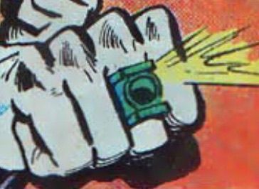
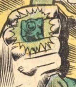
There’s also a reasonable consistency in regards to how big/how much room it takes up on the finger. Here are Grell, Saviuk, and Bright:
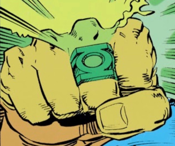
That being said, If I were to keep the V2 and V3 symbols the same size relative to each other, I’d be very hesitant to shrink the V2 symbol-piece down any more than I already have. I think the current 25.4mm size is pretty spot-on.
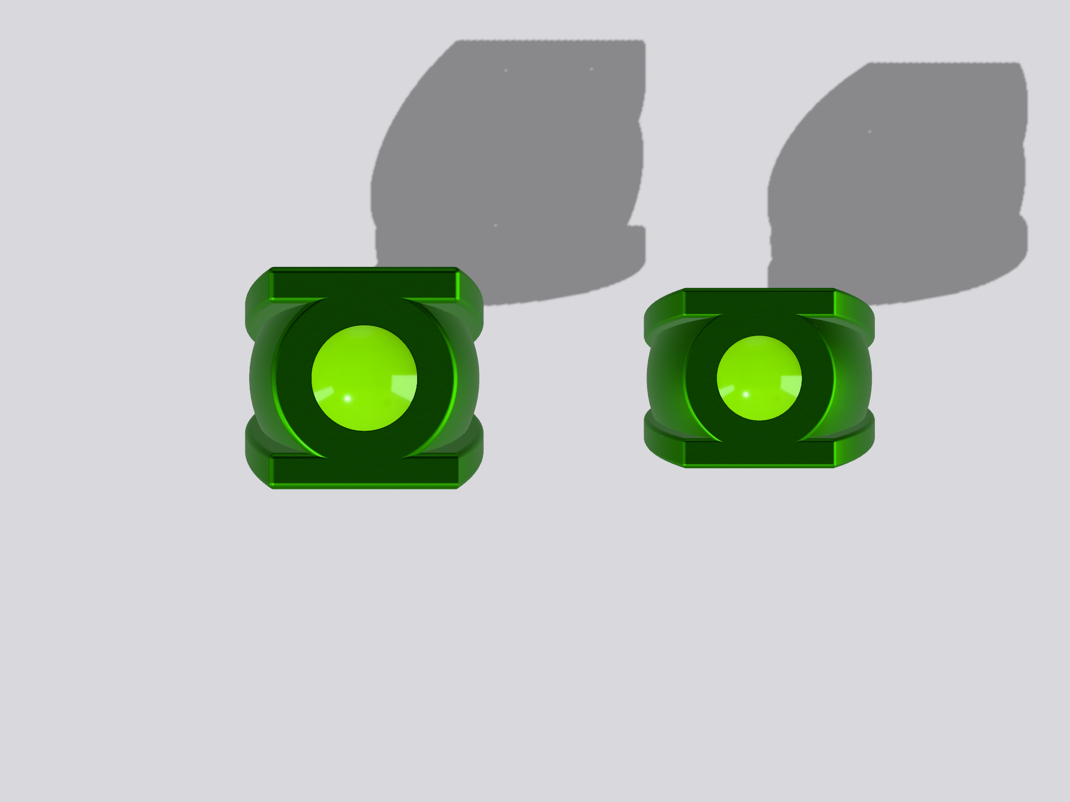
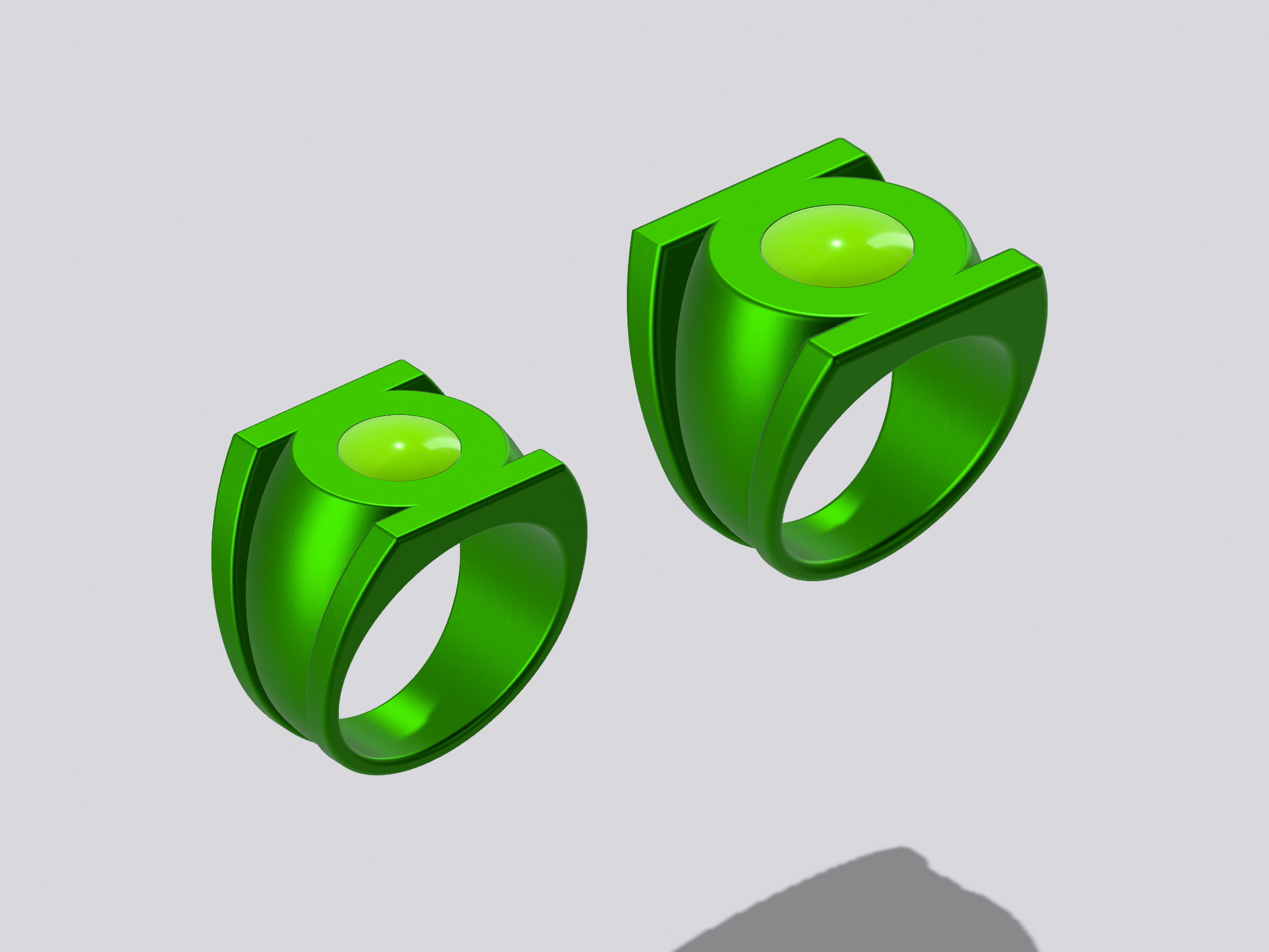
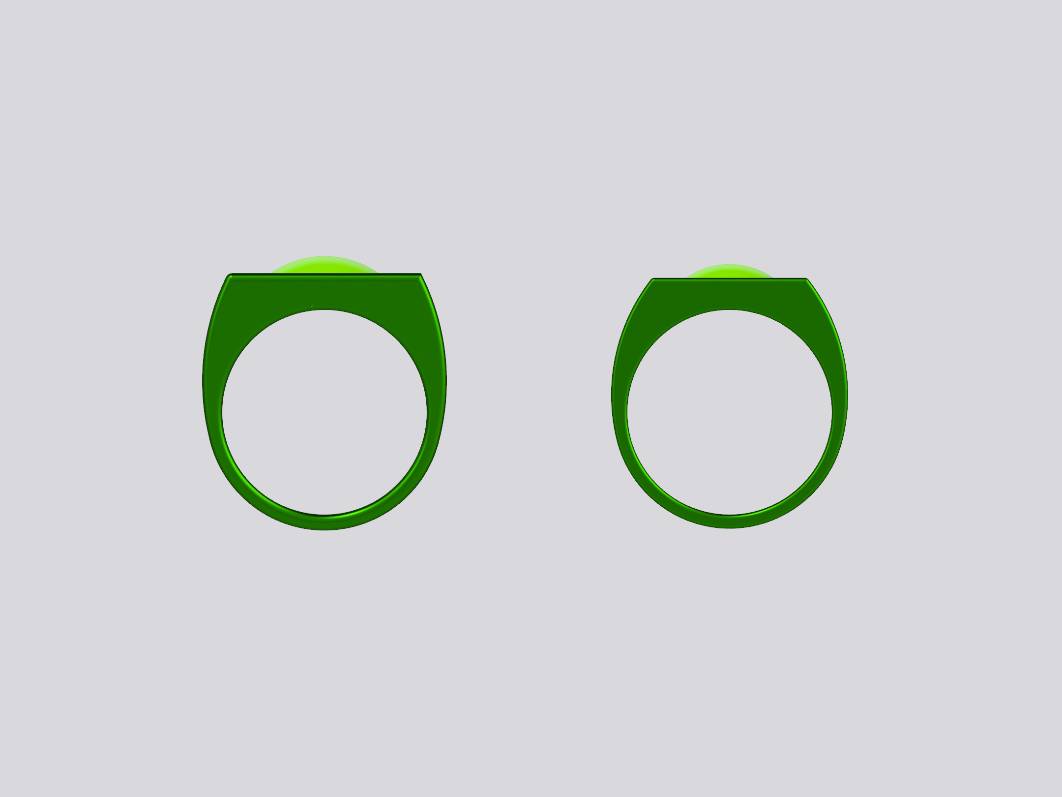
That being said, here’s an experiment. I shaved down the V3 symbol to 20.4 long, and adjusted everything else to fit. So, the ring is about 20% smaller. I think it looks quite nice, but I’m still wondering whether or not smaller is the way to go. I do think the proportions and curvature are sleeker and cleaner than the current, larger model.

There’s also a reasonable consistency in regards to how big/how much room it takes up on the finger. Here are Grell, Saviuk, and Bright:
That being said, If I were to keep the V2 and V3 symbols the same size relative to each other, I’d be very hesitant to shrink the V2 symbol-piece down any more than I already have. I think the current 25.4mm size is pretty spot-on.
That being said, here’s an experiment. I shaved down the V3 symbol to 20.4 long, and adjusted everything else to fit. So, the ring is about 20% smaller. I think it looks quite nice, but I’m still wondering whether or not smaller is the way to go. I do think the proportions and curvature are sleeker and cleaner than the current, larger model.
Pursuit
New Member
For a gift I actually had a custom made ring made similar to this but not with a gem in Silver. It's Silver, and in storage (as it no longer fits and never got it resized as I was worried someone would mess it up)My basis for making the symbol the same size on both the V2 and V3 is the fact that artists usually draw them as looking the same size—so much so, in fact, that it can occasionally be hard to tell which version of the ring they’re actually drawing, V2 or V3.
There’s also a reasonable consistency in regards to how big/how much room it takes up on the finger. Here are Grell, Saviuk, and Bright:
View attachment 1641290View attachment 1641289View attachment 1641291
That being said, If I were to keep the V2 and V3 symbols the same size relative to each other, I’d be very hesitant to shrink the V2 symbol-piece down any more than I already have. I think the current 25.4mm size is pretty spot-on.
That being said, here’s an experiment. I shaved down the V3 symbol to 20.4 long, and adjusted everything else to fit. So, the ring is about 20% smaller. I think it looks quite nice, but I’m still wondering whether or not smaller is the way to go. I do think the proportions and curvature are sleeker and cleaner than the current, larger model.
View attachment 1641285View attachment 1641286View attachment 1641287
View attachment 1641288
For a gift I actually had a custom made ring made similar to this but not with a gem in Silver. It's Silver, and in storage (as it no longer fits and never got it resized as I was worried someone would mess it up)
I do find it interesting that the Mike Grell design gets so much love. As has been previously noted, his was the basis for the 2011 movie ring, which says something. It would be interesting to poll the electorate and see which ring style is the most popular.
Meanwhile, I think I'll do a V3 test print in the smaller size. Shrinking the symbol down a bit makes a radical difference in the aesthetics and overall elegance of the ring. If the symbol is too big, the whole thing looks REALLY tapered in profile, and kinda clunky.
As noted, the symbol/face on the revised, smaller version seen above is 20.4mm tall. I might do one at 22.4mm, to see what an in-between version looks like.
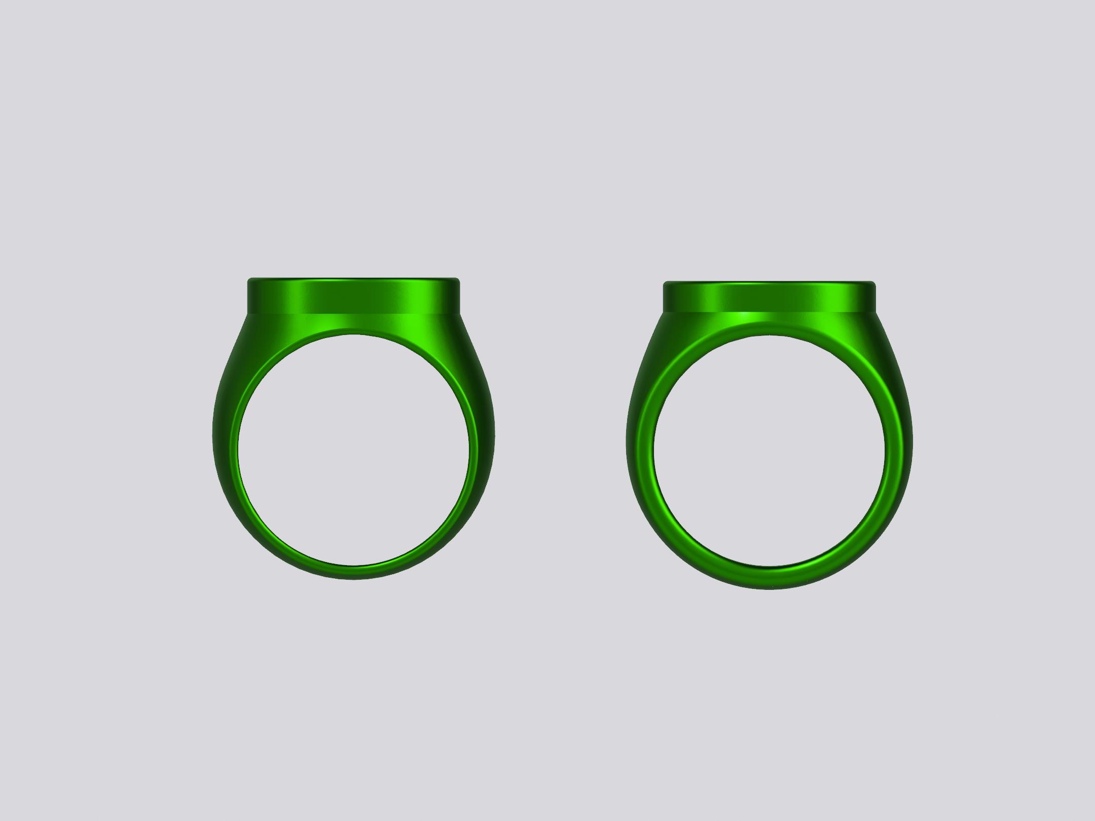
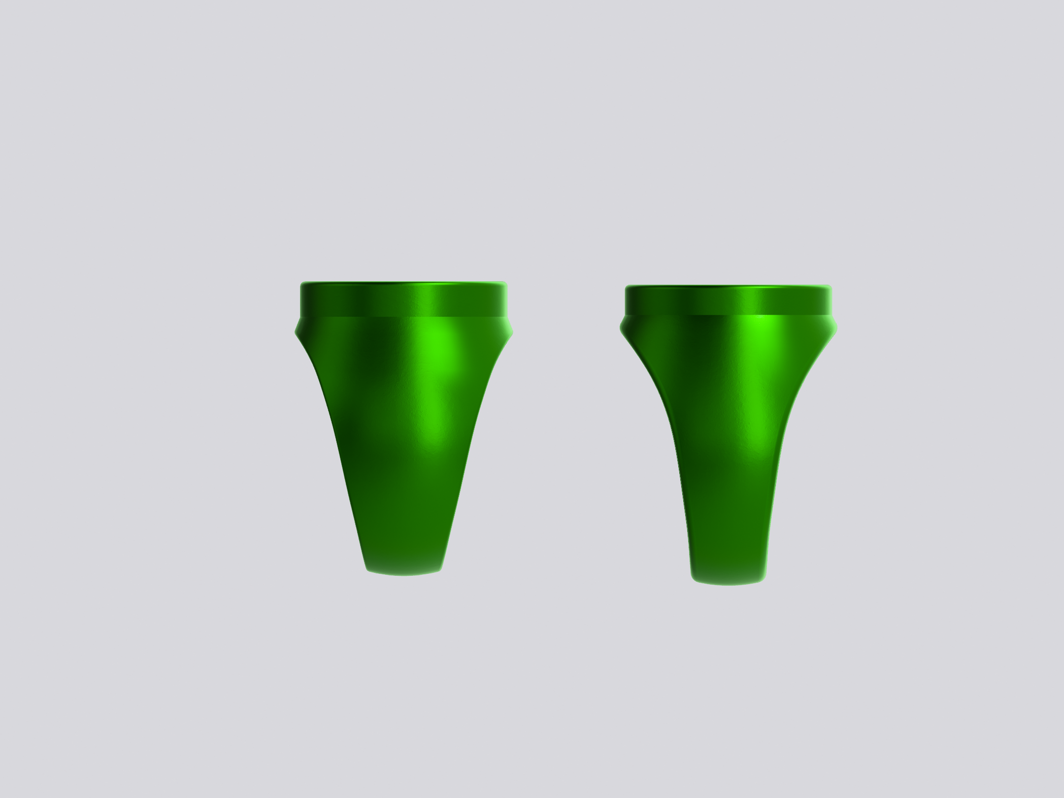
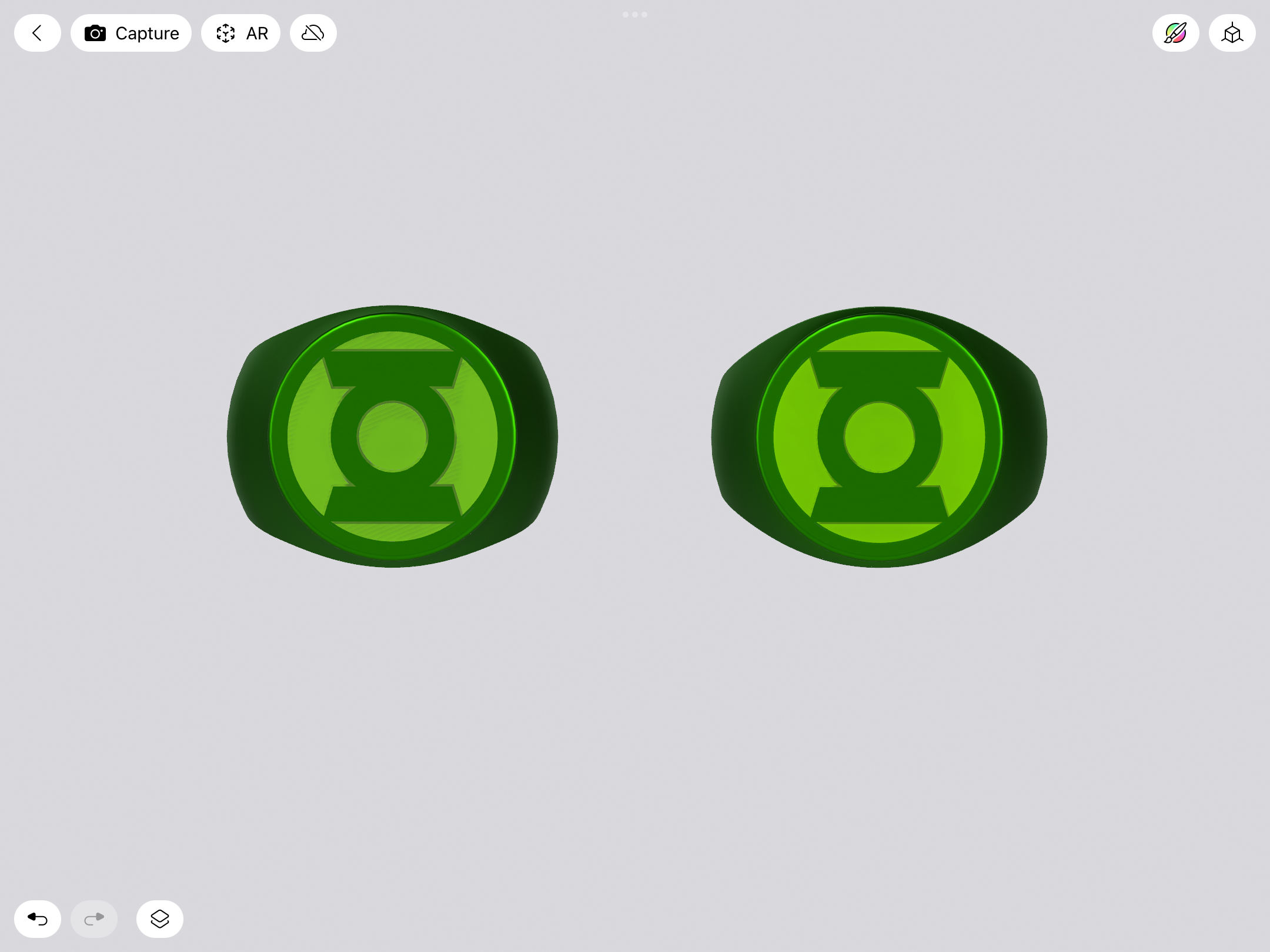
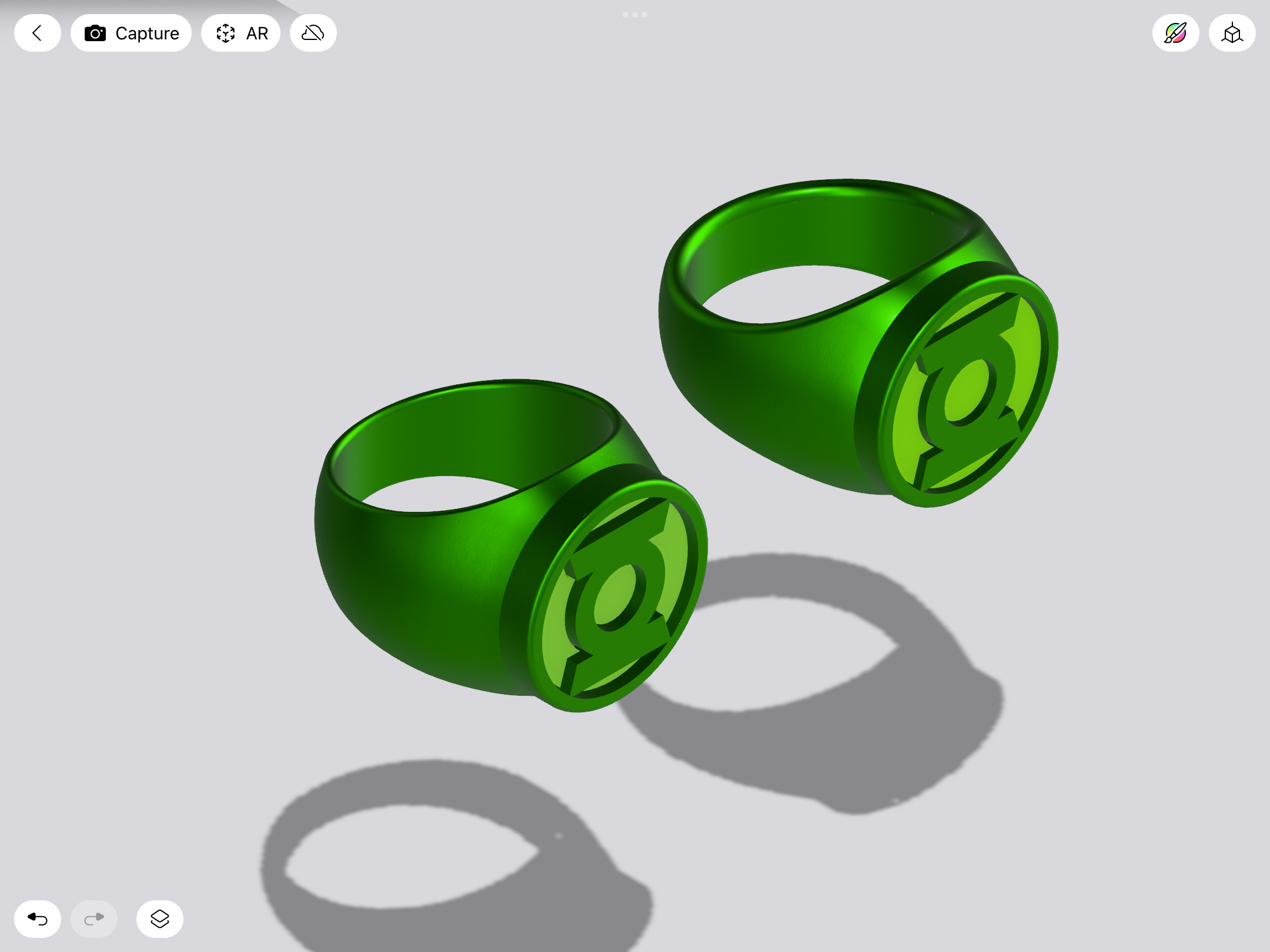
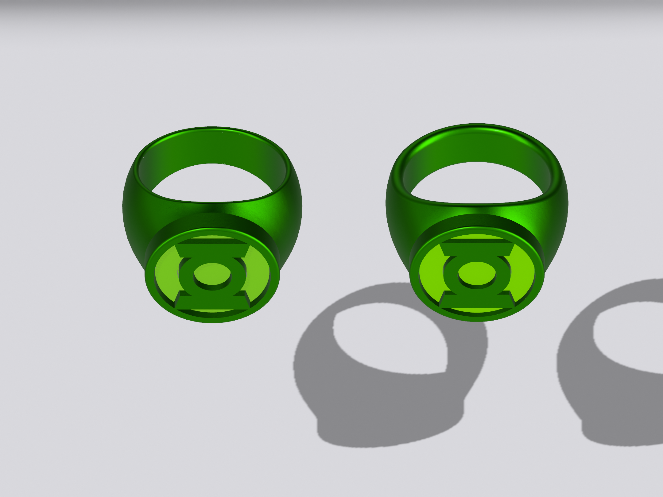
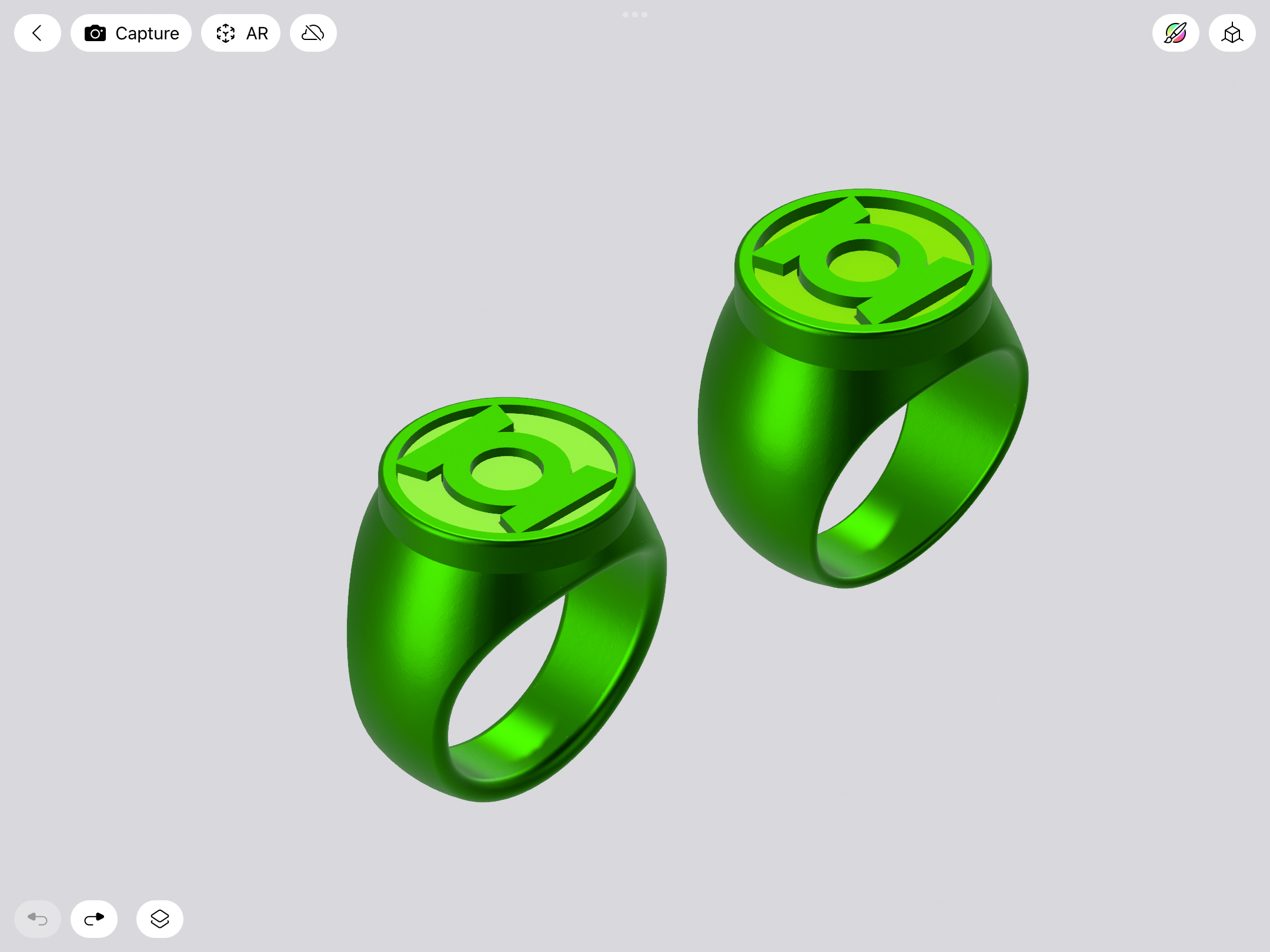
Tweaking. I had previously created a few REBIRTH variants when working on the version I just had test-printed, so I grabbed one of them to use as a base for revisions. The current/printed model as shown upthread has the edges of the finger-hole filleted by 0.50mm. This new model has them at 1.0mm, which flattens the edges around the hole and removes a good deal of mass on the band, helping to emphasize the symbol-disc (now reduced in height to an even 3mm, with the depth of the negative space surrounding the symbol reduced to a slightly shallower 0.75mm).
Also made a few tweaks to the connection points between the three parts (ring, resin insert, disc) so that they sandwich together a little more securely.
Overall, the result is a slimmer and sleeker shape. I may yet again tweak the overall shape of the band and also adjust the thickness. This new version is a bit heavier/thicker, which gives the bottom of the shank more substance.
Here’s a comparison between the model which was just printed (left) and the revised version (right).
Pursuit
New Member
I absolutely love that design and would so proudly wear itI do find it interesting that the Mike Grell design gets so much love. As has been previously noted, his was the basis for the 2011 movie ring, which says something. It would be interesting to poll the electorate and see which ring style is the most popular.
Meanwhile, I think I'll do a V3 test print in the smaller size. Shrinking the symbol down a bit makes a radical difference in the aesthetics and overall elegance of the ring. If the symbol is too big, the whole thing looks REALLY tapered in profile, and kinda clunky.
As noted, the symbol/face on the revised, smaller version seen above is 20.4mm tall. I might do one at 22.4mm, to see what an in-between version looks like.
greatwazoo42
Master Member
You are living up to the expression "no work of art is ever finished, merely abandoned." You've been tweaking and improving these designs for ages and I love every update. I'm not that big a Green Lantern fan but I love the rings and especially the fact that you keep finding ways to make them better. If you're eventually making them for sale this will ensure that the best possible iteration will be what is available and that is wonderful.
Addendum: the other part that I think will end up happening is your work being used as direct references for the artists making the comics and other media themselves. Fan dedication does often lead to improved content for all. Look at West End Games content for the Star Wars Table Top RPG in the 1990's expanding the lore used in SW films, books, and TV over the years.
Addendum: the other part that I think will end up happening is your work being used as direct references for the artists making the comics and other media themselves. Fan dedication does often lead to improved content for all. Look at West End Games content for the Star Wars Table Top RPG in the 1990's expanding the lore used in SW films, books, and TV over the years.
You are living up to the expression "no work of art is ever finished, merely abandoned." You've been tweaking and improving these designs for ages and I love every update. I'm not that big a Green Lantern fan but I love the rings and especially the fact that you keep finding ways to make them better. If you're eventually making them for sale this will ensure that the best possible iteration will be what is available and that is wonderful.
Thanks!
It’s been a long, long process (2 1/2 years, at this point), with lots of tangents and learning curves. I refuse to say “done” until I’m properly satisfied. Comparing the earliest TinkerCad models and test prints to the current versions isn’t even a competition. I’m always finding new ways to make them better or sleeker or more accurate. I actually think we’re nearing the home stretch, now. It’s just nitty-gritty things that I’m still tweaking, really. I’ve given myself no time limit—it’s done when it’s done.
I’m not being egotistical when I say that there’s probably no one else on the planet who has spent more time and energy researching and thinking about these rings. I fully intend for these to be the absolutely best and most-comic accurate models out there. As if they jumped right off of the printed page and became real.
