You are using an out of date browser. It may not display this or other websites correctly.
You should upgrade or use an alternative browser.
You should upgrade or use an alternative browser.
Defined Green Lantern Comic Rings
- Thread starter Gregatron
- Start date
Okay, so…I’ve continued to drive myself totally nuts over what direction to go with the V1. As noted many times, Kane’s art for the ring varied pretty wildly.
I’ve been modeling and remodeling and re-remodeling different iterations of certain design theories, but just can’t quite commit to one. Here are the current concepts:
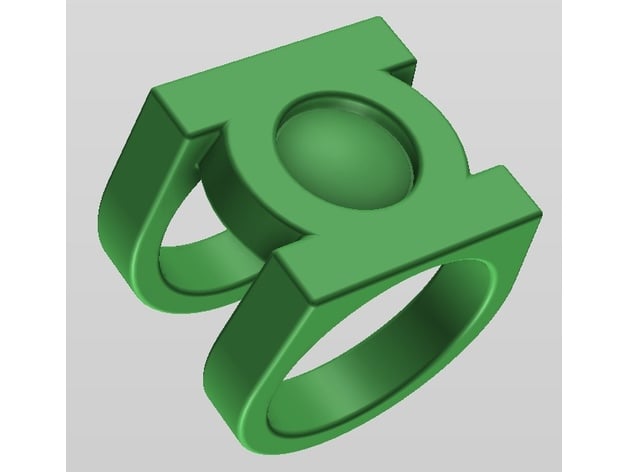
1. Disc on top of band. A curved-band variant of the standard, straight-band V1.

2. Band intersecting symbol-disc. A variant on # 1, with the disc lowered so that the band grips the sides of the disc.

3. Straight-sided signet. The band has a “U” shape in front view, which lines up with the disc, rather than having a curved upper band with an undercut between it and the disc, as in # 1.

4. Traditional signet. The same design theory as the REBIRTH ring, with the top platform of the band (upon which the disc sits) sloping down and flaring outward into the actual band.

5. Chunky signet. Essentially the Alex Ross style—a signet ring without the sloping at the top of the band, and elegantly-arcing band edges all the way from top to bottom when viewed in profile (rather than a parallel-edged band which flares up and out into smaller arcs near the top, as with # 4).

I’ve been modeling and remodeling and re-remodeling different iterations of certain design theories, but just can’t quite commit to one. Here are the current concepts:
1. Disc on top of band. A curved-band variant of the standard, straight-band V1.
2. Band intersecting symbol-disc. A variant on # 1, with the disc lowered so that the band grips the sides of the disc.
3. Straight-sided signet. The band has a “U” shape in front view, which lines up with the disc, rather than having a curved upper band with an undercut between it and the disc, as in # 1.
4. Traditional signet. The same design theory as the REBIRTH ring, with the top platform of the band (upon which the disc sits) sloping down and flaring outward into the actual band.
5. Chunky signet. Essentially the Alex Ross style—a signet ring without the sloping at the top of the band, and elegantly-arcing band edges all the way from top to bottom when viewed in profile (rather than a parallel-edged band which flares up and out into smaller arcs near the top, as with # 4).
…now I’ve come back around to a true variant of the straight-band V1, with a curved “U”-band attached to the bottom of the disc, which seems to track with a lot of Kane’s art. Ofttimes, he seemed to be drawing the standard V1, but with that flaring of the upper band where it attaches to the disc.


Also, a special (and fascinating) bonus that I listened to while modeling, today:
Also, a special (and fascinating) bonus that I listened to while modeling, today:
Last edited:
I love all these final variations too.
I wouldn't be able to choose either. You saw all those shapes used by tons of artists all the time.
I wouldn't be able to choose either. You saw all those shapes used by tons of artists all the time.
An amusing aside—
Of course, Gil Kane stopped being the regular GREEN LANTERN artist in 1970, with issue # 75 being his last regular story. However, he would return to the character—his best known and loved—again and again over the decades for covers, single issues, special stories, guest-appearances, sketches, trading cards, pin-ups, etc.
And, pretty much every time he did, he drew the round V1 ring, despite the fact that the design had stopped being the default in 1976, and would not again become the standard until 1989-1994, and then again in 2004. Now, this was all good and fine for sketches and other such side work, but, in order to try and maintain some semblance of continuity in the actual comics, other artists clearly came in to revise the art and update the ring design.
For example, Kane’s original art for the opening splash page of GREEN LANTERN # 156 shows the V1…

…but the final page shows the V2.

Kane’s preliminary sketch for the cover of GREEN LANTERN # 166 shows the V1…

…but the final art shows the V2.

The original cover art for # 170 appears to have had Wite-Out applied over the rings of both Hal Jordan and the alien Green Lantern below him, and the V3 design crudely drawn over them.

TALES OF THE GREEN LANTERN CORPS Annual # 1 features its title characters inconsistently wearing V1s or V2, depending on the panel, with evidence of redrawing. This panel clearly features what appears to be a Kane V1 signet ring quickly reworked into a V2, with the added sidebars and central hole.

The original art for ACTION COMICS WEEKLY # 603 features what appears to be a paste-up, with another artist drawing the continuity-accurate V2 and cutting/pasting it over the V1.

Regardless of continuity or editorial tweaks to his art, Kane nearly always drew the V1. Although, frustratingly, unless it was a close-up panel, he tended to draw it VERY abstractly. Literally as just a circle on a character’s finger:


Of course, Gil Kane stopped being the regular GREEN LANTERN artist in 1970, with issue # 75 being his last regular story. However, he would return to the character—his best known and loved—again and again over the decades for covers, single issues, special stories, guest-appearances, sketches, trading cards, pin-ups, etc.
And, pretty much every time he did, he drew the round V1 ring, despite the fact that the design had stopped being the default in 1976, and would not again become the standard until 1989-1994, and then again in 2004. Now, this was all good and fine for sketches and other such side work, but, in order to try and maintain some semblance of continuity in the actual comics, other artists clearly came in to revise the art and update the ring design.
For example, Kane’s original art for the opening splash page of GREEN LANTERN # 156 shows the V1…
…but the final page shows the V2.
Kane’s preliminary sketch for the cover of GREEN LANTERN # 166 shows the V1…
…but the final art shows the V2.
The original cover art for # 170 appears to have had Wite-Out applied over the rings of both Hal Jordan and the alien Green Lantern below him, and the V3 design crudely drawn over them.
TALES OF THE GREEN LANTERN CORPS Annual # 1 features its title characters inconsistently wearing V1s or V2, depending on the panel, with evidence of redrawing. This panel clearly features what appears to be a Kane V1 signet ring quickly reworked into a V2, with the added sidebars and central hole.
The original art for ACTION COMICS WEEKLY # 603 features what appears to be a paste-up, with another artist drawing the continuity-accurate V2 and cutting/pasting it over the V1.
Regardless of continuity or editorial tweaks to his art, Kane nearly always drew the V1. Although, frustratingly, unless it was a close-up panel, he tended to draw it VERY abstractly. Literally as just a circle on a character’s finger:
Last edited:
Still tweaking and making V1 variations. Getting close to the next batch of test prints, I think. I’ve already uploaded STLs of some of the other designs (V2, V3, REBIRTH).
Still, the nature of Kane’s curved-band V1 vexes me. It all comes down to the connection between the band and the disc. Does the band grip the outer edge of a (smaller) disc? Fit flush to the bottom of the disc (either with a slight curve to the band, or at a 90-degree angle), traditional signet ring-style? Or is it a (large) disc sitting on top of the band, with an undercut/gap between them?

As noted, the traditional, straight-band V1 most definitely is the band-atop-disc style, with the undercut. So, then, the question becomes—Did Kane simply modify the band shape in some of his art, but still intend the design to be essentially the same, or did he occasionally rethink it into more of a proper signet ring? Obviously, the design was in constant flux, with the disc-atop-straight-band being the default. Are the straight-band and curved-band variations on one design, or two different designs? ARGH!
Still, the nature of Kane’s curved-band V1 vexes me. It all comes down to the connection between the band and the disc. Does the band grip the outer edge of a (smaller) disc? Fit flush to the bottom of the disc (either with a slight curve to the band, or at a 90-degree angle), traditional signet ring-style? Or is it a (large) disc sitting on top of the band, with an undercut/gap between them?
As noted, the traditional, straight-band V1 most definitely is the band-atop-disc style, with the undercut. So, then, the question becomes—Did Kane simply modify the band shape in some of his art, but still intend the design to be essentially the same, or did he occasionally rethink it into more of a proper signet ring? Obviously, the design was in constant flux, with the disc-atop-straight-band being the default. Are the straight-band and curved-band variations on one design, or two different designs? ARGH!
The effort and attention to detail put into this is mind blowing! My compliments to you!
Last month I was reading through the Justice League International/"Bwa-ha-ha!" era and noticed a cool power ring design in Justice League Quarterly #5:

It's Guy Gardner's ring, but after he becomes incapacitated, Ice (Tora) is able to use it for a while:

In terms of your nomenclature it seems most like a modified "chunk" style with the center of the band removed such that only the "bars" of the lantern symbol are extended around the finger. I looked through this thread and didn't see it mentioned, so it may be unique to this issue...
Anyway, I thought it was an interesting design, so I drew it up in Fusion 360.") I did two versions of the logo, since the art is a bit inconclusive as to whether the interior corners where the bars meet the circle are sharp or rounded.
I did two versions of the logo, since the art is a bit inconclusive as to whether the interior corners where the bars meet the circle are sharp or rounded.

Another look at the "sharp" version:

I did some variations with the drafts on the bands to find what looked closest to the look of the comic art and settled on the style on the right:

I also generated two different sizes: 11 and 12. I kept the logo the same size between the two, and due to the sketch constraints the size 12 ended up slightly thicker behind the logo. I think the size 11 geometry is a bit closer to the art, but the 12 is stronger:

The comic art is unclear as to whether or not the lantern symbol's lens area is domed, so it's designed as a separate optional piece; the ring will still look correct without it. An 11 mm self adhesive gem or cabochon can be used in place of the printed gem, but it will likely be too tall to look right (for example: https://www.amazon.com/gp/product/B07YN2C9WQ/ )
If you'd like to build one I've posted the files for the four variations on Thingiverse (link below). For sizes larger or smaller than 11/12, just scale your preferred ring file up or down, and don't forget to scale the gem by the same amount!
 www.thingiverse.com
Last month I was reading through the Justice League International/"Bwa-ha-ha!" era and noticed a cool power ring design in Justice League Quarterly #5:
It's Guy Gardner's ring, but after he becomes incapacitated, Ice (Tora) is able to use it for a while:
In terms of your nomenclature it seems most like a modified "chunk" style with the center of the band removed such that only the "bars" of the lantern symbol are extended around the finger. I looked through this thread and didn't see it mentioned, so it may be unique to this issue...
Anyway, I thought it was an interesting design, so I drew it up in Fusion 360.
I did two versions of the logo, since the art is a bit inconclusive as to whether the interior corners where the bars meet the circle are sharp or rounded.Another look at the "sharp" version:
I did some variations with the drafts on the bands to find what looked closest to the look of the comic art and settled on the style on the right:
I also generated two different sizes: 11 and 12. I kept the logo the same size between the two, and due to the sketch constraints the size 12 ended up slightly thicker behind the logo. I think the size 11 geometry is a bit closer to the art, but the 12 is stronger:
The comic art is unclear as to whether or not the lantern symbol's lens area is domed, so it's designed as a separate optional piece; the ring will still look correct without it. An 11 mm self adhesive gem or cabochon can be used in place of the printed gem, but it will likely be too tall to look right (for example: https://www.amazon.com/gp/product/B07YN2C9WQ/ )
If you'd like to build one I've posted the files for the four variations on Thingiverse (link below). For sizes larger or smaller than 11/12, just scale your preferred ring file up or down, and don't forget to scale the gem by the same amount!
Guy Gardner's Green Lantern ring by mooslug
I noticed this unique take on a Green Lantern ring while reading Justice League Quarterly #5 (from the Bwa-ha-ha! JLI era). It belongs to Guy Gardner, but after he is incapacitated in one story, Ice (Tora) is able to use it for a while.Two sizes of the ring (sizes 11 and 12) are posted, with two...
www.thingiverse.com
Very cool! Nice to see someone else speaking my language, here! I didn’t get to that particular issue during my recent read-through (I just read the two recent JLI trade paperback collections, which didn’t get that far into the run), so it’s new to me. Checking the credits, it seems the art was by Mike McKone, who only did a handful of JLA issues, and was probably just putting his own spin on the design. Basically, the V3/Mike Grell design minus the center section. It almost feels like a precursor to the revised Ethan Van Sciver design, which cut out the negative space around the symbol, allowing Hal Jordan’s finger to be seen through the top of the ring.

In my personal head-canon (which dismisses all those pesky artistic variations), Guy wore the Joe Staton/V2 ring until he was drummed out of the Corps, but, in reality, he was drawn with any number of variations, including the Pat Broderick signet ring, the Mike Grell/V3, etc.
If I went about cataloging ALL the variations and one-off designs, it would take a long, long time, and I consider that beyond the scope of this project. Very neat to see someone else taking up the challenge, at least for that one unique version.
I also see that you’ve gone without a “V” taper to the sidebars (in profile), instead keeping the bars essentially at right angles to the face of the ring, which is actually more comic-accurate to the Mike Grell designs than my own models. I just don’t find a ring comfortable unless the bottom of the band/shank sits nestled in the proximal digital crease of my finger, and is no more than 10mm wide.
Also, as chronicled in this very thread, I eventually gave up on the idea of off-the-shelf cabochons, and have been going with 3D-printed domes which can then be molded and cast in colored resin.
Thanks for the compliments! I’m glad to see people inspired by all of this. I must say—without ego—that, at this point, I’m reasonably sure that I’ve studied the various Green Lantern rings and their history in more detail than literally anyone, anywhere, ever. I’ve tried to make this thread THE definitive resource for anyone curious about the subject, and I love seeing what designs and models other people come up with.
Last edited:
Thanks! Yes, this variation is not the most comfortable to wear - I tried to balance the appearance with comfort, but definitely tipped more towards fidelity to the art in the end. With the lower band pressed into the proximal digital crease, making a fist causes the intermediate phalange to press on the upper band - if I make a really tight fist, the ring itself begins to flex. So it's almost at the upper end of practicality as far as being wearable -- this is partly why I generated a separate size 12 file with the symbol at the same size, rather than just scaling up, as the ring will become harder to wear as the height of the symbol increases.
Thanks! Yes, this variation is not the most comfortable to wear - I tried to balance the appearance with comfort, but definitely tipped more towards fidelity to the art in the end. With the lower band pressed into the proximal digital crease, making a fist causes the intermediate phalange to press on the upper band - if I make a really tight fist, the ring itself begins to flex. So it's almost at the upper end of practicality as far as being wearable -- this is partly why I generated a separate size 12 file with the symbol at the same size, rather than just scaling up, as the ring will become harder to wear as the height of the symbol increases.
There ya go. Whereas I've tried to balance accuracy with wearability, but skewing more toward wearability. I think the "V" profile for the Grell designs actually looks nicer, myself.
…I mean, the inconsistencies alone are driving me mad. In a single issue, GREEN LANTERN Vol 2 # 46, in the span of a few pages, we have…
…a proper signet ring with a smallish disc, and a tapered, very round/organic band/shank (which looks like it was referenced from a real-world ring)…

…then, a few pages later, a tapered, much flatter band with the disc now clearly overhanging it, and a domed gem thingy on top of the disc.

ARGH!
…a proper signet ring with a smallish disc, and a tapered, very round/organic band/shank (which looks like it was referenced from a real-world ring)…
…then, a few pages later, a tapered, much flatter band with the disc now clearly overhanging it, and a domed gem thingy on top of the disc.
ARGH!
Last edited:
Been reexamining the official DC Direct ring replicas for inspiration.
There’s the metal Hal Jordan ring which originally came with a mini-bust of the character, and was re-released in the Planet Krypton Green Lantern ring set (which came with replicas of Alan Scott, Hal Jordan, Kyle Rayner, Sinestro, and Power Ring’s rings):


Clearly a classic signet ring.
Then there’s the new sculpt which came with both the Hal Jordan and Abin Sur 1/1 scale power battery replicas:


I would not be terribly surprised to learn that Ethan Van Sciver used either the Planet Krypton ring or the power battery ring when drawing his REBIRTH version (which initially used the classic GL symbol, before shifting to the new, slanted-sidebars version)…

…since Van Sciver has noted that he kept his art consistent with the licensed replicas of Kyle Rayner’s V2-style (but with the tri-band) ring. Makes sense that he’d want to do the same with Jordan’s.


And then there’s the revised, post-REBIRTH ring which came with the later iterations of the DC Direct power batteries…

…with the same sculpt also being used for the BLACKEST NIGHT PVC promo rings (and in a darker color).

Then there’s the toy version which came with various action figures beginning in 2000, and was molded in various colors (including the white/green SUPER FRIENDS style):


There’s the metal Hal Jordan ring which originally came with a mini-bust of the character, and was re-released in the Planet Krypton Green Lantern ring set (which came with replicas of Alan Scott, Hal Jordan, Kyle Rayner, Sinestro, and Power Ring’s rings):
Clearly a classic signet ring.
Then there’s the new sculpt which came with both the Hal Jordan and Abin Sur 1/1 scale power battery replicas:
I would not be terribly surprised to learn that Ethan Van Sciver used either the Planet Krypton ring or the power battery ring when drawing his REBIRTH version (which initially used the classic GL symbol, before shifting to the new, slanted-sidebars version)…
…since Van Sciver has noted that he kept his art consistent with the licensed replicas of Kyle Rayner’s V2-style (but with the tri-band) ring. Makes sense that he’d want to do the same with Jordan’s.
And then there’s the revised, post-REBIRTH ring which came with the later iterations of the DC Direct power batteries…
…with the same sculpt also being used for the BLACKEST NIGHT PVC promo rings (and in a darker color).
Then there’s the toy version which came with various action figures beginning in 2000, and was molded in various colors (including the white/green SUPER FRIENDS style):
Attachments
Last edited:
Playing around with the thickness of the outer ring surrounding the symbol on the Ross version. The thickness of the disc bezel varies from artist to artist, although Kane and Van Sciver tend to go rather thin, generally. But Ross goes a bit thicker.
I think my test prints have gone a bit too thin, at times. But, then again, I’m not a fan of the super-thick bezels. It’s a tricky balance.
Old on left, new on right.


As noted some time ago, if I stuck with the REBIRTH symbol exactly as it was designed, the bezel would be extremely thin, to the point where test prints would be unfeasible. So, I had to thicken that one up a bit, but not too much. The Ross version, on the other hand, has needed a bit of thickening.
I think my test prints have gone a bit too thin, at times. But, then again, I’m not a fan of the super-thick bezels. It’s a tricky balance.
Old on left, new on right.
As noted some time ago, if I stuck with the REBIRTH symbol exactly as it was designed, the bezel would be extremely thin, to the point where test prints would be unfeasible. So, I had to thicken that one up a bit, but not too much. The Ross version, on the other hand, has needed a bit of thickening.
Last edited: