Defined Green Lantern Comic Rings

Killing time waiting for the test prints to arrive. I’m currently working through the GUY GARDNER series as part of my mega-read-through, and I have a nagging feeling that maybe the Gardner ring shouldn’t be so close in design to the EMERALD DAWN. From an internal logic view, it makes a certain sense—EMERALD DAWN retconned Mark Bright’s ring design into Hal Jordan’s origin and early days, and so the Malvolio/GL Vol. 3 ring became the Post-Crisis iteration of the original Gil Kane design. And, since Sinestro’s ring was supposed to be a yellow knockoff of a GL ring, a design similarity makes sense.

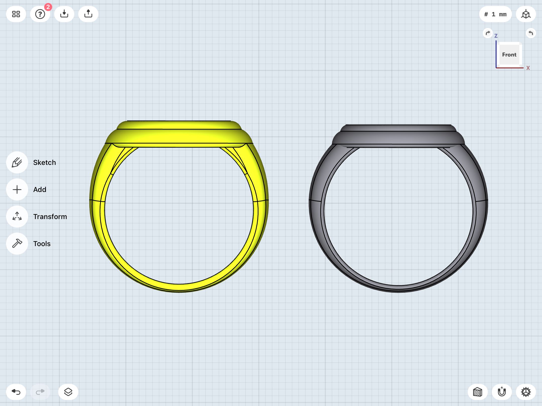
In my most recent design work, I made the Gardner ring identical in size and shape to the GL ring, with the minor differences of that extra setting lip on top of the disc (surrounding the gem), and the Gardner “G” symbol.

...however, as noted, Joe Staton was pretty loose with the size and shape of the ring, and only occasionally drew the disc to look as big as the GL ring’s disc.

So, in anticipation of possible disappointment with the test print, I’m working on a backup, just-in-case alternate version with a smaller disc.
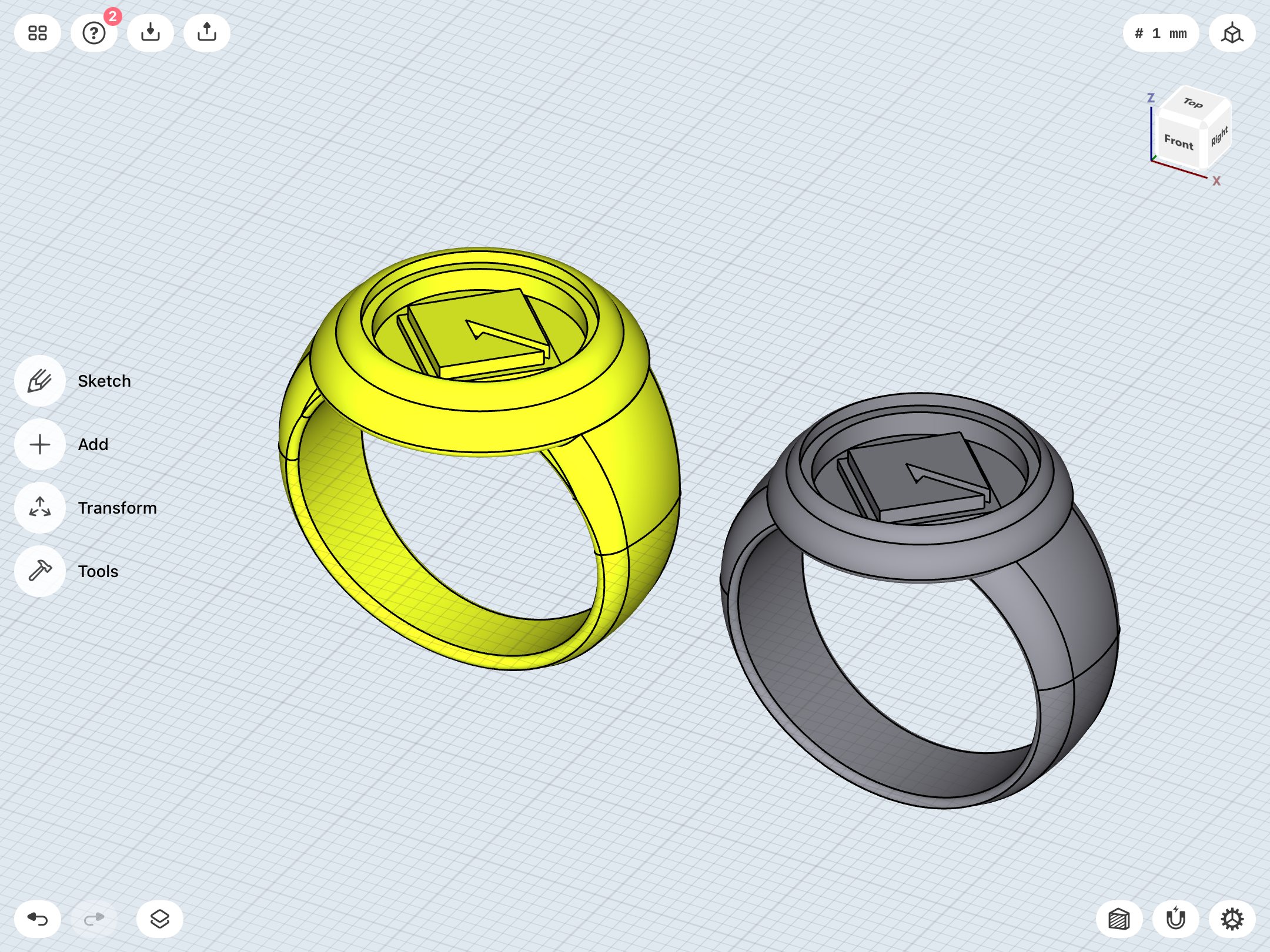
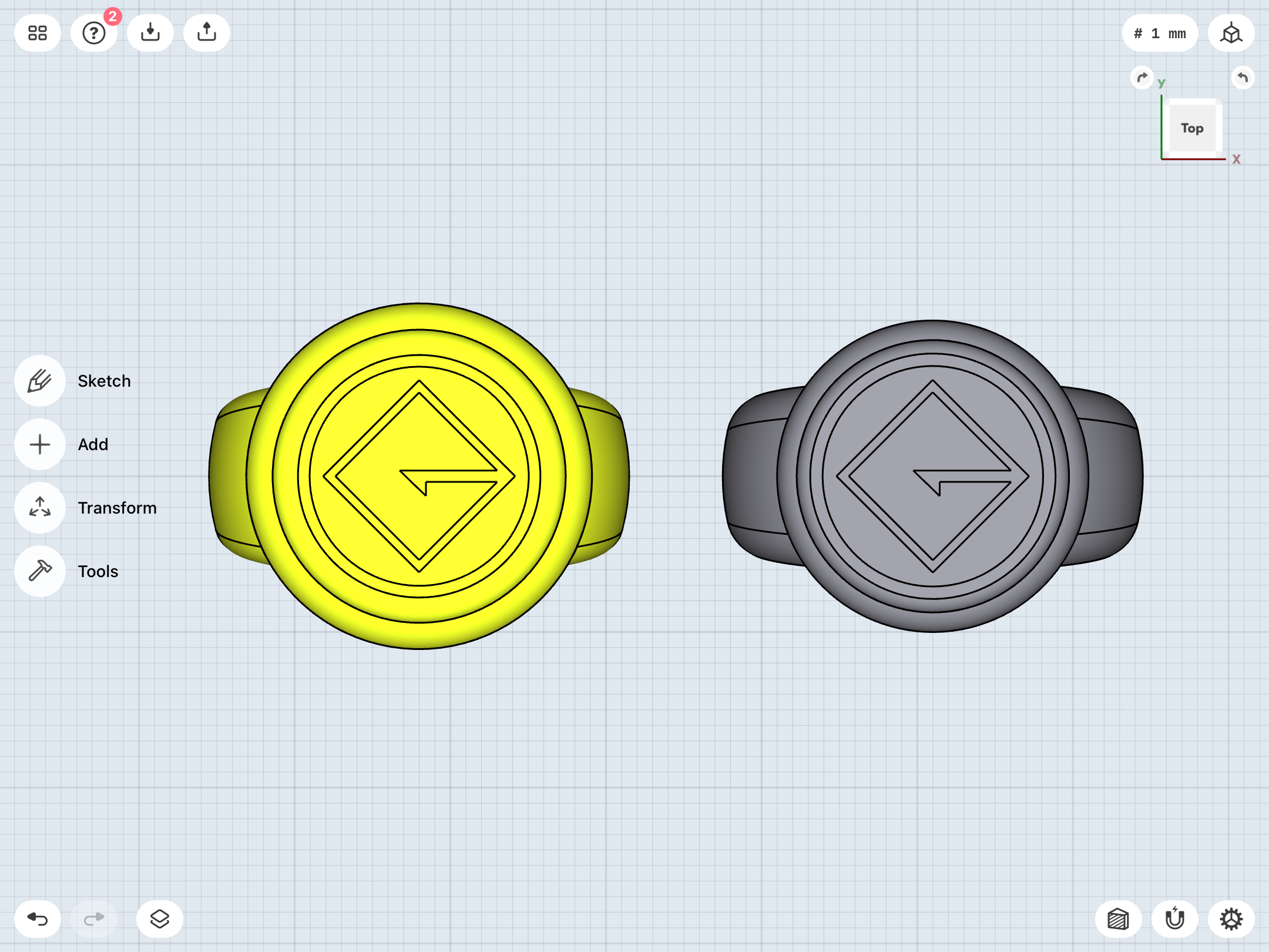
705A3EB7-5F47-4019-8D9A-1B1F9D05D9AD.png
CE61BC09-FF6B-4A65-84AA-24C9F5E4551B.png
08F6C0B4-57B2-43EC-A316-B7B108687E5F.png


As I work through GL Vol. 3, I’m being mindful of the occasional (but inconsistent) tweaks Bright made to his GL ring design, such as a flat ring/edge on the convex symbol-disc, surrounding the symbol itself (which simulates the circle/ring surrounding the official versions of the symbol). I tend to skew toward the simpler EMERALD DAWN version, but we’ll see. Maybe I’ll tweak it.

Also, it should be noted that I finally caught up to the issue and panel which made me fall for that design, many years ago—from GREEN LANTERN Vol. 3 # 39. This was early during my initial time with the character, when I was seeking back issues, and that one panel became my “definitive” version of the GL ring, before I came to know all the other versions.
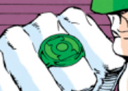
42A2560D-6742-4240-A281-B5091F9C3D7D.jpeg


...and for anyone wondering, my very first issue of GREEN LANTERN was Vol. 3 # 50. Yep, I came in literally when the entire mythos was torn down, and ended up backtracking and exploring everything which came before while also enjoying the new adventures of Kyle Rayner.
 
Test prints came in. Photos to come soon. I just gave the green rings a shot of emerald paint (since I’ve forgone having them dyed as a cost-saving measure), and they’re still curing.

I haven’t examined them in detail, yet, but I’m very pleased with what I see, at first glance. And my doubts about the Gardner ring appear unfounded. Looks to be about 90% where I want it. I think the tapering of the band might just need a bit of tweaking to make it wider at the bottom and thinner at the top. Maybe not. We’ll see.

More to come.
 
Okay, here we go. Paint’s dry.

DC17BFEB-D29B-4992-BF29-B36C4D715A40.jpeg
6CF8CB3B-2A47-4400-B5D9-8B1BA04603C9.jpeg
6035EFC3-FC9D-4FA6-9734-03E5692FC2F9.jpeg
3DC79714-1EAE-4ADB-836C-ED630DAA882C.jpeg
2CD35B71-6150-45D1-B95F-60E56DCA5777.jpeg


Notes on the designs in order, from left to right:

* The Abin Sur ring and its revised symbol design turned out well. Needs more tweaking. The straight-band V1 also looks good. Both might need new bands, since I went with a pretty basic, flat-sided design.

* I need to spend some time with the 24/25/26mm V1 variants (rings 2-4 in the top image) to get a feel for them. The outer ring surrounding the symbol might need a bit of tweaking to make it a little thicker. In fact, due to the symbol shrinking proportionately a bit as a result of the thicker outer rings on these prints, the 26mm V1 doesn’t look as freakishly big as I’d feared it might be, and it totally eclipses the band in top view, Gil Kane-style.

* Very happy with the Alex Ross design. It works very nicely as a sort of idealized Silver Age ring. Maybe needs a SLIGHTLY thinner symbol-disc. Tempted to get this one printed in silver or something (with my green resin insert) for casual wear, without any green coloration.

* Very happy with the V3, although I still wonder about the thickness between the finger-hole and the upper face of the ring, the amount of curvature on the sides (...should they be a little more vertical and less curvy?), and I’m still debating whether to have the telescoping sidebars slightly taper as they travel down to the bottom of the band (as on this print), or to keep them consistently thick.

* The smaller and sleeker V2 looks great. I need to compare it with the previous iteration as well as the reference material to see if the symbol-section isn’t TOO small. As is stands, the proportions and the tapering of the band are excellent.

* As with the Gardner ring, I do indeed seem to have cracked the code on the EMERALD DAWN ring. This one only needs some slight tweaks in terms of band taper/width and the curvature/height of the symbol-disc. But, the overall design is probably about 80-90% there.

* The REBIRTH ring is virtually perfect. About the only changes needed are a slight tweak to the band curvature in profile, and making a more distinctive separation line between the disc and the band (...which I successfully did on the Alex Ross version in order to compare it with the REBIRTH and see which looked better). As previously noted, the REBIRTH and the Ross are fairly close to identical, but I gave the Ross a beefier look and a bigger symbol-disc to distinguish it from the smaller and sleeker REBIRTH.

* And, finally, the Gardner ring is close to perfect, as noted.

I also need to check the tolerances on the resin insert master pieces. I deliberately went with a very tight tolerance this time (a mere 0.15mm offset between the symbols and their resin-insert negative space) to try and minimize looseness/gaps. I think I may wait to cast them in rubber until I have the actual ring designs locked down, hopefully after the next set of revisions.
 
Beginning revisions.

Tweaking the Gardner and EMERALD DAWN rings to make the symbol-discs a bit thicker/taller and give them some more definition/curviness, as well as giving the rings slightly more robust bands.

Modified designs in gray.

FD9B501A-42C7-43D6-9713-DB4C4F9114F9.png
B1605F22-68D6-4724-9FDC-CEEC3B8A4AE7.png
8B9A472A-6312-400C-BF47-6F426AED9AD7.png
D7BC027E-3D4F-4BB5-AAF2-DE0AE29B37F1.png
 
More tweaks. A lesson of this project is that things may seem great on a computer screen, but it isn’t until you have a physical model in (or on) your hand that the flaws become apparent.

Subtle changes here. The thicker band, the rounder-edged disc with smaller symbol, etc.

Old on left, new on right.

EE0FC4D9-CB0F-48C3-BCEB-3A6967DD1ABE.png
B20EC48D-E619-4AB7-B28D-26EC7645A4CA.png
346768E4-72CB-44F3-B194-C70C5DF03F88.png
3D6F1440-16F5-45BA-86EC-B3D7677DB925.png


B6589B88-0A85-4E9D-B346-6F6ED1DB6194.jpeg
D980B31B-652D-4782-B983-4B0B6C4CF544.jpeg
F71E7DC7-64C4-49FC-86E9-7C7CFA9C1A59.jpeg
238517BB-EEB9-4CA6-8B8A-9F1E95181412.jpeg
 
Last edited:
Continuing to tweak various designs based on the data from the new prints. Several of them are definitely in the home stretch, I think. Others need some rethinking.

Coming back to the V1, I find myself thinking more and more that the disc eclipsing the band in top view is perhaps not the way to go. Yes, a lot of Gil Kane art features that honkin’ big disc...

0010141B-83F8-4C17-A291-6CB4D228B979.jpeg
24CE302A-1B20-4293-A93A-39AA44966434.jpeg
57554911-4CAF-4FD3-911C-442BA6B69098.jpeg


...then again, a lot of art doesn’t.

B25AE8C6-B4EF-4348-BF64-883DE537A70F.jpeg
B3E7C772-2211-401C-AAEA-7685DB6EE170.jpeg
95B312C4-CE5B-466B-AB10-BE517BF681D6.jpeg
FA25A0AB-931B-45A2-A6B2-E005DB4C688C.jpeg


As noted, it’s a balancing act in terms of respecting what appears to be Kane’s intent for the design (which was often shifting from issue to issue) and designing a real-world item which is both well-proportioned and aesthetically-pleasing.

More and more, I’m thinking that 24mm might be the magic number for the disc. Also, the height of the disc has been nagging me on the test prints. The discs on the prints just seem to stand a little too tall. The only design where that height really works is the REBIRTH, I think (but not to the ridiculously tall extent of the BLACKEST NIGHT promo rings). I began this project with a consistent height of 5mm for the symbol-discs and the V2 symbol-pieces. That number has slowly been shrinking, over time. Recently, it’s been hovering around 4mm, and closer to 3mm in some cases. I already slimmed down the Alex Ross symbol-disc’s height by about 1/3 after looking at the test print.

Now, I’ve been experimenting with how low the discs can go. 2mm seems too short, at least on my screen. 3D reality might tell a different story. The latest iteration is at 3.25. Here it is compared with the 4mm version (on the left) that I just had printed.

2C7A38E8-917D-4E7F-AE08-E7871C67D5B7.png
DF20EA1C-2799-4088-AE94-92FEBCD210FD.png


Smaller and sleeker really does seem to be the name of the game, here, although it can be a fine line between sleek and dainty. That all said, I do want these designs to have SOME substance and chunkiness to them, and to not look like Cracker Jack rings.
 
Continuing to tweak. Playing with symbol-disc diameter/thickness, and ring-band width/shape (now with a curved/“D” cross-section) for the straight-band V1 and Abin Sur.

Here we have the Abin Sur, straight-band V1, curved-band V1 (this variant with a 24.5mm disc, so as to split the difference) and the Alex Ross.

1C4D1AF5-6933-41B8-9E54-8718386C9209.png
66308FD7-CD3E-4E43-9E02-645D825D734C.png
473AEB82-32DD-4DD6-95D8-F5F92DC04FCC.png


It’s all just a matter of locking down that ideal symbol-disc diameter/thickness, I think. I’ve tried to keep the disc’s dimensions consistent for the three Gil Kane V1 designs (Abin Sur, straight-band, curved-band), but Kane noticably drew the ring with a smaller disc in the early SHOWCASE and GREEN LANTERN stories. So, I’m wondering if I should keep the dimensions the same across the various iterations, or play fast and loose with them, as he did.

Also, while it doesn’t reflect the current iteration’s tweaks, I must say that I’m rather enamored with my Alex Ross test print. It really does work nicely as an idealized version of Kane’s design. Just the right combination of elegance and chunkiness, as well as the addition of the lighter-green crystal inlay surrounding the symbol (a detail that only rarely appeared in the Kane-drawn comics, which usually just colored the entire ring one shade of emerald green).
 
...as usual, I continue to endlessly vacillate between different design theories for the curved-band V1.

The straight-band version is relatively easy—it’s just a matter of nailing down the disc size, and determining whether or not the disc should sit on top of the band, or be lowered so that it intersects with the finger-hole.

And then there’s my nemesis, the curved-band V1. A proper signet ring (albeit with the separate disc/cap on top of the face (middle), the big disc sitting atop the signet band (left), or the lowered disc intersecting the finger-hole (right), and the band becoming a “U” (with the open ends attached to the bottom of the disc), instead of an “O” shape?


C6D0FDF8-1971-40D4-9C34-0840F43E8F73.png
 
Picked up a new type of epoxy resin, today, which is supposed to be bubble-free and high-gloss.

And, since my latest revisions to the REBIRTH ring have only marginally affected the diameter of the outer collar of the symbol-disc, I’m proceeding to smooth the resin-insert master from the most recent test print and prepare it for molding.

Once I get to casting, I think I’m gonna start with fluorescent yellow dye, and then slightly tint it with fluorescent green, for more of a lime-green look than I’ve been getting, so far. I’m also wondering if I should mix in glow powder, or just back the clear resin piece with it, so as to not affect the color of the resin. We’ll see.
 
Last edited:
Experimenting with the new resin, which is much easier to work with than the previous brand.

I mixed up a batch, with the color skewing more toward fluorescent yellow, with some green added (for that lime-green look), and added some glow powder. I poured some of the resin into the new REBIRTH mold I made, and also injected some via syringe directly into the Alex Ross ring’s symbol disc.

I have the feeling that my initial plan— molded and cast masters being glued into the rings—is still the way to go, but direct injection is still a possibility.
 
Last edited:
Finally got a cast for the REBIRTH ring which wasn’t too rubbery. Cutting and sanding it out was a bit tricky. What I need is a mini-belt sander or something to get an even finish on the bottom of the parts. The result of the current test is rather rough around the edges.

Also, with all the trouble this method is giving me, I’m wondering if I should go back to the idea of a three-piece construction (main ring>resin disc>metal symbol top cap), rather than resin insert pieces and a one-piece ring.

7F397CC4-5046-44D9-9DE3-4500757AC1BE.jpeg
 
After working on this project for a solid year, I’ve been taking a break and shifting gears/recharging my batteries with other projects.

However, I have been tinkering around with that three-piece construction for the REBIRTH ring. A top cap-piece which nests into the resin insert (which can be molded and cast in resin without having to cut or sand anything, except maybe the square alignment holes), and that assembly then keying into the top of the main body of the ring. The three-point keying system (two square pegs and the raised, circular platform on the top of the ring body, which nests into the bottom lip of the symbol-cap) should provide a secure attachment with the proper glue.


B9228BE4-D14A-42C1-B7D8-5F57C63E5A28.png
D824A278-3985-4550-B467-13BCCED5D719.png
CD25CF4B-B1E7-4E86-A32B-864546D8C39E.png
 
More tweaks. Changed the pegs from square to round, and added a raised collar to the top of the ring body, which allows for better keying with the top cap AND for the resin insert to nest inside the ring body.

24CBE2D8-0CF7-4A84-9AF3-CABD91880B00.png
B1E110C4-BDAC-4781-8C57-B7886C9433D6.png
 
Still tweaking. Been playing with variants for the REBIRTH band shape. Both Van Sciver’s art and the BLACKEST NIGHT promo rings feature bands with a very smooth taper in profile, and it’s a bit tricky to capture that.


Realizing that I’d already achieved a taper similar to what I’m looking for with the Alex Ross design, I went back, ported that band over, and modified it to fit the REBIRTH ring. There actually is a logic to this, since both designs (Ross’ from the JUSTICE maxi-series and Van Sciver’s from GL Vol. 4) were published in 2005, and it therefore could be said that, in-universe, the ring designs from both of those eras (Ross’ idealized Gil Kane design and Van Sciver’s) would be the same, but for the addition of the revised GL symbol introduced in GL: REBIRTH.


Anyway, the result of these tweaks is two rings with the same overall look and proportions, but featuring the different symbol designs. I also incorporated the three-part (well, four, in the case of the Ross, since there would be two resin insert parts) construction into the Ross ring.

102F4080-8348-4D09-9DB6-BE88BC9EFFA4.png


Still working out the details. I was going for a slightly chunkier look for the Ross, and I’m not entirely sure I want to apply that same look to the REBIRTH. Also, the slightly straighter sides of the upper band of my previous REBIRTH design (right) seem a bit more in-line with Van Sciver’s art and the BLACKEST NIGHT promo rings than my rounder and more bulbous Ross-based design (left).

12DE6474-9DAF-4892-81D5-183C7864E6AF.png
53B37F21-8A62-41BD-9FA2-D4BFBD1423C6.png
 
More tweaks. I took a band from one of my V1 variants, and modified the REBIRTH parts to fit it.


E2CCC9D6-5108-43EA-9908-C4A20A90883B.png


The trick here is the overall proportions and the band profile. Finding a balance so that the taper isn’t too extreme OR too subtle.

The Van Sciver design has that subtly curved “V” band which flares out into the disc platform at the top. There’s also a fair bit of variance in the disc width, ranging from rather small to quite big.

25655B1C-77CD-47F2-9B64-E9FBBA2D7BC7.jpeg
699ACA57-26D0-42D1-A243-719F7B77649A.jpeg
FB05D5A8-27DB-4F39-ADCE-523754B1CEF9.jpeg
953EEE60-8727-4C1E-83D6-595FA12F40F3.jpeg
956768C7-7A3C-4F94-9748-7E96BF157AE5.jpeg


The Alex Ross-based version (left) has a 22mm disc, while the newest version (right) has a 19.6mm disc.


0BF938A8-24DD-482F-A57C-12E2E8B62DA0.png
17AD2559-1415-4888-8B87-CFDB8F3A04A9.png

3CAE191A-2C59-4957-B410-D4DCB7388CBD.png
 
Last edited:
Yet more tweaks. After due consideration, I think the (revised) 20mm disc and the V1 band (right) match Van Sciver’s art better than the Ross (left), which, with its 22mm disc and wide upper band, appears a little too top-heavy. But not too top-heavy for the actual Ross design, of course.


0B02BE55-CA70-4982-8D8E-AE82CF5A9DC8.png

DE54473C-4552-4CEB-9655-8AD2AAC48213.png


Ross:


37485FCC-413C-4B06-9CBC-F66A5329D34D.jpeg


Van Sciver:

96927058-9003-4DAD-8BD7-B8FC0B0770F9.jpeg
 
Last edited:
More tweaks. I’ve gone back to playing with the tapered/conical/flatter-angle-at-the-top, more complex curvature of the upper band, as opposed to the smooth, consistent curve of the previous model. That look just seems more in line with actual signet rings, as well as Van Sciver’s design and the BLACKEST NIGHT promo rings. The problem is that, in profile, the changes in geometry slightly distort the smooth curve of the edges of the band, creating “joints” in the band, so to speak. Although I suppose those could be sanded/polished away.

It’s a tricky balance. This design was often drawn in the comics with almost straight-line, diagonal edges (as you’d see in a sphere-based ring, like in some of my earlier versions of this design), rather than the curvier look of my recent versions.

I also added a bit of height back to the disc and the top of the band (adding a bit more of an upward-tapered look, rather than the squatter look of the previous iterations), and thinned the insert a bit, so as to give the GL symbol a bit more of a raised/relief look against the insert sitting beneath it.

From left to right: Ross-based, V1 band-based, the version I last had test-printed, and the current revision.

I also applied to changes of the current revision to the Sinestro ring.

E73F99BA-25FC-479E-8AC0-270F2FC1183D.png
74025594-2169-43CF-AD97-84C27D9C4DAE.png
 
Also ordered the revised Ross ring.


Meanwhile, I’ve come back to the V1, and again ponder the question—

As noted, there were references to a “power element” in the ring’s setting during the Gil Kane era. And, on occasion, the negative space surrounding the ring’s GL symbol was colored lime green, or even just left plain white. Later iterations, of course (Bright, Ross, Van Sciver, etc.) depicted this area as a glowing green, crystalline material.

Most of the time, though, the early GL stories colored the entire ring that usual flat, emerald green color.

So, the question is: Do I forego the crystal element, and stick with a V1 that’s entirely metal, and one shade of green (which is what it looked like 95% of the time), or do I add in that lime-green crystal, as in the later iterations (which is not what it usually looked like)?

In the meantime, I’ve been tinkering with one of my V1 variants to incorporate the three-piece/crystal sandwich design.

742F21E5-4BB8-4935-BCD8-30C0AC22AAFB.png
 
Last edited:

Your message may be considered spam for the following reasons:

If you wish to reply despite these issues, check the box below before replying.
Be aware that malicious compliance may result in more severe penalties.
Back
Top