Defined Green Lantern Comic Rings

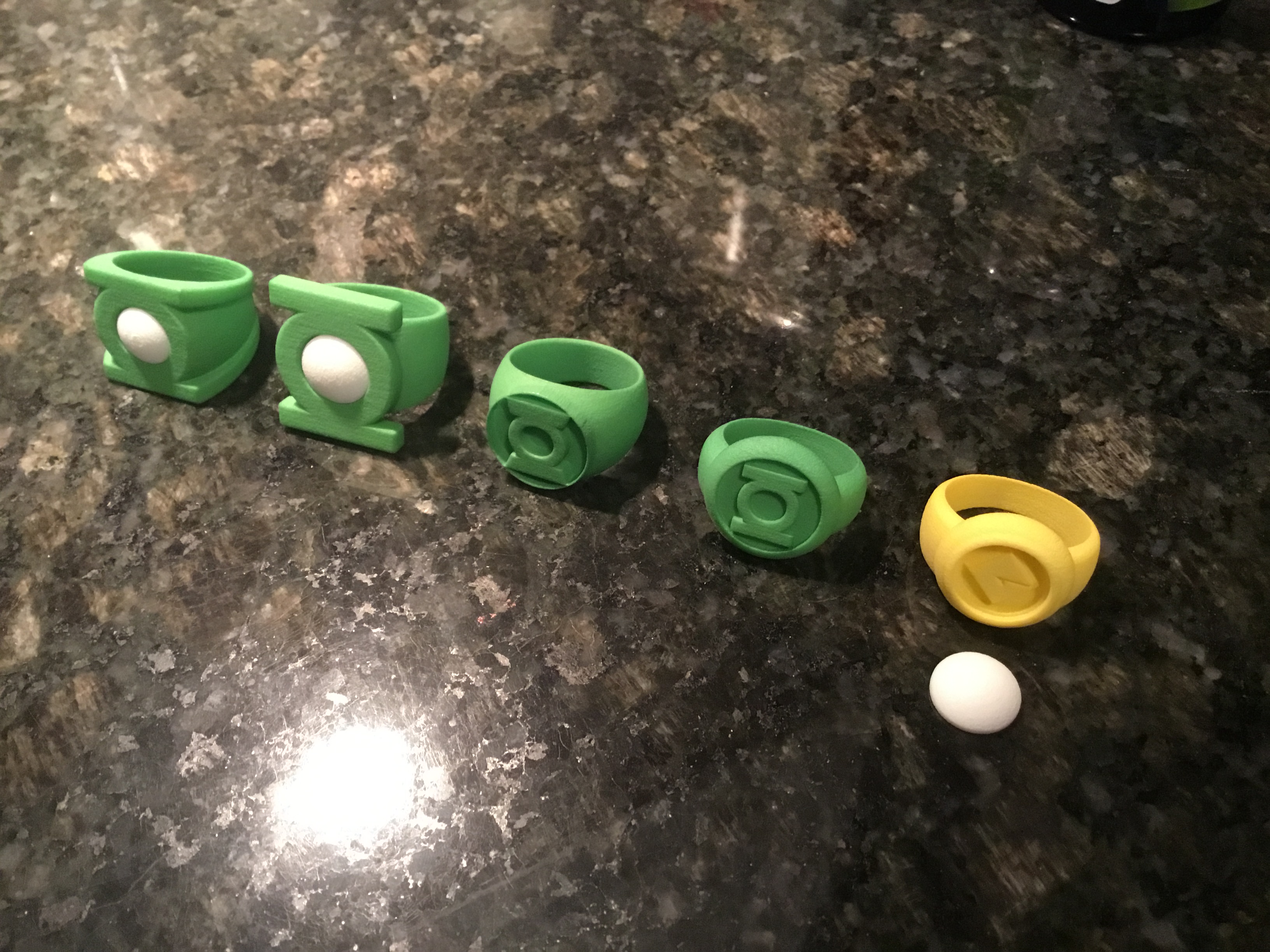
New test prints came in.
6320E321-6C50-46B4-AACD-523C669FECF9.jpeg


All that hard work paid off, because I am EXCEPTIONALLY pleased with them. Very few tweaks are needed, at first glance. I’ll take some time to study and wear them, but the designs are very close to perfect, now.

The V2 seems just about perfect. Good fit, good size, good proportions. The added chamfering on the edges keeps them from being too pointy/hazardous.

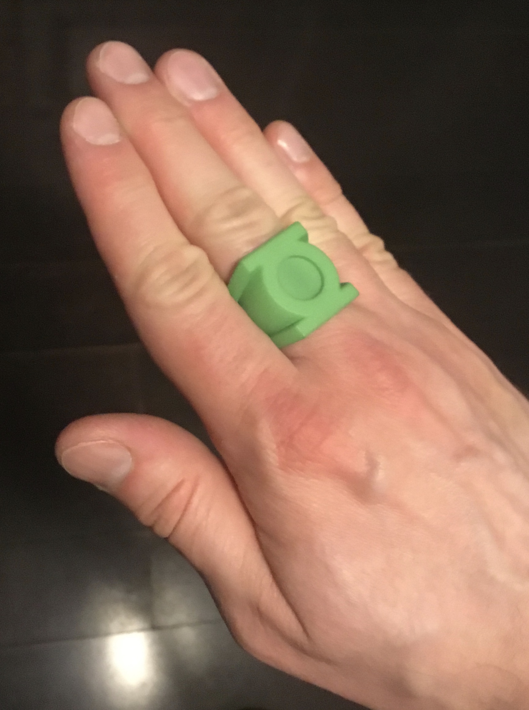
The V3 is...dare I say?...perfect. The size, fit, and look are all excellent. Literally the only tweak I might consider is adding a wee bit of height to the face to give it a slightly higher profile. That’s it. It now has exactly the sleeker, smaller-than-V2 look I was aming for.
978A3671-ED9D-43B0-91E0-0A4484604EF6.jpeg


The EMERALD DAWN ring is the weakest of the lot, but not by much. The fit is slightly too tight at the top (where the symbol-disc intersects with the finger-hole), and the symbol disc needs to be a little taller/thicker.

The modern-style ring is also perfect, for lack of a better word. The only tweak I’m contemplating is making the symbol disc ever-so-slightly taller. I’ll compare it to my reference materials.

The Guy Gardner ring is also close to perfect. The fit is better than the similar-design EMERALD DAWN ring, but still ever-so-slightly tight. And maybe the band could stand to be a bit thicker and wider on the bottom. Looks kinda dainty, as it stands. I should also see if I can squeeze in a slightly larger symbol-disc, but I do dig the compact look of the current version.


The next step is to fill/sand/polish the printed gems, then get to work experimenting with resin-casting them (and filling in the negative space on the EMERALD DAWN and modern rings).
 
Finally managed to create a V1 band using a single, unsegmented sketch, which gives it that smooth profile curve on the sides on the band. After much tweaking, it seems this version of the band only works with a smaller-width upper half, leading back to the “disc stuck on top of band” look. Hmmm.

E53182EB-3C3C-4C8E-942C-C0468A45C716.png
F351C8BD-FEEF-4002-A0A9-35C3535AFC66.png
BEEF5170-D810-4C8E-AB4A-EC761EFA5EE0.png
 
Last edited:
Tweaking and rethinking the EMERALD DAWN ring. The revised version (on right) has a slightly thicker band, a deeper negative space around the symbol, and a taller symbol-disc, which sits slightly higher where it intersects the finger-hole (for a slightly looser fit).

0B8E04BE-64CE-45B9-815B-C66ADD353817.png
 
Last edited:
Well, aside from more modeling tweaks, today has been productive.

First, after letting the printed gems’ smoothing treatment (putty followed by filler primer, buffed and polished to a sheen, then coated with Pledge floor wax for a smooth clearcoat), I mixed together some silicone rubber and molded them.

After the rubber had cured (about six hours), I mixed up two batches of resin: One with a few drops of fluorescent green dye and green glow powder, the other with yellow dye and yellow glow powder. After that, I poured the resin into the molds.

This is my first time molding and casting ANYTHING, so we’ll see how this initial test turns out. My primary concerns are color tint and translucency, moreso in the case of the yellow Guy Gardner gem, since I’d like to be able to see the “G” symbol underneath it. Hopefully, the gem won’t end up too opaque. It may take some experimentation to get things right.

I also used a small syringe to inject the green resin into the negative spaces of the EMERALD DAWN and modern rings. It’s tight, tricky work, and some resin inevitably slopped onto the symbols and the outer symbol-discs, but, fortunately, the resin cleans up well with rubbing alcohol. Still, it’s small, tricky work. The resin is also supposed to be self-leveling, which helps.

I’m wondering if it might not be more controllable to 3-D print parts for those negative spaces, mold/cast them in resin, then sand them to fit in the cavities. That would be a lot of work, though.

On reflection, it would’t be hard to use masking tape or some other agent on the symbols and discs to help prevent resin from going where it shouldn’t. Hmmm. Any suggestions?


Anyway, we’ll see how it all turns after the proper cure time.


In the meantime, here a preview of the curing EMERALD DAWN and modern rings. Note that the glow actually bleeds through the thin wall of the modern ring’s disc, since it hasn’t been light-blocked. Metal rings won’t have that problem, of course, and they should also be easier to work with in terms of cleaning up excess resin.

A3FA042A-62BA-46FE-A808-65DDB8BE309B.jpeg
 
...I got me an idea.

If I go into the Shapr3D models and create negative-space parts for the symbol-discs, then attach them all to a thin backing disc, I can mold that disc and cast it in glow resin. Then, after curing, the parts can be cut/broken off of the disc (as long as the resin pour is thin enough at the top of the mold), finished/sanded for tolerance, then dropped into the rings.

There would be a number of advantages to this, including equal heights for each of the resin parts, rather than my having to eyeball each resin injection point (two on the EMERALD DAWN ring—the space around the symbol and the symbol’s central circle—, and five on the modern ring—since the edges connect to the outer circle, breaking up the negative space into four piece, plus the center circle), and hope they all level out.

It might just be crazy enough to work. The injected resin is messy and something of a wildcard.

I’ll have to experiment. Here’s a quick mock-up of the modern ring’s five negative space parts.

4A89E110-151B-442C-8925-7F3131C94722.png


Also, while not yet fully cured, as of this writing, the injected resin looks to be quite glossy, and I’m not sure about that look. For the rings with gems, yes, great. Nice, shiny-domed glow-gems is just the accurate look I want. However, I might want a more matte look for the non-gem rings. Also, translucency could be an issue, so maybe I should consider frosting the bottoms of the gems with matte paint or good ol’ sanding, so you can’t see through to the the bottom (although, as noted, that IS what I want with the Gardner ring).
 
...well, something went wrong in the mixing of the resin, because the gems are soft and sticky. So, I demolded them, remixed, and repoured, keeping a closer eye on the ratio of resin to hardener, and spending more time slowly mixing them. We’ll see how it goes.
 
Second resin pour also ended up soft and rubbery. Third time’s the charm, hopefully.


Meanwhile, I’ve been creating the theoretical insert pieces to be printed/molded/cast for the EMERALD DAWN ring. Been adjusting the tolerances so that, hopefully, cast-resin pieces would just slot right into the ring.

C32F90F0-593F-40F1-B8CA-A11DEF313173.png
D2ABFC9F-7CD6-42E4-B863-0723E4EA183B.png
7BE42102-66A8-4A9F-B6D4-99EA6969F2E6.png
 
Well, a small bonus has come out of this idea: While working on the modern-era inserts, I came to the realization that the symbol I’d traced was NOT symmetrical, much like the traditional symbol. I have the sneaking feeling that the modern symbol is simply a modified version of the one normally used for licensing, rather than a brand-new drawing. Looks like they just horizontally shortened (and vertically heightened) the rectangular sidebars a bit, then added the angled ends to connect them to the outer ring.


98AC6ED3-9FB4-46BF-86CD-D0D3B56A0879.jpeg


F5EC0867-12BF-45D1-891C-217CF041EC56.jpeg


Of course, considering the scale this design is being produced at, the asymmetry is virtually unnoticeable. But, precision and accuracy are what this project is about, so I made the appropriate tweaks to create a symmetrical version.

EF24C2CC-53FC-4750-8A19-D2265DF24EA7.png
 
Getting better with mixing the resin. I really need to get some dedicated measuring cups instead of just winging it.

That being said, I’ve been doing some test casts in three sizes (V2, V3, Gardner) and two colors (green, yellow).

So far, the green gems look pretty similar to the off-the-shelf ones I’d been previously using. Still playing with color, but the mix of fluorescent green dye and glow powder comes close to the lime green look I’m aiming for.

The yellow gem is tricky. Florescent yellow dye is a bit too intense, and skews too close to green. Proper yellow seems more on-point. However, the glow powder definitely fogs up the gem and obscures the “G” symbol when set in place on the ring. Might have to go with no glow for the Gardner ring, but that’s not a big deal, since the yellow glow powder doesn’t read particularly well AS yellow.
 
Placed a new test print order. The revised versions of the V1,V2, V3, EMERALD DAWN, modern, and Gardner rings, with all but the Gardner ring printed in plain white and unpolished. The reasons for this are that I’d like an accurate sense of the finger-hole size and fit, since the dyed/polished finish does remove some material. Wouldn’t want machined metal rings which have a tighter fit than expected.

The other reason is that I’d like to start calibrating the color of the rings and the gems. Shapeways’ green dyeing process has yielded uneven results ranging from pale to medium green. Not quite the look I’m going for, which is a deeper emerald/forest green. By priming the plain white rings and then painting them a darker, metallic green color, I can get a better sense of how anodized metal rings would contrast with the lighter green gems.
 
Installed some of the test gems into the current test print rings, to get a sense of fit, look, and color.

The Gardner gem is one cast using plain yellow (and no glow powder) rather than fluorescent. Probably used too much dye, because the gem is not as translucent as I’d like.

The V2 and V3 have a good glow to them, although I’m wonder if I shouldn’t back them with the glow paint I was previously using, which would also give them a pale green backing color, slightly visible from the front. I was already thinking of backing the gems with white or aluminum paint to give them a slightly brighter look, even when not charged. A frosted backing (or just seeing through the gems to the green ring underneath) would look a bit dull, color-wise.

8316A4A0-B354-4B6A-8B86-0E34F727E7F2.jpeg
ADC84D6E-CD68-4EA2-AB67-74FEFB4BB353.jpeg
13B84813-C62D-4B44-908E-99ED6B33F913.jpeg


As it stands, I’m planning on remolding the gems anyway, since the models for the V3 and the Gardner have very slightly changed dimensions in the new test print order I placed. And I’m going to took into properly buffing and finishing the gems, possibly with an added clearcoat (be it clear resin, Pledge floor polish, or some other medium).
 
Another interesting discovery involving the modern-era symbol:

The version I’ve been using is the one created for GREEN LANTERN: REBIRTH, in 2004. This version has appeared as part of the cover logos of various GL-related books (beginning with REBIRTH # 1)...

19C4A4A0-1395-467C-AA17-5F19BB3388EF.jpeg


...as well as licensed products like t-shirts and fridge magnets...

AE9D3A9B-79AF-4AEA-88E2-8BAD9C29639C.jpeg


...and the BLACKEST NIGHT ring replicas.

4F6CD08B-DCCA-4CAF-A7A0-343690B3AE1F.jpeg


However, it seems that an alternate version of the modern symbol (an era I am admittedly very unfamiliar with) is predominant for licensing. It has sidebars which are vertically thinner than those of the REBIRTH version, a thinner central symbol-ring, and a thicker circle/ring surrounding the lantern-symbol (with the inner edge sitting much closer to the symbol, resulting in the corners of each sidebar blending more substantially into the ring).

E1BD1810-D85F-4C6C-91C8-CAFF3F3E1017.jpegB22B9FBD-9A54-4364-A3F9-38C91E4859EC.jpeg

This alternate version is the one presented in the Green Lantern style guide for licensees, created for DC Comics by Rivoli Design.


Note that this alternate symbol is presented right alongside the initial REBIRTH symbol, which is still incorporated into the GREEN LANTERN cover logo.


9D8AF5EF-64A0-4F0A-A42A-192A92DF123E.jpeg


...and this alternate version seems to be the one most in use on modern licensed products, like stickers, t-shirts, belt-buckles, and phone cases:

F547918A-80D6-4916-B3E8-C1D9CCFB1C87.jpeg


That all being said, I prefer the initial version of the symbol, aesthetically-speaking. But I may end up modeling this later version, too. It actually seems to be the current official version of the symbol for licensing, or is at least the one most in use. I need to do more research.
 
Last edited:
...well, I traced the alternate symbol, and discovered that, yes, it’s also asymmetrical. So, I created two symmetrical versions (one—middle left—by mirroring the upper sidebar, the other—middle right—by mirroring the lower) to see which looked better. Here they are alongside the REBIRTH version (left) and the source image (right):

0A5515F7-4752-4687-806F-DE73544692E5.png
 
Last edited:
The new test prints should arriving in a few days, and then I can start experimenting with molding and casting the EMERALD DAWN and REBIRTH insert pieces. I also received a proper set of resin measuring/mixing cups, as well as some more dyes to continue experimenting with color.

Meanwhile, I’ve created a new modern-era variant which incorporates the current official licensing symbol. Upon reflection, it appears that this version of the symbol was actually the one I’d originally been using (prior to making my own from tracings of the official symbols) before shifting to the REBIRTH version. I’d mistakenly taken the alternate symbol to be an inaccurate, fan-made one, simply because I was more familiar with the REBIRTH one, and didn’t realize that another variation had actually become the default version for licensing.

Here it is (right) compared to the initial REBIRTH version (left).

FFF6AFCF-07DC-459B-A3B0-B4A6E4CBBD88.png
7CC017EB-4814-49CF-9518-D4DB3C405CC7.png
98C6A1A1-B459-4A0F-9F34-7B23915FDC63.png


Thoughts? I find myself waffling a bit on which one to go with. Probably gonna have to test print the new version and see how it (and its resin insert pieces) compares in person to the REBIRTH-symbol ring.
 
...well, I bit the bullet, and ordered the four new trade paperbacks collecting the Geoff Johns run. They’re essentially the Omnibus volumes split up into smaller, softcover chunks. That being said, the risk here is that the full fun hasn’t been collected, yet (Vol. 5 has yet to be solicited by DC), and so there’s a chance that the final volumes might not see publication.

And, y’know, there’s also the chance that DC Comics might not exist for too much longer.


We’ll see how it goes. This will serve as a sampler of sorts, to see if I like the material. And it might provide more context and inspiration for my modeling project.
 
Been tinkering around with that DC REBIRTH-era, made-from-willpower ring design. Very unusual, that’s for sure, with the symbol’s negative space being cut out, and that strange, wavy shape to the face of the ring. Some artists draw it with a bezel around the symbol, and some don’t. I’ve been playing with both versions.


892A3DCF-EB00-4F16-99DE-341464C5E9AB.jpeg
06E06968-44BE-4802-A14B-6E9C1235C99D.jpeg
0F5D5528-BEF5-4331-9383-9F91AF6D4828.jpeg
28563BCE-77CA-4B80-9AE7-D4E2CF2A0354.jpeg
CB25480F-296D-419F-B20E-87B508986CFC.jpeg
F0DE276D-1272-42AE-8AF0-DEE1C0D1E5AE.png
B8642068-9A27-49CC-8A89-9B0CE99BE2BE.png
61929022-EB36-41B8-948A-4359861FEF31.png
 
Test prints came in. Lots of useful info, here.

First of all, I printed the bulk of the rings in plain, unpolished white. I wanted to see if the polishing for the dyed- green versions was throwing off my assessment of the rings’ fit. As it stands, the difference seems to be negligible.

Now, on to specifics:


I REALLY like the V1 variant with the smaller disc and curve- sided band. It’s essentially pretty close to the Neal Adams design, although it was done more as a whim, and as more of a riff on the Alex Ross version.

918441E3-1DB2-47CF-A07D-85D145121947.jpeg


Speaking of which, the straight- sided Alex Ross version also looks good, although I do find myself wondering I if shouldn’t thicken the outer ring surrounding the symbol. Also, as you can see, the separation line between the disc and the band is very faint. I need to deepen and widen that groove.

4B13C68D-26E9-48DF-B53F-BBA9ED347F5B.jpeg
E4A54306-4AA7-4760-A0E8-3A4BADD8E2A1.jpeg


The EMERALD DAWN ring is now virtually perfect, although the master for the resin insert is a tight fit, as I expected.

897377D7-EB4F-430E-98F1-BCA5401045FF.jpeg


On the other hand, the REBIRTH-era ring’s insert is a perfect fit.

2BB5273D-B57B-4352-83C7-8D019C23289D.jpeg
2AB033B4-6454-48A7-B046-8EA0B8999CC2.jpeg


The Guy Gardner ring is also spot-on. Shrinking down the “G” symbol a bit prevents it from being distorted through a test-gem press-fit into place.

F2D81CAF-CFED-463C-928E-EA31938BC7B6.jpeg
 
Gave the white test rings a shot of primer. Once cured, I’ll hit them with metallic emerald green.


Meanwhile, I’ve been tweaking the V1 variants based on my analysis of the test rings. I added some thickness to the ring surrounding the symbol, because the thin ring just doesn’t look right. I may do the same with the REBIRTH version, too, because that flange surrounding the symbol is really, really thin.

Here are the V1 revisions, and my thoughts.

Numbered 1-3, left to right:


1. The “disc stuck on band” look. Elegant band curvature, matches some Gil Kane art. Basically his original “disc stuck on band” design from the early comics, but with a curvier band.

2. A somewhat generic design, not really based on a particular artist. Matches some Alex Ross and Neal Adams art, though. A curved upper band and a smaller symbol-disc give it more of a traditional signet ring look. The band is slightly visible on the sides of the disc in top view, which doesn’t match Gil Kane, but does match Ross and some others. A balanced, aesthetically-pleasing look, overall. Might do a variant with an even smaller disc.

3. Based on Alex Ross art, this look may also have been what Gil Kane was going for, at times. The upper band is straight-sided, and the symbol-disc remains big. Basically a chunky signet ring.

FE525A8A-39F2-4AEE-86B6-28D5684AD34B.png
AA615B5A-9569-4C1D-B66D-D7AAE13BB9EA.png
9B7D64DB-3EF7-4A03-A8E0-9DACE41E1C0E.png
FCC481A5-897A-403A-9FBE-9434DE13A5C5.png
 

Your message may be considered spam for the following reasons:

If you wish to reply despite these issues, check the box below before replying.
Be aware that malicious compliance may result in more severe penalties.
Back
Top