You are using an out of date browser. It may not display this or other websites correctly.
You should upgrade or use an alternative browser.
You should upgrade or use an alternative browser.
Defined Green Lantern Comic Rings
- Thread starter Gregatron
- Start date
Are you planning to do the one where the symbol post intersects with the ring so that there's a curvature?
Ironically, I cannot find a comic book pic of it right now, but it was my favorite style from the 90s..
View attachment 1767927
Perhaps, although I don't recall seeing many/any with that style in the comics. I'll have to look.
I'm not a big fan of that style, nor versions with oval faces.
Perhaps, although I don't recall seeing many/any with that style in the comics. I'll have to look.
I'm not a big fan of that style, nor versions with oval faces.
I may be mis-remembering, as I'm really struggling to find any pics from the comics at all...
I believe some of the DC animated films have used designs in that vein, if not the comics.I may be mis-remembering, as I'm really struggling to find any pics from the comics at all...
While we’re at it, does anyone have any requests? Any obscure/variant models from the comics to be modeled?
If and when the core models are FINALLY finalized, I’d like to go and create a definitive visual flowchart of the designs’ evolution in the comics, from SHOWCASE # 22 up through Johns/THE NEW 52 era or so.
If and when the core models are FINALLY finalized, I’d like to go and create a definitive visual flowchart of the designs’ evolution in the comics, from SHOWCASE # 22 up through Johns/THE NEW 52 era or so.
DexAntares
Well-Known Member
Alright, Gregatron , I'll see your bet and raise! My new Kyle Rayner printout arrived today. I adjusted the proportions to be closer to both the DC Direct replica and the comic depictions. The new one's on the left and my previous model is on the right. I need to mix up some resin and glow dust to do the inlay. I already whipped up a blue glow dust and resin mix for my Blue Lantern Ring. It's curing as we speak.
Attachments
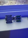
Alright, Gregatron , I'll see your bet and raise! My new Kyle Rayner printout arrived today. I adjusted the proportions to be closer to both the DC Direct replica and the comic depictions. The new one's on the left and my previous model is on the right. I need to mix up some resin and glow dust to do the inlay. I already whipped up a blue glow dust and resin mix for my Blue Lantern Ring. It's curing as we speak.
Excellent!
The print of my own design should be shipping very soon, along with the others. We'll have to do a comparison.
DexAntares
Well-Known Member
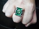
The new ring's lookin' good Gregatron ! Personally I like the version without the outer edge better.
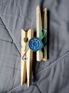
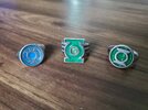
That said, I just got done wet-sanding the surfaces of my newest rings. This time instead of adding small amounts of glow dust to resin with Sharpie mixed in, I just went HAM on adding glow dust until the resin became more like a paste. It seems to have worked out well so far. The daylight color saturation is a deeper green than my previous Kyle ring, and the glow saturation is 100%.
The new Kyle printout is rougher than my last one. I used a different printing service this time. The finish is closer to the DC Direct version, which is fine. It looks rough & ready, not impossibly immaculate. The proportions are closer to the first Kyle ring I had, which was made my Batjeepster back in the day. I may need to add a little more color to the center of the ring. It's a little pale for my tastes right now. The fit is perfect as always. Now I'm just wondering which rings I should do next. I was thinking Sinestro Corps and Indigo Tribe. A Red Lantern ring will need to be last 'cause the glow dust I want to use is said to carry a heavy sulfurous odor. I wanna be careful with that stuff.
Attachments
The new ring's lookin' good Gregatron ! Personally I like the version without the outer edge better.
That said, I just got done wet-sanding the surfaces of my newest rings. This time instead of adding small amounts of glow dust to resin with Sharpie mixed in, I just went HAM on adding glow dust until the resin became more like a paste. It seems to have worked out well so far. The daylight color saturation is a deeper green than my previous Kyle ring, and the glow saturation is 100%.
The new Kyle printout is rougher than my last one. I used a different printing service this time. The finish is closer to the DC Direct version, which is fine. It looks rough & ready, not impossibly immaculate. The proportions are closer to the first Kyle ring I had, which was made my Batjeepster back in the day. I may need to add a little more color to the center of the ring. It's a little pale for my tastes right now. The fit is perfect as always. Now I'm just wondering which rings I should do next. I was thinking Sinestro Corps and Indigo Tribe. A Red Lantern ring will need to be last 'cause the glow dust I want to use is said to carry a heavy sulfurous odor. I wanna be careful with that stuff.
Lookin’ good!
And, yes, I suspect the ribbed edges were dropped for the print version because it was decided to streamline the design a bit more.
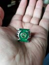
Still tweaking. Getting the bezel to be the right size, shape, and height is the tricky part. I also determined that the circular negative space surrounding the symbol needs to be an ellipse instead of a circle, as with the outer edge of the bezel. And, instead of just cutting the symbol into the band, I created the symbol as a separate piece, so as to be able to adjust its size in relation to the bezel.
The whole design intent of this ring as per Ethan Van Sciver was to take the REBIRTH design and streamline/flatten it. Which is why it doesn’t have shoulders or a disc. Rather, the symbol is curved, and the symbol-bezel wraps around the top of the band.


The whole design intent of this ring as per Ethan Van Sciver was to take the REBIRTH design and streamline/flatten it. Which is why it doesn’t have shoulders or a disc. Rather, the symbol is curved, and the symbol-bezel wraps around the top of the band.
Still at it.
I created another variant. My previous versions of this design (featuring a somewhat ovoid shape for the upper half, which adds more material to the top of the ring) were somewhat akin to the various signet rings I’ve modeled.
For this new version, I went with a completely round ring, with a consistent 2.5mm thickness from top to bottom, then the bezel hugging the top of it.
The result is even more streamlined, and closer to the source material, I think.
Still needs tweaking, but this is a promising direction.
Last edited: