Aeon Flux Animated - Trevor Goodchild Currency

snouty

Active Member
I'm having a crack at the money you see in the Aeon Flux animated show.

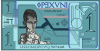
Here's the reference:

Trevor ref 1.pngTrevor ref 2.png

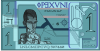
And here's what I have so far.

Trevor Note Test.png

The font is wrong but then it's hand drawn in the original. Any thoughts on that?

My intention is to make it a bit less cartoony and more real. But it's a start.
 
It is looking real good so far.

If you have not planned on it, and if you can, you should try to make the circling and forced perspective patterns right and left of the head, in multi-colored. It should make look more modern.
 
It is looking real good so far.

If you have not planned on it, and if you can, you should try to make the circling and forced perspective patterns right and left of the head, in multi-colored. It should make look more modern.

Hi there, yes I had half heartedly thought about that and your comment has firmed up my resolve to do just that :) obviously the colours I'm using so far are just the ones in the short shots of the bill in the show, but I'll make them finer and more subtley toned once I have the structure down more. Choosing all the colours is going to be a job in itself.

Thanks for the kind words, much appreciated.
 
You are welcome.

It is looking even better now. One observation, on the plate number, the P looks more like an F on the screen capture to me.
 
okay more lines etc. and a LOT of cleanup. Tiny lines and dots tweaked millimeters in one direction or the other.
This is a level of precision the original did not get. :D

Trevor Note Test 4.png
 
Last edited:
Yep very nice, I just have to add the slash through the O. I used the letter O rather than the number 0, a littler trick I learned from the titles of 2OO1: A Space Odyssey. :)

Screen Shot 2017-07-23 at 08.45.08.png
 
Excellent details, this is going to be impressive.

Haha, thanks :) yeah I want it to be exact as I can make it. Obviously I'm going to add, but the fun part is the forensic pick apart "is that a block of lines or a just a block?"

BTW can anyone make out that fine text at the top under the title. I'm drawing a blank.
 
Quick update:

DONE
Bottom font altered to better match.
More lines added on right side.
Number 1 filled with light colour and made more proportionate.
Background colours added.

TO DO
redo the portrait
figure out the fine text below the title.
figure out what happens under the coins.
Juggle the line weights to make them balance because they are ALL over the damn place.
Add fine almost invisible "security" features in the filled areas.

We are almost there.


Trevor Note Test 5.png
 
The fine print inder the title seems to say something like (underlined words unclear and guessed):

THIS IS NOT A THING LRG AND
ALL CREDITS FUSE AND PRINTED

You EXPECT Aeon Flux stuff to make no sense but . . .
Damn I dunno, it's really fuzzy. Shame there are no HD assets out there.

Any thoughts?
 
Last edited:
Okay that's enough for today.
 

Attachments

  • Trevor Note Test 6.png
    Trevor Note Test 6.png
    819.9 KB · Views: 26
  • Trevor Note Test 6.png
    Trevor Note Test 6.png
    812.1 KB · Views: 28
Last edited:
hahaha ok it would have helped me if I was American, I'm actually a Brit so I don't handle a lot of American money. The line is probably a direct lift from US currency . . . This note is legal tender for all debts public and private

so it might probably be that, I think :D
 
This thread is more than 6 years old.

Your message may be considered spam for the following reasons:

  1. This thread hasn't been active in some time. A new post in this thread might not contribute constructively to this discussion after so long.
If you wish to reply despite these issues, check the box below before replying.
Be aware that malicious compliance may result in more severe penalties.
Back
Top