1:350 Enterprise with Acreation Decals!

clancampbell

Sr Member
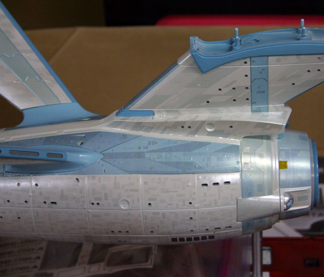
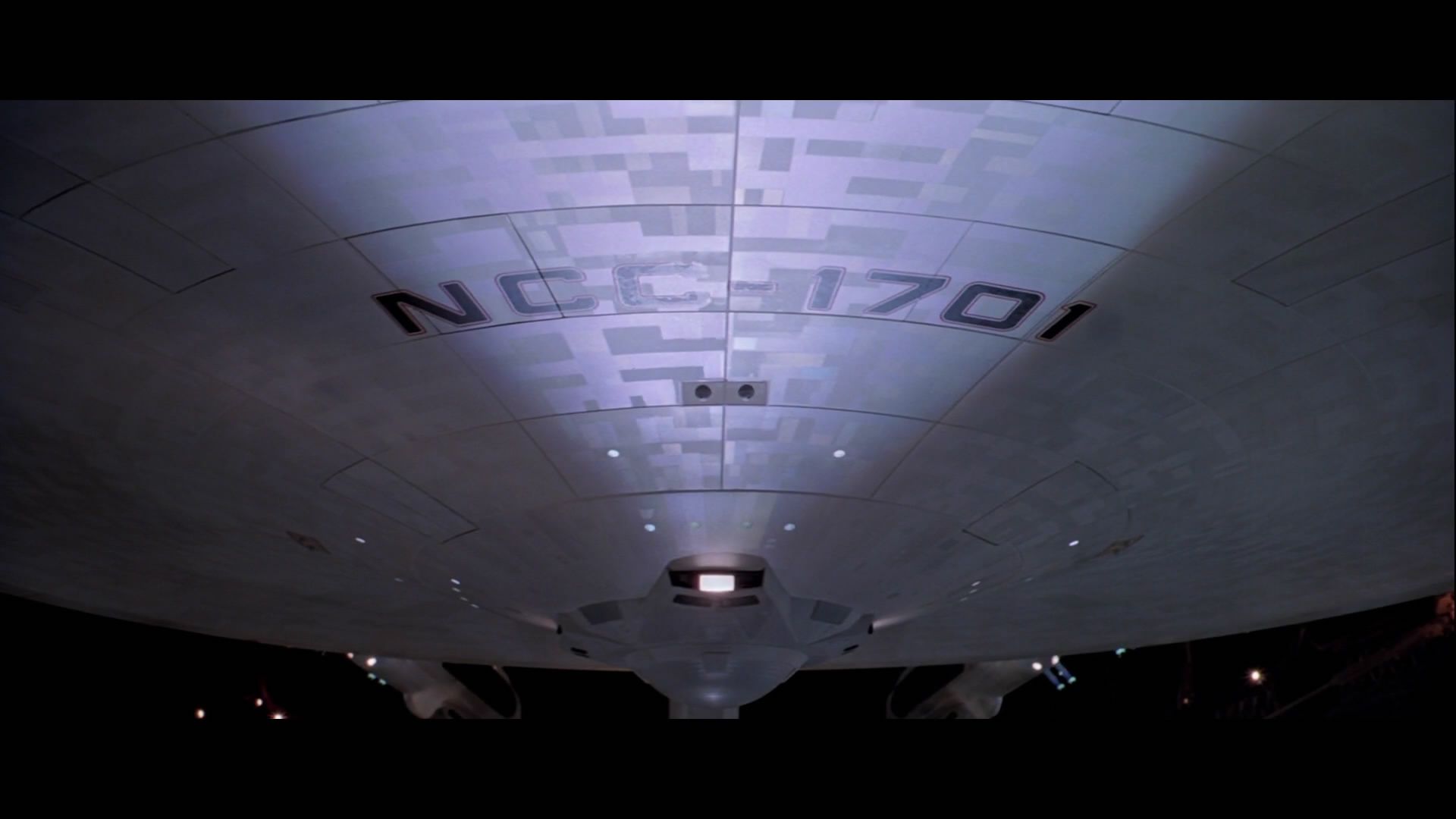
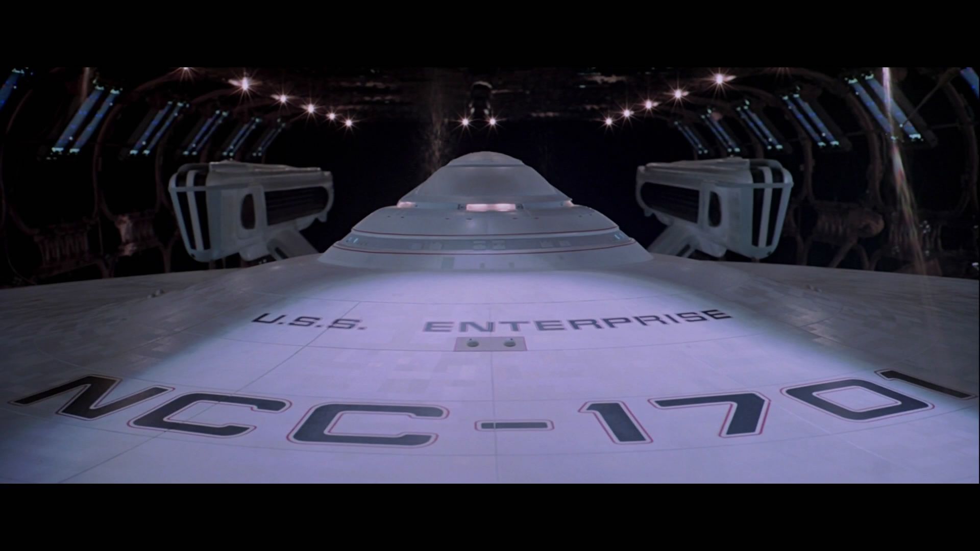
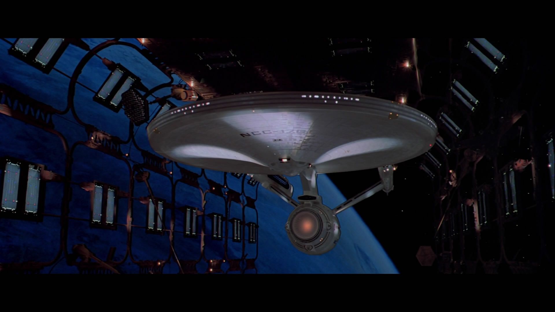
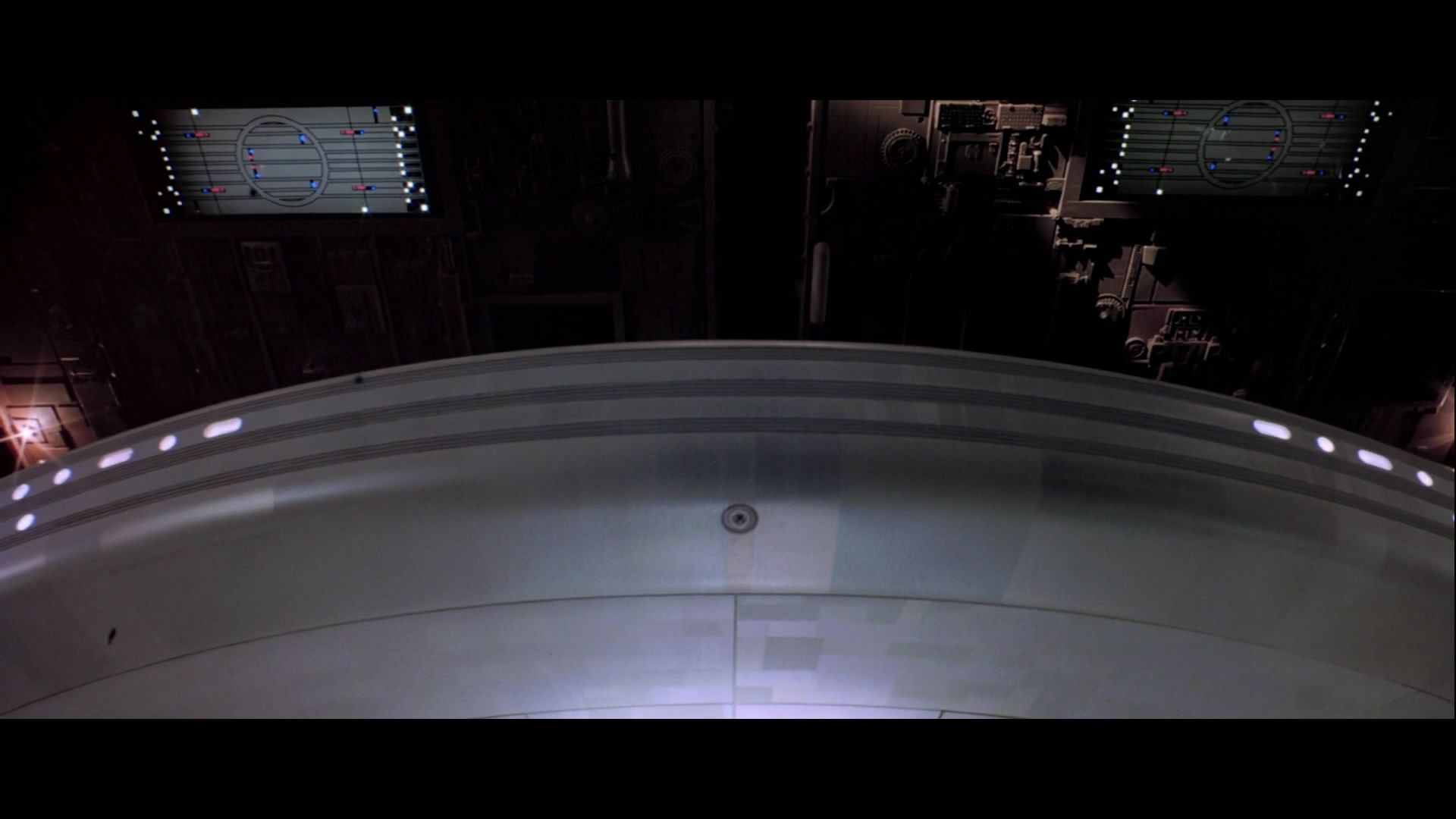
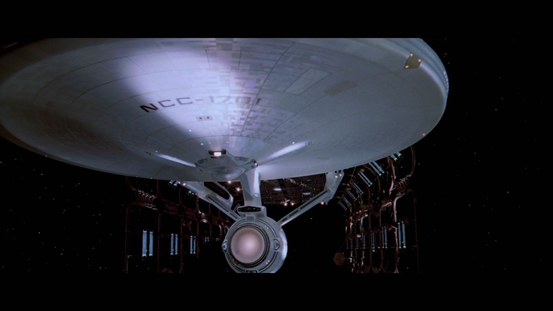
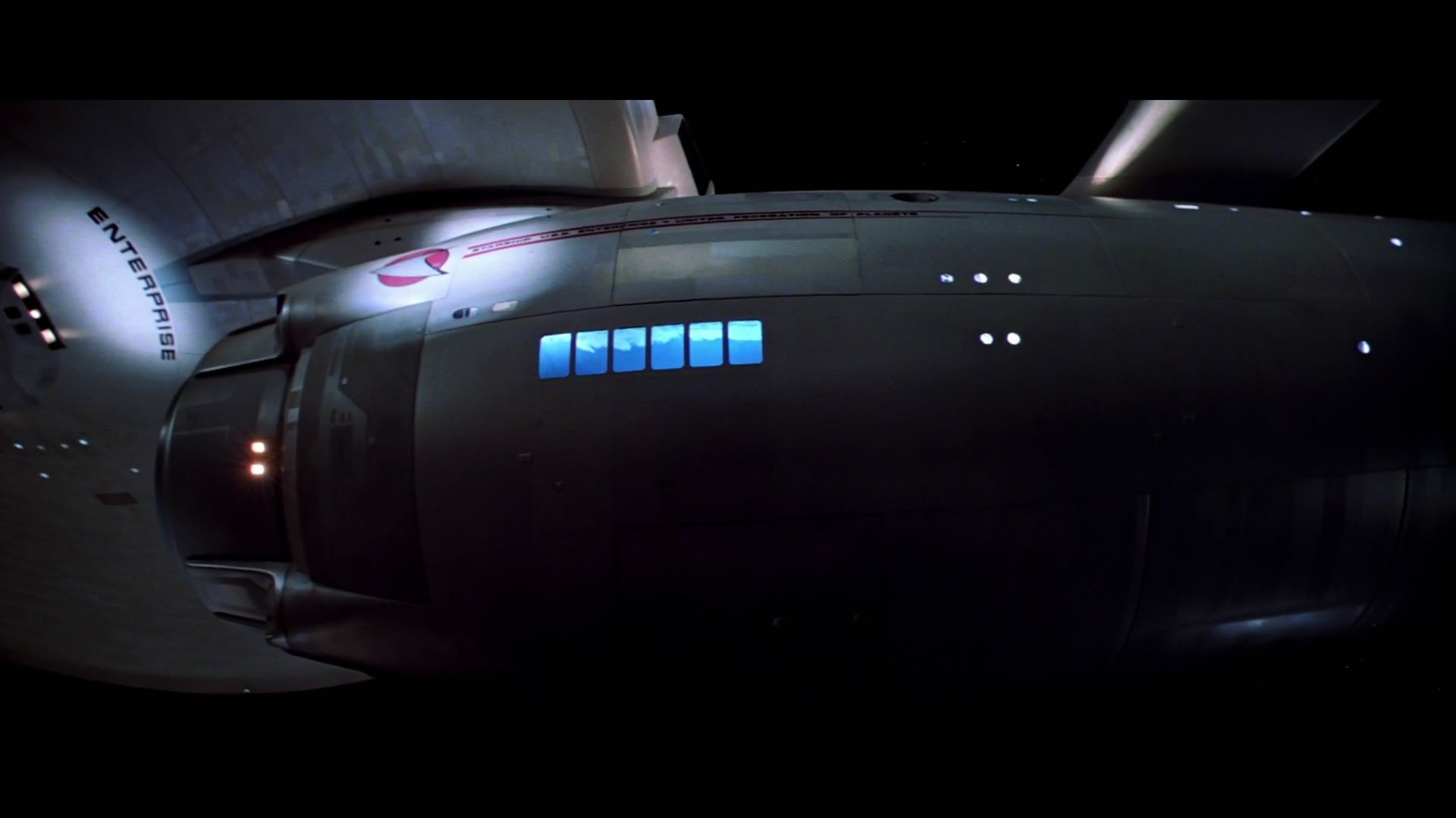
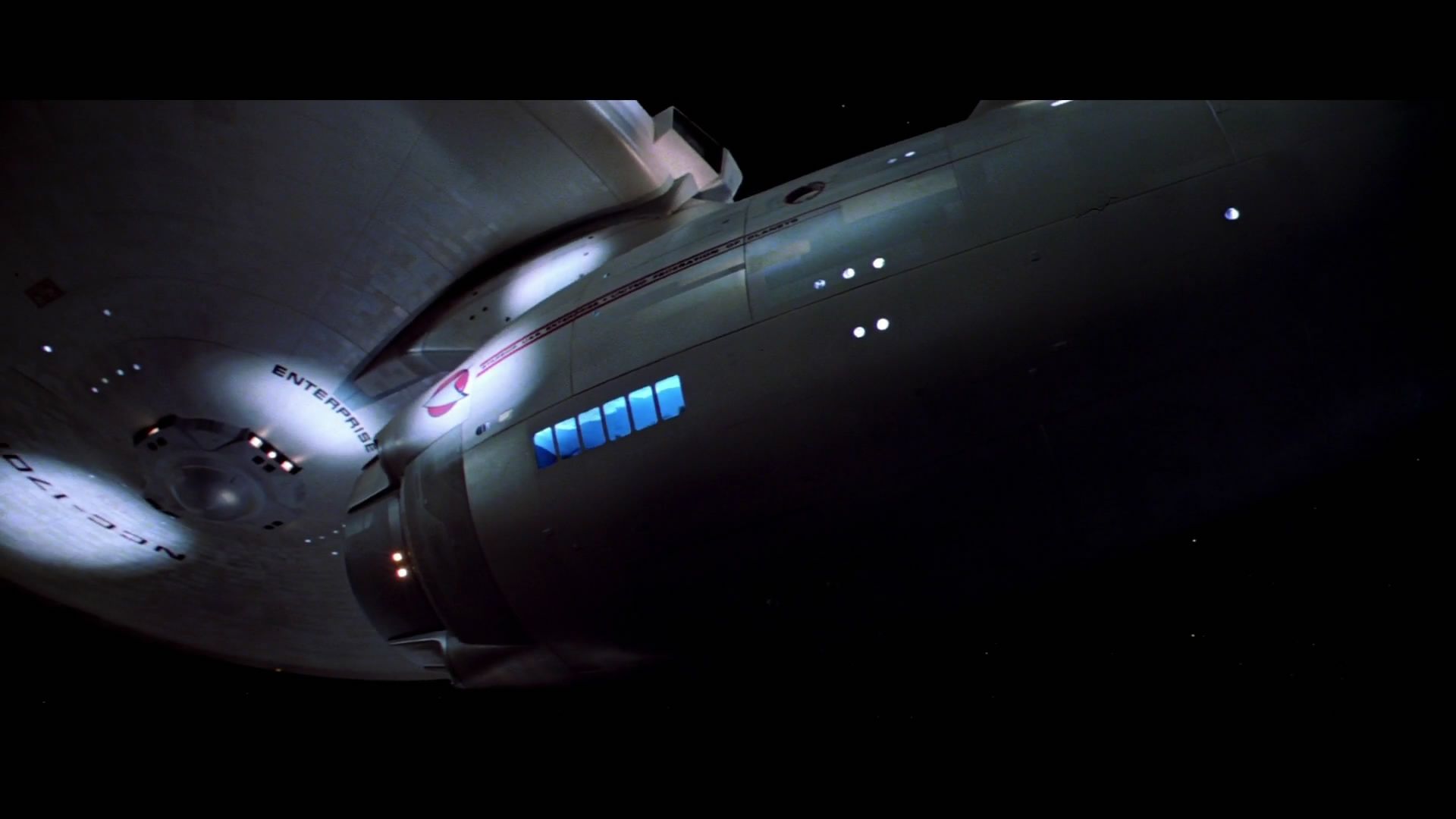
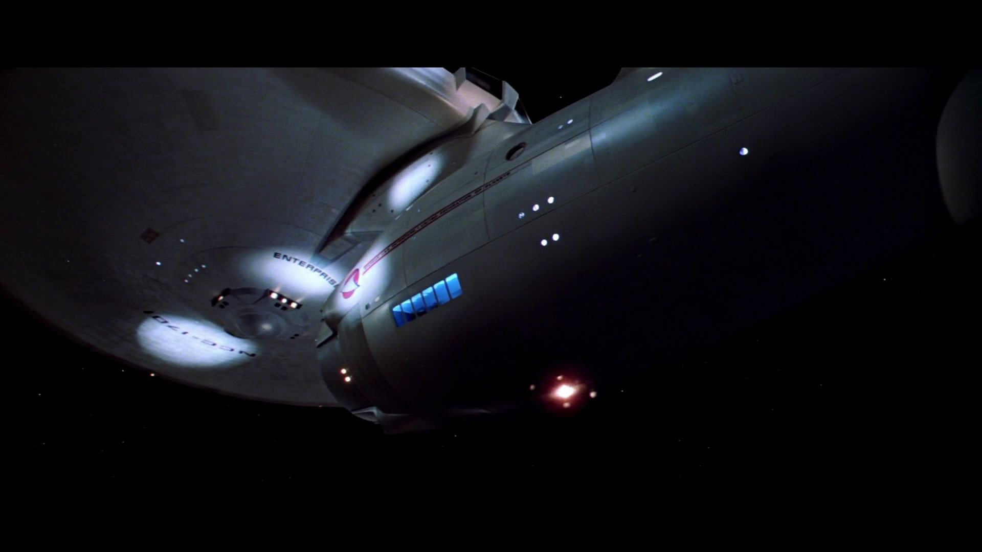
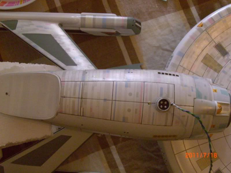
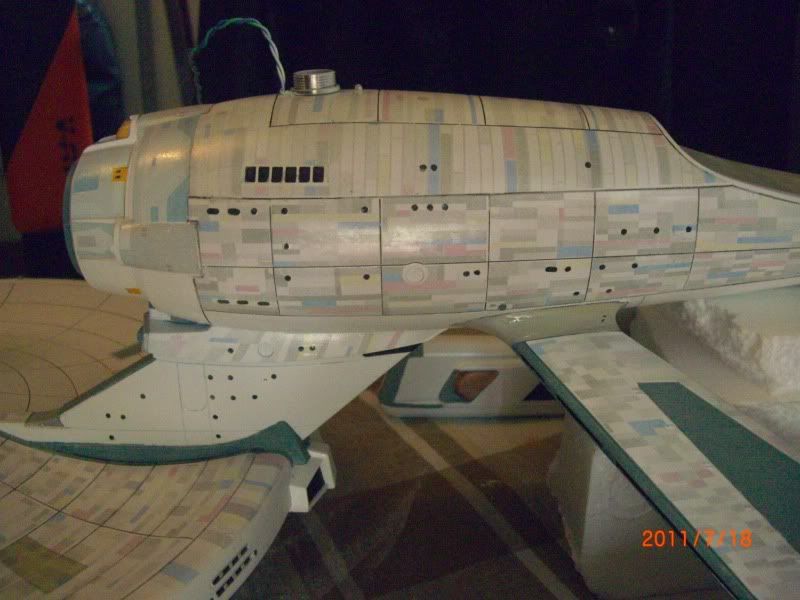
Just thought i'd show my progress on this so far.
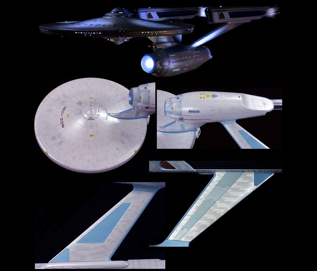
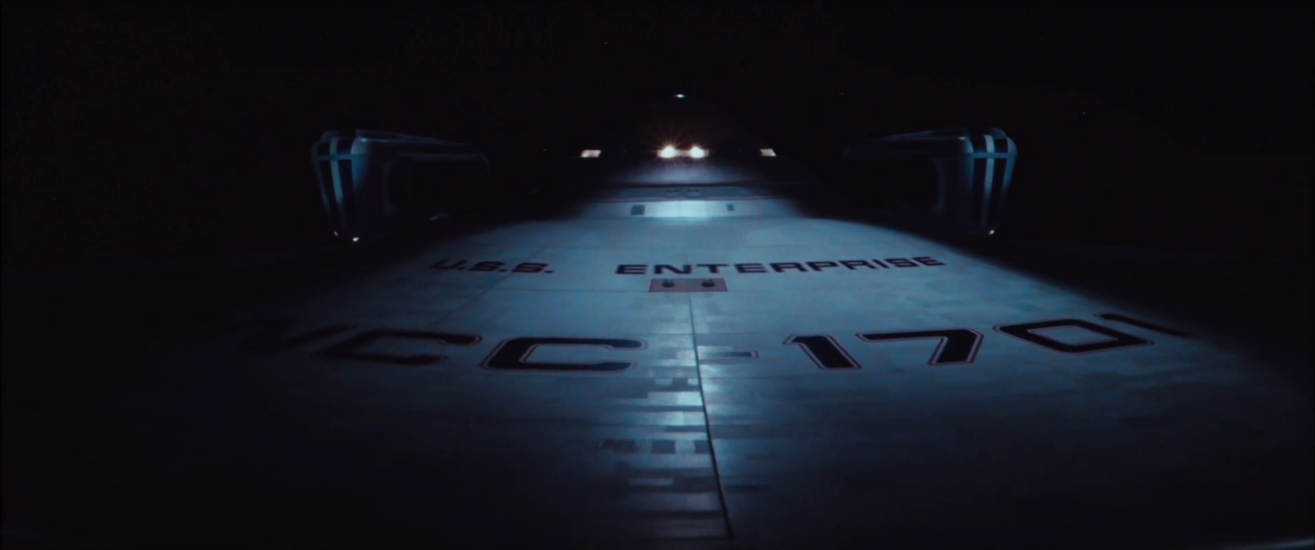
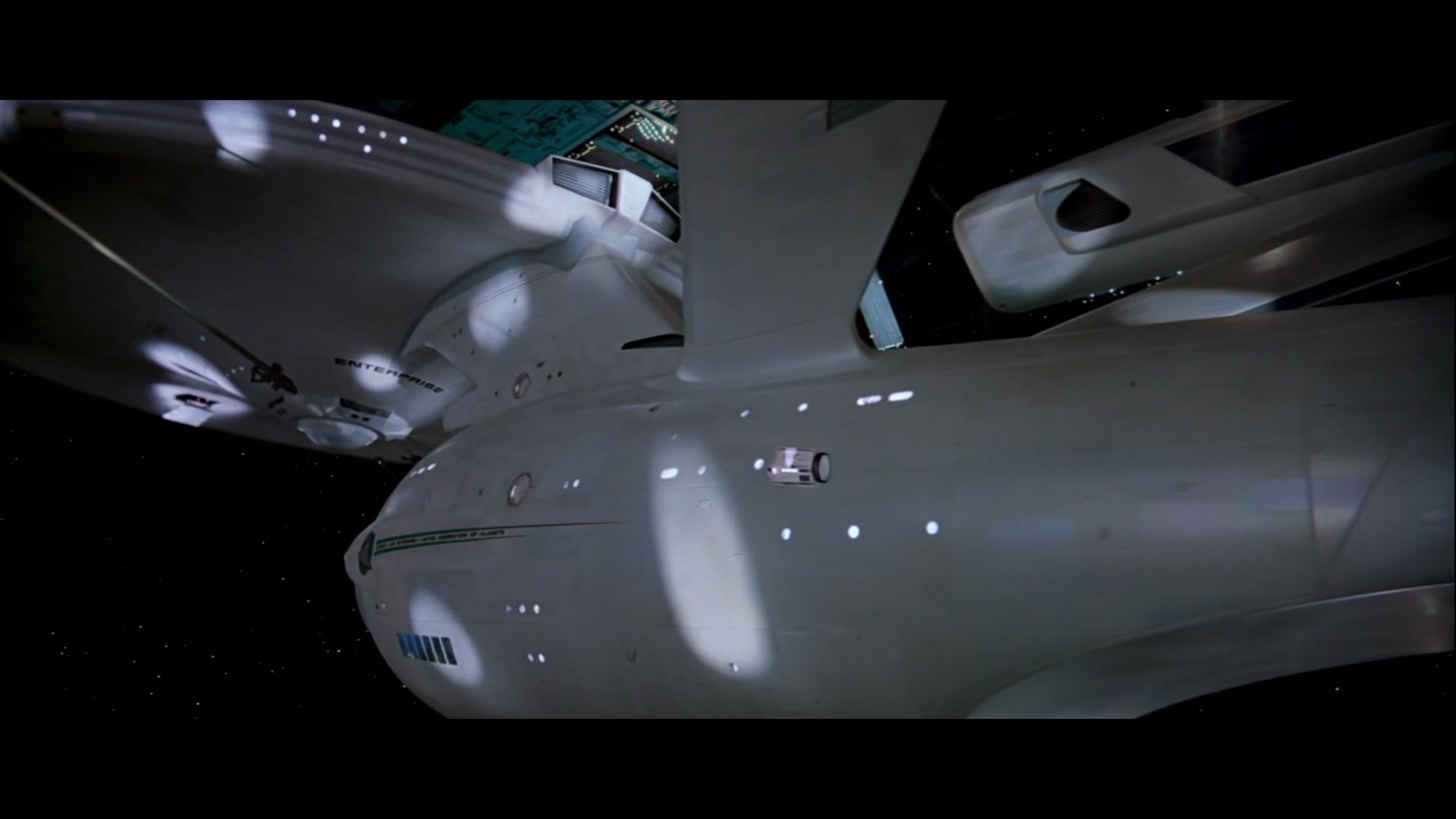
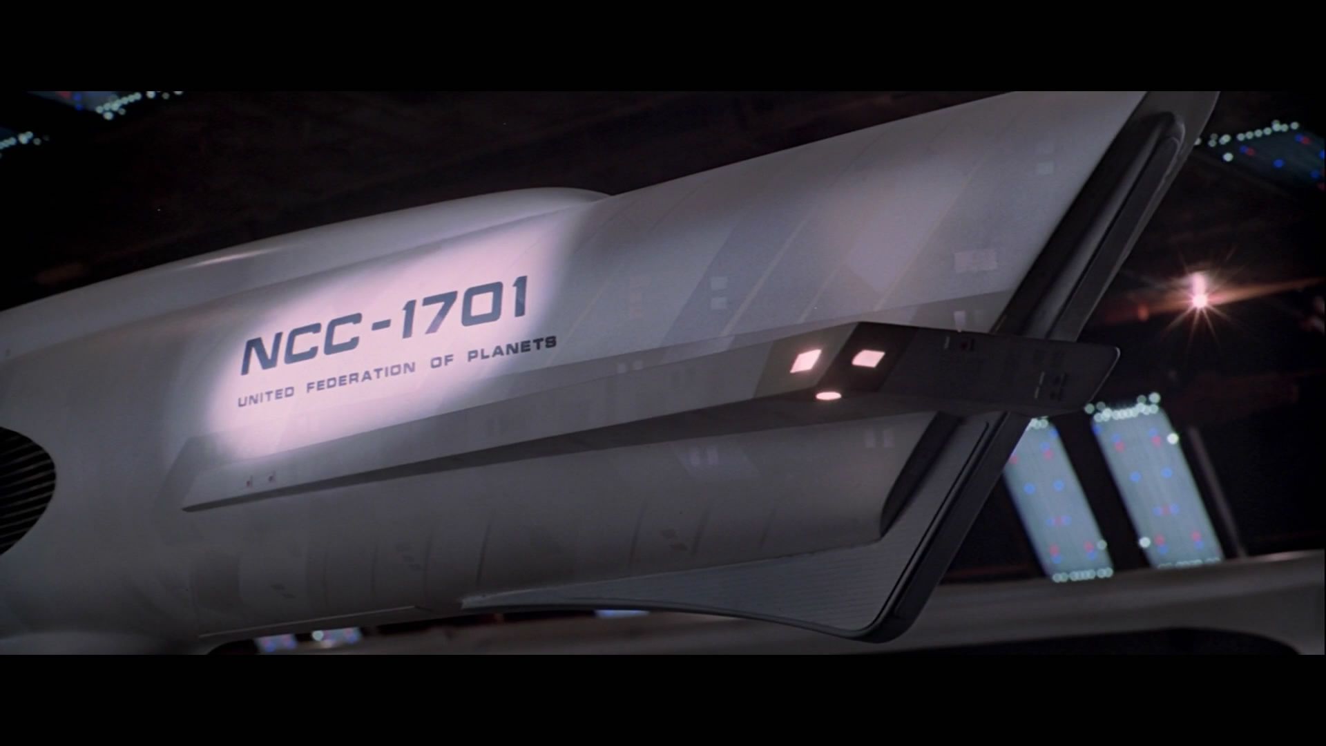
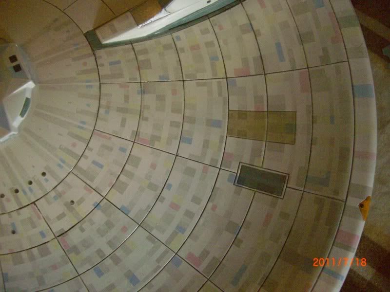
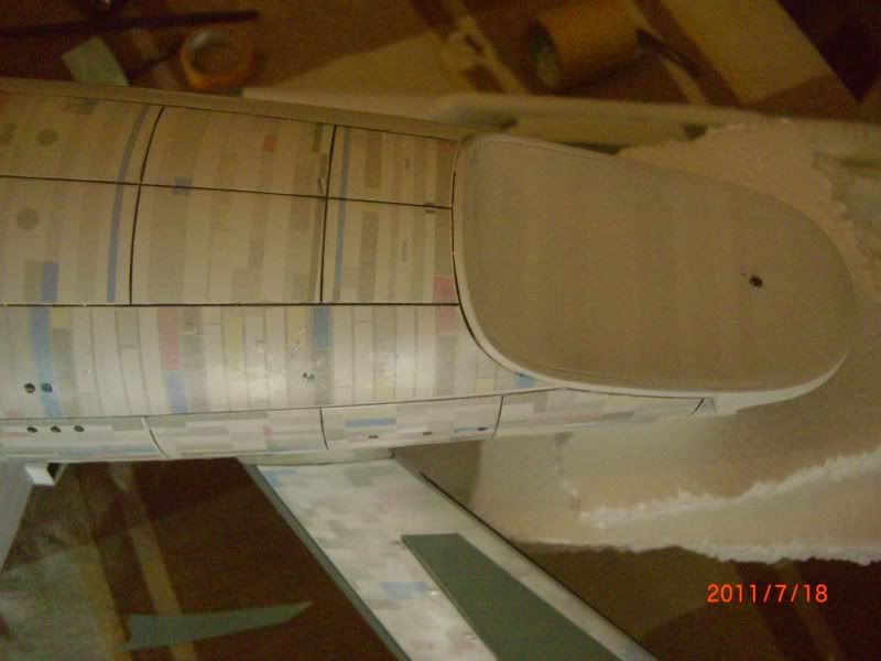
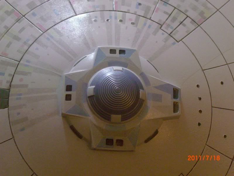
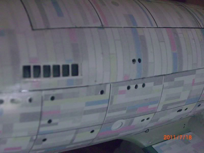
The Acreation decals are amazing...i can't praise them highly enough!

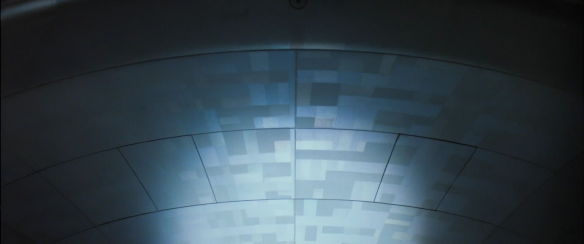
The aztecing looks a little too colurful in places, but in the flesh, they are just fine.

My paint work, (ugh) is a bit high contrast, but the last 2 i did of these were quite subtle and lacked a bit of impact. I'm not going for screen accurate...

Sorry it's another Big E...:unsure

Rich

aztec015.jpg


aztec014.jpg


aztec012.jpg


aztec010.jpg


aztec009.jpg


aztec008.jpg


aztec007.jpg


aztec006.jpg
 
No? Well Kudos to Acreation for making a set of decals that actually work unlike the R2 ones that came with the model....i found the R2 ones to be very thick and incredibly brittle.

Rich
 
It's taking SOOOO long to put these on.....you spend an hour decalling, step back and think, "Doesn't look any different...."

With this build, i've done all the usual interiors, used the little L'Arsenal blokes, Trekmodeler lighting kit and i've added the Raytheon spotlights. I didn't bother with any pics to date as there's been so many of these and, barring some utterly gobsmaking paintjobs, they're all much of a muchness.

I'll do some more piccies of my progress soon!

Rich
 
Good work on the decaling, but I'm not getting why they're so colorful. Wasn't the aztecing just subtle panel variation...?

Not criticizing, just asking. :)
 
The colors on the decals look correct, but the problem is that the original had pearlescent paint that only showed color at certain angles. The decals look the same from all angles, just full color all the time. They also have an even sheen, instead of the variation of finish on the original. They save a lot of work masking and painting, but they have a trade off.

Nice work on the decals, it must be a chore in itself just to put them on, even if it is less than painting.
 
Yeah, it's laborious, but looks nice. I was tinkering with the idea of doing a bit of loose masking and spraying over the decals with pearl white, this would tone some down and give a shiny/matt finish when i'm done.

Opinions?

Rich
 
Really amazing job you've done on this so far!

I just wanted to throw an idea out there though...

I've done a bit of airbrush work with automotive acrylics and was thinking that possibly you could try top coating over the finished decal application with a satin clear with added pearl powder.
The satin coat might just slightly tone down the color of the decals while the pearl powder would simulate the effects of the original's pearlescent paint.

Just an idea :confused

It really is looking great!
 
It's a nice idea! Acrylic won't go over the top though as the Acreation decals are sealed with Testors. I know, i tried! It dissolved the colour and distorted the decals.....

Rich
 
The colors on the decals look correct, but the problem is that the original had pearlescent paint that only showed color at certain angles. The decals look the same from all angles, just full color all the time. They also have an even sheen, instead of the variation of finish on the original. They save a lot of work masking and painting, but they have a trade off.

Nice work on the decals, it must be a chore in itself just to put them on, even if it is less than painting.


Ah, I see. So the decals that came with my Polar Lights 1:350 Enterprise are technically not screen accurate since they are not these pastel colors...?

I'm much more into Star Wars than Star Trek so forgive me for not having done my in-depth homework on this one. :angel
 
...So the decals that came with my Polar Lights 1:350 Enterprise are technically not screen accurate since they are not these pastel colors...?

I like the R2 decals, especially in these pics from their site. I assume they are translucent and allow a pearlescent paint to show through.


The only real problem is the even sheen, if the sheen can be varied it would look great.

The colors were very subtle, practically invisible on screen. There is a slight hint of color in these caps, but the variation in sheen on the panels is more apparent.


The colors were very subtle, practically invisible on screen. There is a slight hint of color in these caps, but the variation in sheen on the panels is more apparent.


You're absolutely right, now that I have a proper reference of what it is I should be looking for. Until now I thought they were just subtly varying shades of the hull (gray, i.e.)... :wacko

Live and learn!

Thanks for clarifying. :):thumbsup
 
Remember, these decals are for those of us who want an amazing, plated effect without painting. I painted my last 2....this time, i really wanted to try wallpapering the ship! I'm not keen on the R2 provided decals....i WILL be using their strongback and other blue decals....i just like the detail on them. Overall they are way too thick, inflexible and severely brittle in some cases.

More pics soon.

Rich
 
Back
Top