Leatherwing
New Member
Hi all! First post 
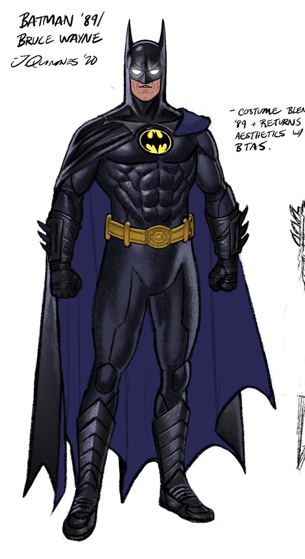
I'm planning on building the Batsuit as seen in the Batman '89 comic.
It's gonna be a slowly but surely kind of build. Mostly using parts by other, more talented makers.
Here's the main reference:

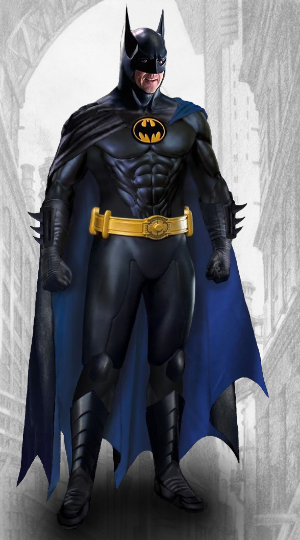
My first step was to recreate this image using photographs and keeping in mind what products I want to use (so, for example, the fins are the Bat of Burbank ones, because I already have those). The purpose was to get a clear idea what a realistic best case scenario would be. Here it is:

As you can see, I stayed really close to Quinones' drawing, with the exeption of the turned head, because, well, you know.
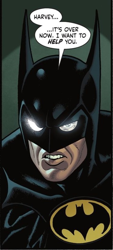
Also, the emblem appears to be the Returns emblem in this drawing, but it often looks different in the actual comic, so I'm going to make an emblem based on the following panel:

Which is just about it for the concept phase, I think. I'll update on the actual build the coming Friday. Stay tuned
I'm planning on building the Batsuit as seen in the Batman '89 comic.
It's gonna be a slowly but surely kind of build. Mostly using parts by other, more talented makers.
Here's the main reference:
My first step was to recreate this image using photographs and keeping in mind what products I want to use (so, for example, the fins are the Bat of Burbank ones, because I already have those). The purpose was to get a clear idea what a realistic best case scenario would be. Here it is:
As you can see, I stayed really close to Quinones' drawing, with the exeption of the turned head, because, well, you know.
Also, the emblem appears to be the Returns emblem in this drawing, but it often looks different in the actual comic, so I'm going to make an emblem based on the following panel:
Which is just about it for the concept phase, I think. I'll update on the actual build the coming Friday. Stay tuned
