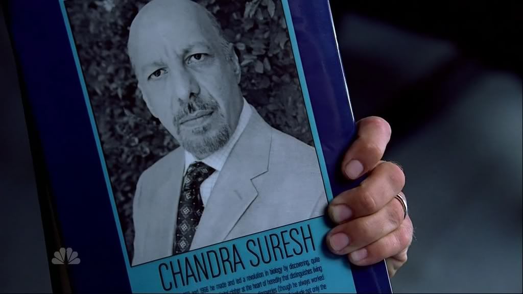
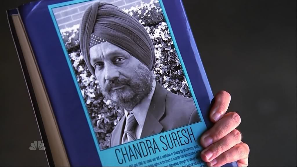
Heroes - Activating Evolution Book 2

Howlrunner

Sr Member
Let me start off by saying that I know there's already a thread on the Activating Evolution book from Heroes, but that thread is about the book being created by Gundrosen based on the first book you see in Heroes (with the different actor playing Suresh) and is his work (and seems to be on hiatus for the moment). :)

As I'm rather impatient sometimes I thought I'd have a go at it myself. :lol

To start off, I wanted to try to get the size of the book as accurate as possible, but I can't find any info on length, breadth width, etc. So checking out the screencaps on the Heroes wiki, I looked through my books to try to find something as close as possible. I'm going for "The X Files Book of the Unexplained" size because I think it looks about right:

BookSize.jpg


Height and breadth of the book look fine, but the thickness is possibly a little off (not enough pages). The thickness looks much closer in real life though then in these photos. If anyone has any ideas about exact size, please let me know. :)

OK, so working to this size (19.5cm x 25cm x 3cm) I've done up the first mock on Photoshop (scaled down versions posted here though).
Comparison.jpg


First picture shows (three different) screen caps blown up and transformed to fit the correct size. The second picture is my version. And the 3rd picture is my version layered over the top of the screen cap blow up so you can see the layout and spacing is very close.

Couple of things need work on:

1) The font is not an exact match - I need Garage Gothic Regular, but can't find it without having to pay.
2) Not sure about the colour of the spine text - should it be light blue or white? Need to go watch Heroes again.....
3) Could really use better pictures of the helix for the front cover and Suresh for the back - the only online pics I've found are really small and they lose most of their detail being blown up.
4) Need to figure out what the blurb on the back of the book says.

So, thoughts, opinions, help? :)
 
You might want to re-read those existing threads, I believe there is info or links for some of the text. Maybe even for the photos.

The spine - author is white, title is cyan.

As well, I'm wondering is there is a dark blue keyline around the photo - seems that way in those pics.
 
I've been through the thread with a fine tooth comb already - the only info on the font that it has is that it's Garage Gothic Bold (though actually I think it's more likely Garage Gothic Regular). There is a link posted to a free download site, but if you follow the link it then takes you to the company where you have to pay $25 to download the font. No decent photos in that thread either.

As for the spine, yeah, I believe you're right. I did suspect that but couldn't confirm it from online images.

And I also agree about the dark blue keyline - will get that added too.

Thanks. :)

EDIT - Updated cover:

Test1.jpg
 
Last edited:
Yet another update.....

Popped my copy of Heroes in and took some more screencaps. Noticed some more things. :rolleyes:lol

The bird in the circle on the spine is in fact in a comic-style speech bubble with a small tail. You can actually just see this in the first picture I posted, but I didn't notice it before.

The keyline on the back is actually black, not dark blue - as is all the text.

I've also updated the picture on the back of Suresh using a better screencap, so it now has more detail (though it's still not amazing).

I've also cleaned up the edged of the helix a bit more so make it sharper.

Still not really any further forward on the text though - the best screencaps of it I can get are mainly from "One Giant Leap" (episode 103), but I still can't make out the words:

Activating3.jpg

Activating6-1.jpg

Activating9.jpg


Anyone with genetically activated super sight able to make it out? :lol Anyone got the HD DVD set that can take lend a hand?
 
Wow....looking good! How about the text under Suresh's picture...anyone know what that is yet? Either way if these are offered I'd be up for a couple of book jackets!
 
I've tried posting on various different Heroes specific forums and no-one seems to have a clue. I really don't want to just make it up.

First line definately looks like words 2 and 4 are dates seperated by the word "and" - "...... 195? and 196?....." which means the first word is probably "Between" (it would be the right length and make sense).

First line looks like it might end in "..... by discovering......"

I'm trying to work from downloaded episodes recorded off TV though, so making out words is difficult. I really need screencaps from the DVD, or better yet, the HD DVD.
 
hows this
Between 1953 and 1966 he made and led a revolution in biology by discovering, quite literally, the secret of life: the digital cipher at the heart of heredity that distinguishes living from non-living things--the genetic code. His own discoveries--though he always worked with one other partner and did much of his thinking in conversation--include not only the double helix but the whole mechanism of protein synthesis, the three-letter nature of the code, and much of the code itself.
looking forward to that cover...
snapshot20070225201003.jpg


snapshot20070225200342.jpg
 
WOW! :eek Thank you VERY much Starfighter and Melissa! Excellent work! I will get cracking..... :cool
 
Last edited:
OK, thanks to everyone's help, here's where we're up to:

Test1-1.jpg

:cool

Updates:

Accurate text has been added to the back.
Name on back has been repositioned.
Thin black border added around main cyan box on back (visible in HD screencap)
Photo of Suresh has been completely redone using HD screencap supplied by Starfighter.

It looks finished now. :)

Things that still need improved:

The bird in the circle - any chance on an HD pic of that Starfighter?
The godsend symbol - could use a HD pic to work from as I'm not vastly happy with the current quality I've worked with.
Font - to be honest, it's 95% accurate (only noticeable difference with what I've used is that my font has different letter spacing, there's a flick on the leg of the "R" and the "O" is too rounded at the top and bottom) and I'm happy with it, but it could always be improved if I can get hold of Gothic Garage Regular.
Size - I'm happy with the length and breadth, but the thickness of the spine looks just too narrow. I reckon (checking out my bookshelf) it should probably be about the thickness of a 468 page book (3.5cm), but unfortunately I don't have any that thick with the right size length and breadth.
 
Last edited:
I am so looking forward to putting this on my shelf, I almost cannot wait for you to post the finished product.

OK, thanks to everyone's help, here's where we're up to:

Test1-1.jpg

:cool

Updates:

Accurate text has been added to the back.
Name on back has been repositioned.
Thin black border added around main cyan box on back (visible in HD screencap)
Photo of Suresh has been completely redone using HD screencap supplied by Starfighter.

It looks finished now. :)

Things that still need improved:

The bird in the circle - any chance on an HD pic of that Starfighter?
The godsend symbol - could use a HD pic to work from as I'm not vastly happy with the current quality I've worked with.
Font - to be honest, it's 95% accurate (only noticeable difference with what I've used is that my font has different letter spacing, there's a flick on the leg of the "R" and the "O" is too rounded at the top and bottom) and I'm happy with it, but it could always be improved if I can get hold of Gothic Garage Regular.
Size - I'm happy with the length and breadth, but the thickness of the spine looks just too narrow. I reckon (checking out my bookshelf) it should probably be about the thickness of a 468 page book (3.5cm), but unfortunately I don't have any that thick with the right size length and breadth.
 
I don't know if the thread has disappeared or is restricted to speshal people, but I can't access the link you've posted. :cry
 
Back
Top