You are using an out of date browser. It may not display this or other websites correctly.
You should upgrade or use an alternative browser.
You should upgrade or use an alternative browser.
Defined Green Lantern Comic Rings
- Thread starter Gregatron
- Start date
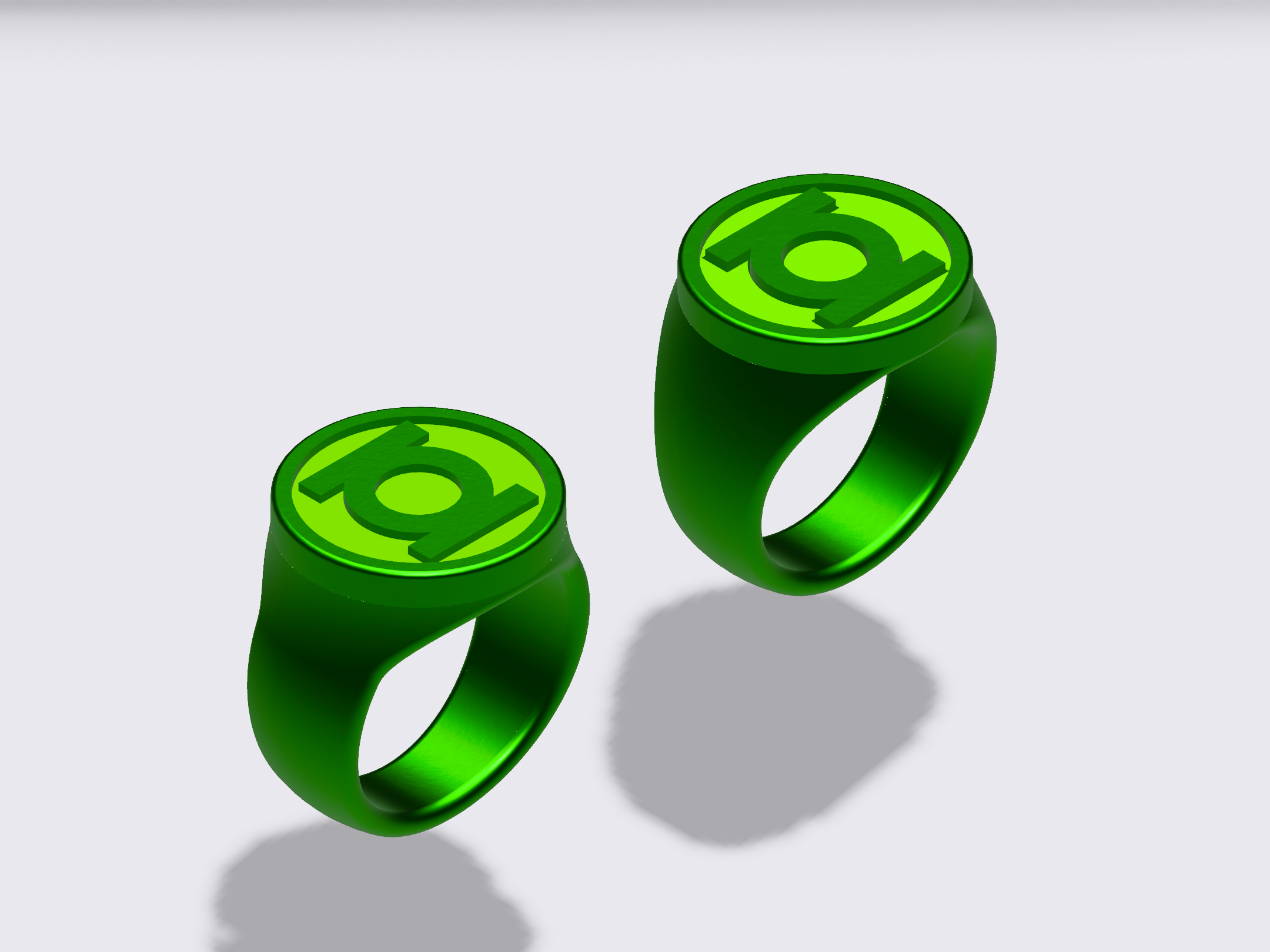
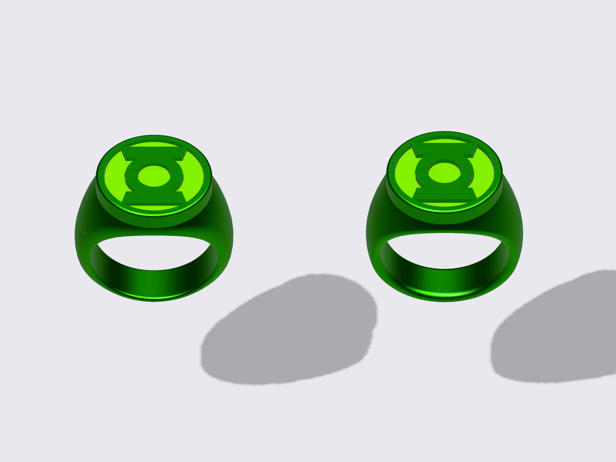
Still playing around. One thing which has concerned me is the join of the disc and the band. With variants where the disc is bigger in diameter and thus overhangs the edges of the band, the result is is rather harsh transition when viewed from below, and a finger-hole that is squared-off at the top (left). However, if the disc and the band are merged together before the finger-hole is cut into them (and the hole therefore cuts into the bottom of the disc), then the edges blend together more smoothly, BUT the bottom edge of the disc is no longer a squared-off 90-degrees (right).
I’ve more frequently seen images of real rings which tend toward the latter, but I’m not sure which is the best way to go. And, of course, Gil Kane’s art is inconsistent and ambiguous. The REBIRTH-style rings avoid this problem entirely, since the disc sits atop a full-round band, with a platform for the disc to sit on.
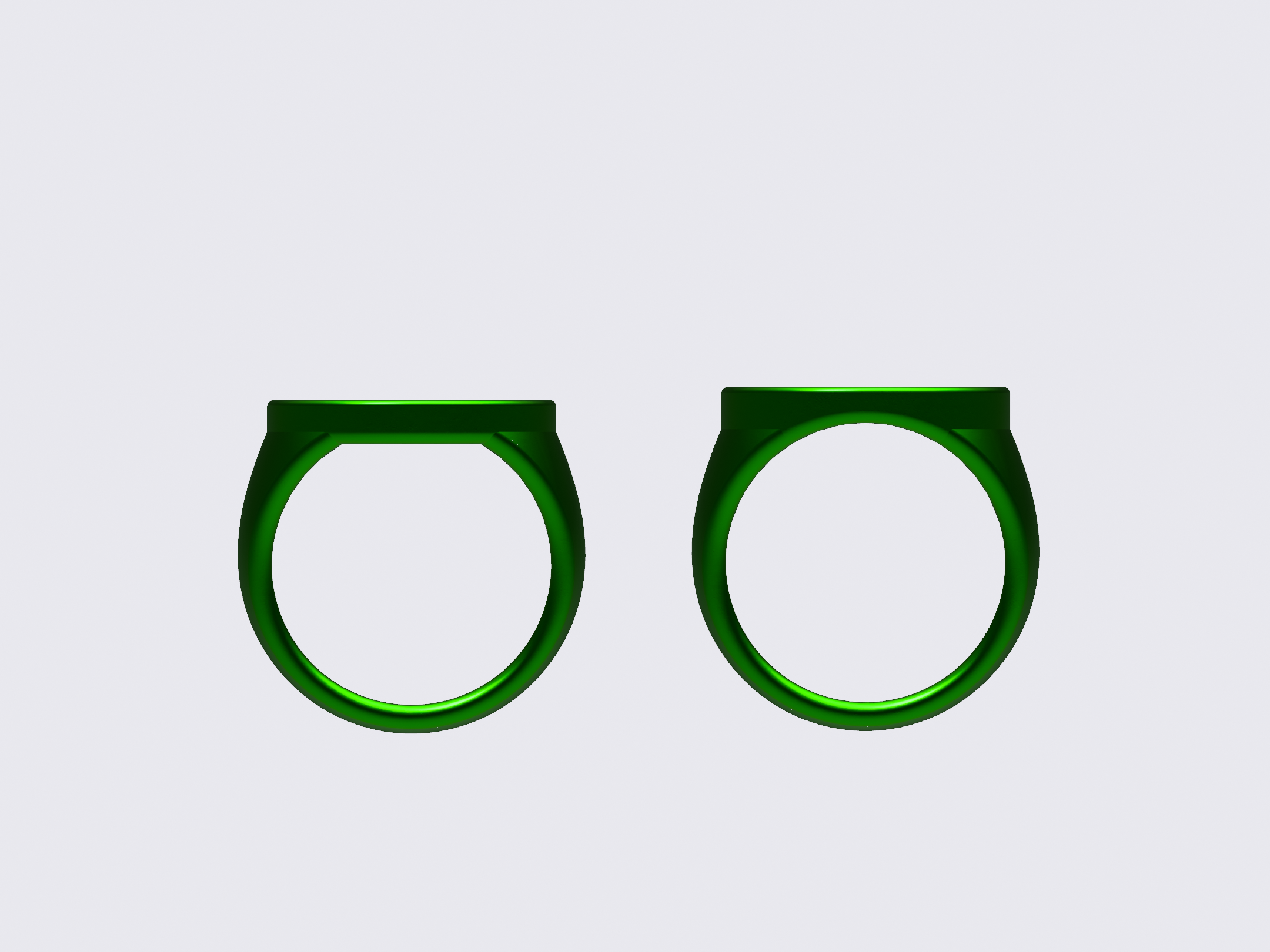
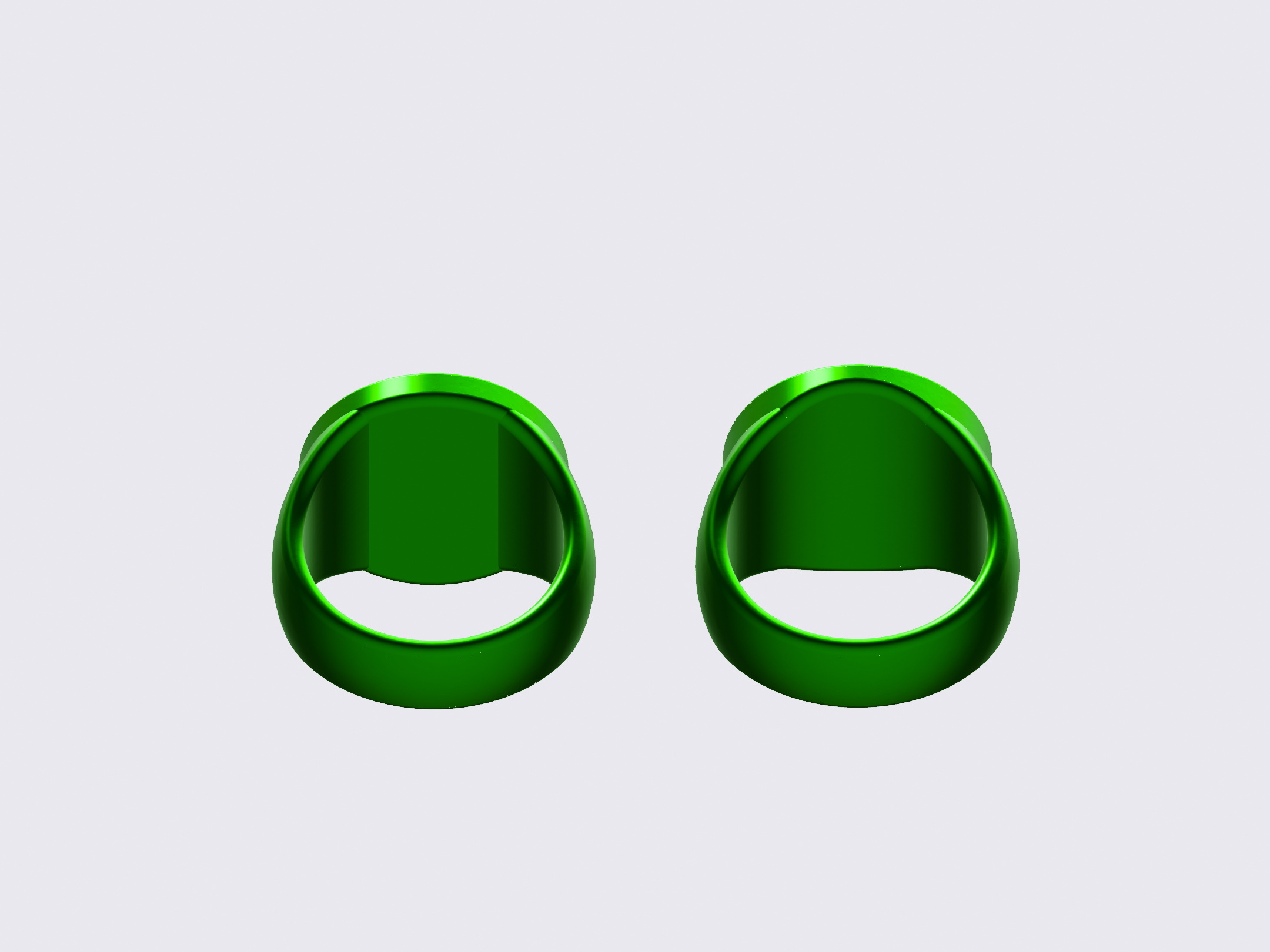

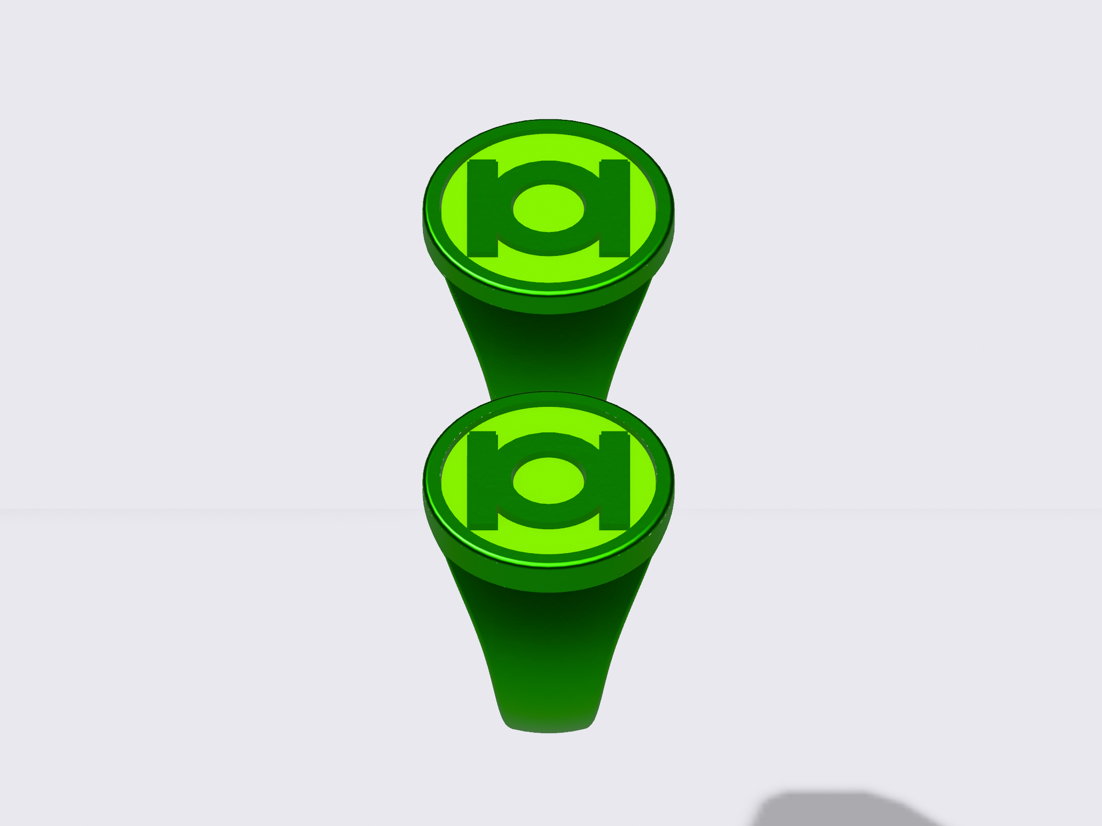
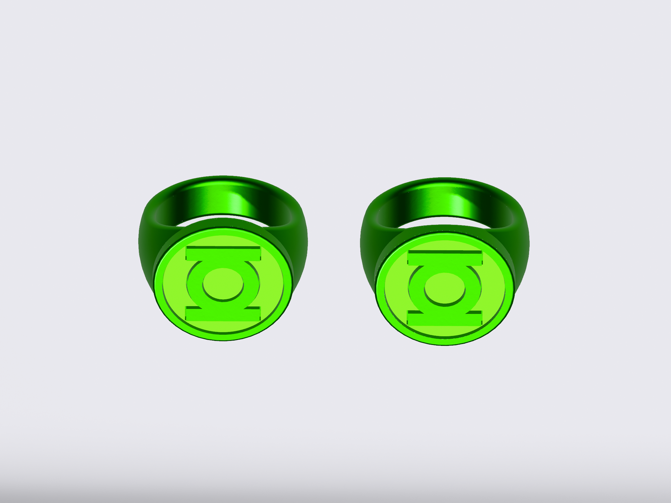
I’ve more frequently seen images of real rings which tend toward the latter, but I’m not sure which is the best way to go. And, of course, Gil Kane’s art is inconsistent and ambiguous. The REBIRTH-style rings avoid this problem entirely, since the disc sits atop a full-round band, with a platform for the disc to sit on.
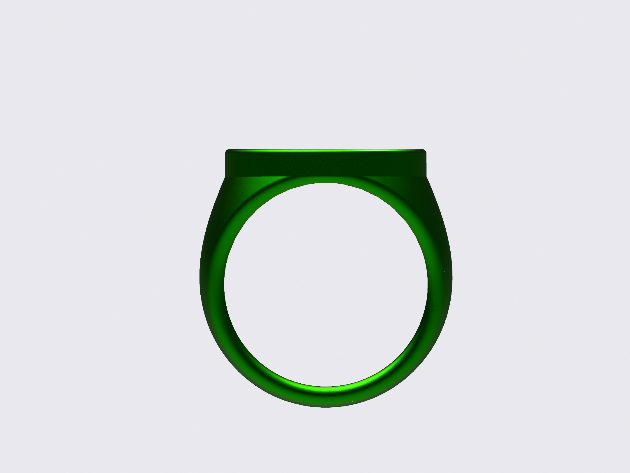
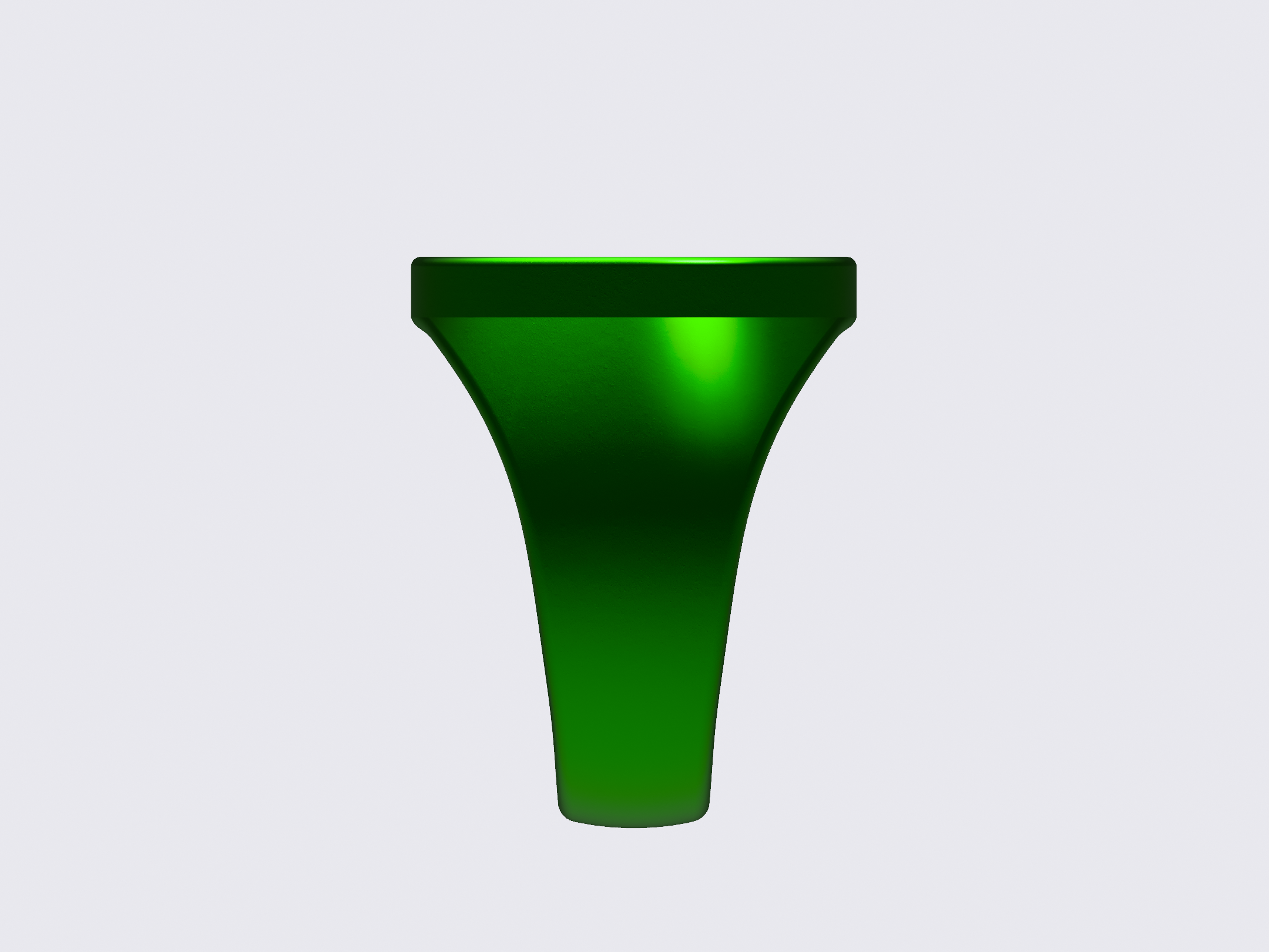
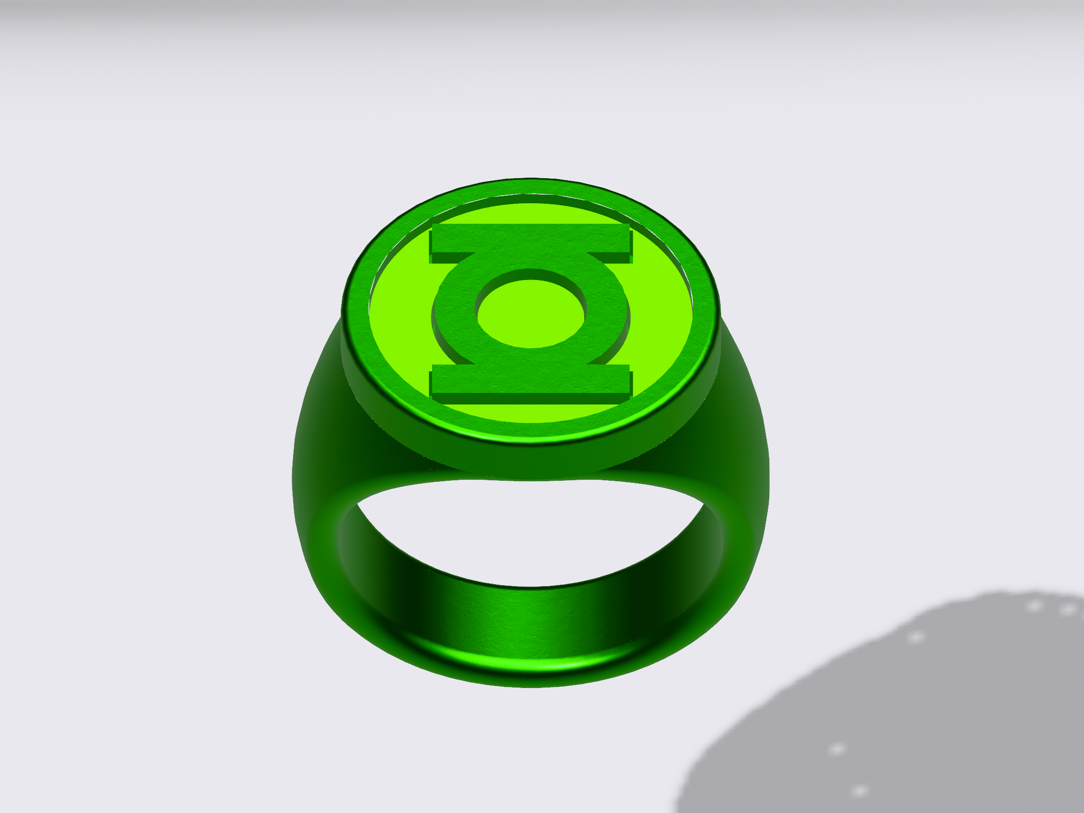
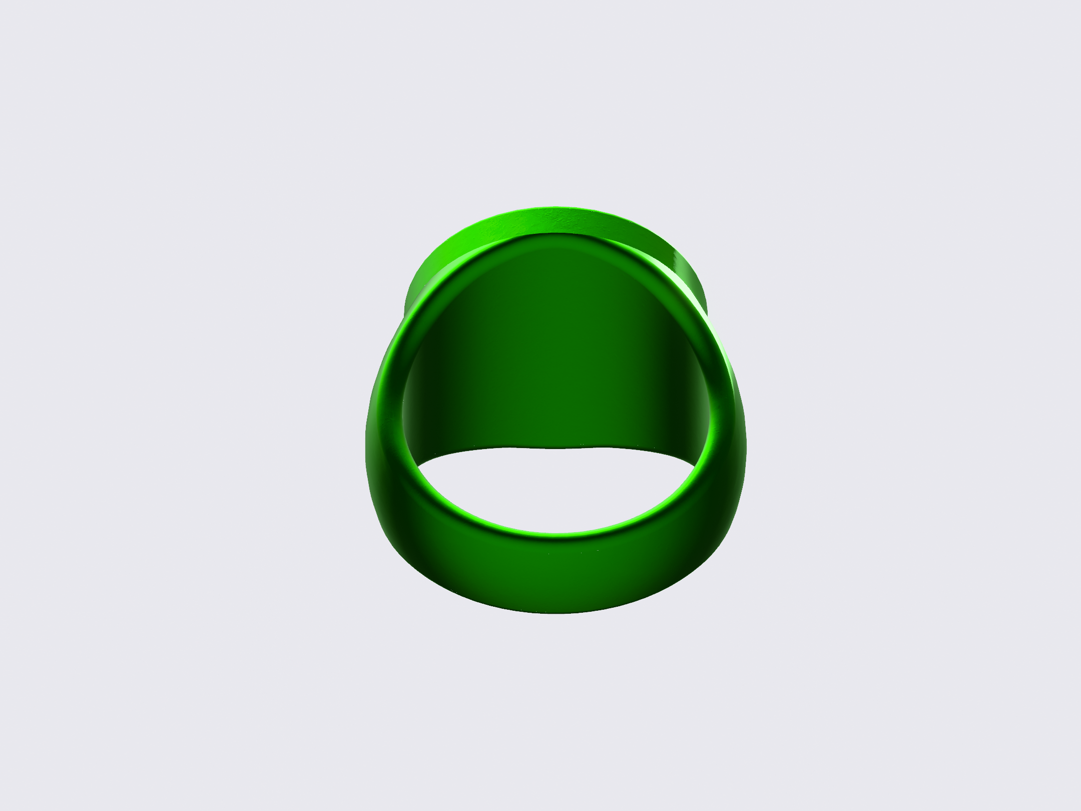
Hmmm. In playing with the relationship between the two parts, I think I finally hit on a proper balance. This one has a 22mm disc, as opposed to the 23mm discs of the ones previously posted. And the 90-degree angle of the edge of the disc is preserved.
Is this what Kane and various others were drawing? Is this the unicorn I’ve been chasing? Is the disc too small? Should it overhang the band, rather than blending into it?
As noted, the REBIRTH design is subtly different, with a (usually) smaller disc and a platform that the disc sits upon, as opposed to the disc sitting right above the finger-hole fillets (as on this new model). It would be nice to think that the two designs are the same, except for the old vs. modern symbols, but I think they should remain separate. I may even shrink the REBIRTH symbol-disc (currently 20.5mm) a bit more to distinguish it from this Silver Age version.


Last edited:
Experimenting with a new technique to create the band. The result is something which looks a little closer to Kane’s artwork, with the band/shank being reasonably vertical and then flaring up and out to form the round platform for the disc.
On the left is the new version, and on the right is the old, which has a curvier, more organic band.


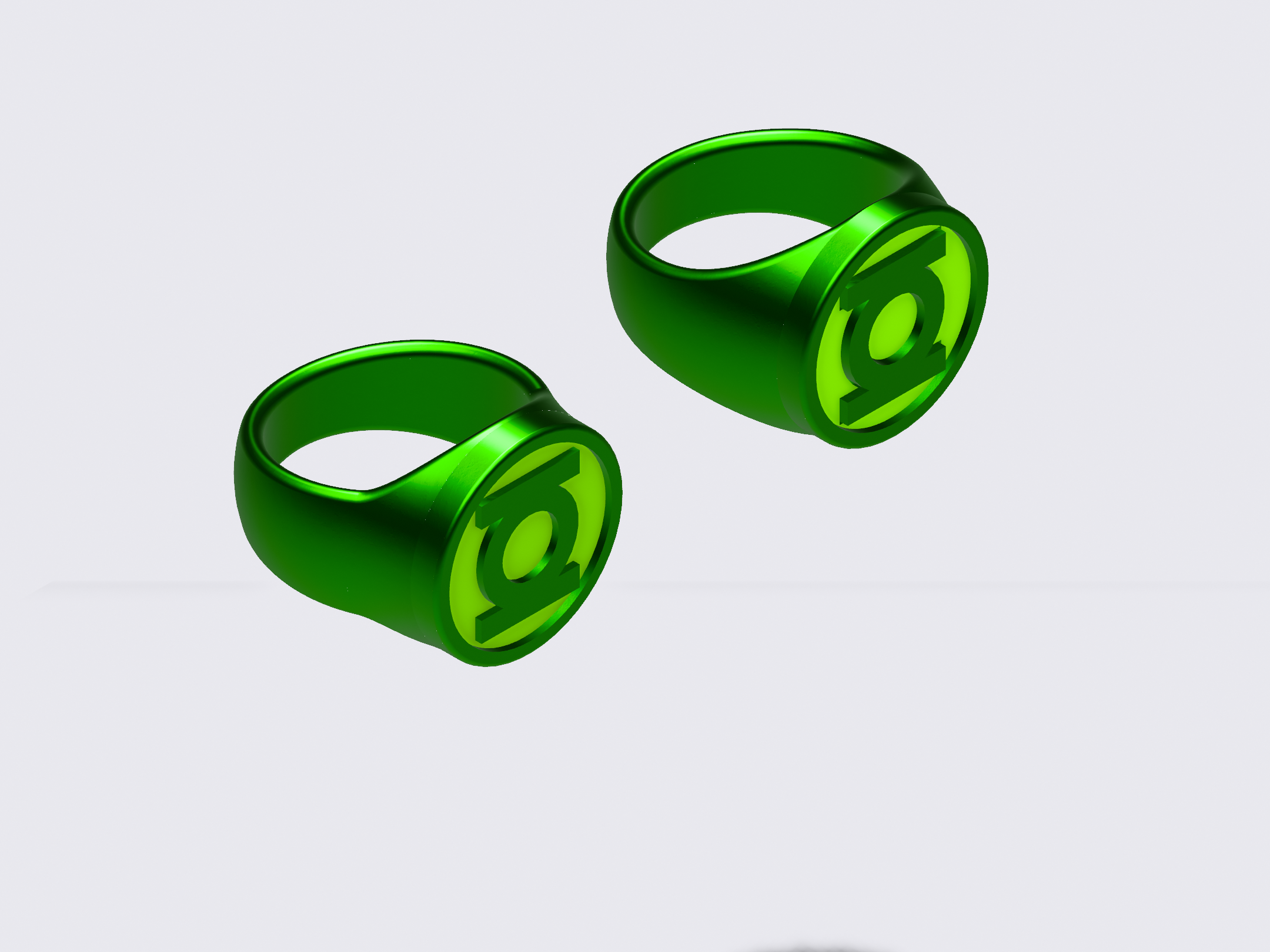
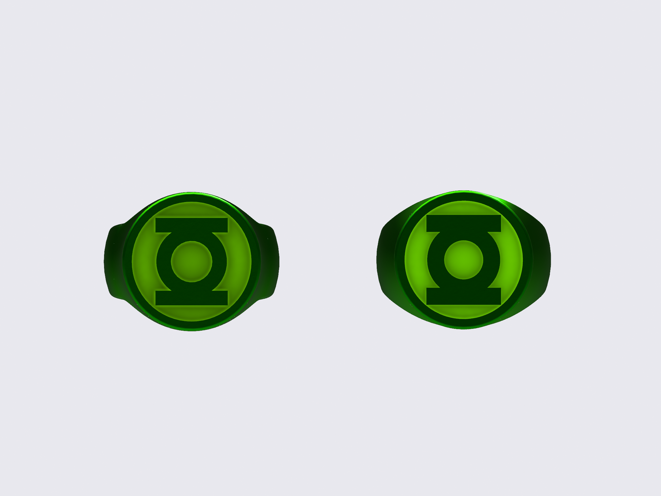
On the left is the new version, and on the right is the old, which has a curvier, more organic band.
Back to tweaking the previous version.
Here we have three variants on the same band and disc design. The major difference is how the parts fit together. One has a 22mm disc, and the disc and finger-hole chamfers intersect at their edges, keeping the 90-degree disc-edge intact. The other two rings have 23mm discs. On one, the disc intersects the top of the finger-hole and squares off the top of it. The other ring’s disc also intersects the hole, but the hole cuts into the bottom of the disc to create a full-round hole.
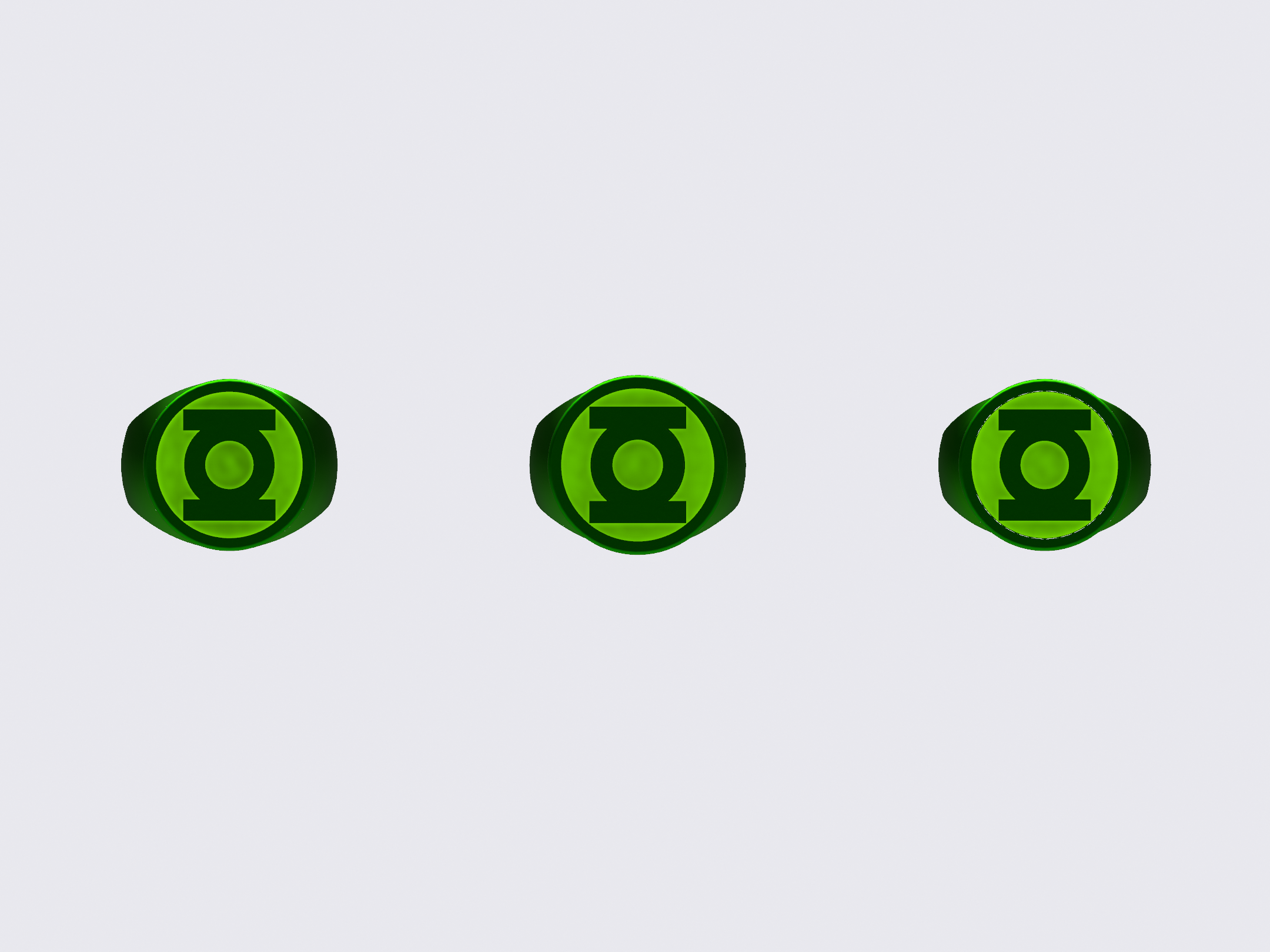
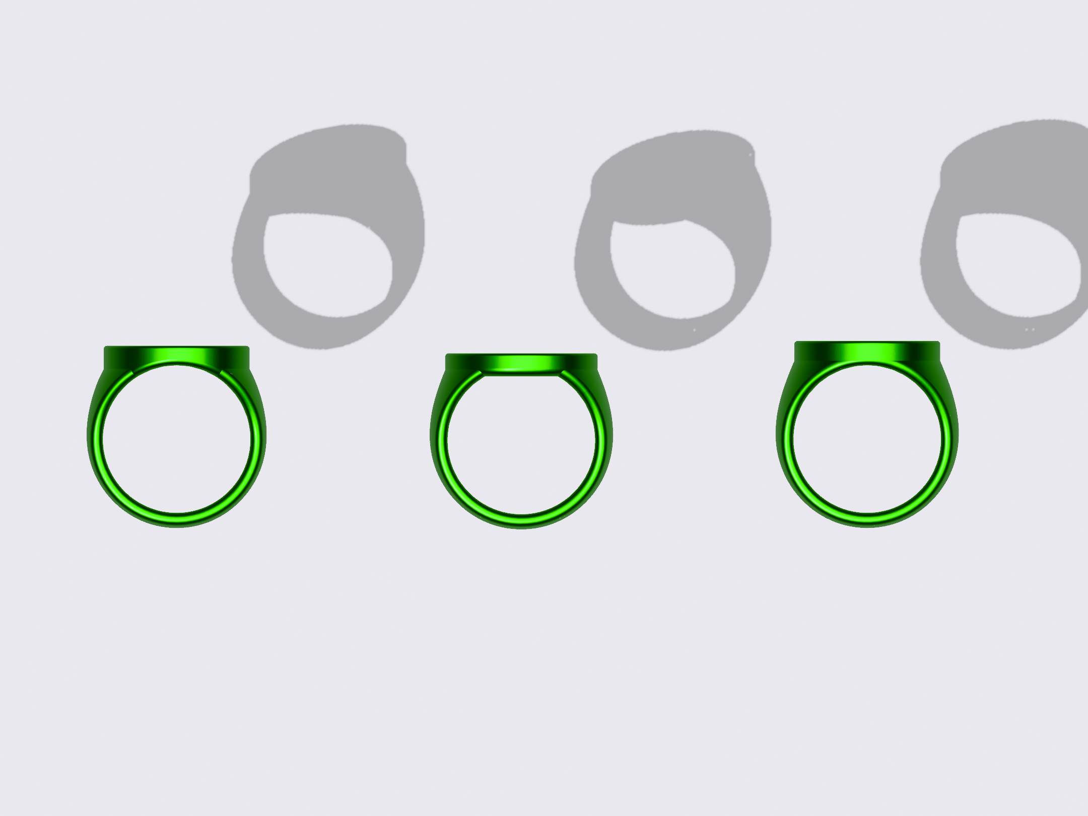
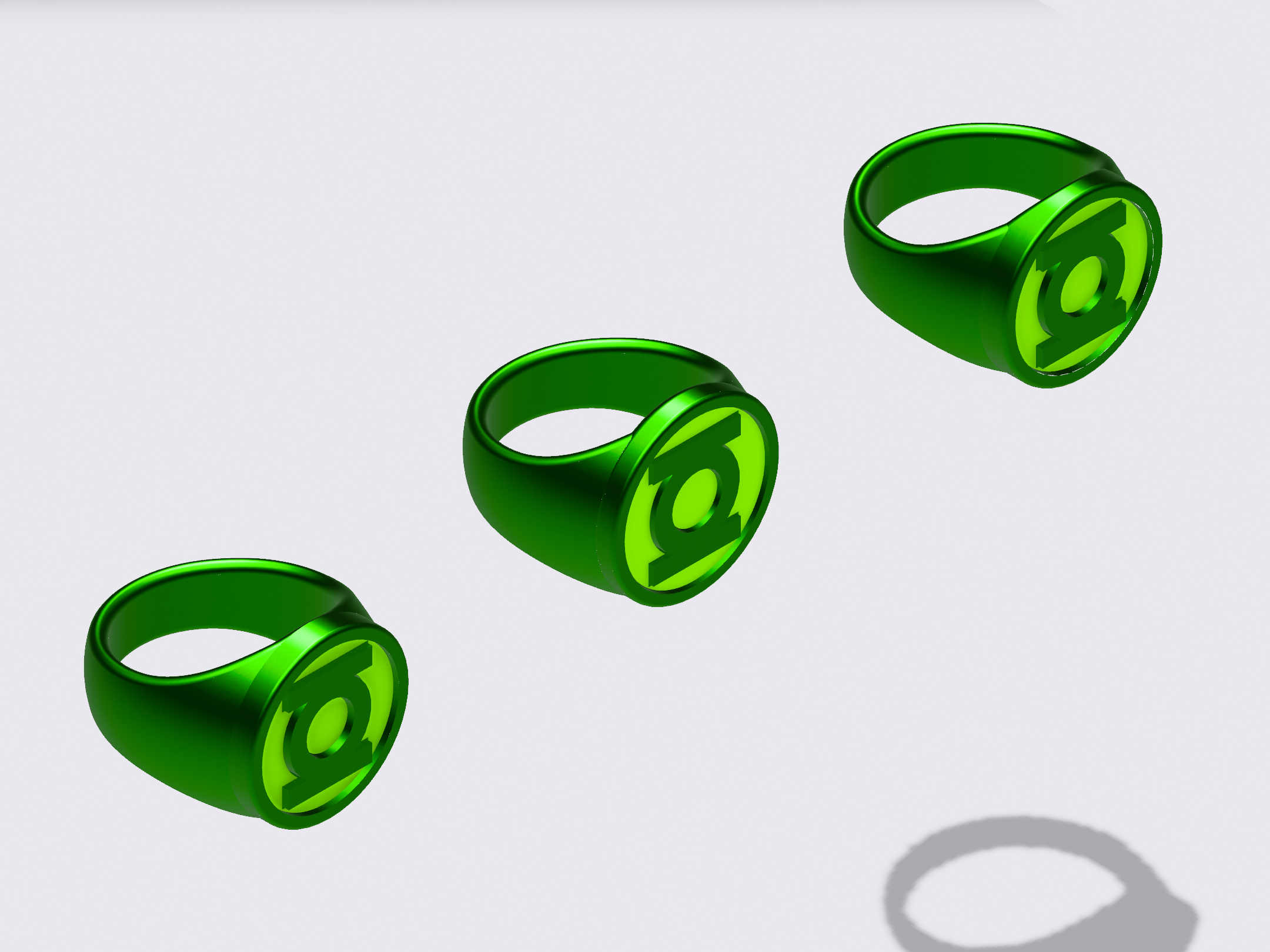
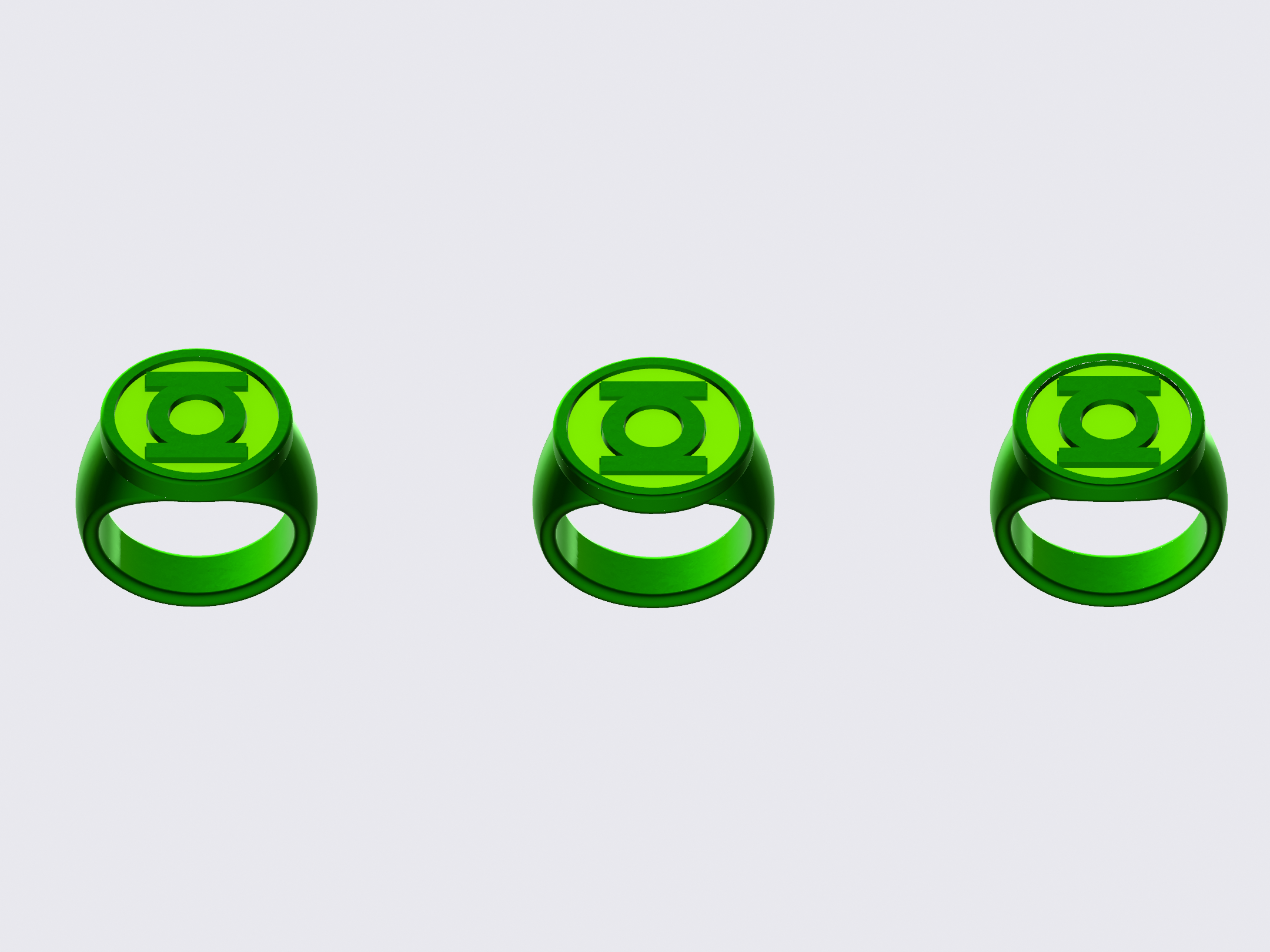
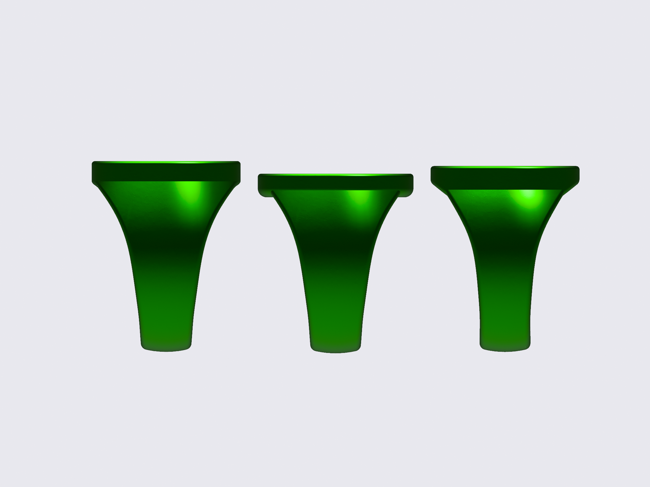
Here we have three variants on the same band and disc design. The major difference is how the parts fit together. One has a 22mm disc, and the disc and finger-hole chamfers intersect at their edges, keeping the 90-degree disc-edge intact. The other two rings have 23mm discs. On one, the disc intersects the top of the finger-hole and squares off the top of it. The other ring’s disc also intersects the hole, but the hole cuts into the bottom of the disc to create a full-round hole.
I've been doing more research on how real rings are made, using lost wax casting.
My current models are based upon spline shapes, round at the bottom, and flaring out at the top. The finger-hole is then cut into the shape, and the edges are filleted (by 1mm). This gives the edges a nice, smooth, curvy look.
However, these real rings are created by cutting the shape out of wax, with the profile-view wedge-shape of the band shaped by hand, and the gently-filleted edges of the finger-hole added with files and sanding.
I need to experiment more with using these real-world methods to have more control over the shape and width of the band in profile.
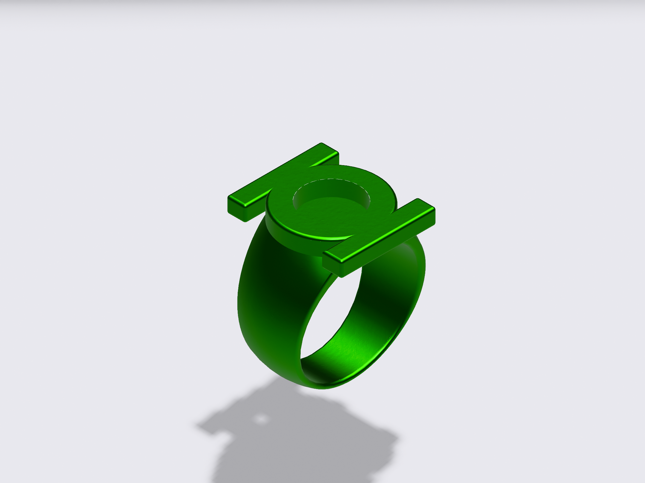
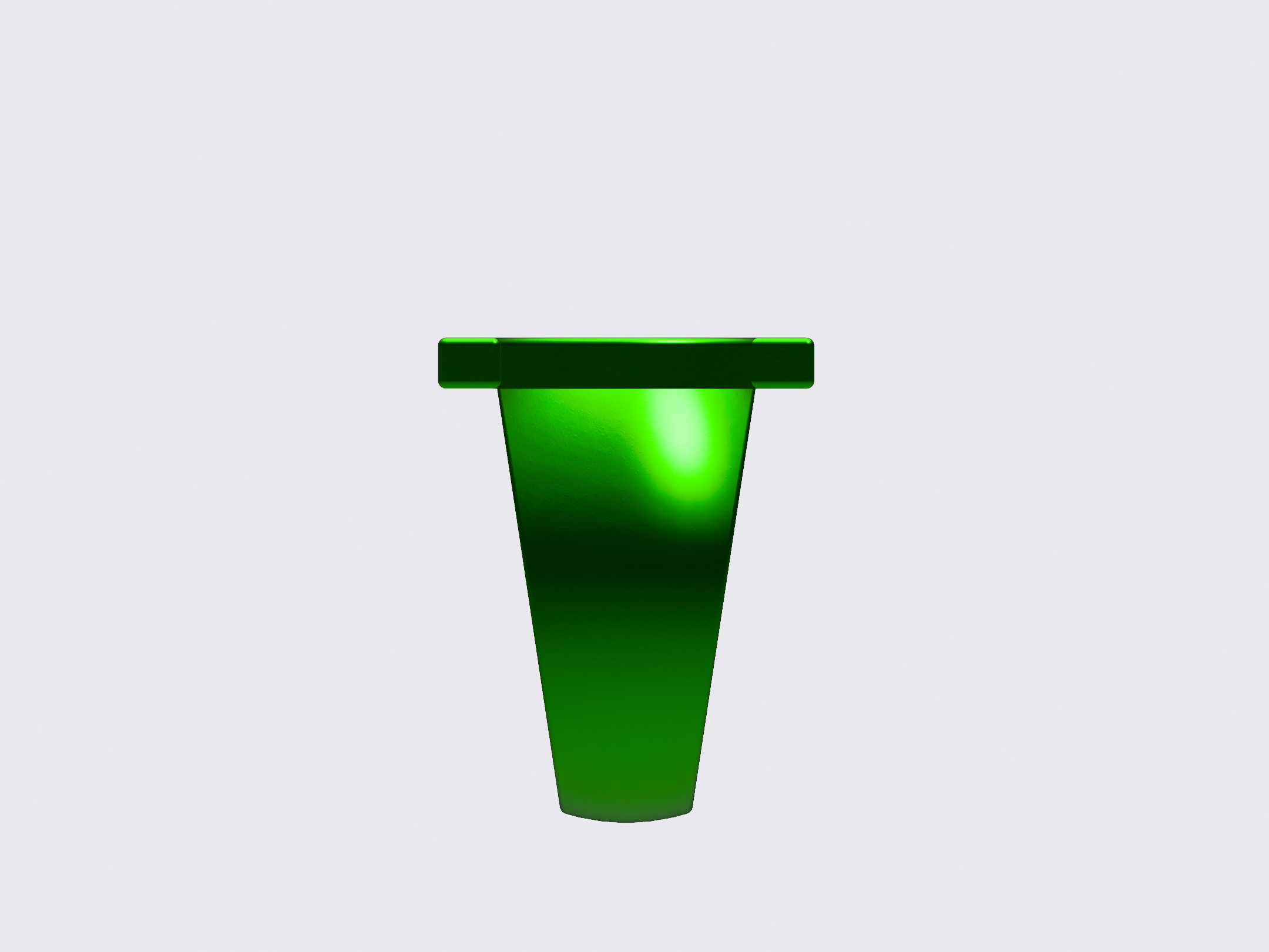
A quick experiment with the V2. As previously noted, I’ve been struggling with how the underside of the symbol-piece attaches to the top of the band. As mentioned some time back, I rather liked Patrick Gleeson’s iteration, which is essentially the standard signet ring with disc, but also with the V2 sidebars attached to the disc to create the symbol-piece.
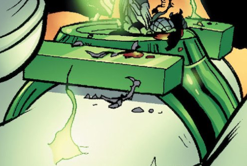
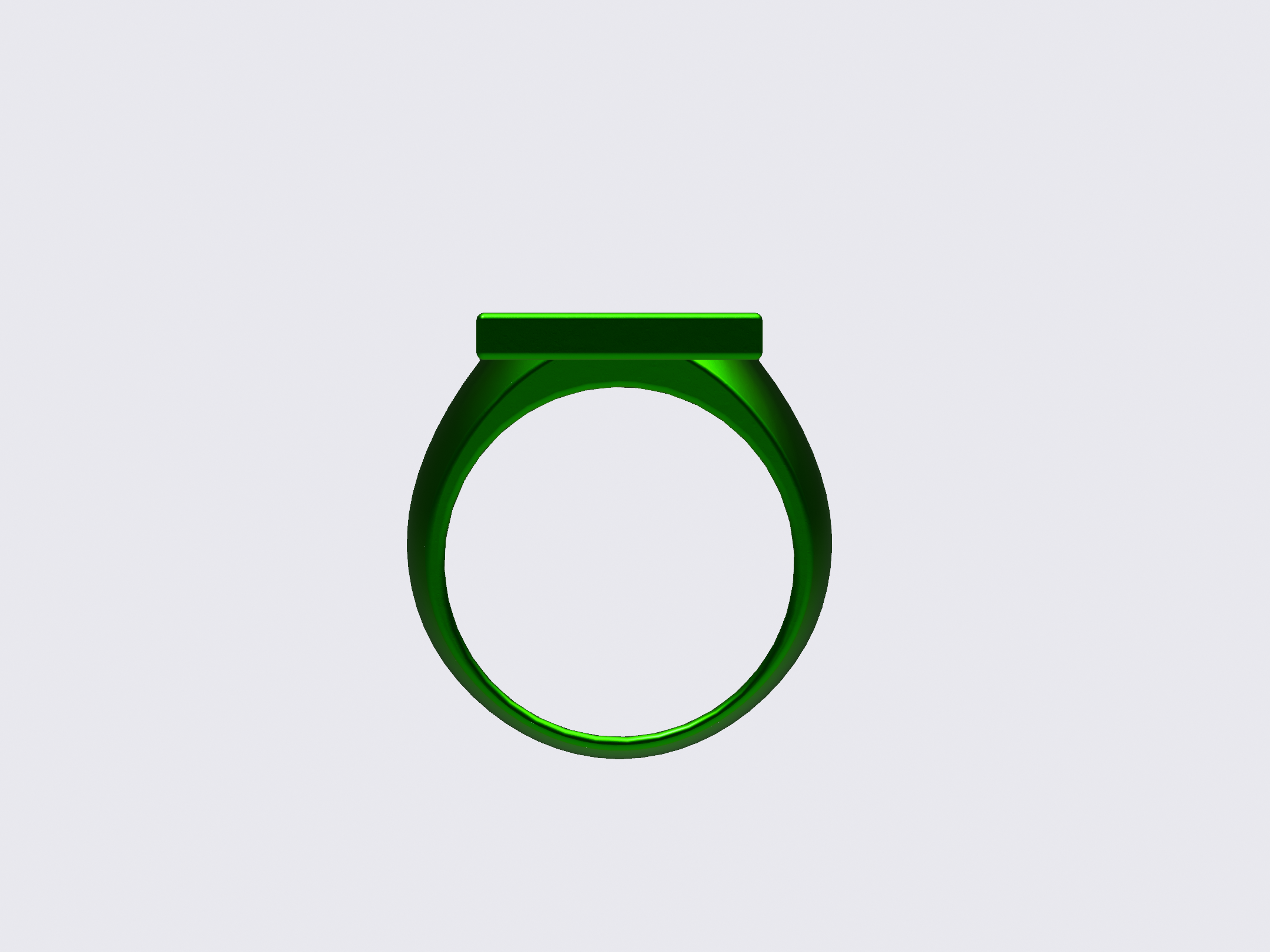
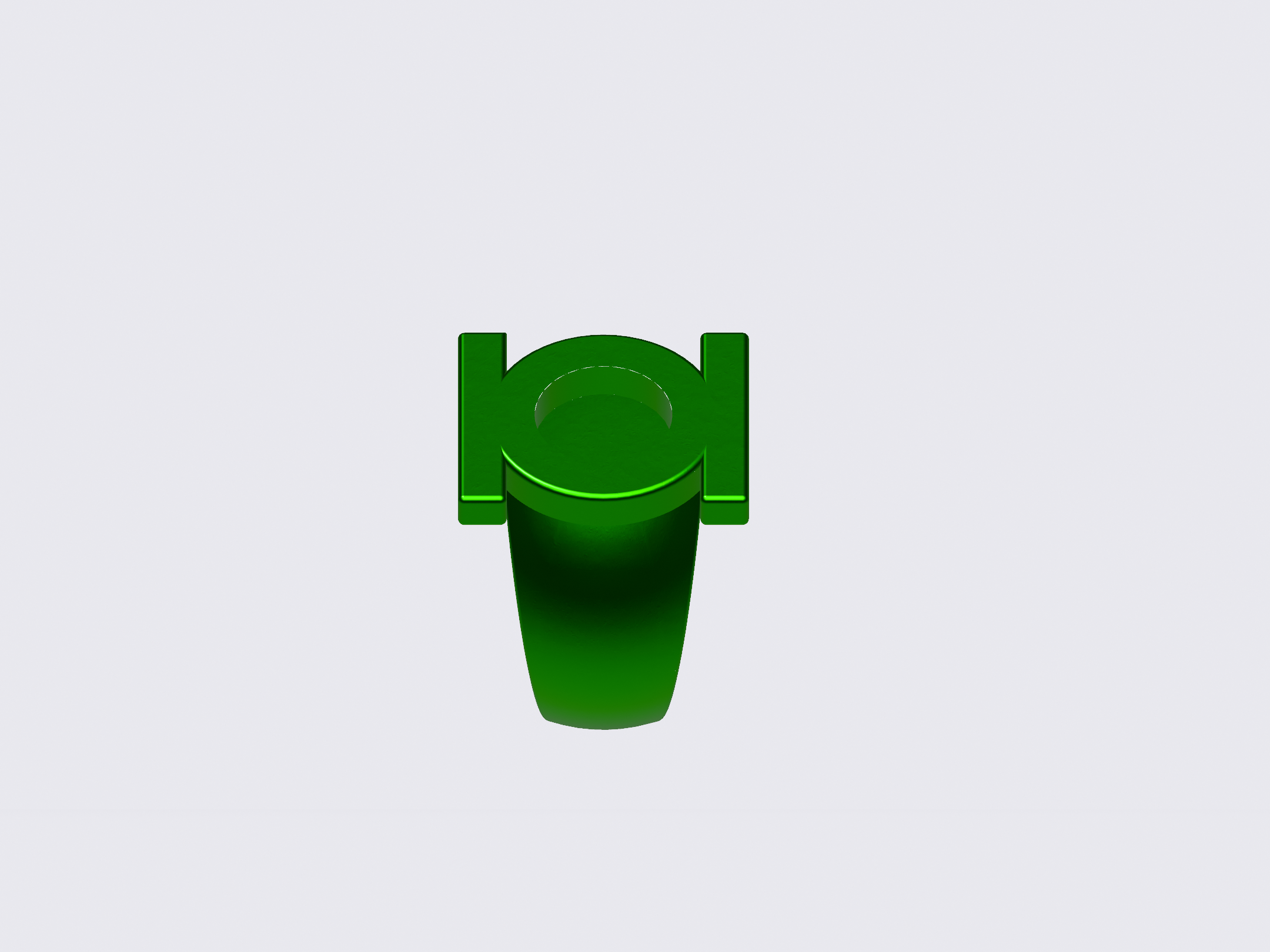
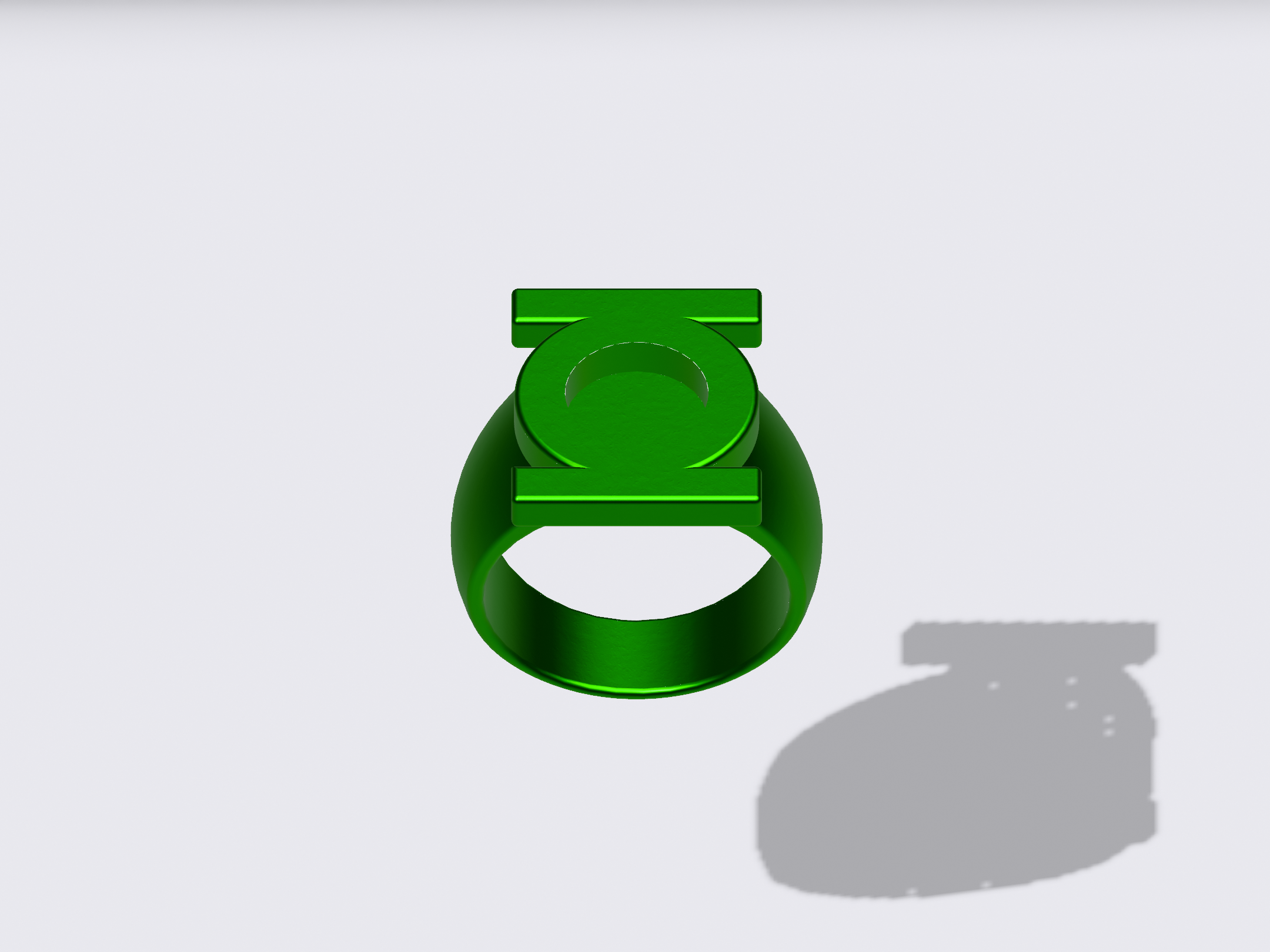
So, I mocked up a version of that, albeit with the disc’s edge at 90 degrees, as opposed to the slope on Gleeson’s version. As opposed to previous models, there is no undercut where the central ring of the symbol-piece meets the top of the band. Instead, the band flares out into a shoulder, which the round central ring of the symbol sits upon.
This is a rather flowing and elegant look. HOWEVER, I’m trying to replicate the 80s-90s look established primarily by Joe Staton and Dave Gibbons, among others. And I’m not sure this is what they were going for. More research is needed.
That being said, the 1992 GREEN LANTERN MOSAIC promo ring (with the glow-in-the dark center) applies exactly this technique in its construction. And it looks like the later DC Direct replicas might, too. Hmmm.
Last edited:
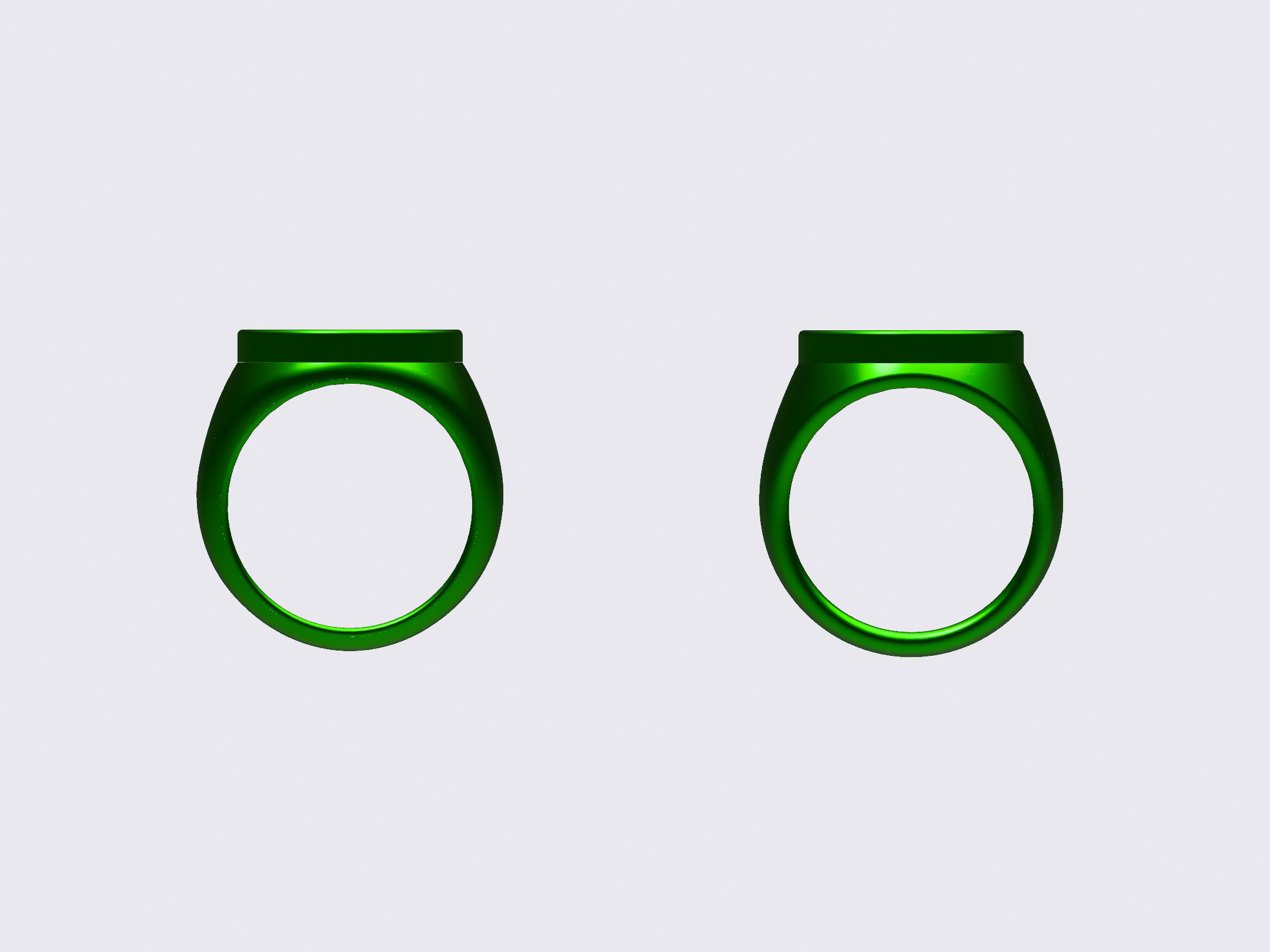
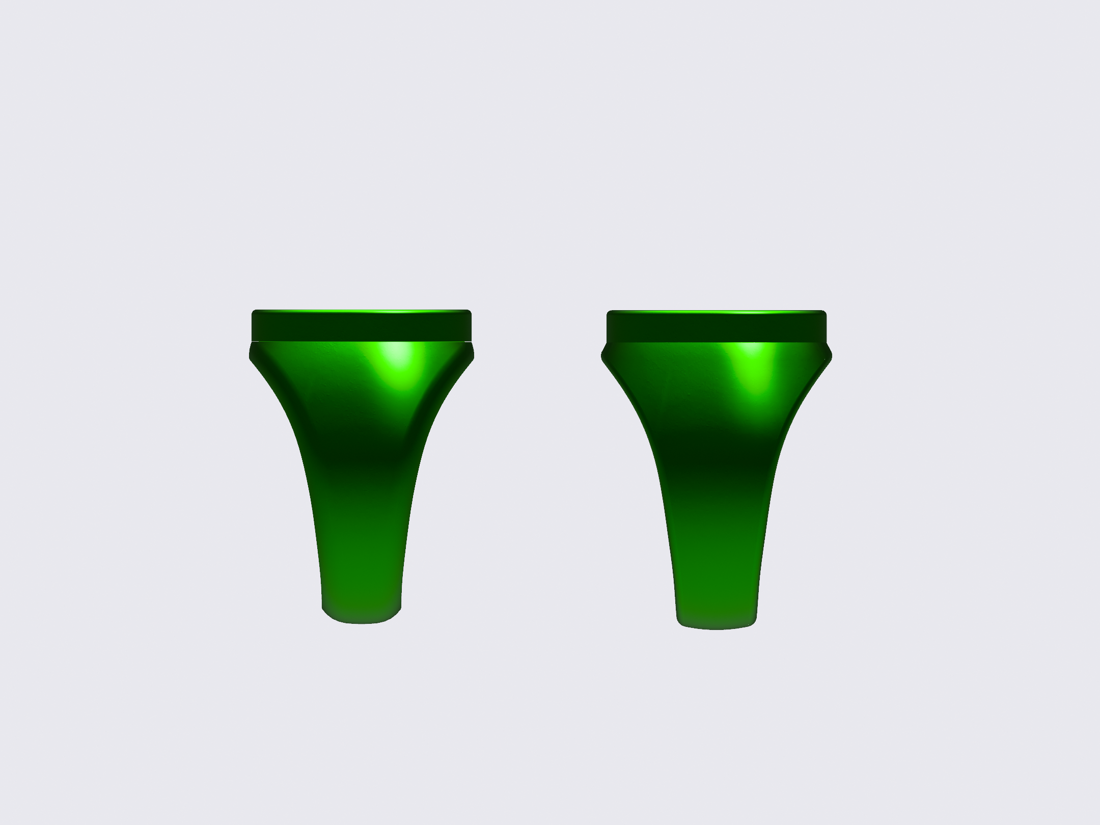
Went back to the REBIRTH design and applied the same techniques as I did on the V1.
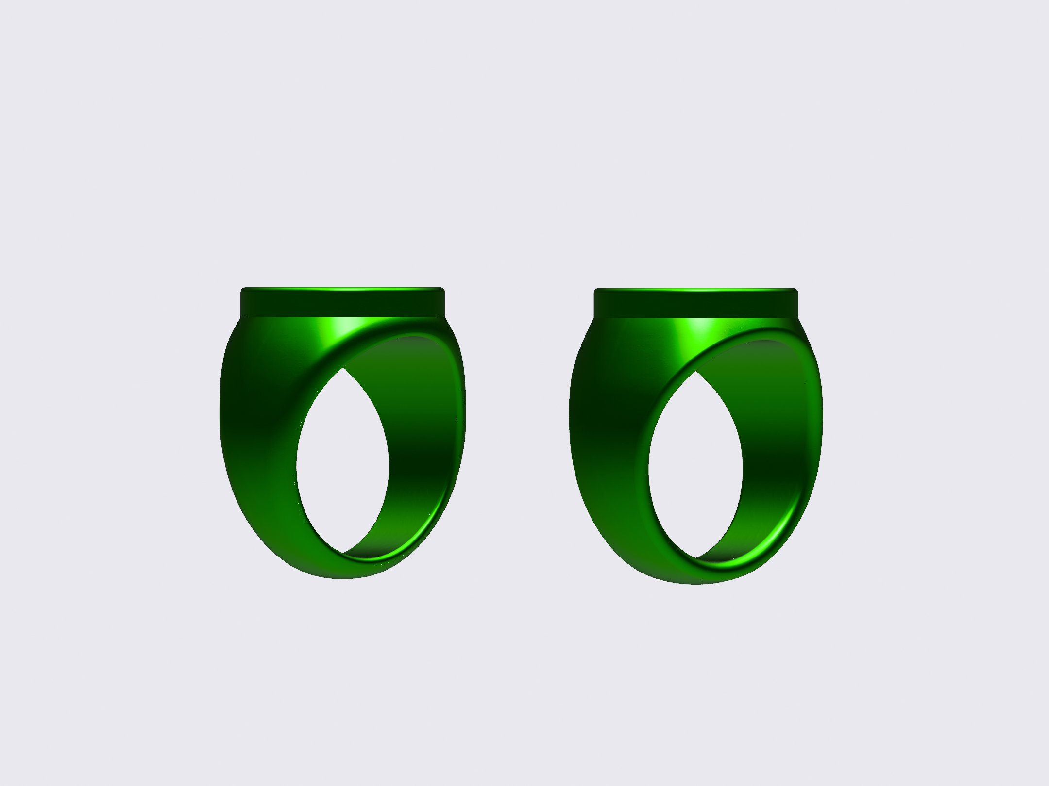
The older model (right) is based on any number of real-world ring designs I’ve seen, with a slightly more bulbous body and relatively flat edges on the finger-hole (which I filleted by 1mm to round them off).
The new model (right) has a curvier and more organic band, with only the inner edges of the finger-hole filleted (and only by 0.5mm).
