The recent GREEN LANTERN movie has resparked my interest in the comics. I've been a lifelong GL fan, and it kind of amazes me that there have been relatively few ring replicas that are fairly true to the comic designs. I have several of them--the Blackest Night promo, the 1990 promo, etc., but none of them have really scratched that itch to have a high-quality, comic-accurate, wearable GL ring.
I love my modded TRU Movie ring, but that's, well, the MOVIE ring, and my first love is the comic. There's an elegance to the comic rings. I get why they went with the weathered crystal/metal look for the movie, but I prefer the solid green metal style of the comics.
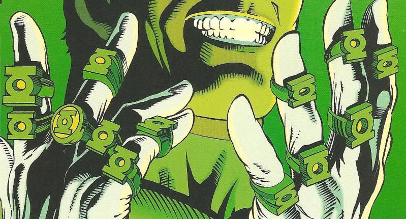
Of course, there have been countless artistic interpretations over the years, but three basic designs have been used over the years (aside from Alan Scott's and some other variants for the very non-human GLs):
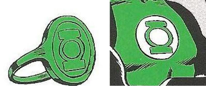
* The original/Hal Jordan style.

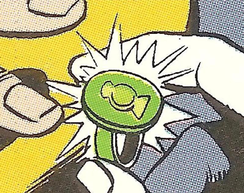
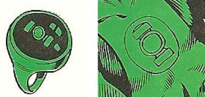
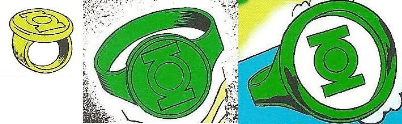
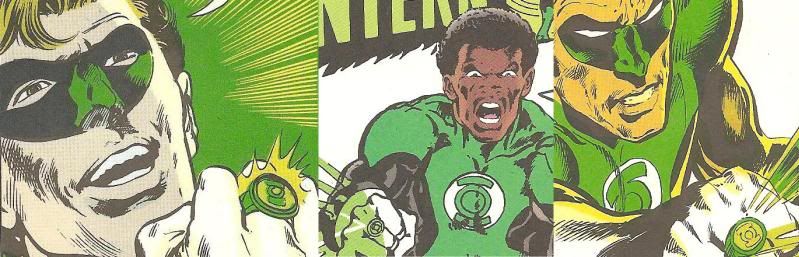
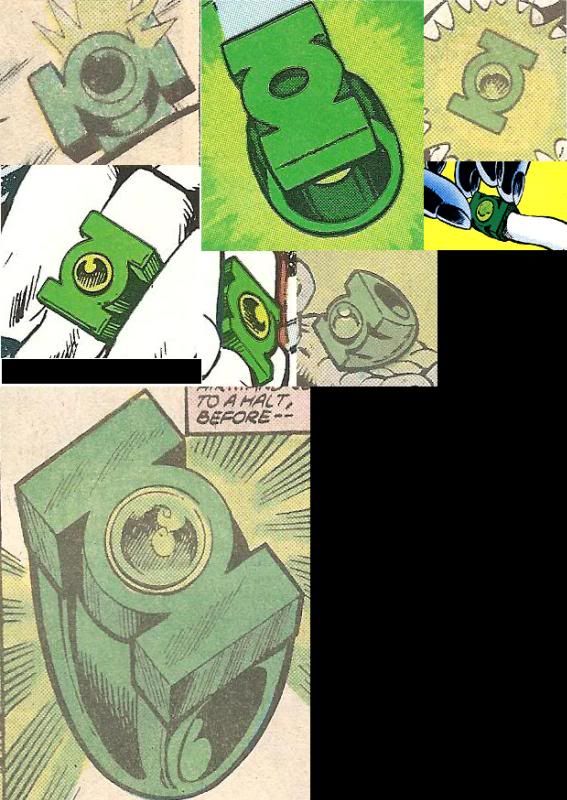
Gil Kane's original version of Hal Jordan's ring was essentially a simple ring band (akin to a wedding ring band--no detailing, and the same shape/width all the way 'round), with a disc on top emblazoned with the GL symbol. The symbol, of course, went through many, many evolutions over the years, from the original, more complex design, to the classic version used for licensing, to the recent modification of that design (with the slanted sides on the top and bottom).
This design has had several variations, from the band blending into the disc, to the more traditional, signet-style ring as depicted by Alex Ross, among others. Also, the inset areas of the face have often been colored a lighter green than the reliefed GL symbol, so as to make the symbol stand out more as in the last image of the three seen above.
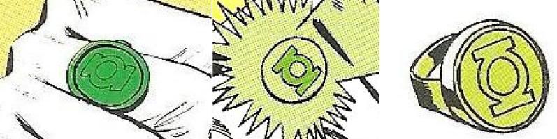
* The "Version 2" Corps style.
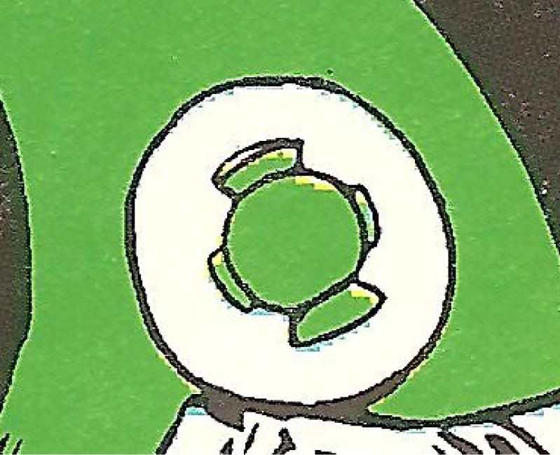
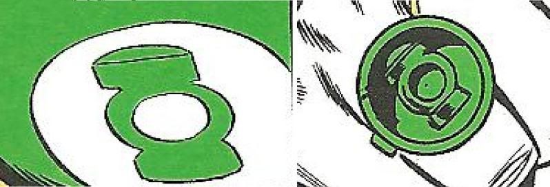
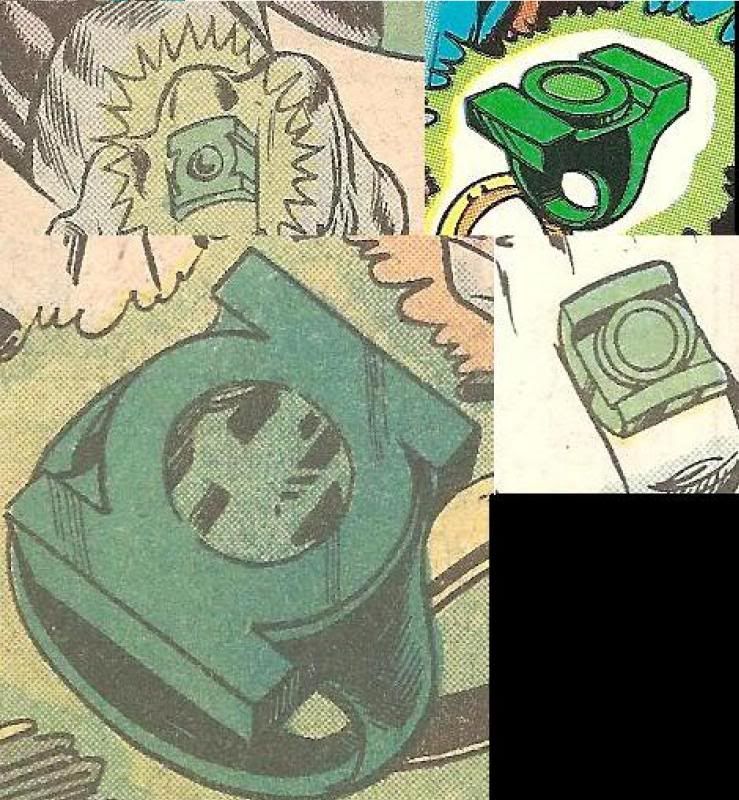
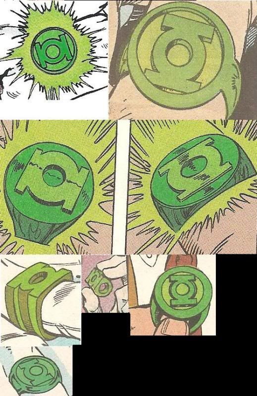
Mike Grell's 1970s redesign eliminated the disc-on-band look, and went with a 3-D version of the GL symbol (minus the circle surrounding the symbol) stuck on top of a band. This version also went through many variations, until it stabilized under the hands of artists like Joe Staton and Dave Gibbons.
The only real variation of this design is that some versions feature a center gem (depicted as either flat and flush with the GL symbol, or a dome-shaped gem protruding from the face of the symbol, as in the last image of the three seen below).

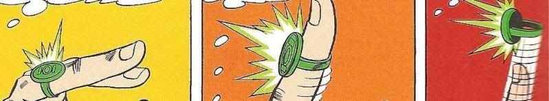
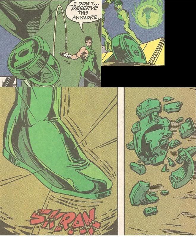
* The "chunk" style.
This is a distinct variant of the V2--on this one, the GL symbol blends into the band, with the grooves going all the way around the band (or not, in some cases). The GL movie ring follows this style, despite its being the least-seen of the three main types.

For many years, I've wanted a high-quality replica of the first two versions (or even all three), although the classic Jordan style is my favorite--it has a certainly classy elegance to it.
While there have been some great fan-made replicas, none have quite captured the right "look" for me (although some of the work I've seen is really, really great).
My "perfect" GL rings would go something like this:
Hal: Anodized metallic green metal ring. Two-part construction (GL symbol-disc atop simple band). No two-tone color scheme for inset portions of symbol.
V2: Anodized metallic green metal ring. Two-part construction (3-D GL symbol atop a simple band). One version without a gem, and the other with a lighter, lime-green-ish "dome" gem.
Chunk: Same as the V2, but with a flush lime-green gem.
The available licensed rings have their issues. Here are a few examples:

The Brightest Day promo ring is pretty spiffy version of the more recent "Jordan"-style rings--it just sits really high (due to the very thick ring-symbol-disc on top), and features the modern, "slanted-sides" symbol, which I'm not fond of. But I LOVE the metallic green paint scheme--it's just about perfect for my ideal ring. It's more of a traditional signet-style, though, as opposed to Gil Kane's disc-on-a-band look, which I prefer.
The 1990, glow-in-the-dark promo ring is about 80-90% right when compared to the V2. The only issues are the funky slanted sides on the GL symbol piece (when viewed in profile), and the band width, which spreads out to create a "platform" for the symbol piece. The "gem" is just glow-in-the dark plastic which sits flush with the face.
The DC Direct "toy" ring (which was released with many action figures, and as a Comic-Con promo in 2005) is very close to my preferred style--a GL-symbol disc stuck on top of a band. The issues here are size (won't even fit on any my fingers), color (a drab olive), and the "squashed" GL symbol.
The cheapie version of the "chunk" ring that's currently available gets the basic design right, although the bare metal with green inlay is wrong, of course.
The 1990 and Blackest Night rings also use the correct, "official" version of the GL symbol (the modern variant in the case of the BN ring). Too many ring replicas feature a "squashed" symbol, or one that has the wrong proportions. Can it really be so hard to get this symbol right, even at a small scale?

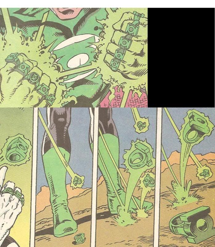
Thoughts? What are your favorite GL ring styles? What artists have drawn your favorite rings? Do you like some of the really far-out styles of the alien GL rings?
Most importantly, when and how will the definitive comic-style rings be made, and by whom? It's really amazing that such relatively simple designs have never quite been done justice. I think a two-piece construction on the Hal and V2 style rings would make the task easier. Although, as noted, Megatron's signet-style rings look really sweet.
I love my modded TRU Movie ring, but that's, well, the MOVIE ring, and my first love is the comic. There's an elegance to the comic rings. I get why they went with the weathered crystal/metal look for the movie, but I prefer the solid green metal style of the comics.
Of course, there have been countless artistic interpretations over the years, but three basic designs have been used over the years (aside from Alan Scott's and some other variants for the very non-human GLs):
* The original/Hal Jordan style.
Gil Kane's original version of Hal Jordan's ring was essentially a simple ring band (akin to a wedding ring band--no detailing, and the same shape/width all the way 'round), with a disc on top emblazoned with the GL symbol. The symbol, of course, went through many, many evolutions over the years, from the original, more complex design, to the classic version used for licensing, to the recent modification of that design (with the slanted sides on the top and bottom).
This design has had several variations, from the band blending into the disc, to the more traditional, signet-style ring as depicted by Alex Ross, among others. Also, the inset areas of the face have often been colored a lighter green than the reliefed GL symbol, so as to make the symbol stand out more as in the last image of the three seen above.
* The "Version 2" Corps style.
Mike Grell's 1970s redesign eliminated the disc-on-band look, and went with a 3-D version of the GL symbol (minus the circle surrounding the symbol) stuck on top of a band. This version also went through many variations, until it stabilized under the hands of artists like Joe Staton and Dave Gibbons.
The only real variation of this design is that some versions feature a center gem (depicted as either flat and flush with the GL symbol, or a dome-shaped gem protruding from the face of the symbol, as in the last image of the three seen below).
* The "chunk" style.
This is a distinct variant of the V2--on this one, the GL symbol blends into the band, with the grooves going all the way around the band (or not, in some cases). The GL movie ring follows this style, despite its being the least-seen of the three main types.
For many years, I've wanted a high-quality replica of the first two versions (or even all three), although the classic Jordan style is my favorite--it has a certainly classy elegance to it.
While there have been some great fan-made replicas, none have quite captured the right "look" for me (although some of the work I've seen is really, really great).
My "perfect" GL rings would go something like this:
Hal: Anodized metallic green metal ring. Two-part construction (GL symbol-disc atop simple band). No two-tone color scheme for inset portions of symbol.
V2: Anodized metallic green metal ring. Two-part construction (3-D GL symbol atop a simple band). One version without a gem, and the other with a lighter, lime-green-ish "dome" gem.
Chunk: Same as the V2, but with a flush lime-green gem.
The available licensed rings have their issues. Here are a few examples:
The Brightest Day promo ring is pretty spiffy version of the more recent "Jordan"-style rings--it just sits really high (due to the very thick ring-symbol-disc on top), and features the modern, "slanted-sides" symbol, which I'm not fond of. But I LOVE the metallic green paint scheme--it's just about perfect for my ideal ring. It's more of a traditional signet-style, though, as opposed to Gil Kane's disc-on-a-band look, which I prefer.
The 1990, glow-in-the-dark promo ring is about 80-90% right when compared to the V2. The only issues are the funky slanted sides on the GL symbol piece (when viewed in profile), and the band width, which spreads out to create a "platform" for the symbol piece. The "gem" is just glow-in-the dark plastic which sits flush with the face.
The DC Direct "toy" ring (which was released with many action figures, and as a Comic-Con promo in 2005) is very close to my preferred style--a GL-symbol disc stuck on top of a band. The issues here are size (won't even fit on any my fingers), color (a drab olive), and the "squashed" GL symbol.
The cheapie version of the "chunk" ring that's currently available gets the basic design right, although the bare metal with green inlay is wrong, of course.
The 1990 and Blackest Night rings also use the correct, "official" version of the GL symbol (the modern variant in the case of the BN ring). Too many ring replicas feature a "squashed" symbol, or one that has the wrong proportions. Can it really be so hard to get this symbol right, even at a small scale?
Thoughts? What are your favorite GL ring styles? What artists have drawn your favorite rings? Do you like some of the really far-out styles of the alien GL rings?
Most importantly, when and how will the definitive comic-style rings be made, and by whom? It's really amazing that such relatively simple designs have never quite been done justice. I think a two-piece construction on the Hal and V2 style rings would make the task easier. Although, as noted, Megatron's signet-style rings look really sweet.
Last edited: