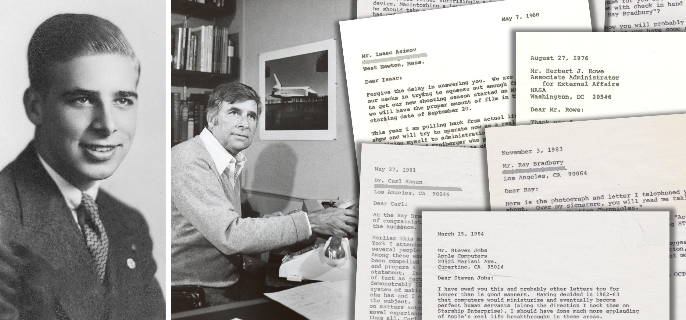
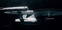
1/1000 PHASE II Enterprise

Ah, gotcha! I used both the kwik-set and regular on a project and did not like them at all. I've heard good things about Apoxie-sculpt though; I'll have to try it out sometime!

I also looked up the UGH! Phase-II Enterprise model ki; this is the one, right?


It occurs to me that I should point out out what the stock UGH! kit started out as, thanks to Starchwreck's old video review:

 
Good. I would love to see you do a Planet of the Titans Enterprise…that has more looks than the Phase II that it was confused with…like N-1 and the Nedalin disaster.


Last edited:
Got a second batch of rubber curing over the nacelle front endcap master. I’ve had to make two molds, since there’s only one master, and I want to use the same batch of tinted resin to make both endcaps, rather than doing two separate pours using one mold.

Meanwhile, a serious, possibly blasphemous question: Could…could this actually be the best version of the Enterprise? Listen, the TOS design is the greatest and most influential spaceship of all time. And the TMP Refit might just be the greatest visual effects model of all time.

But Jefferies’ PHASE II redesign really was his final word on the ship, and incorporates a number of changes and improvements that he’d wanted to implement. The secondary hull is curvier (like he’d always wanted) and more robust, and also has the sleeker, integrated sensor/deflector dish. The nacelle pylons are elegantly swept back, and are a sort of upside-down mirror of the shape of the dorsal. The nacelles themselves are sleeker and shorter and look more high-tech than the TOS versions, and are well-balanced on the pylons. The planned nacelle grill lighting effect would have finally implemented an idea which was intended for the TOS design. The saucer is larger and better proportioned. There’s an actual weapons assembly, which was missing on the TOS ship.

The PHASE II features all of the shape/proportional/design improvements which made their way into the TMP version, but also retains the TOS aesthetic and color scheme. Sort of the best of both worlds, as it were.
 
Aridas' Balson has an even better teardrop secondary hull. I have seen stretched cigars-but they need a deep chest and wider saucer.
 
Look, ma—nacelle caps!


The first resin pour turned out a bit rubbery, so I gave it another go. After buffing, I backed the front ends of the nacelles with crinkled Bare-Metal foil cut to shape, then glued the resin endcaps on. After that, the gaps were filled with Micro Krystal Kleer.

I’d tinted the resin orange before pouring, but the final result looked a little too toy-ish. That, combined with a desire for consistency with my TOS-era models, led me to then give the endcaps a few coats of the same clear orange acrylic I’ve used on the outer nacelle domes of those other models. The final result is a slightly darker, more mottled orange-red. I’m pleased with the look.


05520BB1-C339-4386-AA12-4FAE813F5E76.jpeg
07F0AD85-80D9-433F-9647-188CE9B165E4.jpeg
 
After some more deliberation, I decided to give the model some light pastel weathering. Less than the TOS version, and relatively subtle. It just doesn’t look “right” or finished without it.
 
I found these recently on DeviantArt from a guy named Hunter-56. I know tastes differ, but this is now my favorite TOS Enterprise.

View attachment 1604634View attachment 1604635View attachment 1604636


Tastes do indeed differ. This is a fine model, but rather overdesigned.


At the end of the day, I still think Jefferies' simple, elegant aesthetic is the absolute best and most futuristic. Clean and simple, not clunky and overdetailed. Unfortunately, the one-two punch of 2001 and STAR WARS forever altered the trajectory of STAR TREK designs.


It makes me ill that NuTREK has badly redesigned the real Enterprise not once, but twice, and continues to try to overwrite history. Just type in a search for "Polar Lights Enterprise", and the STD kit version will now pop up in abundance. Sigh.
 
Tastes differ indeed. I don't find much that's compelling about the design of the Phase II Enterprise (it's cool that you like it, though!). I hated the Abrams ship, but adore the Strange New Worlds design. That was my absolute favorite until the one I linked to. In the linked images I only didn't really like some of the twin flood lights on the struts and secondary hull, but he seems to have removed them in revisions.

I just don't find the Jeffries design to be believable for a ship of that size. It's going to have seams and more details than the TOS design. For me, the lack of detail detracts from the realism. The Refit is a brilliant rethinking of this aesthetic and for me also gets pretty much everything right.

But that's what makes it futuristic, you see. Massive engines supported by spindly pylons, a totally smooth hull--these are subtle things which indicate technology beyond what we currently have. Just imagine 3D-printed hulls, or welding techniques which result in a seamless whole.

All of the panel lines and Aztec panel patterns and greeblies of the later iterations just make the ships look less futuristic. Compare a Commodore 64 to an iPad, and you'll see what I mean.


I've seen more than a few people joke about how there must have been some kind of technological collapse in-between TOS and THE MOTION PICTURE, because everything went from smooth and simple to lots of buttons and knobs and Aztec hull patterns and whatnot.
 
For all intents and purposes, the model is essentially ready for glosscoating in preparation for decals, and yet I’ve been holding off. I have the nagging feeling that I can do better in terms of filling the gaps between the nacelle endcaps and the nacelles, for a smoother blend/transition. Maybe a bit of Epoxie Sculpt and then the hull color over that. We’ll see.

Also, I have the nagging feeling that I may have goofed on the saucer grid.

As previously noted, the general blueprints for the PHASE II ship match the general blueprints (as seen in THE MAKING OF STAR TREK) for the TOS ship, which has fewer radial lines and fewer concentric lines than on the 11-foot studio model. The TOS blueprints have five concentric lines, whereas the model has six.


B2DA6E76-74DA-4E2C-A3FC-9CA98E1CB8FD.jpeg


The under-construction PHASE II studio model also had six concentric rings. For my penciled-on grid, I referenced an early Shaw drawing which applied the TOS grid to the PHASE II blueprints. However, the proportions seem a bit off, with the space between the second-to-last and the last/outer ring actually being about the same size (or even a bit smaller) than the preceding ring, rather than being slightly larger, an error which I’d failed to notice. As a result, the spacing on my grid is a bit off, and it looks like the big “NCC-1701” may need to actually have a concentric gridline running through the center of it, rather than the top edges being aligned with the third concentric gridline from the center. We’ll see.


796A4AC1-649D-4BF3-B4D8-1BA1265FB967.jpeg
 
…actually, my initial assessment may have been mistaken. Been playing with the sticker (not waterslide decal) sheet from a 1/1000 TOS Enterprise to get a sense of placement for the name and registry. With everything spaced like the TOS ship, the graphics look a little too clustered, and sit a bit too close to the B/C deck structure, rather than the registry number sitting right in-between the saucer edge and the B/C deck. The PHASE II saucer is bigger, after all, and so placing the markings just like on the TOS model throws the registry off-center.

So, I cut everything up, and aligned the top edges of registry letters/numbers with that third concentric gridline (and spread the letters/numbers out a bit further), and, sure enough, the placement looks more centered, correct, and better proportioned. We’ll see how it goes.

4F20E0EA-9BEB-44B9-AC1A-694261ECFEB0.jpeg
 
…actually, my initial assessment may have been mistaken. Been playing with the sticker (not waterslide decal) sheet from a 1/1000 TOS Enterprise to get a sense of placement for the name and registry. With everything spaced like the TOS ship, the graphics look a little too clustered, and sit a bit too close to the B/C deck structure, rather than the registry number sitting right in-between the saucer edge and the B/C deck. The PHASE II saucer is bigger, after all, and so placing the markings just like on the TOS model throws the registry off-center.

So, I cut everything up, and aligned the top edges of registry letters/numbers with that third concentric gridline (and spread the letters/numbers out a bit further), and, sure enough, the placement looks more centered, correct, and better proportioned. We’ll see how it goes.

View attachment 1605110
Yeah...that placement really works well! I see what you mean about the larger saucer and the hull registry spacing now.
 
Yeah...that placement really works well! I see what you mean about the larger saucer and the hull registry spacing now.

Yeah, I'll have to take a photo of an uncut 1/1000 TOS registry sticker on the model to show the difference. The standard placement of the TOS name/registry markings simply does not look right on the PHASE II saucer, partly because the TOS registry number hugs the specific size/diameter of the round gridline on that version, whereas the size and spacing of the PHASE II gridlines is bigger, which requires the number to have a different/wider spacing.

So, yeah, the TOS name/registry marking placement (the upper bar of the "T" in "Enterprise" intersects the first concentric gridline, and the registry number hugs the outside of the third concentric gridline) still works for the PHASE II, but the bigger saucer and its bigger concentric gridlines necessitate a slightly wider placement of the markings.
 
Well, I ended up filling in the gaps between the nacelles and the resin endcaps with Apoxie Sculpt to create a very smooth transition. As it is, the color of the putty already blends into the hull color very well, but I’ll still apply some touchup paint after it cures.

Meanwhile, I’ve left the registry stickers on the saucer just to give a sense of how the model will look when it’s done.

And I believe it’ll look sexy.


6C64F081-CFFD-4991-96A3-DD3FBC414FC5.jpeg

7B7865F4-95EE-4BB8-AC3B-C34723163F32.jpeg

3F6E4110-5D7B-483E-8D47-EB1B0983B9FB.jpeg
 
As I wait for the putty to cure, I continue to go back and forth on whether or not to include the nacelle chinguards. They were in all of the concept art, as well as Jefferies' blueprints...BUT they were also marked with "x"es on the blueprints, which usually means "omit". Would they have made it onto the studio model? Who can say?

Argh!
If they were "x-ed off", then I say leave them off.; if you find out differently later, you can always add them. But if you put them on and later confirm they were indeed not on there, you could risk some damage to the model having to remove them.
 

Your message may be considered spam for the following reasons:

If you wish to reply despite these issues, check the box below before replying.
Be aware that malicious compliance may result in more severe penalties.
Back
Top