You are using an out of date browser. It may not display this or other websites correctly.
You should upgrade or use an alternative browser.
You should upgrade or use an alternative browser.
Spider-Man '77 TV costume thread!
- Thread starter Martin-El
- Start date
rmschneider104
Sr Member
Re: Spider-Man '77 costume at PIH - Pictures?
Agreed. That's a classic Spidey look.
Agreed. That's a classic Spidey look.
Re: Spider-Man '77 costume at PIH - Pictures?
I have a number of issues with the Maguire version of the suit. It looks neat, and it's instantly recognizable as Spider-Man, but it strays from the comic book version in a number of ways:
1. The raised webbing (in the comics, the suit has a silk-screened web-pattern). Also, the weblines are silver, and in the comics, they've always been black. Of course, it's entirely possible that Steve Ditko wanted the suit to have grey-white weblines (like a real spider's web), but could only ink them in black, of course, due to the limitations of comic book art at the time.
The suit also looks uncomfortable to wear with all that foam-rubber webbing stuck on. I've always imagined Spidey's suit as being very silky, lightweight (for wearing under street clothes), and durable.
2. The changed spider design on the back (sure, it matches the chest emblem, but it doesn't look like that in the comics).
3. The silk-screened "brick" pattern (it makes the suit look like it has "scales").
4. The triangular-looking eye lenses. I prefer the beautifully rounded lenses drawn by John Romita Sr. in the comics.
5. The incorrect web-pattern on the palms.
6. The lack of underarm webs.
7. No web-shooter nozzels (as a result of the pointless and stupid decision to give Spidey the infamous organic web-shooters instead of mechanical ones).
8. The fact that what is obviously a $100,000 suit was somehow whipped up with no explanation by a cash-strapped teenager (...and one who somehow wasn't smart enough to build mechanical web-shooters, at that!).
For the movies, I would have preferred something similar to the '77 suit, which gets a lot of stuff right.
It would have been neat to see a true Steve Ditko version of the suit in the recent films, with big underarm webs and a red-and-black color scheme (for those who don't know, Spider-Man's suit was supposed to be red-and-black--with blue as a highlight color to show detail--, but over time, it "became" red-and-blue as Ditko spent less time inking in the black sections. The same thing happed to Batman when his black-and-grey suit "became" blue-and-grey over time).
I've alway preferred John Romita, Sr's take on the suit, myself. That's probably the most cosmetically perfect superhero costume ever. Maybe a blend of Romita and Ditko would have worked better for me.
Last edited:
Re: Spider-Man '77 costume at PIH - Pictures?
I agree that the suit in the new movies looks a little off when compared to the comics, but at the same time would you want to see a lycra spandex (i.e. above suit) in a film with a 200 million dollar budget?
They didn't exactly cover themselves with glory when it came to the goblin suit, but they mostly got the spidey suit looking good. It could have been better, but it could have been a hell of a lot worse.
Duh, mannequin, nevermind about the weird hair question.
Chris
Re: Spider-Man '77 costume at PIH - Pictures?
Hey guys,
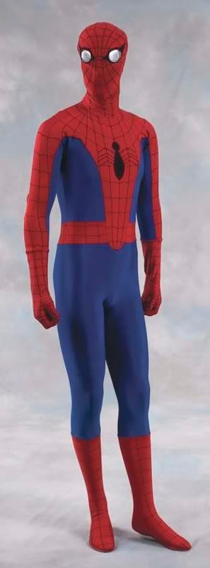
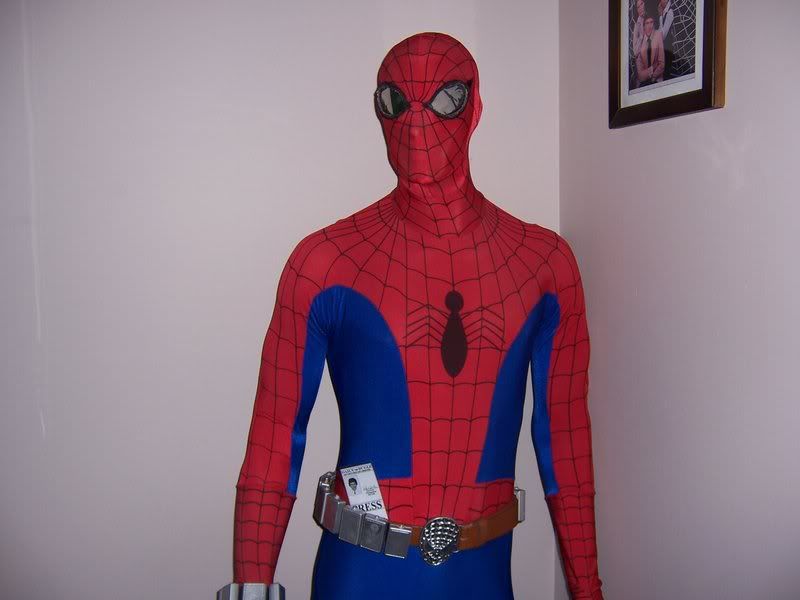
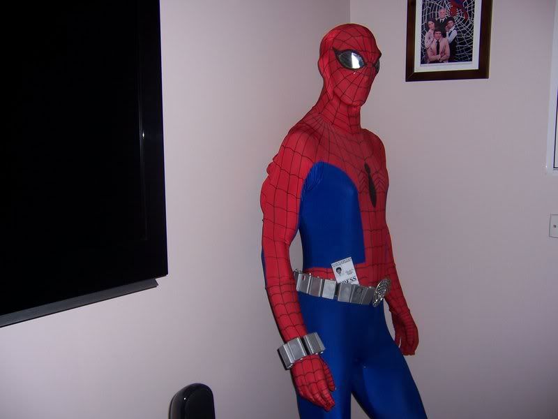
I also have loved that suit and have wanted it since seeing that show, I owned a replica Eaves Brooks style costume just last year and sold it after purchasing a real one a few months back from a guy who stated it had been used on the series (don't know if that's completely true or not). It is a real Eaves Brooks costume and what I believe is the best costume they ever made to represent spidey. I added the replica webshooters and belt myself and I now just need some gloves and boots to complete the look. Anyway heres some pics and if anyone out there has some better reference pics of the actual costume I would also love to see them.
Cheers, Todd.
")
Hey guys,
I also have loved that suit and have wanted it since seeing that show, I owned a replica Eaves Brooks style costume just last year and sold it after purchasing a real one a few months back from a guy who stated it had been used on the series (don't know if that's completely true or not). It is a real Eaves Brooks costume and what I believe is the best costume they ever made to represent spidey. I added the replica webshooters and belt myself and I now just need some gloves and boots to complete the look. Anyway heres some pics and if anyone out there has some better reference pics of the actual costume I would also love to see them.
Cheers, Todd.
Re: Spider-Man '77 costume at PIH - Pictures?
Sorry guys, I think I cut off my post, what I wrote was that I managed to score this costume off a guy just recently who told me that it had been used in the tv series ( I don't know how true it was though) but it is an original Eaves Brooks costume and is a great find for me. If anyone out there also has some pics of one of these or the original I would also love to see it.
Cheers, Todd.
Martin-El
Sr Member
Re: Spider-Man '77 costume at PIH - Pictures?
Todd -
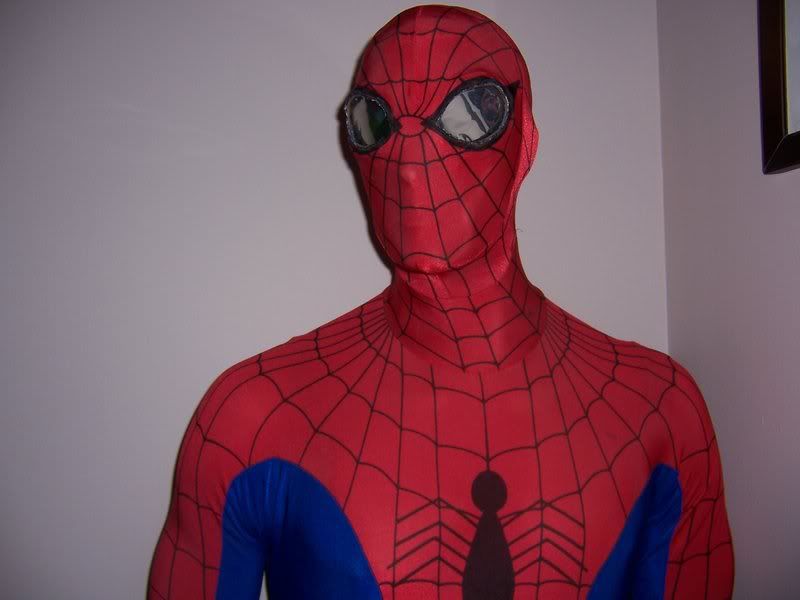
Firstly, awesome classy display. You are gonna HAVE to hook me up with all you know about these things and where to get one. Is the replica you sold of the same standard? Who are Eaves Brooks? Do they still supply?
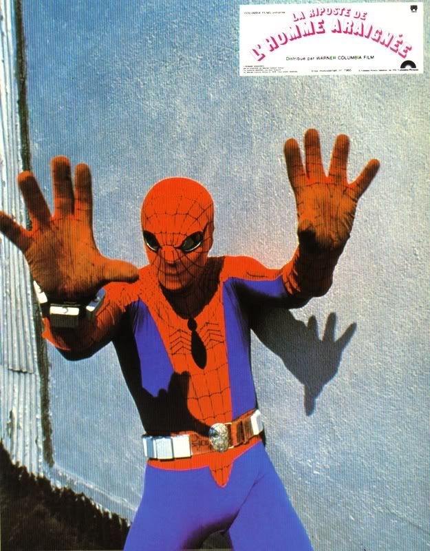
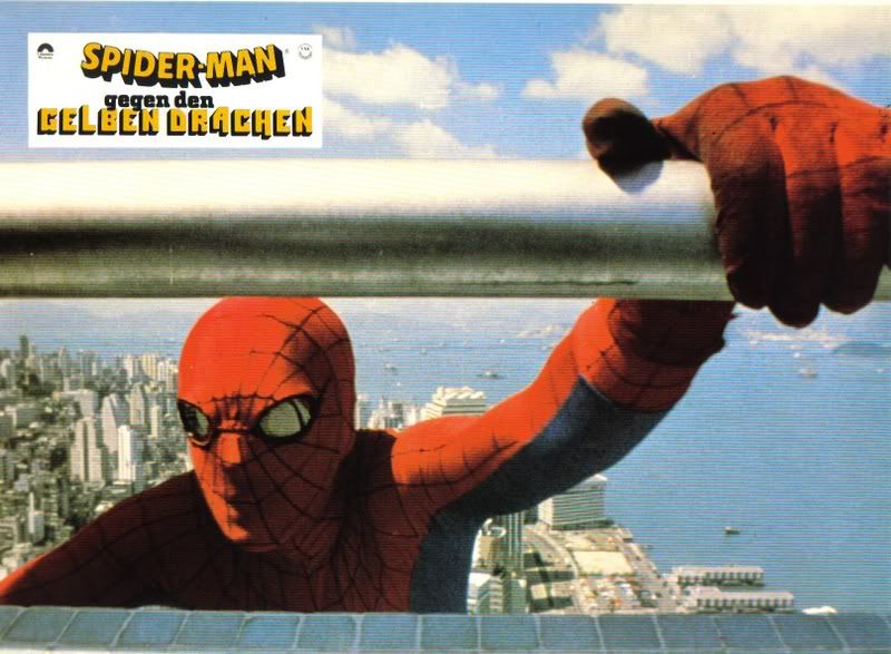
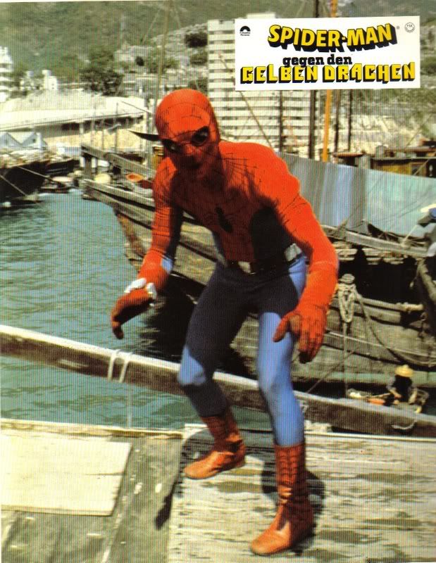
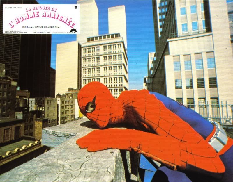
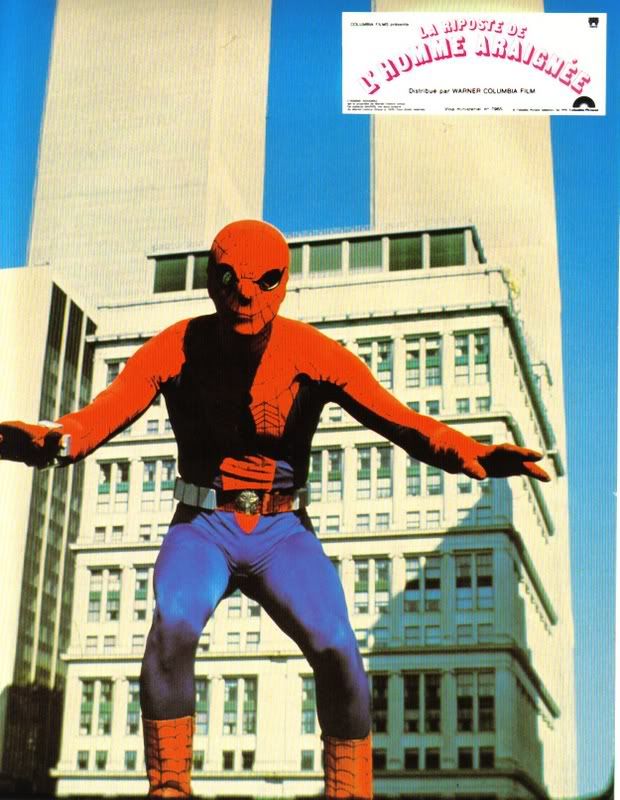
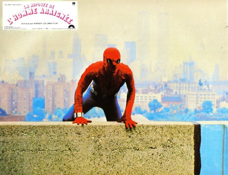
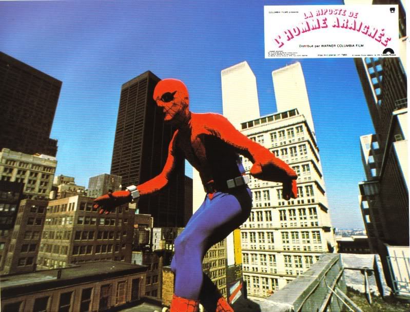
With further investigation it appears Spidey had a new suit for each of what became the three TV movies - (did you know they were released theatrically in the UK?) The first, (sold last week) had silver plates riddled with pinholes for lenses, wheras Strikes Back introduced the belt, gloves and soft boots over the outfit. In The Dragon's Challenge, the suit was more refined and had the dark mirror lenses.
And for anybody after reference;
Todd -
Firstly, awesome classy display. You are gonna HAVE to hook me up with all you know about these things and where to get one. Is the replica you sold of the same standard? Who are Eaves Brooks? Do they still supply?
With further investigation it appears Spidey had a new suit for each of what became the three TV movies - (did you know they were released theatrically in the UK?) The first, (sold last week) had silver plates riddled with pinholes for lenses, wheras Strikes Back introduced the belt, gloves and soft boots over the outfit. In The Dragon's Challenge, the suit was more refined and had the dark mirror lenses.
And for anybody after reference;
Re: Spider-Man '77 costume at PIH - Pictures?
Thanks buddy, I just sent you a pm regarding the info, yes the suit had several changes and my all time favourite was the late season 2 look when the lenses were changed to the mirrors, I loved them. I've just made a few adjustments to mine to accommodate different style lenses to be worn. I place thin velcro around the inside of the eye sockets so they can be changed to the silver pinhole eyes or mirror lenses, as sometimes I like to change my displays around in the prop room. Anyway thanks again and come on people show some spidey tv stuff, even though many think it was cheesy, I still love the suit. Cheers, Todd.
Thanks buddy, I just sent you a pm regarding the info, yes the suit had several changes and my all time favourite was the late season 2 look when the lenses were changed to the mirrors, I loved them. I've just made a few adjustments to mine to accommodate different style lenses to be worn. I place thin velcro around the inside of the eye sockets so they can be changed to the silver pinhole eyes or mirror lenses, as sometimes I like to change my displays around in the prop room. Anyway thanks again and come on people show some spidey tv stuff, even though many think it was cheesy, I still love the suit. Cheers, Todd.
Re: Spider-Man '77 costume at PIH - Pictures?
Has the entire television series and all movies ever been released on DVD? Id love to have all the shows on DVD. Ive seen a few on ebay which are bootleged.
Has the entire television series and all movies ever been released on DVD? Id love to have all the shows on DVD. Ive seen a few on ebay which are bootleged.
Lan-Ed-Tul
Well-Known Member
Re: Spider-Man '77 costume at PIH - Pictures?
c'mon man, just like any of the movies of supewrheroes and such that are actually being made now due to the tech we have to actually be able to do them now, they modernize them.
Stan Lee, wanted to modernize the character, to a more beleiveable type thing that could possibly happen. look at our genetics research these days, crap like that, could actually happen some day in the future.
i thought Stan did a excellent job modernizing spiderman. i liked it.
my 2 cents!!
electric jay
Well-Known Member
Re: Spider-Man '77 costume at PIH - Pictures?
The family got a huuuuuge settlement from Uncle Ben's death.:cool
8. The fact that what is obviously a $100,000 suit was somehow whipped up with no explanation by a cash-strapped teenager (...and one who somehow wasn't smart enough to build mechanical web-shooters, at that!).
The family got a huuuuuge settlement from Uncle Ben's death.:cool
Lan-Ed-Tul
Well-Known Member
Re: Spider-Man '77 costume at PIH - Pictures?
thats a good point though. the movie never elates to how he got the final design, we just see the wrestling setup he did, and a drawing of the final suit, we dont know where he got the materials for the final suit.
thats a good point though. the movie never elates to how he got the final design, we just see the wrestling setup he did, and a drawing of the final suit, we dont know where he got the materials for the final suit.
kalkamel
Master Member
Re: Spider-Man '77 costume at PIH - Pictures?
Omigod! As I watched those pics, the jazzy theme music just played in my mind!
Here's the opening sequence on Youtube for a journey back to 1977:
http://www.youtube.com/watch?v=q8aQvCEn3JU
Omigod! As I watched those pics, the jazzy theme music just played in my mind!
Here's the opening sequence on Youtube for a journey back to 1977:
http://www.youtube.com/watch?v=q8aQvCEn3JU
DarthVeach
Well-Known Member
Re: Spider-Man '77 costume at PIH - Pictures?
WOW did that bring back some cool memories! I wish they'd get that on DVD soon!
WOW did that bring back some cool memories! I wish they'd get that on DVD soon!
spidermanc
Well-Known Member
Re: Spider-Man '77 costume at PIH - Pictures?
Nice. Saw one of those on ebay before.
Nice. Saw one of those on ebay before.
Similar threads
- Replies
- 2
- Views
- 825
- Replies
- 16
- Views
- 4,860
- Replies
- 1
- Views
- 674
- Replies
- 0
- Views
- 858