Time Bandits Map of the Universe

breakfstmachine

Active Member
RPF PREMIUM MEMBER
Every time I watched Terry Gilliam's "Time Bandits" I thought about the map Randall's gang carried around. Every successive viewing I was enthralled by how these cosmic beings, builders of the Universe and All Creation, were using a physical document to navigate All Creation. Even better still, this map is immediately recognizable as a map yet completely unlike any other map in our dimension.

I started THINKING about making this map in the middle of 2015, shortly after I finished a copy of Henry Jones' Grail Diary.

I started researching making this map at the beginning of 2017, realizing that unlike The Grail Diary, there wasn't quite as much research that had been done on this prop, besides a couple notable replicas that have been produced previously. The story that I've read here is that there were two maps produced for the film: one is the possession of Terry Gilliam; the other is owned by the estate of George Harrison, who was a co-producer on the film. Liner notes indicate the scan included with the Criterion is the George Harrison copy.

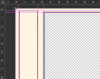
With a copy of the Time Bandits Criterion Blu-Ray, I scanned the fold-out map at high-resolution and stitched it together as my starting point. From what I've seen discussed here and across the internet, full size is approximately 39" x 24-1/2" total, including the borders with the clocks.

Next, I wrote out a rough and slap-dash "process" list with the pieces that I could see and that I knew would need some detailed attention.


  1. Borders/Frames
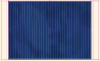
  2. Dark Blue Nebula Background
  3. Grid Lines
  4. Grid numbers
  5. Shapes: Circles, Triangles
  6. Gate Markers (~40)
  7. Squiggle Compass Rose, Snake Thing
  8. Vertical Numbers (Font?), Horizontal numbers
  9. Blue Time-Topography
  10. White Time-Topography
  11. Allllllll the other details
  12. Clocks

But what good is a plan if it's not flexible? I'm excited about where this project will take me... it certainly doesn't seem as simple as this list would imply.
 
People always ask what mine is when they see it hanging on the wall, "Why it's a map of the Universe":lol

Few know where it came from.

Terry Gilliam recieved a map from one of the runs here years ago
 
Yes, I recall a quite extensive research thread and the resultant excellent replica printed on canvas was offered here once or twice. At that time I believe someone was given access to a higher resolution scan of what was in the video release and then reference was used to improve the details. All the work has been done so perhaps the original replica maker can just offer prints again? Have you found the original threads here? They were 10-15 years ago.
 
Joatrash did the reserch if I remember.
Our very own Indy Magnoli makes the best one, on aged canvas, at a full metre wide.
You could pm him for details..
 
There were 4 probably more versions iirc, micdavis was the first.

Jheilman still offers them and is the most accurate one.

Indys are Joatrash maps

Joatrash and jheilmans are supposedly very very close to each other
 
Last edited:
There were 4 probably more versions iirc, micdavis was the first.

Jheilman still offers them and is the most accurate one.

Indys are Joatrash maps

Joatrash and jheilmans are supposedly very very close to each other

IIRC, I think Adam Savage proudly displays the jheilmans version in his mancave.
 
Just took this picture one minute ago in our den above the fireplace...

image.jpg
 
I have one of the Joatrash maps and, while I think the artwork and craftsmanship are outstanding, my only niggle is that I feel it is slightly undersized. The map I have measured approximately 35.25" x 21" before I trimmed the right side row of clocks off and it is currently 32.5" wide (the frame is 24" x 36"). According to his Etsy page the Jheilman maps are 40" x 24.25".

20180118_101822.jpg

Dave
 
Last edited:
Ah! I'm so happy people still love and appreciate this map. I found a number of threads here discussing the map, but was unable to find a research thread. I'll take another look, or else maybe it's been archived? (Edit: I just looked back, but was unable to locate a research thread. Any chance it can be unearthed?) I've already been searching through old books of astrology and alchemy and found good reference for a lot of the details.

It's nice to know there are some knowledgeable resources out there, as well. In my research, there are a couple bits on here that have remained obscure to my eye(like the writing on the top border).

Thanks everyone! I'm going to keep a log here as I work on this.
 
Last edited:
chris_s also made an excellent version of the map, with a (sadly) very limited production run. Still, might be worth taking a look for additional inspiration!

Does anyone own more than one of these maps? I've always wanted to see all of the various iterations of the Time Bandits map side-by-side for comparison! It's hard to tell through photos online, but I always got the sense that Joatrash's was a little more impressionistic or "painterly" while Jheilman's was more crisp in the fine details. For my tastes, and for wall-hanger decor, I think I might prefer painterly...but I'd really have to see them next to each other to confirm this suspicion.
 
This project exists mostly because I've been taking a year to remodel(see also: ignore) my garage shop space after it sprung a leaky roof at the beginning of last year. I also replaced the door to my office space since the previous one was disintegrating (water and MDF do NOT mix). The point is- I had to pack up my workshop and I needed something to work on that didn't take up a big physical footprint- like a large digital file.

1. BORDERS & FRAMES

The borders were pretty straightforward, and I referenced screenshots and the fold-out map for proportions. Here's a small snap:
attachment.php


(I'm just realizing now, I need to add the thin blue lines around the clock borders.)

2. DARK BLUE NEBULA BACKGROUND

Here now are a couple of my failed approaches to figuring out the background:
• My first inclination was, "Hey! it's a little extra work, but I can clone brush out a lot of junk and pick colors and fill in and it'll be a close enough match!" This did NOT work.
• I reached out to Chris_S for a little guidance because his map came out so darn beautiful, and while it wasn't what I wanted to hear, (The sound of a Pantone color) it was certainly what I NEEDED to hear: "Choose something and go with it."
• I began painting away to my heart's content, trying different methods of blending and blurring to coax out the contrast and shading of the vast nebula of creation. And I finally ended with something that felt good.

3. GRIDLINES

The gridlines took about an hour to add.
attachment.php


Post script: At some point, I reviewed the blue nebula and noticed some contrast issues and redid the whole thing, but with a better idea of how I was approaching the overall effect. Luckily, I can adjust the brightness and contrast, I can tweak the saturation, so if I can dial in where the color "clouds" of darker blues and richer tones are, I can adjust the values later when testing prints.
 

Attachments

  • timebandits_bordersandframes.png
    timebandits_bordersandframes.png
    23.4 KB · Views: 3,749
  • timebandits_nebulaandgrid.png
    timebandits_nebulaandgrid.png
    310.1 KB · Views: 4,050
With the blue nebula background, the borders and the gridlines, I next focused on the dashed and solid connection paths which did not take too long. This brings me to a crossroads of starting with the challenging elements of this piece: the "Time Topography," the portals, the holes, the icons, the other tiny, almost imperceivable details. It was time to dive deep, having built up some momentum.


There has been something in the back of my head that keeps nagging at me- Terry Gilliam was always using collage as a primary artistic expression, pulling from existing references and being inspired by renaissance/enlightenment era artwork to develop his style, pairing it with his illustrations. The Time Bandits map seems very reminiscent of this and I have a hard time believing that this particular piece was developed in a vacuum. In looking at the symbols and the details, it feels like there has to be some unifying methodology behind it all... but I haven't quite cracked it yet...


OK. So here is my plan- I have to take this one step at a time- and if I want the best results, I want a "hand drawn" feel to the map. If I want the best accuracy, I have to essentially trace the scanned map. It isn't possible to trace those blue squiggles against the blue background with all the other visual noise going on, so I decided to isolate the ripples/topography, print them in black, trace them by hand, scan them, invert, change color, then lay back into the map.


Yes, this is a lot of work, but I want this map to have the feeling that a hand was used to draw these lines.... so I will use my hands to draw these lines.


In order to not drive myself crazy, I am splitting up the map into "portions" and I will tackle each one by one by one- isolate some elements, print them, trace them, scan them. It will be slow incremental progress but as long as I focus on one part at a time, I will plod forward.

timebandits_portions.png

Here are a few samples of tracings, ready to be scanned, tinted blue, and dropped back in:
timebandits_trace2.pngtimebandits_trace1.png
 
Joatrash did the reserch if I remember.
Our very own Indy Magnoli makes the best one, on aged canvas, at a full metre wide.
You could pm him for details..

Haha, wow... talk about a blast from the past. That map was the first ever prop run I did here and like so many others I used to dream about having one as a kid. After my initial run, I gave Indy Magnoli permission to make up a bunch and I guess he still has stock of them, and offers a fully finished version. (The Magnoli version actually has a couple of very small detail differences to the run I did myself.) Funnily enough, I haven't gotten around to framing my copy... it's still folded up behind glass on my "miscellaneous props shelf".
 
Hello. Which version of the map are you recreating? The one used in the the entire movie or the one shown at the end of the movie right before the credits?
 
Hello. Which version of the map are you recreating? The one used in the the entire movie or the one shown at the end of the movie right before the credits?
That's a great question, but not quite simple to answer. The stories I've heard, and perhaps someone can chime in to corroborate or contradict this, is that there were two maps made: The Shooting Map and the Credits Map, as you mentioned.

The Shooting Map is only seen in the movie with our heroes and it's details can only be discerned from screenshots. With that in mind, recreating the map solely using this reference is likely impossible without access to the actual production prop. (Rumor has it this is owned by Terry Gilliam.)

The Credits Map used at the very end of the movie, is supposedly the map that has been scanned and included with the Criterion Blu Ray/Special Edition release. This map can be scanned, blown up, and reviewed in higher detail, but the color is significantly different than what's seen in the Shooting Map and it's missing the script at the top of the map, as well as the clock panels on the left side (Shooting Map) let alone both sides (Credits Map).

I believe the previous replicas made are hybrids of the Shooting and Credits Maps. The replica I'm recreating will be a hybrid, with the primary basis in the Credits Map.
 
Around the third portion of isolating elements and tracing, I had a breakthrough that feels like it could unravel a ton of obscure and obfuscated details of the map.

As I was frustrated with the upper triangular “chart,” wishing I could read the writing, I started thinking about the words I could read- Hyle and Deus. Deus means God, er, Supreme Being, but I don’t have any idea what Hyle means.

“Screw it,” I thought, “I’ll just google “Deus, Hyle, Triangle.”

And there it was:
timebandits_fludd_hyle.png

Robert Fludd’s Hyle Chart.

This starts to lend evidence towards my original theory that the map is a collaged piece, rather than drawn purely from imagination.
The Hyle Chart or Hyle Triangle is used in two places on the map, one is cropped and they are both colored differently.

And who is Robert Fludd?

From Wikipedia:
Robert Fludd...was a prominent English Paracelsian physician with both scientific and occult interests. He is remembered as an astrologer, mathematician, cosmologist, Qabalist and Rosicrucian apologist.
Fludd is best known for his compilations in occult philosophy. He had a celebrated exchange of views with Johannes Kepler concerning the scientific and hermetic approaches to knowledge.

A quick google image search for Robert Fludd starts to bring up a lot of interesting imagery that feels very familiar, very Gilliam-esque. That quick image search turned into a week in an Internet K-Hole, unable to pull myself away from the hydra-like browser tabs, for every one I close, two more pop open with new search terms to comb through. I am poring over pages and pages of occult imagery, symbols, glyphs, Egyptian, Greek, Norse, icons, zodiac, mysticism, alchemy, and ancient cosmology.

This leads me to another major breakthrough via “mysticism symbols,” which look to be the symbols used in the two central concentric rings.
timebandits_mysticism.png

Alright. This feels great to find some of this stuff. I've got a heading to continue to search for so many of these symbols and icons, but now with more direction!
 

Your message may be considered spam for the following reasons:

If you wish to reply despite these issues, check the box below before replying.
Be aware that malicious compliance may result in more severe penalties.
Back
Top