I knew as soon as my subscription notification dinged that someone was posting this video. (Which I have been examining closely)
I know she is using white gloves, but I she is now holding the film used hero prop.
There are two details that convince me of this:
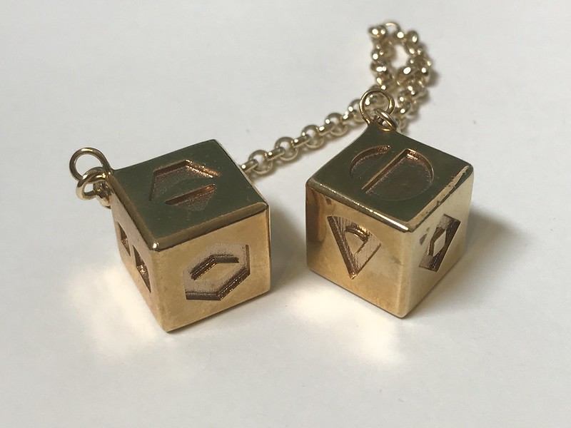
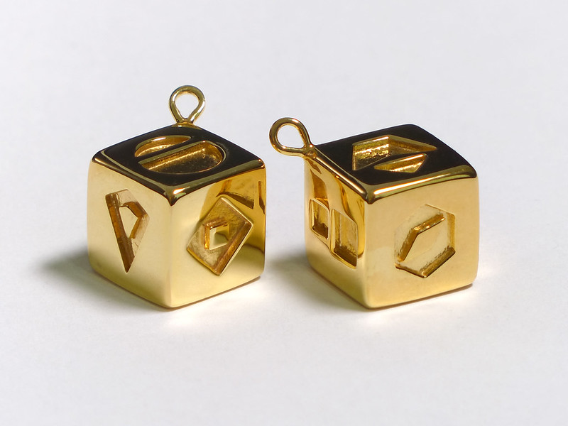
1: The corners are too sharp. When compared to this film shot, the corner radius doesn't match. I am specifically talking about where three corners meet, not the edges. What she is holding has corners closer to my Rev 1 design.
2: The space between the two portions of the "One" symbol isn't large enough. When comparing against this reference image.
However, this video may reveal a few things about the hero prop. I made the "one" symbol based on the image linked just above. In that image there is a slight taper on the one symbol. But this may be due to some pillow distortion, perhaps from a macro lens. But lets assume the one shown in the Youtube video is a good symbol. So I will have a Rev 4 to make.
Regarding the "five" symbol, I know for sure that it doesn't have a flat cut between the small triangle and the rest. This is from another reference images. I think that YouTube compression, combined with the slight round on that edge screwed up that detail. I do think however that the base edge on the "five" symbol needs to be a bit wider than I have now.
I think that perhaps distortion also caused the edges to look a bit more rounded than what you see in the the Feb 7th video. I believe my Rev 3 corners are closer to the hero prop. I do however plan on altering those two symbols a bit.
------------
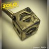
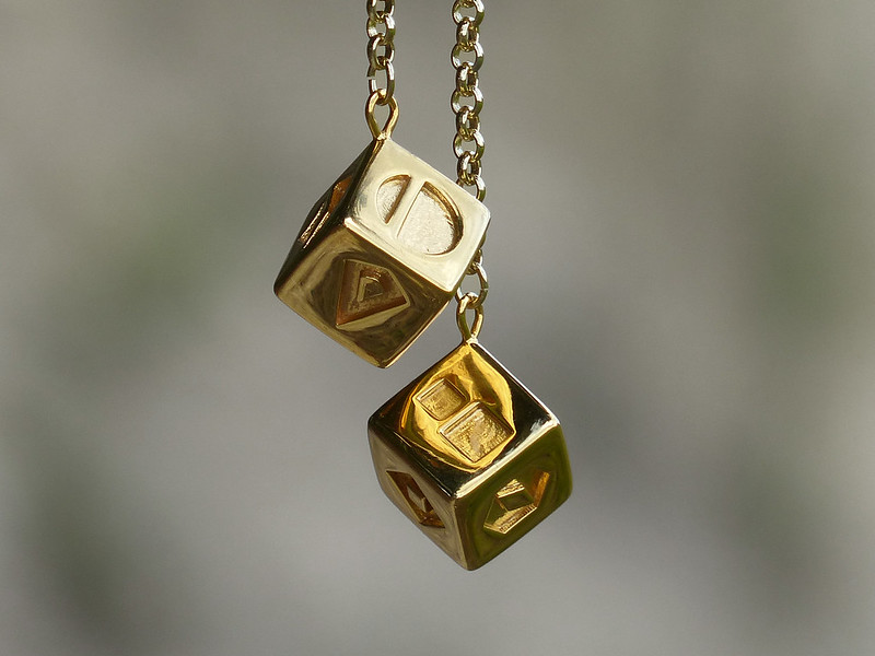
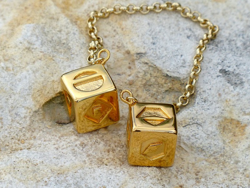
What I find interesting is that the aging on the dice in the new video look almost identical to the aging I am seeing on my brass dice, which have been hanging in my car the past few weeks. (As compared to the attached bright gold chain) I wonder if they even gold plated the original prop, or just made it in Brass. Freshly polished brass can be hard to distinguish from gold.
FYI, the above reference were taken from the Star Wars: The Last Jedi Secrets Explained.)
I know she is using white gloves, but I she is now holding the film used hero prop.
There are two details that convince me of this:
1: The corners are too sharp. When compared to this film shot, the corner radius doesn't match. I am specifically talking about where three corners meet, not the edges. What she is holding has corners closer to my Rev 1 design.
2: The space between the two portions of the "One" symbol isn't large enough. When comparing against this reference image.
However, this video may reveal a few things about the hero prop. I made the "one" symbol based on the image linked just above. In that image there is a slight taper on the one symbol. But this may be due to some pillow distortion, perhaps from a macro lens. But lets assume the one shown in the Youtube video is a good symbol. So I will have a Rev 4 to make.
Regarding the "five" symbol, I know for sure that it doesn't have a flat cut between the small triangle and the rest. This is from another reference images. I think that YouTube compression, combined with the slight round on that edge screwed up that detail. I do think however that the base edge on the "five" symbol needs to be a bit wider than I have now.
I think that perhaps distortion also caused the edges to look a bit more rounded than what you see in the the Feb 7th video. I believe my Rev 3 corners are closer to the hero prop. I do however plan on altering those two symbols a bit.
------------
What I find interesting is that the aging on the dice in the new video look almost identical to the aging I am seeing on my brass dice, which have been hanging in my car the past few weeks. (As compared to the attached bright gold chain) I wonder if they even gold plated the original prop, or just made it in Brass. Freshly polished brass can be hard to distinguish from gold.
FYI, the above reference were taken from the Star Wars: The Last Jedi Secrets Explained.)


")